Jump to content

MechWarrior HUD's


43 replies to this topic

Poll: Mech HUD (109 member(s) have cast votes)

Which MechWarrior had the most helpful HUD?

  1. MechWarrior (2 votes [1.83%])

    Percentage of vote: 1.83%

  2. MechWarrior 2 (10 votes [9.17%])

    Percentage of vote: 9.17%

  3. MechWarrior 3 (27 votes [24.77%])

    Percentage of vote: 24.77%

  4. MechWarrior 4 (20 votes [18.35%])

    Percentage of vote: 18.35%

  5. MechWarrior: Living Legends (8 votes [7.34%])

    Percentage of vote: 7.34%

  6. MechWarrior Online (42 votes [38.53%])

    Percentage of vote: 38.53%

Which MechWarrior had the most cosmetically pleasing HUD/cockpit?

  1. MechWarrior (3 votes [2.78%])

    Percentage of vote: 2.78%

  2. MechWarrior 2 (4 votes [3.70%])

    Percentage of vote: 3.70%

  3. MechWarrior 3 (23 votes [21.30%])

    Percentage of vote: 21.30%

  4. MechWarrior 4 (12 votes [11.11%])

    Percentage of vote: 11.11%

  5. MechWarrior: Living Legends (6 votes [5.56%])

    Percentage of vote: 5.56%

  6. MechWarrior Online (60 votes [55.56%])

    Percentage of vote: 55.56%

Vote Guests cannot vote

#1 RL Nice

    Member

  • PipPipPipPipPip
  • 163 posts
  • LocationA computer.

Posted 16 May 2012 - 01:21 PM

One of my favorite things about simulation games is seeing the inside of the cockpit (for this reason, MechWarrior 4 had my least favorite HUD out of all the games). Especially if you can see all the switches and displays on them. Sadly, no 'Mech game has any HUD information displayed on the actual cockpit itself, I'm guessing because it would be too difficult to read if the cockpit's bouncing around as the 'Mech's walking, but I guess I shouldn't complain.

MechWarrior 1:
Posted Image
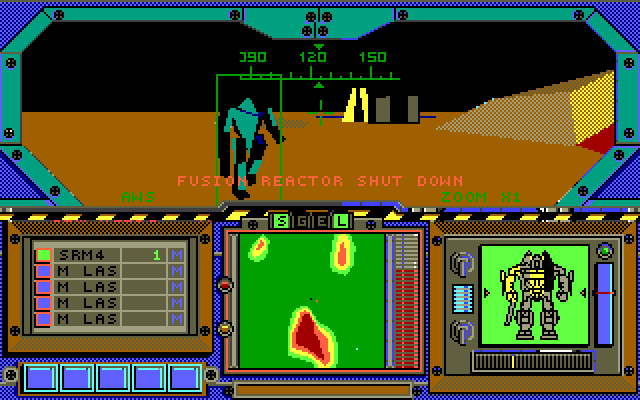
Okay, I guess. It doesn't look like an actual cockpit, and I don't know whether the readout is for your own 'mech or the targeted 'mech. Keep in mind I haven't played this game in extent, so I don't know how to read it..

MechWarrior 2:
Posted Image
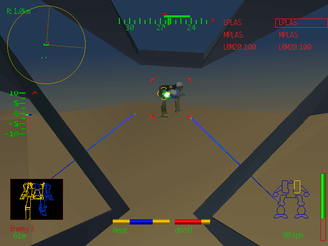
Bonus points for being the cockpit I grew up with, so it's the most nostalgic one for me. I love the wireframe 'mech in the targeting display, and those window frames are just beautiful. Another neat thing I like is how the schematic for your own 'mech is unique to the chassis you're piloting, and not a generic image like the modern games use. It's a shame you can't see the actual control panel in the cockpit but I guess that was simply the technical limitation of the time that came with using a 3D cockpit. But otherwise, it's a nice HUD, giving all the info one needs without being too complex. The only real downside I see to this HUD is that the uninitiated might not necessarily know that "dH/dT" means JumpJets.

MechWarrior 3:
Posted Image
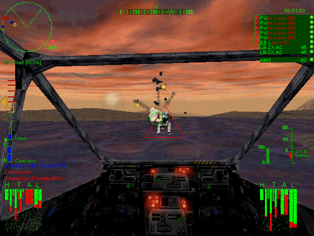
I love the cockpit, with all it's little buttons and lights. It might just be my favorite cockpit from all the MechWarrior games. It's just beautiful It's not visible in this screenshot, but the default damage indicators for this game are animated, like MechWarrior 2's, only they're textured as well. Once again, the damage on a targeted 'Mech is color coded, but without a wireframe model, it's kind of hard to read. I really love the way the HUD fuzzes up with damage and heat. I also like the way only the targeting reticule zooms in instead of the entire screen- I find it easier to pilot a 'Mech this way.

MechWarrior 4:
Posted Image
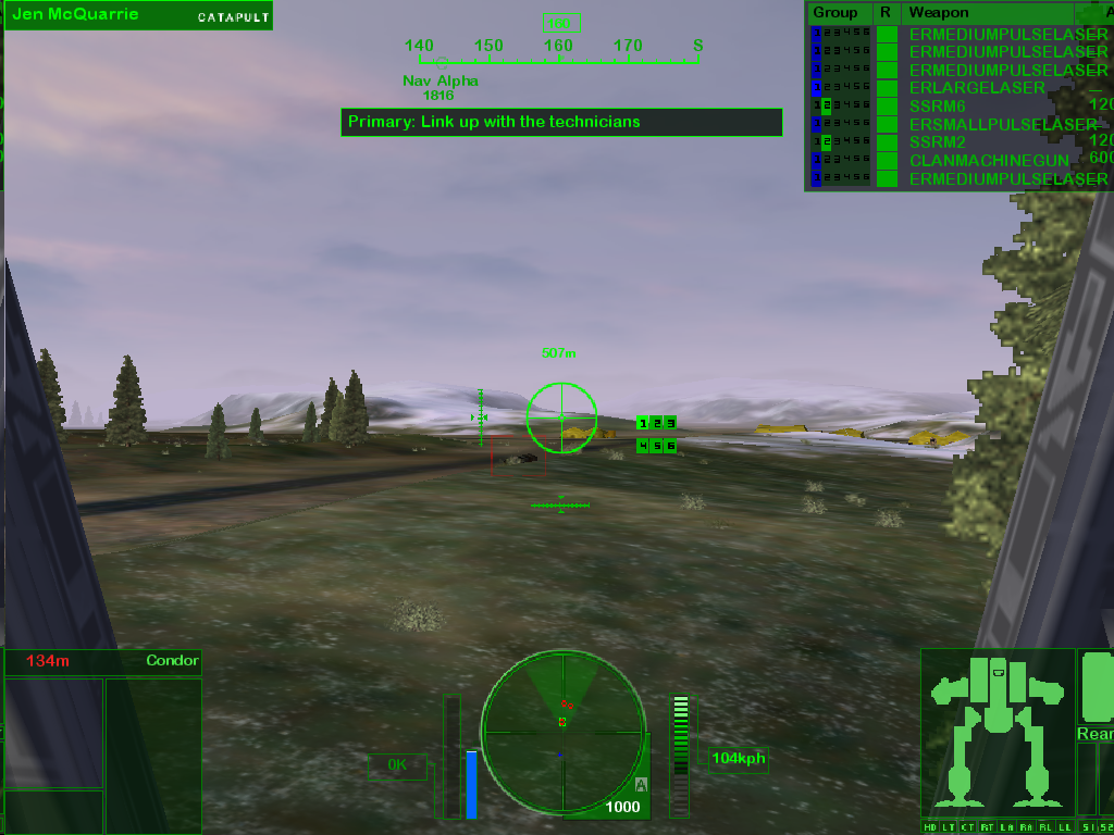
This HUD is just ugly. I can hardly see the cockpit, which as mentioned before, is something I love about older simulation games. Still, the weapons indicator I think looks better than previous games and there's a rear damage indicator, which is pretty nice. I think the best improvement this HUD made is the zoom reticule, which is no longer tiny like in MechWarrior 3.

MechWarrior: Living Legends
Posted Image
It's an okay cockpit, satisfactory on the lights and displays (although it depends on the 'Mech- some have very empty cockpits with no displays or anything) while skimping out on more detailed stuff, like flips and switches. Of course, it's a 3D cockpit and would make this already demanding mod even more taxing on the hardware. I like having two radar screens and the little tabs that tell you which radar mode you have activated. There's a lot more detail here, like specific numbers for heat buildup and other things whose meanings I haven't figured out yet. But my favorite improvement is that the damage indicators now display both schematics and damage bars side by side (or rather, one on top of the other). Haven't figured out what the BT thing is, though.

MechWarrior Online:
Posted Image
I'm liking what I'm seeing here so far, like the information displayed right next to the target indicator and how the damage schematics display internals as well as the name of the 'Mech being targeted. The map and radar are now also combined, which is an improvement from Living Legends. Lots of nice detail in the cockpit, although it's not all visible. I also saw the side of the cockpit in one of the gameplay videos when an Atlas made a sharp turn. The side is pretty empty, but I guess you guys simply haven't gotten to putting detail there yet, especially since it's not something the player would normally see. I like the cooldown bar next to the weapons, which I don't believe is something we've had since MechWarrior 3. All in all, I love the cosmetics the most. It's going to be perfect with a little hula girl to top it off.

Edited by RL Nice, 16 May 2012 - 01:31 PM.


#2 Aegis Kleais

    Member

  • PipPipPipPipPipPipPipPipPipPip
  • Legendary Founder
  • Legendary Founder
  • 6,003 posts

Posted 16 May 2012 - 01:23 PM

From today's standpoint, MWO, hands down.

If I had to pick one for its time and for a game that I actually had played, I would say MW3.

#3 Joseph Calvert

    Member

  • PipPipPipPipPip
  • Knight Errant
  • 153 posts
  • LocationQC, Arizona

Posted 16 May 2012 - 01:31 PM

MWO for me. The same or more info, with a cleaner design.

#4 Atlai

    Member

  • PipPipPipPipPipPipPipPipPip
  • Legendary Founder
  • Legendary Founder
  • 3,439 posts
  • Locationfrom the East of the South end of the North

Posted 16 May 2012 - 01:33 PM

View PostAegis Kleais™, on 16 May 2012 - 01:23 PM, said:

From today's standpoint, MWO, hands down.

If I had to pick one for its time and for a game that I actually had played, I would say MW3.

Took the words right out of my mou..fingers ;)

#5 CoffiNail

    Oathmaster

  • PipPipPipPipPipPipPipPipPip
  • The Cub
  • The Cub
  • 4,285 posts
  • Facebook: Link
  • Twitter: Link
  • LocationSome place with other Ghost Bears. A dropship or planet, who knows. ((Winnipeg,MB))

Posted 16 May 2012 - 01:38 PM

Another vote for MWO

#6 Zakatak

    Member

  • PipPipPipPipPipPipPipPip
  • Elite Founder
  • Elite Founder
  • 1,673 posts
  • LocationCanadastan

Posted 16 May 2012 - 01:51 PM

Was not a fan of the MW2 HUD really. MW4 had a nice HUD, but it took up alot of space and much of it wasn't translucent. MWLL's HUD I don't like at all, unfortunately, the radar display is bulky and space inefficient. MWO's HUD (which still has time to be reworked) has a beautiful minimap and radar, but I'm not a fan of the damage displays or thick yellow lines.

So I'm definetly giving this to MW3. Everything is in the right place, and has minimal impact on your ability to see. It also feels alot more like a modern military display, as you can see:

Posted Image

Edited by Zakatak, 16 May 2012 - 01:55 PM.


#7 ChalybsUmbra

    Member

  • PipPipPip
  • 83 posts

Posted 16 May 2012 - 02:06 PM

I love the MWO design and functionality. MWO finally has it so that the map and radar are unified, which is going to be essential for the role warfare. I also like that it gives you the opponent's weapons, and it even tells you the model of the mech. The best part though is the extra information on the cockpit monitors, i.e. the ammunition, gyro and life support status. But MW3 comes very close.

Aesthetics wise, there is no competition here. MWO is equally beautiful on the inside as it is outside. No mech simulator game has given me the feeling that I'm in a cockpit AS WELL as wearing a helmet with a HUD. It's a very nice touch to split the extra information like the ammunition and criticals from the HUD to the various cockpit displays. Also, as a side note, when the game is in motion, it's easy to get the feeling that the player himself has inertia against the mech's movements with every step. It lends itself to the differentiation of the mechwarrior and cockpit.

#8 ChalybsUmbra

    Member

  • PipPipPip
  • 83 posts

Posted 16 May 2012 - 02:19 PM

View PostZakatak, on 16 May 2012 - 01:51 PM, said:

Was not a fan of the MW2 HUD really. MW4 had a nice HUD, but it took up alot of space and much of it wasn't translucent. MWLL's HUD I don't like at all, unfortunately, the radar display is bulky and space inefficient. MWO's HUD (which still has time to be reworked) has a beautiful minimap and radar, but I'm not a fan of the damage displays or thick yellow lines.

So I'm definetly giving this to MW3. Everything is in the right place, and has minimal impact on your ability to see. It also feels alot more like a modern military display, as you can see:

Posted Image

How does MW3 look like that? The closest similarity I can draw with any of the games is MWO, or to a lesser degree MW4. The heading, distance, pitch and yaw are conveyed more similarly in MWO.

As for taking up less space, maybe a little. MW3 has more space length-wise, but MWO definitely has more width-wise, which I think is more important unless everyone is camping a hill or jump jetting.

#9 Ethicus

    Member

  • PipPipPip
  • Ace Of Spades
  • Ace Of Spades
  • 78 posts

Posted 16 May 2012 - 02:41 PM

only comment i have is please put the effective ranges of the weapons on the hud like in MW:LL

Edited by Ethicus, 16 May 2012 - 02:42 PM.


#10 CSG Gunslinger

    Member

  • PipPipPip
  • 85 posts

Posted 16 May 2012 - 03:02 PM

Thanks for the post, I played all of these so I can relate. Now that youve put all of the cockpit views in one place, I do like the view of mwonline but Id like to be able to have more distinct colors for the important stuff, heat, wireframe damage display etc. this stuff would be best if easily identifiable at a glance, you don't want to have to pause and study your HUD in the midst of a fight.

#11 TheMagicMan

    Member

  • PipPip
  • 41 posts
  • LocationMare Tranquillitatis

Posted 16 May 2012 - 03:25 PM

Honestly MW2 is my favorite hud (as was said, for nostalgia mostly ;) ). Not the titanium trilogy one, but the original one. It's very elegant and clean while still being functional and immersive. I like the MW4 hud the least, but I hate just about everything about that game so I'm slightly biased. The MWO hud did a great job of capturing what I loved about the MW2/MW3 huds and I am very pleased with it.

#12 Paewen

    Member

  • PipPipPipPipPip
  • The 1 Percent
  • The 1 Percent
  • 123 posts
  • LocationColorado

Posted 16 May 2012 - 03:44 PM

I couldn't vote for the MWO HUD, because I haven't sat in the cockpit behind it yet. With that said, I think it will be the most functional, but I couldn't vote for it.

Ask again a month after release.

#13 Vieric

    Member

  • PipPipPip
  • 57 posts

Posted 16 May 2012 - 04:34 PM

View PostPaewen, on 16 May 2012 - 03:44 PM, said:

I couldn't vote for the MWO HUD, because I haven't sat in the cockpit behind it yet. With that said, I think it will be the most functional, but I couldn't vote for it.

Ask again a month after release.


I am in agreement with Paewen on this, so excluding the "MWO" option, i picked MW4 HUD info, coupled with MW3 design, i feel that would be ideal, as i found the MW3 interface quite pleasing (for its time), yet lacking some usful info (namely a torso rotation indicator).

It also had a lot more in the way of small details over MW4 which impacted immersion in huge ways, the fuzz when you take damage, the different zoom reticules between clan and IS mechs, that sort of thing.

In short, ideally I would see the two combined and modernized a bit, namely in terms of sizing and position.

Edited by Vieric, 16 May 2012 - 09:11 PM.


#14 theginganinja

    Member

  • PipPipPipPipPip
  • Philanthropist
  • Philanthropist
  • 192 posts
  • LocationMinnesota

Posted 16 May 2012 - 09:59 PM

MWO, with the exception of two small things - the damage indicators are a bit ugly, and I'm not a huge fan of how everything is yellow. That said, MW3 is a very close second - it keeps everything simple, has great damage effects, and gives you three good options for how you want to view damage readouts. MWO mainly won because of the mini-map (Grid coordinates = loads easier to direct your buddies, and the previous mini-maps haven't done a good job of integrating the radar function into the display) and the (presumably) useful extra information it gives the player

#15 Chembot

    Member

  • PipPip
  • 33 posts
  • LocationAdelaide

Posted 17 May 2012 - 12:28 AM

With the MWO cockpit, could we see some grime around the glass edges? It
Looks a bit too clean for a war machine. And maybe some of the buildup you get from rain.

Talking about rain and frost. What are mechs, or in this case the Atlas going to use to clear the windows from rain? Are we gonna see windscreen wipers or something different, like compressed air blowing the moisture away?

#16 Mota Prefect

    Member

  • PipPipPipPipPipPipPip
  • Legendary Founder
  • Legendary Founder
  • 634 posts
  • LocationAboard Sheep Star 1 Battleship - Location Classified

Posted 17 May 2012 - 12:43 AM

View PostTheMagicMan, on 16 May 2012 - 03:25 PM, said:

Honestly MW2 is my favorite hud (as was said, for nostalgia mostly :rolleyes: ). Not the titanium trilogy one, but the original one. It's very elegant and clean while still being functional and immersive. I like the MW4 hud the least, but I hate just about everything about that game so I'm slightly biased. The MWO hud did a great job of capturing what I loved about the MW2/MW3 huds and I am very pleased with it.

Yeah!

EDIT: Also the HUD color should be changeable from yellow a variety of other colors that would be more aesthetically pleasing.

Edited by Mota Prefect, 17 May 2012 - 12:44 AM.


#17 Bloodycrow

    Member

  • PipPipPip
  • 91 posts
  • LocationEugene, Oregon

Posted 17 May 2012 - 02:29 AM

Don't forget that MWLL has had a new HUD planned for awhile. Designed by the wonderful FlyingDebris himself!

#18 Ethicus

    Member

  • PipPipPip
  • Ace Of Spades
  • Ace Of Spades
  • 78 posts

Posted 17 May 2012 - 01:03 PM

What would be interesting is if they just allowd the player a "cockpit customization" option in the mechlab.
Allowing 3 types of HUDs:

1: can be MW:O
2: can be MW:LL
3: can be MW:3
All of them will look sleek and spiffy with the 3D way they handled MW:O, but its more of the placement of the items on the HUD

honestly i like all 3 of those HUD designs.
MW:O - will give the fresh new look.
MW: LL - i always liked the idea of the 2 different radars, one for mech torso twist and targetting, one for placement on the map itself, the way the team chat was working sounded very clean and precise thanks to the grided system of the map. i know they have it in the new MWO too, but thats where i first saw it used. i want the grid system to stay there no matter what HUD they choose personally
MW: 3 - will give the nostalgia we all want (obviously graphically updated with the GRID and all that stuff)

i also am not fond of the way the damage indicators look in MW:O though. when it comes to that, i prefer the MW2 or MW4 version

Edited by Ethicus, 17 May 2012 - 01:07 PM.


#19 Dream Seaker

    Member

  • PipPipPip
  • FP Veteran - Beta 1
  • 79 posts
  • LocationOntario, Canada

Posted 17 May 2012 - 01:20 PM

i feel like MW: O's hud blends in with the cockpit much better than the others, though i think it would be awesome to change the colour scheme possibly... :3

Edit: and i completely agree with ethicus' points

Edited by Dream Seaker, 17 May 2012 - 01:22 PM.


#20 Deathz Jester

    Member

  • PipPipPipPipPipPipPipPipPip
  • Legendary Founder
  • Legendary Founder
  • 2,107 posts
  • LocationOH, USA

Posted 17 May 2012 - 01:30 PM

There's an Evolution of Mechwarrior video, rather cool to watch. shows huds, game play, etc.


also some hud/action from Living Legends.

Edited by Iron Harlequin, 17 May 2012 - 01:34 PM.


1 user(s) are reading this topic

0 members, 1 guests, 0 anonymous users