


This thread is being dedicated to the issues I see relating to the social side of the interface. This will include how it functions, why I feel that the current social screens can use work, and what I suggest for possible concepts on improving these structures.
The problems as I perceive them currently currently:
- The current interface is a tiny button on the bottom of the screen. It is one of the smallest parts of the interface that I can see.
- You are not informed when friends log into the game while you are on. This discourages larger group play.
- When action happens from the social menu and it is not up, the small button on the bottom of the screen will flash, such as a group invite or receiving a message.
- Though the button flashes to give notice of activity, it is so small that it often gets overlooked, even with it flashing bright blue. This leaves messages and invites to often get overlooked for periods of time.
- Once inside the social menus, you can not interact with any other pieces of the interface without closing the whole menu. You also can only ready up once in a group from the social menu, instead of the launch button.
With these problems explained, these are the issues that can be addressed to make the system better. Please, post additions as you feel needed.
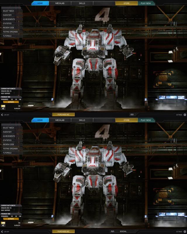
- Make the interface larger, even if it stays on the bottom of the interface. It's the smallest button I can see on the interface. The icon also doesn't exactly say what it is used for.
- The social interface is almost completely hidden, and this leaves it often ignored. Unless the interface is actively on the screen, it is invisible and you can't see any updates or notices from the system.
- It is too easy to ignore in it's current state.
My proposed solutions/suggestions to address these problems as I see them:
- 1. Change the social button to like how the other tabs are, with the icon possibly faded into the background of the button or off to a side. Then have the button say "social" on it (or something) to help clarify what the button is.
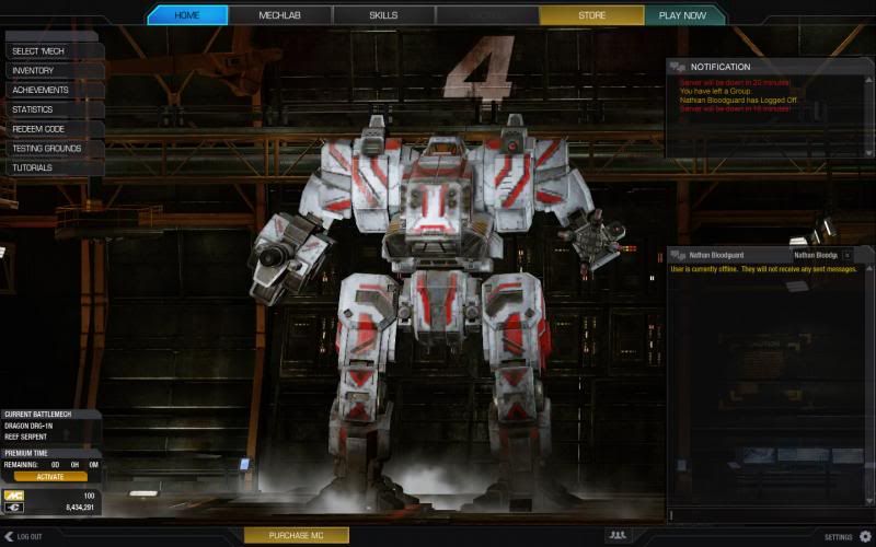
- 2. After looking over the various tabs and sections of the other parts of the current UI, I have come to realize that a large section of the right hand side is completely unused besides for graphical representation of your mech. Though I love to look at my mech, I would suggest having this area be designed with fad away popup windows. These windows would be from the social interface, and would popup and slowly fade away informing you of social activities that have happened. Such as when a friend has logged on/off, as well as informing you that you have received a message.
- 3. After observing that the right side is being used to display my (gorgeous) mech, it could be used for the social interface even farther than just popup windows. When in a group, I would suggest your group options/chat take over this underused right section of the screen (the third or fifth column depending upon how many columns the design was based upon). Sure, it will cover up my (beautiful) mech, but it will increase the functionality of the interface drastically for the social interface.
This new "notification" right column could even be used for system announcements as well, such as "system going down for maintenance in 15 minutes", or even to announce new sales (have this as a turn off/on option).
Photo Examples:
1.
2.
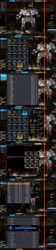
3.
(All these photos, if they are not large enough for you, can be found here: http://s92.photobuck...w=recent&page=1 )


