Jump to content

Your Thoughts On The New Smoke Jaguar Icon?


31 replies to this topic

#1 Keeshu

    Member

  • PipPipPipPipPipPip
  • Philanthropist
  • 470 posts

Posted 03 June 2014 - 09:43 AM

Come on Smoke Jaguars, the other clans posted this thread, and you haven't? Step it up! ;)

Personally I greatly prefer this new icon. Much more intimidating, and you can actually see more of the symbol in the background. Only downside is that the Jaguar isn't all Grey + Smokey, but I think that has to do with the fact of the flag textures in the background would make it blend in too much if it were to do that.

Posted Image
Posted Image

#2 ChapeL

    Member

  • PipPipPipPipPipPipPipPip
  • Elite Founder
  • Elite Founder
  • 1,363 posts

Posted 03 June 2014 - 09:46 AM

I prefer the Jaguar's pose in the classic version... wouldn't mind to see the new one that way.

#3 Jehdin

    Member

  • PipPip
  • 35 posts
  • LocationHuntress

Posted 03 June 2014 - 09:52 AM

I'm 50/50 on the new design. As I stated in a previous thread I'm just happy to finally have something other than the stupid lone wolf icon after so long.

Edited by Jehdin, 03 June 2014 - 09:52 AM.


#4 CyclonerM

    Tina's Warrior

  • PipPipPipPipPipPipPipPipPipPip
  • FP Veteran - Beta 2
  • FP Veteran - Beta 2
  • 5,684 posts
  • LocationA 2nd Wolf Guards Grenadiers JumpShip

Posted 03 June 2014 - 09:58 AM

I am not a Jag and will never be.. But i think the classic one looks better. Black cat? Nah thanks.

#5 swamp hag

    Member

  • PipPipPipPipPipPipPipPip
  • WC 2017 Participant
  • 1,482 posts

Posted 03 June 2014 - 09:58 AM

Hideous, form and color choices both.

#6 Jehdin

    Member

  • PipPip
  • 35 posts
  • LocationHuntress

Posted 03 June 2014 - 09:59 AM

View PostCyclonerM, on 03 June 2014 - 09:58 AM, said:

I am not a Jag and will never be...


Well we can't all be perfect. ;)

#7 swamp hag

    Member

  • PipPipPipPipPipPipPipPip
  • WC 2017 Participant
  • 1,482 posts

Posted 03 June 2014 - 10:01 AM

In fact I think all the redesigned Clan logos are ... well ... I hope they didn't pay a lot.

#8 Jehdin

    Member

  • PipPip
  • 35 posts
  • LocationHuntress

Posted 03 June 2014 - 10:03 AM

View PostGlory, on 03 June 2014 - 09:58 AM, said:

Hideous, form and color choices both.


I agree. I don't get the color choices. The "jaguar" design itself just lacks any kind of "coolness" imo.

#9 John Clavell

    Member

  • PipPipPipPipPipPipPipPip
  • 1,609 posts

Posted 03 June 2014 - 10:24 AM

I think all the clan logos are poorly conceived. I don't feel there's much thought behind the shape and form. That's not to say all of the original clan logos where without issues yet many of them have very strong elements that are iconic. Much of that dose not translate through very clearly in my mind. My 2 cent.

Edited by John Clavell, 03 June 2014 - 10:26 AM.


#10 _Comrade_

    Member

  • PipPipPipPipPipPipPipPip
  • Elite Founder
  • Elite Founder
  • 1,120 posts

Posted 03 June 2014 - 10:25 AM

Should be grey not black, but other then that like it. It looks to be on its hind legs rather flying through the air

#11 Raigner

    Member

  • PipPipPipPipPip
  • The Fang
  • The Fang
  • 132 posts
  • LocationAlabama, USA

Posted 03 June 2014 - 10:35 AM

I would like gray over black myself, I do not remember being the Void Jaguars, but over all I like it but time for a change from that 20 year old flat un-articulated logo.

#12 JDOGG

    Member

  • Pip
  • FP Veteran - Beta 1
  • FP Veteran - Beta 1
  • 11 posts
  • LocationIL

Posted 03 June 2014 - 12:32 PM

I'm not a fan of it. I would have liked if they at least retained some of the original smoky color of the Jaguar. Now it just looks like a black panther.

#13 MechB Kotare

    Member

  • PipPipPipPipPipPipPip
  • Bad Company
  • Bad Company
  • 720 posts
  • LocationHuntress

Posted 03 June 2014 - 01:11 PM

Im dissapointed. I think others ended up nicely, comparing to ours. But its something i can and will live through.

#14 KinLuu

    Member

  • PipPipPipPipPipPipPipPip
  • Ace Of Spades
  • Ace Of Spades
  • 1,917 posts

Posted 03 June 2014 - 11:46 PM

I like the shape.

It looks aggressive and really jumpy. Completely do-not-think;jump-into-enemies-face kinda like CSJ is supposed to be.

I do not like the color.

It is to dark, it is more Clan Coal Jaguar than Clan Smoke Jaguar. I really liked the steel-grey of the orgininal design.

#15 Nova Latios Storm

    Member

  • PipPipPipPipPipPipPip
  • The Grizzly
  • The Grizzly
  • 606 posts
  • LocationAnother Galaxy

Posted 04 June 2014 - 12:41 AM

I like it yes! But it is hard to see when in-game.

#16 dezgra

    Member

  • PipPipPipPipPipPip
  • The Defiant
  • The Defiant
  • 271 posts
  • LocationLaborer caste mess hall

Posted 04 June 2014 - 08:55 AM

Needs to be gray, not black.

#17 pbiggz

    Member

  • PipPipPipPipPipPipPipPipPip
  • Overlord
  • Overlord
  • 4,684 posts
  • LocationOutreach

Posted 04 June 2014 - 10:12 AM

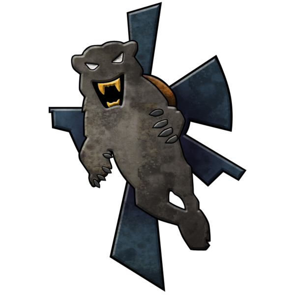
I should let you all know, a black panther is generally any melanistic member of any panthera species. This refers to jaguars, leopards, and cougars.
Posted Image
this is a melanistic jaguar, so any complaints that the clan is now smoke panther are unfounded, as smoke jaguars, if they existed today, would fall under the panthera genus and be considered panthers.


With regards to the actual insignia, I think the new one looks silly, and the colour combinations are off. An updating of the jaguar itself to look more intimidating is great, as the original one at a quick glance looks a bit like clan bubbly rabbit. However, the odd orange circle and blue limbs do not look remotely like they belong, they should stick to the more classic colour combinations, a smoky grey jaguar leaping off a blackish stone grey background sans orange circle.

Edited by pbiggz, 04 June 2014 - 10:12 AM.


#18 SilentWolff

    Member

  • PipPipPipPipPipPipPipPipPip
  • The God of Death
  • The God of Death
  • 2,174 posts
  • LocationNew Las Vegas

Posted 04 June 2014 - 01:38 PM

I'd prefer the old design.
There must of been alot of complaints about the new icons, cause Russ just posted that they are going to also redo the old icons, then have us vote on which we prefer.

#19 ALKALIN3

    Member

  • PipPipPipPipPipPip
  • Caladbolg
  • Caladbolg
  • 246 posts

Posted 04 June 2014 - 03:40 PM

Glad to see the redo and vote. I'd prefer designs along the lines of the Freebirth insignias. Sometimes less is more

#20 pbiggz

    Member

  • PipPipPipPipPipPipPipPipPip
  • Overlord
  • Overlord
  • 4,684 posts
  • LocationOutreach

Posted 08 June 2014 - 07:38 AM

View PostMarack Drock, on 04 June 2014 - 01:28 PM, said:

Actually the Jaguar falls in the family of Panthera Onca Jaguar which contains Jaguars (no actual Panthers). The Panther is BLACK, WHITE, OR GREY. Those are the only actual species of Panthers. In America there is the Florida Panther.

The Jaguar actually resembles a Leopard with is black spots on yellow fur. They live in Central and South America and do not live near the Florida Black Panther, or the Black Panthers in Africa.

What is on the CSJ icon is a Panther not a Jaguar.

Edit- They fall in the family of Big Cats, but if we say a Panther is a Jaguar cause its a big cat, then we can say a Lion is a Jaguar too, and we can quite clearly see they ARE DIFFERENT!


I work at a zoo, im not talking out of my ass.


1 user(s) are reading this topic

0 members, 1 guests, 0 anonymous users