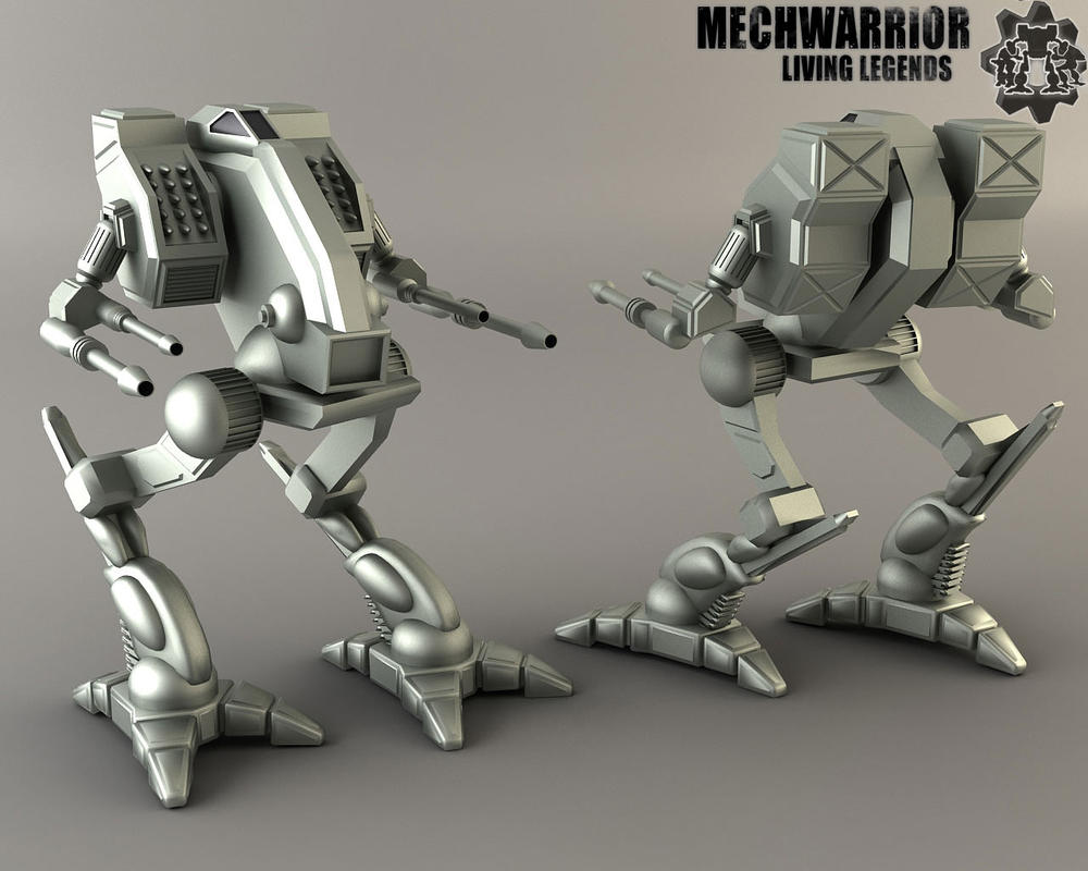
Vulture: Battle-Tech v MW4
#21
Posted 01 June 2012 - 12:58 PM
I think both bt and mw4 look good.
#22
Posted 01 June 2012 - 01:04 PM
#24
Posted 01 June 2012 - 03:05 PM
It's a great mech, at least the look.
Personally, I think the MW4 version with the original Arms would be neat, the MW4 version looks heavier, and somewhat more IS...
But it's a relatively mobile clan Heavy, and as previous posts state, while it certainly makes no sense to have them that uncovered (then again, mechs make no sense. *shush*), those thin, sleek arms convey a lot more aggressiveness and fit the name better.
#25
Posted 01 June 2012 - 03:10 PM
#26
Posted 01 June 2012 - 03:19 PM
Also, MW4 made me hate that chin rack since the AI would always destroy it in the campain.
#27
Posted 01 June 2012 - 03:19 PM
#28
Posted 06 December 2012 - 07:11 AM
#29
Posted 07 December 2012 - 11:13 AM

Nothing compares to the original. The look and "feel" of it perfectly match the fiction written for it.
 TwoFaced, on 01 June 2012 - 12:58 PM, said:
That's kind of it right there. It's a relatively fragile design. MW4 made it look too beefy/tough for what it really is. I like the look of the MW4 version but it's just not what the 60-ton Vulture is. Maybe as a 70 or 80-ton upgrade.
 UnLimiTeD, on 01 June 2012 - 03:05 PM, said:
There is fluff text in TRO: 3050 Upgrades about the Ghost Bears manufacturing Vultures in the I.S.
Quote
That could allow them to shoe-horn the MW4 version into canon if it were possible. Except I think there's a problem using Microsoft-owned artwork in BattleTech. Spit license and all that jazz. Same reason we probably won't see the MWO versions used in BattleTech.
Edited by cache, 07 December 2012 - 11:14 AM.
#30
Posted 07 December 2012 - 01:52 PM
I love the alien nature of early clan tech art, and even though it suffered from the same malaise as all mech art back then (drawing is hard), when modern redesigns go too far they often loose their essential mojo.
 Adridos, on 01 June 2012 - 12:36 PM, said:

This is the sauce right here. I really hope FD does a revision faithful to the early design rather than something more like the MW4 monstrosity. So far he's done a great job with the mechs I like, and remarkable things with some mechs I really didn't, so I know I shouldn't be worried. But because it's this mech, I am a bit.
#31
Posted 08 December 2012 - 08:29 AM
Every Mechwarrior game prior to this has had some pretty horrendous in game art of mechs. MW1, 2 and to a lesser extent 3, have been the result of technical limitations.
But once Microsoft got their hands on it, all the mechs turned into horrendous looking fisher paykel inspired toy mechs, with horrible stubby design language. I wish a grave pox upon the art director or whoever in charge that was responsible for that decision.
Just utterly ruined. And even worse is that whoever is handling Mechwarrior Tactics is taking that design direction and making it even super worse. It's unbelievable how bad that game looks.
FD... please make the clan mechs look better than the Timberwolf and Mad Dog on the Mechwarrior 2 covers.
Edited by Zaptruder, 08 December 2012 - 08:29 AM.
#32
Posted 10 December 2012 - 12:32 PM
#33
Posted 10 December 2012 - 01:09 PM
#34
Posted 21 January 2013 - 09:32 AM
#35
Posted 18 July 2016 - 02:05 PM
- The MechWarrior 4 series actually showed the Medium Pulse Lasers in a chin rack, the results are the moving of the Medium Pulse Lasers into the Center Torso, this model is called the Mad Dog Mk II (Vulture Mk II) by the online BattleTech Community.
- The canon status of the Mad Dog Mk II (Vulture Mk II) was confirmed by the Lead Developer in a ruling on the official forum on 21 Aug 2013:
1 user(s) are reading this topic
0 members, 1 guests, 0 anonymous users


