Jump to content

Catapult; Classic Versus Current.


51 replies to this topic

Poll: Classic, Founders, or MWO Standard? (186 member(s) have cast votes)

Which Catapult design (appearance) do you prefer?

  1. Classic (Battletech art / model) (11 votes [4.89%])

    Percentage of vote: 4.89%

  2. Founder's (Operation Inception) (90 votes [40.00%])

    Percentage of vote: 40.00%

  3. Current (121 votes [53.78%])

    Percentage of vote: 53.78%

  4. Battletech 3050 (tech readout?) design (3 votes [1.33%])

    Percentage of vote: 1.33%

Vote Guests cannot vote

#21 Taemien

    Member

  • PipPipPipPipPipPipPipPip
  • 1,576 posts
  • LocationNorth Carolina

Posted 11 April 2013 - 12:26 AM

I definitely like the current one. Some games made the Catapult look anemic, and some of the mini's don't look that great. But PGI did great on the current model and set the bar on what all heavy mechs can be gauged.

MWLL's Catapult was decent, though the missile racks could use work, though the C version with Arrows was pretty good too.

#22 Onmyoudo

    Member

  • PipPipPipPipPipPipPip
  • 955 posts

Posted 11 April 2013 - 12:29 AM

I voted both Current and Operation: Inception, I think they're both good. Maybe when we get those customisable chassis we can choose between them.

#23 Kaspirikay

    Member

  • PipPipPipPipPipPipPipPipPip
  • 2,050 posts

Posted 11 April 2013 - 12:30 AM

Snub nosed is cute

#24 SgtMagor

    Member

  • PipPipPipPipPipPipPipPipPip
  • 3,542 posts

Posted 11 April 2013 - 03:24 AM

the current Snub nose looks good, that little change in design from the founders made it look more intimidating.

#25 Jetfire

    Member

  • PipPipPipPipPipPipPipPip
  • 1,746 posts
  • LocationMinneapolis, MN

Posted 11 April 2013 - 04:35 AM

As much as I love my founders, I prefer the current really.

#26 80sGlamRockSensation David Bowie

    Member

  • PipPipPipPipPipPipPipPipPip
  • 3,994 posts
  • LocationThe Island

Posted 11 April 2013 - 05:15 AM

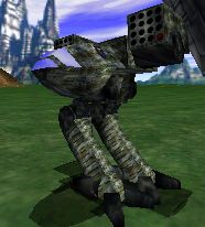
Uhhhhhh....


MechWarrior 2 Says Hello


Posted Image

#27 Oni Ralas

    Member

  • PipPipPipPipPipPipPip
  • 762 posts

Posted 11 April 2013 - 05:40 AM

Current design. If we were running with clan tech, classic would be fine (as it shares MadCat DNA).

I hated the catapult in MWx, but dig it in MWO.

#28 Asmosis

    Member

  • PipPipPipPipPipPipPipPipPip
  • 2,118 posts

Posted 11 April 2013 - 06:18 AM

classic has the whole mickey mouse thing going on, don't think I could take it seriously on the battlefield. Also didn't see the difference in founders vs current till I started reading thread :ph34r:

#29 FrostCollar

    Member

  • PipPipPipPipPipPipPipPip
  • 1,454 posts
  • LocationEast Coast, US

Posted 11 April 2013 - 06:22 AM

I love the beak, but the snub nose is OK too. The classic Cat looks a bit goofy because of how large its body is compared to the missile pods. It also looks like it ate all the pies.

#30 Serious Table

    Member

  • PipPipPip
  • 78 posts
  • LocationTexas

Posted 11 April 2013 - 06:38 AM

Current. I absolutely LOVE what they're doing with these 'Mechs, and prefer every single one of these new designs to anything that was released previously. A lot of the original art makes the 'Mechs look... well, weird. And some of their interpretations are additionally more weird. I hated the way the Catapult looked in Mechwarrior: Living Legends, but this current design of the CPLT-C1 and CPLT-K2 are top notch.

And it's carried into every single chassis. The Cataphract, the Atlas (that poor Atlas didn't get the attention it deserved in MWLL), the Awesome especially, the Jagermech, the Centurion, the Jenner, the Commando.... every single 'Mech looks industrial, like a hardened battle machine. I'll accept no substitute.

#31 Vasces Diablo

    Member

  • PipPipPipPipPipPipPip
  • 875 posts
  • LocationOmaha,NE

Posted 11 April 2013 - 07:09 AM

Love my founders Cat, but the snub nose of the current standard is the better looker (IMO)

#32 General Taskeen

    Member

  • PipPipPipPipPipPipPipPipPipPip
  • 5,737 posts
  • LocationCircinus

Posted 11 April 2013 - 07:13 AM

I prefer the 3050 artwork design from Battle Tech.

Posted Image

#33 Tie Ma

    Clone

  • PipPipPipPipPipPip
  • 433 posts

Posted 11 April 2013 - 07:41 AM

classic is lame. i don't hate the MW4 or MC2 design though.

#34 Corvus Antaka

    Member

  • PipPipPipPipPipPipPipPipPipPip
  • 8,310 posts
  • Twitch: Link
  • LocationInner Sphere

Posted 11 April 2013 - 07:42 AM

I like both the founders and the currrent design best

#35 Koniving

    Welcoming Committee

  • PipPipPipPipPipPipPipPipPipPipPipPipPip
  • 23,384 posts

Posted 11 April 2013 - 09:20 AM

View Postmwhighlander, on 11 April 2013 - 05:15 AM, said:

Uhhhhhh....


MechWarrior 2 Says Hello


Posted Image


I never saw the MW2 Catapult. I had botha Titanium Edition for PC and a PS1 edition. I know the computer had more, but I have never, ever seen inner sphere mechs in MW2. O_O;

Also, added the Battletech 3050 manual's sketch of the catapult to the voting options. Failed to add the MW2's version as they look very similar.

Remember you can vote for multiple mechs, and it's okay to delete your vote and revote if you want.

Edited by Koniving, 11 April 2013 - 09:47 AM.


#36 MeiSooHaityu

    Member

  • PipPipPipPipPipPipPipPipPipPipPip
  • 10,912 posts
  • LocationMI

Posted 11 April 2013 - 10:02 AM

The classic Catapult looks pretty bad. I think the Catapult is the mech PGI did the most benefit to. They took a dorky looking mech and made it cool.

Hats off to PGIs design team.

#37 Koniving

    Welcoming Committee

  • PipPipPipPipPipPipPipPipPipPipPipPipPip
  • 23,384 posts

Posted 11 April 2013 - 01:21 PM

Personally I've been trying to decide which battlemech's arms from those already built in the game would look good for a "Madcat" mock up made out of classic or founder's catapults.

Ideas?

#38 Lord Perversor

    Member

  • PipPipPipPipPipPipPipPip
  • 1,815 posts
  • LocationSomewhere in New Aragon

Posted 11 April 2013 - 01:31 PM

View PostColonel Pada Vinson, on 11 April 2013 - 07:42 AM, said:

I like both the founders and the currrent design best


Cannot agree more, so far all the MWO designs looks way more wonderfull than any other even the old classic ones.

Can't Wait to see more and more mech redesigned!!

#39 buttmonkey

    Member

  • PipPipPipPipPipPipPip
  • 666 posts
  • LocationNorway

Posted 11 April 2013 - 01:35 PM

i voted classic but as in the metal miniature

http://www.ebay.com/...S:B:SHOP:US:101

i think they look much nicer with longer legs

and be honest when you think it about it, it makes more sense that it would be tall as it is a missile boat, much easier to just fire over other mechs instead of having some one run in front of you and ruin your whole salvo :\

#40 FrostCollar

    Member

  • PipPipPipPipPipPipPipPip
  • 1,454 posts
  • LocationEast Coast, US

Posted 11 April 2013 - 01:43 PM

View Postbuttmonkey, on 11 April 2013 - 01:35 PM, said:


Talk about top heavy! A stiff breeze looks like it could blow the thing over, let alone a gauss slug.


1 user(s) are reading this topic

0 members, 1 guests, 0 anonymous users