
New Snow Raven Logo
Started by redlance, Apr 24 2013 04:11 PM
4 replies to this topic
#1
Posted 24 April 2013 - 04:11 PM
did this for my unit. thoughts?


#2
Posted 24 April 2013 - 04:26 PM
Couldnt tell what it was for a while lol
#3
Posted 24 April 2013 - 04:56 PM
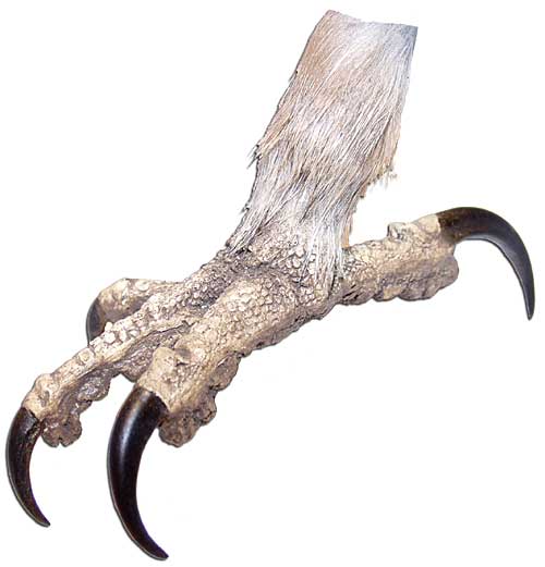
love your work with the basic design, but feel the thickness of the talon overall looks more like a Dragon or even a wildcat of some sort than a birds (probably adding to the confusion Tennex expressed). I think if you slimmed the talon down, and added a little "bird flesh/scale detail, it would pop out more as a Snow Raven insignia. Something akin to, but better rendered and not bright yellow, lol, this

but jsut my 2 cts. I can't do cg art at all, so take it for what you will.

but jsut my 2 cts. I can't do cg art at all, so take it for what you will.
#4
Posted 24 April 2013 - 07:01 PM
 Bishop Steiner, on 24 April 2013 - 04:56 PM, said:
love your work with the basic design, but feel the thickness of the talon overall looks more like a Dragon or even a wildcat of some sort than a birds (probably adding to the confusion Tennex expressed). I think if you slimmed the talon down, and added a little "bird flesh/scale detail, it would pop out more as a Snow Raven insignia. Something akin to, but better rendered and not bright yellow, lol, this

thank you both for the feedback, it is much appreciated. i really was going for a more raptor-ish look on the claw it self, the feathers at the end are really where i wanted the bird element to come in. i took tennex's comment to heart and decided to try and make the claw more defined and more identifiable. adding scales and trimming it down would have just been SO MUCH work. what do you think now as it is, with the redefinition and cleaned up lines?
Edited by redlance, 24 April 2013 - 07:02 PM.
#5
Posted 24 April 2013 - 07:36 PM
I do like it more, but it still feels rather thick for a birds talon, to my mind.

get where you are coming from on the tons of work things, as I have people recommend "simple" fixes for stuff all the time that essentially require a complete remake.

get where you are coming from on the tons of work things, as I have people recommend "simple" fixes for stuff all the time that essentially require a complete remake.
Edited by Bishop Steiner, 24 April 2013 - 07:37 PM.
1 user(s) are reading this topic
0 members, 1 guests, 0 anonymous users


