Ui 2.0 - Feedback
#1081
Posted 08 April 2014 - 09:53 PM
Really, why would I buy a Hero mech (or any mech) in UI2 when I can't see what I'm getting?
#1082
Posted 12 April 2014 - 06:43 PM
#1083
Posted 12 April 2014 - 11:59 PM
 7ynx, on 12 April 2014 - 06:43 PM, said:
This.
I've been trying to badger them to say anything about our feedback on UI2.0. I failed.
For my part, I think official feedback threads are like panic rooms - they are there to make you feel better, not to actually use them.
I might be getting old, but not being able to actually read most things without craning my neck is really bad. Not even mentioning all the actual user experience design fails in the interface.
Offering a bet: Nothing major will be changed in that UI ever. Anyone betting against me?
#1084
Posted 13 April 2014 - 06:01 AM
I get a feeling that all that was considered - how good this "UI" looks, not how useful it is to use. And it must be the other way around.
#1085
Posted 13 April 2014 - 08:39 AM
Or at least give me bonus miles for my mouse movement.
Edit: Pleeeeease?
Edited by Gevatter T, 13 April 2014 - 08:39 AM.
#1086
Posted 13 April 2014 - 10:17 PM
 DirePhoenix, on 05 March 2014 - 06:53 PM, said:
If you paid attention to the tweets preceding the one where that quote comes from, UI font scaling is on the way, and I sort of doubt he was referencing the current build anyway.
It is a little bit of a #FirstWorldProblem to complain about how hard the font is to read on your 60-inch TV from your recliner 15 feet away (even though I am having the same issue on my 40" screen sitting 10' away), but I'll be thankful for font-scaling. I don't think I can blame them for being caught off-guard that people would be playing this in a "living room" setup as compared to a more "traditional" desktop setup though.
Its not just font that is small - its small font and HUGE icons. Generic icons which tell me nothing but since they are huge and colorful they are all i see. So i have to struggle - just to see what i have to see and for what? so they can show me my mech model in hi-res? For me game is not about fancy mechanical dolls - its about mech warfare and being able to fit my mech as fast and as effortless is my top concern. And i get UI that is all about - "Look, its pretty" and functions like its made for torture.
It was so good when it was list of stuff - not its so horrible that its just pile of garbage. Then i knew that if i see ac-2 - then ac-20 is down. Likewise small laser is upwards from large. Here - i cant tell i have to look hard at huge icons with small font. awful.
Another point is double confirmations. God i hate this shit. Everything i do - i have to confirm twice. Do i want to buy this stuff - yes i do, do i want to save my configuration - yes, please, choose game type every time i press start - why? please redeem your achievement - ok - now confirm that redeeming process ended. And not getting "save it" button on screen that tells you that you gonna lose your changes if continued, just yes/no is just epic anti-ui.
#1087
Posted 14 April 2014 - 07:41 AM
Everytimes they change a major thing, and see they broke it because they're either too lazy or not competent enough to do something good, they let us rot like apples : after a while, they see the protest loose it strenght and consider all protesters are now used to the broken thing...
Very current move in all governments against contestation.
Not very respectful of users, and in the internet world, an incentive to hate and flame...
#1088
Posted 15 April 2014 - 11:59 PM
Could you be any more transparent?
#1089
Posted 16 April 2014 - 03:49 AM
 Lindonius, on 15 April 2014 - 11:59 PM, said:
Could you be any more transparent?
Badger them on Twitter. I tried and failed, perhaps you're more lucky. I don't even play more than 2-3 rounds an evening these days, and only with mechs I know exactly, since reading anything in this UI is just exhausting and not fun at all.
Just increasing the size of fonts already seems to be too hard for them to do (after claiming UI2.0 is the bottleneck delaying everything - one could argue it mainly delayed shelling out even more mechs to grab cash).
Edited by DasAmok, 16 April 2014 - 04:10 AM.
#1090
Posted 16 April 2014 - 07:18 PM
 DasAmok, on 16 April 2014 - 03:49 AM, said:


Edit:
On a side note I've just realised that this thread is no longer pinned. Is this because PGI consider UI 2.0 to be "finished"? *smirk*
Edited by Lindonius, 16 April 2014 - 07:44 PM.
#1091
Posted 18 April 2014 - 01:07 PM
Worse of all, I see half the screen taken up by a cool model of my mech, why not just put an overlay over it a la old skool UI that shows whats in each hardpoint?
Why are all the important numbers so tiny? Why make a mechlab that doesn't tell me hardpoint loadouts with minimal effort (like UI 1.6 did).
How can it have taken so long and be so un-intuitive to use? Comments like this were seen in the public testing feedback and I guess you ignored it?.
You know what, I'm going to play another game, because I seriously can't bear the thought of actually having to change the loadout of my mechs. Also my mind boggles at how long this took to come out and how bad it is.
Oh, and the thing crashed on closing, thanks. WIll drop by in another 4 months to see if anything is better.
Thought of the day - "Style over substance".
Edited by MoonfireSpam, 18 April 2014 - 05:19 PM.
#1092
Posted 19 April 2014 - 02:22 AM
The things I miss more from the old UI are the ability to hover the mech and see graphically where the hardpoints are and clicking on the parts to edit their loadout. That was pointed out in the first PTS, and we were told that would be an option in the near future.
Font size should be taken into consideration as well. I don't read anything from the stats as even some aren't even precise (weapon range, for instance). I use Smurfy's for that - and I have to.
#1093
Posted 19 April 2014 - 09:02 AM
#1094
Posted 21 April 2014 - 12:53 PM
When customizing mechs, you should have the body locations on the left as current, but put a filter on the inventory for energy, missile, ammo, equipment, engine, etc. It would be much better laid out I feel and prevent a player from selecting left arm, ammo, left leg ammo. Your selections are not currently persistent in the present design. I know that a filter option is built in to the new UI, so it should be relatively easy to make a change like this and still be consistent with the overall UI. You can easily red out any things that don't fit into the current body location.
#1095
Posted 24 April 2014 - 06:26 AM
#1096
Posted 29 April 2014 - 12:47 PM
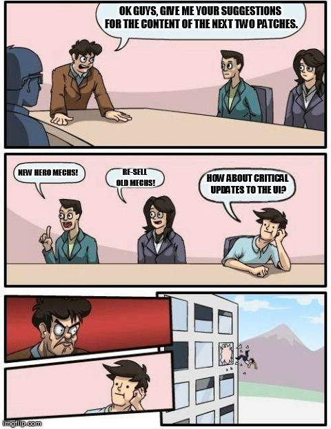
This UI is a reason to get fired.
2 user(s) are reading this topic
0 members, 2 guests, 0 anonymous users

 This topic is locked


