Jump to content

Ui


47 replies to this topic

#21 NeoRocket

    Member

  • PipPip
  • Bad Company
  • Bad Company
  • 45 posts

Posted 04 February 2014 - 09:14 PM

View PostTheMightyServo, on 04 February 2014 - 06:40 PM, said:


In addition, you can't look at a basic loadout of what your mech carries. If you already have a mech built, or are looking at a new one, rather than have an interface that shows what gear a mech carries, you see nothing.

The old interface allowed you to hover over different locations, hover over the hardpoints, hover over the locations, and see the equipment.

It wasn't great, but was somewhat intuitive.

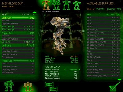
This is easy to navigate - you can see where your gear is, you can see a gear summary, and armor is easy to read:
Posted Image

Things are aligned like how the mech stands.

This is easy to navigate - you can see locations and gear at a glance, and work with it from there:

Posted Image

This is easy to navigate (arguably the best part of the old interface):
Posted Image

You can hover over your limbs for hardpoints, you can hover over your equipment details on where it's located, you can see what your mech is loaded out with in the summary at right.

And individual locations were just as easy, with a diagram that makes sense, and represents the layout of the mech itself.

You could select locations, and during build they were aligned with what you're looking at.

Posted Image

And you could zoom back out and get your summary of the mech with your loadout listed. Would've been handy to see an ammo counter someplace - that would've been helpful, but overall it wasn't too bad.

This 2.0 crap is crap, where every location is compacted on the left side of the screen, they can't all be seen at once, equipment and hardpoints are hidden under menus, the location loadout shows up on the right while the list of locations is on the left, icons are pointlessly huge for no reason (the only difference in the vast majority of engines is the numbers - not the pictures) and etc:

Posted Image

This is counterintuitive to decades of Battletech and Mechwarrior games. The interface is the easiest thing to get right. You even can do a vertical list without making it difficult to use.

You don't split locations across the screen, and make them only accessible one at a time - you put them together.

Posted Image

Simple, easy to read, and a complete summary, and it even makes the vertical menu readable if that was something that somebody at PGI just had to have:

Posted Image

But see that - there's a "current loadout" tab that shows what you carry, that gives basic info on the whole mech, and lets you know what your build is.

UI2 doesn't have any of that.

It was "fixed" into being overcomplicated, counterintuitive, incomprehensible to new players and old.

-
The ability to look at all purchaseable mechs at once is nice... but you can't look at their loadouts or locations either... which defeats the whole damned purpose.


I fully agree with this entire post. Seriously the former needs to come back and at the most be added to. Instead everything was thrown out and replaced. What replaced is seriously un intuitive. I cannot look at specs on mechs I am thinking of buying now. I JUST spent $30 on this game yesterday and am SORELY regretting it. This highlights the downfall of online "pay to play" free games. The fluidity with which they can be nerfed, boosted or completely changed with anything I just mentioned rendering quite often money just spent to be of a much lesser value. Now I for all intents and purposes cannot design or effectively modify a mech. the former curve was high enough so that plenty of mioney was made off my mistakes but I just sucked it up without complaining. So here it is... I hereby am committed to spending NO more money whatsoever while this "improved UI remains in it's present form. Along with that most likely I shall be playing MWO much much less. Planetside II and Hawken in this minute started looking as options I will be spending a LOT more time in again as I had kinda let them go to favor MWO as I was engrossed in this game. If it ain't broke don't fix it. Here I see a common mistake many tech nerds have been guilty of for literally decades now. The tendency when something works to keep "impoving" it until it is rendered useless to the majority and the product in effect fails. For a recent example see Windows 8 that MS is still trying to spin while finally admitting they cluelssly bothced the whole OS in terms of interaction and usability. I think this patch even surpasses the level of OS 8 in FAILED status. No... I am NOT going to spend hours/days to learn it's poorly planned interface now. I jsut spent two hours and gave up unable to find things I used to easily navigate to. I don't know whether they are there and I can't find them or they aren't even there to find such as specs on mech I am shopping for. Now I also have found at the least I can't click on a body part and open a menu to interact with loading or stripping elements from it. Seriously think of going back to old UI or watch MWO take a giant hit on customers. I have a friend that is supposed to come over tomorrow to look at this game and was going to get the game and I already suggested how to spend his first $50. At this point I am very sorry to say I will need to tell him not to bother for now and the why. Maybe if they change it back he will still be open to looking at this game. I cannot advise this game with it's present mechbay UI to anyone. PGI you need to FIX this and I would suggest before the next weekend arrives. Yeah I know it would be a lot of work but hey more work was put into developing and implementing breaking the game.

Edited by NeoRocket, 04 February 2014 - 09:36 PM.


#22 Spinning Burr

    Member

  • PipPipPipPipPipPip
  • Elite Founder
  • Elite Founder
  • 429 posts
  • Google+: Link
  • Facebook: Link
  • LocationNew Orleans, LA

Posted 04 February 2014 - 09:29 PM

"No sir. I don't like it."

#23 NeoRocket

    Member

  • PipPip
  • Bad Company
  • Bad Company
  • 45 posts

Posted 04 February 2014 - 10:10 PM

Have fun I am gonna go play something else. I will look in in a day from now and see if any commitment is made to fix this, SOON (I would suggest by this coming weekend). If I see an attitude of, "deal with it" (already present in this thread but admittedly in the tiny tiny minority so far) or "just take hours (and tens of dollars in 30 dollar blocks)" to "learn" this new UI I am most likely done with Mech Warrior until the next iteration comes out whoever gets the contract to make version 6 of the game.

As far as the $45 I have spent on this game in just the last week, keep it. All sales are final. I will just chalk it up as a sore lesson learned in these tight times. I played a LOT of 2 and 3 and MW4 and the new MWO was really growing on me as I liked the developer commitment to the spirit and lore of the Mech Universe over MW4.

But "playability" is always a concern in any game and with the UI2.0 interface the developers obviously entirely forgot that very basic foundation of whether ANY game lives or dies.

Sigh, today is a sad day. I imagine the Hawken paople are glad with the way the competition shot itself in the foot today with an AC20 point blank. I have played both Hawken and MWO and had committed to actually spending my money and more impotantly time and reccomendations to others, on MWO! Until UI 2.broken.
"Snatching defeat from the jaws of victory!"

Edited by NeoRocket, 04 February 2014 - 10:16 PM.


#24 TheMightyServo

    Member

  • PipPip
  • 40 posts
  • LocationLow Earth Orbit

Posted 05 February 2014 - 01:26 AM

View PostDamocles69, on 04 February 2014 - 08:22 PM, said:


wait wait wait... your telling me that PGI over complicated something and then failed to explain it properly?

surly you jest


I lol'd.

At the same time, there is no "fail to explain it properly". It sucks. No amount of explaining will correct failure, it will only elaborate on failure.

Every one of the other interfaces/loadout explanation diagrams is superior to the one in UI 2.0.

Needless features were added, good features were removed. The layout was changed into a visually pretty but incomprehensible mess.

For veteran players, it's obnoxious and frustrating, for new players its needlessly complicated and confusing. There's no way for them to explain it into being good. That's like explaining a circle into being a square. Nice trick if you're a politician or maybe a cult leader, but eloquence and linguistic obfuscation doesn't make it possible to pick up a **** by the clean end.

Again, it's especially stupid because they have literally got decades of successful layouts that even if they weren't great, were at least intuitive. I find paper to be the best - which is also basically the same layout as the 3rd party mech design pages use - it just fills everything out and makes it easy to use for anyone.

The old UI showed 3d locations as you hovered on them, showed you hardpoints, showed you what things looked like as you changed them - it took the older design pages and gave a 3d representation. Worked pretty well.

The new one is like telling us that all wheels will be square now, because square is best. They can explain how good square wheels are all day long, they still suck.

So, no, I am not jesting.

And don't call me Shirley.

Posted Image

#25 sabujo

    Member

  • PipPipPipPipPipPipPip
  • 531 posts

Posted 05 February 2014 - 03:29 AM

View PostNehkrosis, on 04 February 2014 - 02:16 PM, said:

its easy.
go to inventory>mechs>click through mechs, modules appear in loadout, same as it used to be.


No, it's not easy. And the fact that it is broken is that there is no Modules installed summary on the first screen, as it was before. Now, to find a module you need to click (and wait) two times for each mech, not considering the fact that you need to double back to the list screen every time.

People that are defending this implementation have no experience in interface design or user experience. Using your own opinion while can be valid in the pool of personal opinions, is far from the absolute analysis that need to be made. This UI has severe usability problems that need addressing.

This is a classic example of sacrificing function for aesthetics.

I was hoping many of these no brainer issues would be solved on release, especially after they being repeatedly pointed out by large groups of users in the test sessions. It was a disappointment.

#26 CDLord HHGD

    Member

  • PipPipPipPipPipPipPipPipPipPip
  • Legendary Founder
  • Legendary Founder
  • 9,190 posts
  • Location"You're not comp if you're not stock."

Posted 05 February 2014 - 05:21 AM

Mech organization and filters is good!

Mechlab is busy, overly complicated, hard to read and find pertinent info, and a step back from the old one.

I'd also like for the location of my modules be displayed in the inventory.

#27 Funky Bacon

    Member

  • PipPipPipPipPipPipPip
  • 629 posts

Posted 05 February 2014 - 09:41 AM

I made a thingy. Not the best maybe, but it's something.

Posted Image

Hope ya can see where I'm going with this,

I though a small overview of your currently equipped items would work well where if you click on one of the sections, either via the paperdoll or mini-overview, to bring up a larger, easier to read window of that section which also (on the right) brings up only the equipment that you can fit in that section. lasers, missiles heatsinks etc. But if your currently selected section cannon contain certain equipment, it will not be shown in the list.

The visuals also changed a bit to make it easier to separate each individual item that is equipped on your mech. As well as a triangle that will remove the item if clicked on.

also I gave the now much smaller drop down menu some of the old categories from the old UI to better filter out stuff such as weapons, ammo, heatsinks & equipment, and upgrades.
The new drop down menu also does not have the over sized icons anymore and have a brief info of the equipment. Clicking an items bring up more details about the item selected as well as an icon for that item.

"Checkout" button changed to "Equip / Buy".

another thing not present in the picture would be to also to bring up an info window to the left of the big highlighted section window so you can compared an equipped item with a highlighted item in the drop down window.

#28 CDLord HHGD

    Member

  • PipPipPipPipPipPipPipPipPipPip
  • Legendary Founder
  • Legendary Founder
  • 9,190 posts
  • Location"You're not comp if you're not stock."

Posted 05 February 2014 - 10:08 AM

View PostFunky Bacon, on 05 February 2014 - 09:41 AM, said:

I made a thingy. Not the best maybe, but it's something.

Posted Image

Hope ya can see where I'm going with this,

I though a small overview of your currently equipped items would work well where if you click on one of the sections, either via the paperdoll or mini-overview, to bring up a larger, easier to read window of that section which also (on the right) brings up only the equipment that you can fit in that section. lasers, missiles heatsinks etc. But if your currently selected section cannon contain certain equipment, it will not be shown in the list.

The visuals also changed a bit to make it easier to separate each individual item that is equipped on your mech. As well as a triangle that will remove the item if clicked on.

also I gave the now much smaller drop down menu some of the old categories from the old UI to better filter out stuff such as weapons, ammo, heatsinks & equipment, and upgrades.
The new drop down menu also does not have the over sized icons anymore and have a brief info of the equipment. Clicking an items bring up more details about the item selected as well as an icon for that item.

"Checkout" button changed to "Equip / Buy".

another thing not present in the picture would be to also to bring up an info window to the left of the big highlighted section window so you can compared an equipped item with a highlighted item in the drop down window.

I very much like this and I THINK PGI said they are looking into a more Smurphy-like interface. The key here is this UI is their baby, their answer to everything. They built it from teh ground up to be customizable and easily adapted. We'll see where it takes us.

#29 Nehkrosis

    Member

  • PipPipPipPipPipPipPip
  • Overlord
  • Overlord
  • 772 posts

Posted 05 February 2014 - 10:22 AM

no. It is literally just as stressful finding Modules as it used to be.
albeit things look prettier, so less background levels of Rage.

I have spoken.

#30 Sandpit

    Member

  • PipPipPipPipPipPipPipPipPipPipPipPip
  • Veteran Founder
  • Veteran Founder
  • 17,419 posts
  • Facebook: Link
  • Twitter: Link
  • LocationArkansas

Posted 05 February 2014 - 10:45 AM

TL;DR

have some cake. see, this could easily have been avoided had you not posted a duplicate thread. Would you like to discuss where the new UI touched you?

#31 Roadbeer

    Member

  • PipPipPipPipPipPipPipPipPipPip
  • Elite Founder
  • 8,160 posts
  • LocationWazan, Zion Cluster

Posted 05 February 2014 - 10:56 AM

Posted Image


#32 Nathan Foxbane

    Member

  • PipPipPipPipPipPipPipPipPip
  • The Wolf
  • The Wolf
  • 2,984 posts

Posted 05 February 2014 - 01:59 PM

View PostDestined, on 05 February 2014 - 11:55 AM, said:

howd this get here

Space wizards?

#33 Egomane

    Member

  • PipPipPipPipPipPipPipPipPipPip
  • 8,163 posts

Posted 05 February 2014 - 02:09 PM

Alakazam!

Posted Image

#34 Ialti

    Member

  • PipPipPipPipPipPip
  • 373 posts
  • LocationMontana

Posted 05 February 2014 - 02:39 PM

I will now chant the Canticle of Lost Threads, may this one's soul rest in peace for all that it lead a surly life.

#35 Roadbeer

    Member

  • PipPipPipPipPipPipPipPipPipPip
  • Elite Founder
  • 8,160 posts
  • LocationWazan, Zion Cluster

Posted 05 February 2014 - 02:45 PM

View PostEgomane, on 05 February 2014 - 02:09 PM, said:

Alakazam!

Posted Image


Fixed


#36 Egomane

    Member

  • PipPipPipPipPipPipPipPipPipPip
  • 8,163 posts

Posted 05 February 2014 - 02:50 PM

View PostRoadbeer, on 05 February 2014 - 02:45 PM, said:


Fixed


Wait... I need a way to give this post more likes....

#37 Sandpit

    Member

  • PipPipPipPipPipPipPipPipPipPipPipPip
  • Veteran Founder
  • Veteran Founder
  • 17,419 posts
  • Facebook: Link
  • Twitter: Link
  • LocationArkansas

Posted 05 February 2014 - 04:03 PM

View PostDestined, on 05 February 2014 - 11:55 AM, said:

howd this get here

Modgate :rolleyes:

#38 Sandpit

    Member

  • PipPipPipPipPipPipPipPipPipPipPipPip
  • Veteran Founder
  • Veteran Founder
  • 17,419 posts
  • Facebook: Link
  • Twitter: Link
  • LocationArkansas

Posted 06 February 2014 - 09:27 AM

View PostDestined, on 06 February 2014 - 08:49 AM, said:

*Ahem*

I put on my robe and wizard hat

Are we talking about wizard
Posted Image

OR
"Wizard"
Posted Image

#39 Roadbeer

    Member

  • PipPipPipPipPipPipPipPipPipPip
  • Elite Founder
  • 8,160 posts
  • LocationWazan, Zion Cluster

Posted 06 February 2014 - 09:37 AM

View PostDestined, on 06 February 2014 - 09:30 AM, said:


Ha, I actually have this costume from a few years ago. It's probably the cheapest fabric I've ever worn.... also, because it is so cheap, the zipper in the back doesn't stay up and we had to safety pin it closed.

Posted Image


#40 Sandpit

    Member

  • PipPipPipPipPipPipPipPipPipPipPipPip
  • Veteran Founder
  • Veteran Founder
  • 17,419 posts
  • Facebook: Link
  • Twitter: Link
  • LocationArkansas

Posted 06 February 2014 - 09:58 AM

I knew you were a nerd


1 user(s) are reading this topic

0 members, 1 guests, 0 anonymous users