
I was wondering, am I the only one who thinks that the Merc-Corps faction logo (and even the Lone Wolf one) should have a little bit of color in them?
All the other faction logos have a very nice look, combined with a bit of color to make them really "pop" and look quite nice. Then you have the Merc-Corps logo, which has some detail in it, but is just shades of black, white, and gray. It just doesn't quite match up to the rest.
Honestly, I have my faction set as House Kurita just because the Merc-Corps logo is so lousy compared to the others.
I don't think this would be a difficult thing to adjust (nor do I think it's terribly important to the developers). But I was wondering if I'm alone in wanting it changed?

Small Modifications To The Faction Logos
Started by mdmzero0, Mar 10 2014 10:40 AM
2 replies to this topic
#2
-
-

- 1,906 posts
Member
Posted 10 March 2014 - 01:23 PM
I don't really mind it. I do however want the ability to upload my own profile photo for my pilot.
#3
-

-

- 2,382 posts
Member

Posted 10 March 2014 - 03:59 PM
Would be nice of the lone wolf and merc unit icon was changed. There is a lone wolf icon in lore. They are a merc unit that is made of up of loosely organized mechwarriors. The default merc icon can be the MSRB logo, or one designed for Outreach.
Cannon Lone Wolf logos.


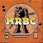
Mercenary Review and Bonding Commission logo.
These could be default logos, or a similar version. I would hope that merc units would be able to upload their own unit icons in place of a default one. House units could be used instead of the general house logo.
Cannon Lone Wolf logos.
Mercenary Review and Bonding Commission logo.
These could be default logos, or a similar version. I would hope that merc units would be able to upload their own unit icons in place of a default one. House units could be used instead of the general house logo.


1 user(s) are reading this topic
0 members, 1 guests, 0 anonymous users


