Best And Worst Looking Mechs In Mwo? (In Game Models, Not Concept Art)
#61
Posted 28 March 2014 - 03:11 PM
I think they really nailed the Hunchback and Trebuchet in terms of looks, they look great.
#62
Posted 28 March 2014 - 03:26 PM
 Bishop Steiner, on 28 March 2014 - 01:16 PM, said:
Eh.. the length is about right.

vs

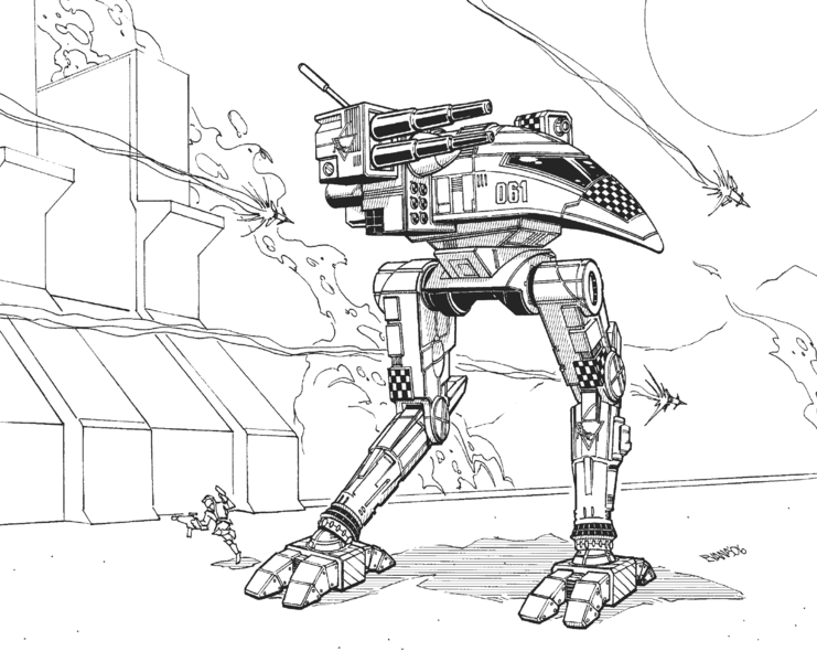
This is the best comparison angle that I can come up with between the two. The only real difference, other than the width of the back of the chassis, is the length of the SRM tubes in the middle.
Edited by Foxfire, 28 March 2014 - 03:29 PM.
#63
Posted 28 March 2014 - 03:57 PM
 Foxfire, on 28 March 2014 - 03:26 PM, said:
Eh.. the length is about right.

vs

This is the best comparison angle that I can come up with between the two. The only real difference, other than the width of the back of the chassis, is the length of the SRM tubes in the middle.
Wow alex drew the raven really close to this illustration huh. now that they are side by side i can see that.
I prefer this one though

plus it wasn't oversized in MW4 like it is in MWO
#64
Posted 28 March 2014 - 05:34 PM
#65
Posted 28 March 2014 - 05:47 PM
medium- favorite- Blackjacks (C'mon it's a baby Jager), Hunchies. least- Trebbie, shadowhawk
heavy- favorite- Catapult, Jager. least- quickdraw, thunderbolt
assault- favorite- atlas. least- battlemaster
#66
Posted 28 March 2014 - 07:12 PM
Top three worst:
1) Quickdraw. The only 'Mech I do not own. Too big. Too clumsy. Feet that look about the size of tanks.
2) Trebuchet. Flat and featureless. I actually like the modular look to it, but it doesn't reflect light like the other 'Mechs, and appears too dark in its bay. Also, the cockpit design change from concept to model is the biggest disappointment in the art department for me, and an absolute Mechbreaker.
3) Battlemaster. I love pretty much all of the 'Mech except the cheaply designed weapon modules. Big black boxes and cylinder slapped haphazardly and half-assedly all over 'Mechs seems to be the new, streamlined thing. The Battlemaster got it the worst, in my opinion.
#67
Posted 28 March 2014 - 09:58 PM
 Bishop Steiner, on 28 March 2014 - 12:22 PM, said:
*shrugs*
Guess I never got the memo-.
Bishop, you being able to kill things in it would have have been in spite of, rather than helped by the design. Players were more used to the slender arms of the Hunchback back then, the Cent had massive limbs compared to that so the usual designs of armor distribution didn't work out so well on the Cent. Those massive arms attracted fire away from the torsos at the cost of losing a good deal of firepower.
After piloting a Cent myself I personally found which situations I excelled in it with and which situations would doom me. Ended up not caring for it's arm mounted ballistic as it was too easy to lose and I preferred my 4SP for SRMs and LRMs. My time with it did teach me how to make a Cent pilot's day a nightmare though and not to underestimate it. Since you could cripple it you were better off doing so as fast as possible, I'm betting far too many people of the time dismissed it as a threat because of the Glass part of Glass Cannon.
And in this thread, people reminding me of just how good the models were for our Beta Mechs. The original Cat and Hunchback looked more Cell-Shaded in model design but oh dear lord did that fit the game just perfectly, gave the entire game a lovely style. Personal preference, I know, but I would love to see a return to that and have the beauty of MWO return instead of the "Gritty Realism" that we have for design now.
#68
Posted 28 March 2014 - 11:20 PM
#69
Posted 29 March 2014 - 01:12 AM
 Bishop Steiner, on 27 March 2014 - 08:53 AM, said:
Bish, I want whatever you're smoking cause I think the Jenner looks, even with FD's fixing, terrigash.
I know, opinions and all, but still
Anyways down to beeswax:
Lights:
Best: Commando
Runner-up: Spider
Worst: Jenner
Mediums (couldn't decide so I merged best and runner up into one):
Best: Hunchback (classic 4G) and Centurion
Worst: Blackjack
Heavies:
Best: Orion
Runner-up: Catapult
Worst: Jagermech
Assaults:
Best: Victor
Runner-up: Atlas
Worst: Get out of here, STALKER
On a massively related note: I can't do well in mechs that I think look gash, full stop. If it looks good, 50/50 I'll do well. Even if it's classed by the meta to be gimping the team, I may still perform well consistently. Appearance is everything to me in this game; no point killing/dying copiously if you don't look fab-u-lous!
#70
Posted 29 March 2014 - 01:25 AM
2. Centurion
3. Cataphract
4. Awesome
worst looking mechs are all humanoid... please give us more stuff like the Uziel and Shadowcat ...
#71
Posted 29 March 2014 - 05:06 AM

Edited by Ragnar Darkmane, 29 March 2014 - 05:10 AM.
#72
Posted 29 March 2014 - 05:53 AM
 SuckyJack, on 28 March 2014 - 09:58 PM, said:
After piloting a Cent myself I personally found which situations I excelled in it with and which situations would doom me. Ended up not caring for it's arm mounted ballistic as it was too easy to lose and I preferred my 4SP for SRMs and LRMs. My time with it did teach me how to make a Cent pilot's day a nightmare though and not to underestimate it. Since you could cripple it you were better off doing so as fast as possible, I'm betting far too many people of the time dismissed it as a threat because of the Glass part of Glass Cannon.
And in this thread, people reminding me of just how good the models were for our Beta Mechs. The original Cat and Hunchback looked more Cell-Shaded in model design but oh dear lord did that fit the game just perfectly, gave the entire game a lovely style. Personal preference, I know, but I would love to see a return to that and have the beauty of MWO return instead of the "Gritty Realism" that we have for design now.
Naw, some of us were just early adopters of the shield arm. Cuz even crazier by conventional wisdom, I ran an XL in mine. Speed (comparably speaking) and keeping the left arm to the enemy made Centy a fun boy. Got a little harder for a minute when engine caps came in, but no real biggie.
I still hear people pontificate about how easy they are to disarm, hence the rise of the Zombie. Yet my YLW keeps eating everything in front of it. And I ain't THAT good, bro!
#74
Posted 29 March 2014 - 07:21 AM
Light - Locust
Medium - Blackjack
Heavy - Dragon
Assault - Umm.... The Atlas I guess?
Worst:
Light - Spider
Medium - Kintaro
Heavy - Thunderbolt
Assault - Banshee, formerly the Battlemaster, formerly the Victor, formerly the Highlander. Seriously, I think the Assault class gets uglier with every one released. I can't wait for the Mauler to do a C-c-c-c-combo breaker.
Best looking class- easily the Heavy class. Every chassis looks very unique. Even the ugly T-bolt is easy to recognize on the battlefield.
#76
Posted 29 March 2014 - 09:06 AM
Light: Raven 4X, 3L
Runner up: Jenner
Medium: Hunchback 4G, 4SP
Runner up: Centurion
Heavy: Catapult K2, C1
Runner up: Thunderbolt
Assault: Stalker 3F, Misery
Runner up: Atlas D
Honourable Mentions:
Locust, Griffin, Jagermech and Awesome.
Worst looks:
Spider
Trebuchet
Quickdraw
Banshee
Edited by MisterPlanetarian, 29 March 2014 - 10:07 AM.
#77
Posted 29 March 2014 - 01:00 PM
Mediums
tThe Hunchie (with ac20) though the Cent is a close Second,worse Blackjack
Heavies
Either the Catapult or the Dragon worse Orion or the Thunderbolt
Assaults
Atlas I'd love to say the Victor but I simply can't, that runs in third because of its spread shoulders, or it would jump the highlander, and maybe the Atlas (its got the best cockpit, after the Griffin) thworse hands down its the Battlemaster, though the Banshee comes in a close Second for the wooden spoon (though I think the banshee's cockpit is one of the best, and you see more of that)
This thread made me sit down and think and its confirmed for me more than anything, is that the early mechs were far far better thought out and better looking when it came to making the 3d model
Edited by Cathy, 29 March 2014 - 01:50 PM.
#78
Posted 29 March 2014 - 01:05 PM
Overall: Catapult K2
Light: Raven
Medium: Centurion
Heavy: Catapult (K2)
Assault: Battlemaster
Worst:
Overall: Stalker
Light: Firestarter
Medium: Kintaro
Heavy: Orion
Assault: Stalker
#79
Posted 31 March 2014 - 03:17 AM
Light: Raven
Medium: Centurion
Heavy: Cataphract
Assault: Battlemaster
Worst:
Light: Jenner
Medium: Griffin
Heavy: Jaegermech
Assault: Banshee
1 user(s) are reading this topic
0 members, 1 guests, 0 anonymous users


