Jump to content

Updated! Timber Wolf Screen Shots Revealed


950 replies to this topic

#641 Hornviech

    Member

  • PipPipPipPipPipPip
  • Wrath
  • Wrath
  • 206 posts

Posted 11 April 2014 - 11:06 PM

Now just some Questions regarding the Clan Designs,

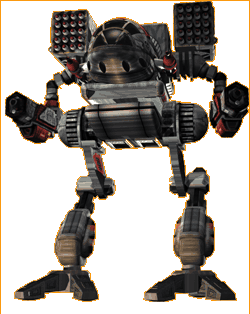
Will you change the Design of the Mad Cat to match the Original Design that we know for 20 Years?

Will you interpret the other Clan Mechs your way or will they look like the Originals?

I just need to know because if you keep your interpretation of the Mech designs so far away from the Original then I want a refund off my 240$.

I know you have to make some design adjustments but this one is totally out of scale and disappointing!

Please change it you have to try harder !!!!

Do it !

Posted Image

Edited by Hornviech, 11 April 2014 - 11:08 PM.


#642 GalaxyBluestar

    Member

  • PipPipPipPipPipPipPipPipPip
  • 3,748 posts
  • Location...

Posted 11 April 2014 - 11:59 PM

View PostSmittiferous, on 11 April 2014 - 10:03 PM, said:


Who the **** do you think you are??

Yeah, I'm one of those that said trashbox garnered the attention of twenty-odd years ago. I said it before, a lot of designs need a refresh, TW included.

But the TW in the MW3 intro looks like absolute balls.

Almost as bad as the one in the TCG.

Yeah, I said it again, 'son'. Don't get your knickers in a twist boss.

Posted Image

Posted Image timeless classic and most people know it, in fact the MWO Atlas was a good adaption MWO deserves a an equally good madcat adaption.

#643 aniviron

    Member

  • PipPipPipPipPipPipPipPipPip
  • 3,752 posts

Posted 12 April 2014 - 12:23 AM

View PostGhost0r, on 10 April 2014 - 08:48 PM, said:

This is a Mad Cat.

Posted Image


You must be confused, that's clearly a Timberwolf. ;]

#644 KuroNyra

    Member

  • PipPipPipPipPipPipPipPipPip
  • Legendary Founder
  • Legendary Founder
  • 2,990 posts
  • LocationIdiot's Crater.

Posted 12 April 2014 - 12:24 AM

View PostGalaxyBluestar, on 11 April 2014 - 11:59 PM, said:

Posted Image

Posted Image timeless classic and most people know it, in fact the MWO Atlas was a good adaption MWO deserves a an equally good madcat adaption.

MW:O Atlas is pretty nice.

But the "older" version with the glowing eye's was so much better!
At least my old Founder's Atlas still have his look.

#645 Dukarriope

    Member

  • PipPipPipPipPipPipPip
  • 923 posts
  • Twitter: Link
  • Locationa creative suite

Posted 12 April 2014 - 12:57 AM

View PostDrathorin, on 10 April 2014 - 05:39 PM, said:

It's almost like you don't know how walk cycles work.

I spent long enough analyzing walk cycles to be able to tell when something will bug me across a variety of games, thank you.

View PostDirePhoenix, on 10 April 2014 - 05:42 PM, said:

If it moves like most digitigrade animals/non-flying land birds, it probably lowers its profile slightly when moving at fast speeds and stands a little more erect at slow speeds.

Sure, but when it stands straight it seems to stand too darn high. It looks like 60% legs from bottom to top.
Most living things reduce their profile when attempting to sprint, because it makes for a more aerodynamic or stable profile, so you're right.
Plus from a gameplay standpoint this means that nobody would want to stand still with a Timber Wolf for very long, it'd mean it'd be stick up at least a couple of meters over cover relative to if it were moving. With no real advantage because its arms aren't over the head.
I suspect this is the same reason why most 'mechs in this game (most glaringly, the humanoids) do not lower their torso at full stride.

View PostCimarb, on 10 April 2014 - 06:03 PM, said:

It's not that they CAN'T have more polygons, it's that every increase in polygons makes the game perform worse. You have to draw a line somewhere.

That's just the result of poor coding. Again, I stress that tessellation is a standard feature of CryEngine 3 and doesn't require a whole lot of extra power (all recent GPUs have a dedicated tessellation unit), plus a low setting exists for a reason. On average, increasing "LoD", "level of detail" of geometry, does not usually have a significant impact unless its in the kilometers, where people can't see the detail anyway.
Honestly, PGI seems to have a lot of problems getting the game to run smoothly, but people like you are just encouraging them to stay 2001.

Edited by Dukarriope, 12 April 2014 - 12:57 AM.


#646 Prc

    Member

  • PipPipPipPipPip
  • FP Veteran - Beta 1
  • 191 posts
  • LocationBuenos Aires - Argentina

Posted 12 April 2014 - 01:12 AM

Those legs are a joke... the torso is awesome but those legs damn they are more disappointing than the masakari arm missile pod

Posted Image

i hope the missile pods to be a component apart from the torso

#647 ssm

    Member

  • PipPipPipPipPipPipPip
  • 574 posts
  • LocationPoland

Posted 12 April 2014 - 01:31 AM

View PostHornviech, on 11 April 2014 - 11:06 PM, said:

Now just some Questions regarding the Clan Designs,

Will you change the Design of the Mad Cat to match the Original Design that we know for 20 Years?

Will you interpret the other Clan Mechs your way or will they look like the Originals?

I just need to know because if you keep your interpretation of the Mech designs so far away from the Original then I want a refund off my 240$.

I know you have to make some design adjustments but this one is totally out of scale and disappointing!

Please change it you have to try harder !!!!

Do it !

Posted Image

You know that:

1) Every single mech in MWO underwent a major redesign, not to mention that the Mad Cat model is in line with concept art that you (allegedly) based you purchase on, not some image you took off the web ?

2) Their license forbids them to use non-inhouse artwork (like TRO one, or the one shown above) to make models?

(As for the refund - as with Phoenic packs, I think it won't be a problem getting one)

#648 ssm

    Member

  • PipPipPipPipPipPipPip
  • 574 posts
  • LocationPoland

Posted 12 April 2014 - 01:38 AM

View PostPrc, on 12 April 2014 - 01:12 AM, said:

Those legs are a joke... the torso is awesome but those legs damn they are more disappointing than the masakari arm missile pod

Posted Image

i hope the missile pods to be a component apart from the torso

Fun fact - Masakari missile pod was always part of LA - the artist who did original TRO image was either lazy, or for reason that baffles me, didn't know about this

Edited by ssm, 12 April 2014 - 01:40 AM.


#649 RedDragon

    Member

  • PipPipPipPipPipPipPipPip
  • 1,942 posts
  • LocationKurpfalz, Germany

Posted 12 April 2014 - 01:47 AM

View Postssm, on 12 April 2014 - 01:38 AM, said:

Fun fact - Masakari missile pod was always part of LA - the artist who did original TRO image was either lazy, or for reason that baffles me, didn't know about this

Yeah, but then do it this way:

Posted Image

Who the hell would mount the missiles that go up after being fired, especially so in MWO, underneath the PPC barrels?

#650 Navid A1

    Member

  • PipPipPipPipPipPipPipPipPip
  • CS 2022 Gold Champ
  • CS 2022 Gold Champ
  • 4,938 posts
  • LocationVancouver, BC

Posted 12 April 2014 - 01:51 AM

View PostPrc, on 12 April 2014 - 01:12 AM, said:

Those legs are a joke... the torso is awesome but those legs damn they are more disappointing than the masakari arm missile pod

Posted Image

i hope the missile pods to be a component apart from the torso


That warhawk looks nice... i don't see any problems with that...
(that's my honest opinion... and i hate my opinion because the knights with shiny armors also have the same opinion)
save for the position of the missile pod which can be place on the side or above the PPC barrels... if we assume that clan lrms go up after being fired

it is at least until now... i thought the timber concept was cool too... well the actual model didn't turned out like the concept at the end.

Edited by Navid A1, 12 April 2014 - 01:57 AM.


#651 ssm

    Member

  • PipPipPipPipPipPipPip
  • 574 posts
  • LocationPoland

Posted 12 April 2014 - 01:55 AM

View PostRedDragon, on 12 April 2014 - 01:47 AM, said:

Yeah, but then do it this way:

Posted Image

Who the hell would mount the missiles that go up after being fired, especially so in MWO, underneath the PPC barrels?

You've got a point here, but it kinda makes sense given that those weapons are lore-compliant, actual reattachable pods. Putting them above PPCs would put them out of line with PPCs in the other arm and look wonky;on the side would break the silhouette. So they kinda made compromise here.

Edited by ssm, 12 April 2014 - 01:56 AM.


#652 Prc

    Member

  • PipPipPipPipPip
  • FP Veteran - Beta 1
  • 191 posts
  • LocationBuenos Aires - Argentina

Posted 12 April 2014 - 01:57 AM

@ssm - as reddragon said i was talking about the pod being under the ppc's

this is how it should be

Posted Image

@navid - i have no problems with the warhawk looks perfect except for that arm same as the madcat except for those legs

(2lazy2quoteproperly)

#653 ssm

    Member

  • PipPipPipPipPipPipPip
  • 574 posts
  • LocationPoland

Posted 12 April 2014 - 02:03 AM

View PostPrc, on 12 April 2014 - 01:57 AM, said:

@ssm - as reddragon said i was talking about the pod being under the ppc's

this is how it should be

Posted Image

@navid - i have no problems with the warhawk looks perfect except for that arm same as the madcat except for those legs

(2lazy2quoteproperly)

I'd rather have them under arms, but if they made them to look in line with rest of the weapons (boxy) - I'll be fine with this.

#654 o0Marduk0o

    Member

  • PipPipPipPipPipPipPipPipPip
  • Bad Company
  • Bad Company
  • 4,231 posts
  • LocationBerlin, Germany

Posted 12 April 2014 - 02:24 AM

View PostNavid A1, on 11 April 2014 - 07:48 PM, said:

A 5 minute edit:
Posted Image

I think it looks nimble (like the concept art) without feeling it would snap on first AC2 hit .... as you can see, a small shrink in thighs goes a long way...
the joint may seems small but it was inevitable in a 5 min edit... it can stay the same size as the current model. the main focus was on the thigh itself.

To make reasonable adjustments you need the right perspective first. A bottom-up view is no neutral basis for this. Your result might be too thin in the right view angle.

View PostNavid A1, on 12 April 2014 - 01:51 AM, said:

i thought the timber concept was cool too... well the actual model didn't turned out like the concept at the end.

The model is exactly like the concept art.

#655 Av4tar

    Member

  • PipPipPipPipPip
  • FP Veteran - Beta 1
  • 195 posts
  • LocationOcean 12

Posted 12 April 2014 - 02:50 AM

only

Primary Configuration:
2x ER Large Lasers
2x ER Medium Lasers
1x Medium Pulse Laser
2x LRM-20'™s
2x Machine Guns

and not ?
  • 2x Clan ER Large Lasers
  • 2x Clan ER Medium Lasers
  • 1x Clan Medium Pulse Laser
  • 2x Clan LRM-20'™s
  • 2x Clan Machine Guns


#656 Navid A1

    Member

  • PipPipPipPipPipPipPipPipPip
  • CS 2022 Gold Champ
  • CS 2022 Gold Champ
  • 4,938 posts
  • LocationVancouver, BC

Posted 12 April 2014 - 02:54 AM

View Posto0Marduk0o, on 12 April 2014 - 02:24 AM, said:

To make reasonable adjustments you need the right perspective first. A bottom-up view is no neutral basis for this. Your result might be too thin in the right view angle.


The model is exactly like the concept art.


- In the right view angle it might actually look bigger... this is a bottom-up view with a slightly wide FOV... therefore, generally, objects in the center of the image appear smaller than they actually are.
But i agree. To have a neutral basis, a standard Left-Front-Top view is necessary.

- No, the thigh thickness near the knee joint isn't.

Edited by Navid A1, 12 April 2014 - 03:00 AM.


#657 Iqfish

    Member

  • PipPipPipPipPipPipPipPipPip
  • 3,488 posts
  • Google+: Link
  • LocationGermany, CGN

Posted 12 April 2014 - 03:06 AM

Guys, perspective.

I thought everybode knows how that stuff works.

Hold your hand on the leg in the front and see how the mech really looks.
Or just look at the other screenshots.

Other then that: If you dont like it, dont buy it.

#658 DonTony

    Member

  • Pip
  • The Ardent
  • The Ardent
  • 13 posts

Posted 12 April 2014 - 03:30 AM

Am I the only person who sees that it looks exactly like the concept art? Sure the legs might be an inch too chubby but it isn't nearly as ground breaking as you drama queens make it out to be. That and it looks like one of the best Timber wolf renders I've seen even though it's a tad different.

#659 Navid A1

    Member

  • PipPipPipPipPipPipPipPipPip
  • CS 2022 Gold Champ
  • CS 2022 Gold Champ
  • 4,938 posts
  • LocationVancouver, BC

Posted 12 April 2014 - 05:32 AM

View PostDonTony, on 12 April 2014 - 03:30 AM, said:

Am I the only person who sees that it looks exactly like the concept art? Sure the legs might be an inch too chubby but it isn't nearly as ground breaking as you drama queens make it out to be. That and it looks like one of the best Timber wolf renders I've seen even though it's a tad different.


contradiction?
you might want to look up the word "exactly"

some people here are giving feedback (to PGI). they are not insulting anybody. The drama is made by comments like yours (which interestingly often contains aggression against the one giving the feedback... unlike the posts from the people in the opposite front). Don't worry, PGI is not going to revert back to the ugly 80's design nor they're gonna cancel the clan packages and take away the goodies because of our feedback. So relax, PGI wont give a d*mn.! :rolleyes:

#660 o0Marduk0o

    Member

  • PipPipPipPipPipPipPipPipPip
  • Bad Company
  • Bad Company
  • 4,231 posts
  • LocationBerlin, Germany

Posted 12 April 2014 - 06:41 AM

View PostNavid A1, on 12 April 2014 - 05:32 AM, said:

So relax, PGI wont give a d*mn.! :rolleyes:

And I am happy about it. :wacko:


13 user(s) are reading this topic

0 members, 13 guests, 0 anonymous users