Jump to content

Jade Falcon Logo


40 replies to this topic

#1 Mechwarrior413183

    Member

  • PipPipPipPipPip
  • Overlord
  • Overlord
  • 185 posts

Posted 03 June 2014 - 10:11 AM

So what do you guys think of the new Jade Falcon logo?

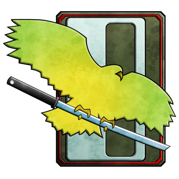
I like it personally but wish it was less shadowed so the whole of the Falcon could be seen easily, but I can see why they went with the shadows just about.

Edited by Mockeryangel, 03 June 2014 - 10:11 AM.


#2 CyclonerM

    Tina's Warrior

  • PipPipPipPipPipPipPipPipPipPip
  • FP Veteran - Beta 2
  • FP Veteran - Beta 2
  • 5,684 posts
  • LocationA 2nd Wolf Guards Grenadiers JumpShip

Posted 03 June 2014 - 10:15 AM

I have to be honest. No disrespect intended, but as i wrote in other threads.. It does not look a fearsome bird of prey :) 
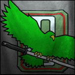
Now that i have my "mad dog" icon i have nothing to fear from you "green pigeons" ;)

#3 Keeshu

    Member

  • PipPipPipPipPipPip
  • Philanthropist
  • 470 posts

Posted 03 June 2014 - 10:35 AM

Personally I find this new icon to be much more intimidating than the old one. I grew up with Mechwarrior 2, and I prefered to use the Jade Falcon, so I should be more biased towards the old design, but I am not.

The old one just looks waaaay too relaxed, and much too fat. The new one properly represents how intimidating the Clans (specificly Jade Falcon) can be.


Posted Image
Posted Image


If I couldnt be Kurita, Goliath Scorpion, Ghost Bear, I'd pick Jade Falcon for sure. Jade Falcon was always my favorite Icon after clan Burrock, Cloud Cobra, and Goliath Scorpion anyways. I don't much like anything else about Burrock or Cloud Cobra though.

#4 Mechwarrior413183

    Member

  • PipPipPipPipPip
  • Overlord
  • Overlord
  • 185 posts

Posted 03 June 2014 - 10:43 AM

People are calling the new one Jade Pigeon but I think the old logo looks much more comparable to a pigeon than the new one as you say the old one looks fatter.

#5 CyclonerM

    Tina's Warrior

  • PipPipPipPipPipPipPipPipPipPip
  • FP Veteran - Beta 2
  • FP Veteran - Beta 2
  • 5,684 posts
  • LocationA 2nd Wolf Guards Grenadiers JumpShip

Posted 03 June 2014 - 10:46 AM

View PostMockeryangel, on 03 June 2014 - 10:43 AM, said:

People are calling the new one Jade Pigeon but I think the old logo looks much more comparable to a pigeon than the new one as you say the old one looks fatter.

Well, yes and now. It must be that i am so used to it that i instantly disliked the new one.. Who knows? ;)

#6 Keeshu

    Member

  • PipPipPipPipPipPip
  • Philanthropist
  • 470 posts

Posted 03 June 2014 - 11:07 AM

View PostCyclonerM, on 03 June 2014 - 10:46 AM, said:

Well, yes and now. It must be that i am so used to it that i instantly disliked the new one.. Who knows? ;)

Well, when something has been unchanged for a long time, usually people will despise whatever is new at first when they see it. Which is why I was surprised when they re-designed the icons at all. It's an incredibly risky move, even if whatever original thing looked incredibly Ugly/terrible and the new thing looked incredibly awesome. I feel that after a while most people will prefer these new designs after a while.

#7 CyclonerM

    Tina's Warrior

  • PipPipPipPipPipPipPipPipPipPip
  • FP Veteran - Beta 2
  • FP Veteran - Beta 2
  • 5,684 posts
  • LocationA 2nd Wolf Guards Grenadiers JumpShip

Posted 03 June 2014 - 11:40 AM

View PostKeeshu, on 03 June 2014 - 11:07 AM, said:

Well, when something has been unchanged for a long time, usually people will despise whatever is new at first when they see it. Which is why I was surprised when they re-designed the icons at all. It's an incredibly risky move, even if whatever original thing looked incredibly Ugly/terrible and the new thing looked incredibly awesome. I feel that after a while most people will prefer these new designs after a while.

Seyla.
Yours are true words but i highly doubt i will prefer these new designs to the originals. They look more martial and militaristic, if nothing else.

Anyway, this is exactly how it went with the Timberwolf. At first it was like "??!! .. !!!??.. !!??!!!" then it was like "mmh these screenshots are better.. Maybe it is not so bad after all" and eventually "Wow it is so cool i must buy it! I claim my Timberwolf!" :P

Still, even if it is cool, there are at least two other TW designs that are cool AND are close to the original ;)

P.S. I still hate those legs. Straight from MW4 <_<

#8 Keeshu

    Member

  • PipPipPipPipPipPip
  • Philanthropist
  • 470 posts

Posted 03 June 2014 - 12:24 PM

View PostCyclonerM, on 03 June 2014 - 11:40 AM, said:

Seyla.
Yours are true words but i highly doubt i will prefer these new designs to the originals. They look more martial and militaristic, if nothing else.

Anyway, this is exactly how it went with the Timberwolf. At first it was like "??!! .. !!!??.. !!??!!!" then it was like "mmh these screenshots are better.. Maybe it is not so bad after all" and eventually "Wow it is so cool i must buy it! I claim my Timberwolf!" :P

Still, even if it is cool, there are at least two other TW designs that are cool AND are close to the original ;)

P.S. I still hate those legs. Straight from MW4 <_<

I've had things mess with my Nostalgia before with other game series. So it's made it easier for me to accept changes done to things I've loved because it's usually the case that after a while I will prefer the newer thing more often. So that's kinda why I'm alright with these new icons already. I can't be more descriptive about it than that.

Posted ImagePosted ImagePosted Image
The MW4 legs were pretty faithful to the original design though. Personally I prefer the Mechwarrior 2 Timber Wolf, but never expect it back (unless it was called something else) because I love how long everything is and the ears seem to have a better emphasis on them.

The MWO's Legs are taken straight from the Cataphract though.
Posted Image
Posted Image

Edit: Which Timber Wolf do you find to be the best version?

Edited by Keeshu, 03 June 2014 - 12:25 PM.


#9 Sevrid

    Member

  • PipPipPip
  • Star Colonel II
  • Star Colonel II
  • 66 posts
  • LocationMA

Posted 03 June 2014 - 12:35 PM

I like it, but it could be a lot better, I feel bad for Ghost Bears, someone said it looks like it is sneezing and now I can't get that out of my head. Lol.

#10 QuantumMike

    Rookie

  • Knight Errant
  • 3 posts

Posted 03 June 2014 - 01:10 PM

I think the logo is fine, but it would be cool if they gave that bird some fearsome talons.

#11 Alaskan Nobody

    Member

  • PipPipPipPipPipPipPipPipPipPipPip
  • The Determined
  • The Determined
  • 10,358 posts
  • LocationAlaska!

Posted 03 June 2014 - 02:33 PM

View PostKeeshu, on 03 June 2014 - 11:07 AM, said:

Well, when something has been unchanged for a long time, usually people will despise whatever is new at first when they see it. Which is why I was surprised when they re-designed the icons at all. It's an incredibly risky move, even if whatever original thing looked incredibly Ugly/terrible and the new thing looked incredibly awesome. I feel that after a while most people will prefer these new designs after a while.

Very well put. :P

#12 _Comrade_

    Member

  • PipPipPipPipPipPipPipPip
  • Elite Founder
  • Elite Founder
  • 1,120 posts

Posted 03 June 2014 - 02:37 PM

It kind of looks like the falcon is surfing on a er large laser, i dig it

I mean yea it could look a little more like a samurai sword

#13 Silence Jin Mang

    Member

  • PipPipPipPipPip
  • The Hawk
  • The Hawk
  • 170 posts
  • LocationVirginia, america

Posted 03 June 2014 - 02:43 PM

I like the new look a lot actually, its a lot more paint like, which is how logo`s in militaries tend to be. So I cant complain about that, but the wolves looks like a "mad dog" as Cycloner put it. Though they all look good and it fits with the PGI style.

#14 KuroNyra

    Member

  • PipPipPipPipPipPipPipPipPip
  • Legendary Founder
  • Legendary Founder
  • 2,990 posts
  • LocationIdiot's Crater.

Posted 03 June 2014 - 03:12 PM

View PostMockeryangel, on 03 June 2014 - 10:43 AM, said:

People are calling the new one Jade Pigeon but I think the old logo looks much more comparable to a pigeon than the new one as you say the old one looks fatter.


The Jade Pigeon...
That's..... That's actually almost a badass name!

Personatly, I like the JF logo. It look pretty nice, but the sword isn't clear enought...

Edited by KuroNyra, 03 June 2014 - 03:13 PM.


#15 BigTaeng

    Member

  • PipPipPipPipPipPip
  • Star Colonel V
  • Star Colonel V
  • 307 posts
  • LocationBotany Bay

Posted 03 June 2014 - 04:11 PM

I think they used this image as their inspiration. It did not turn out too bad.

Posted Image

It could use more secondary feathers though, and the left leg looks off as Yedohw pointed out in the logo thread in the main Clan forum. The folding/shading effects they tried to do with the flag are inconsistent as well.

Edited by BigTaeng, 03 June 2014 - 04:13 PM.


#16 Tim East

    Member

  • PipPipPipPipPipPipPipPip
  • Shredder
  • Shredder
  • 1,422 posts

Posted 03 June 2014 - 04:17 PM

You know, I actually like it pretty well, apart from the sword, which could definitely stand to be a bit more sword-like and a bit less ERLLaser.

I feel sorry for the Wolves. Their totem appears to have been shaved. That's probably why it looks so pissed off.

Edited by Tim East, 03 June 2014 - 04:22 PM.


#17 shinigaminus

    Member

  • PipPipPip
  • 63 posts
  • LocationIronhold

Posted 03 June 2014 - 10:33 PM

hmm....
Posted Image

Edited by shinigaminus, 03 June 2014 - 10:50 PM.


#18 Daneel Hazen

    Member

  • PipPipPipPipPip
  • Nova Commander
  • Nova Commander
  • 173 posts
  • LocationFlorida

Posted 04 June 2014 - 04:36 AM

Needs a bit more light on the sword handle. Like it otherwise.

#19 Expired

    Member

  • PipPipPipPipPipPipPip
  • Overlord
  • Overlord
  • 572 posts
  • LocationNord-Nord-West

Posted 04 June 2014 - 05:11 AM

I like the new logo aswell.
I think too many are expecting some kind of an eagle but the new logo shows exactly what a falcon looks like.

But the Katana looks pretty strange... more like a crowbar imo

#20 Bluefalcon13

    Member

  • PipPipPipPipPipPip
  • Elite Founder
  • Elite Founder
  • 355 posts
  • LocationColorado Springs, CO

Posted 04 June 2014 - 07:54 AM

View PostExpired, on 04 June 2014 - 05:11 AM, said:

I like the new logo aswell.
I think too many are expecting some kind of an eagle but the new logo shows exactly what a falcon looks like.

But the Katana looks pretty strange... more like a crowbar imo


Gordon Freeman would be proud of the Jade Falcons!


1 user(s) are reading this topic

0 members, 1 guests, 0 anonymous users