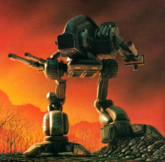
All in all I love my Mad Dog, but I'm going to love my Loki more

Where The Mad Dog (Vulture) Went Oh So Wrong. Offically Closed! Problem Fixed!
#101
Posted 24 September 2014 - 02:29 PM
All in all I love my Mad Dog, but I'm going to love my Loki more
#102
Posted 24 September 2014 - 02:30 PM
Until then go back the the Nerf The Timber Wolf threads......... DROPS THE MIKE.....
#103
Posted 24 September 2014 - 02:31 PM
 Metus regem, on 24 September 2014 - 02:28 PM, said:
I'd go so far as to say MW 4, didn't.
http://youtu.be/X0UNaFuZFNg?t=2m58s
looks pretty good to me.
#104
#106
Posted 24 September 2014 - 02:40 PM
#107
Posted 24 September 2014 - 02:41 PM
 Metus regem, on 24 September 2014 - 08:47 AM, said:
So in short HG, is blowing smoke with no fire to back it about the mech designs, but no-one feels like taking them head on about the rights, or going to Studio Nu or Big West to get the rights.
Even if Tatsunako didn't have legal ownership of the designs to sell, in late 1990's and early 2000's HG filed copyright, trademark, and licensing claims on all things Robotech in the US. If they did try to fight this in the U.S. it would be a very long and very expensive venture and not worth the financial risk.
#108
Posted 24 September 2014 - 02:42 PM
I prefer the MWO Mad Dog to the older designs, but eh what do I know.
The laser choices make sense in the MWO world as they match the other clan styles. Not that there would have been anything wrong with making adjustments and having something unique in that area.
The MWO Mad Dog is a right nice heavy regardless of aesthetic decisions.
#109
Posted 24 September 2014 - 02:47 PM
#110
Posted 24 September 2014 - 02:48 PM
http://mwomercs.com/...asers-on-raven/
#111
Posted 24 September 2014 - 02:49 PM
#112
Posted 24 September 2014 - 02:49 PM
I would like to raise a point that I haven't read yet (or maybe just glazed over a bit) but when we look at mechs in, say, Steel Battalion or Hawken, you get the impression that "ya, that can take a hit". Compare that to MW2 versions of the Mad Dog or Marauder with flimsy looking arms and legs; then look at MWO's beefier aspects, and one can quickly assume "that's better because it looks like it's more armoured".
But then, where's the artistic flare? We want to be taken out of our world and into the Battletech universe, where there is solid differentiation between Mechwarrior and just another stompy robot game.
I think Star Wars did this very well in the creation of their AT-AT walkers; from a physics and future technological standpoint those walkers are a 'terribad' design; but truly iconic and memorable when compared to the walkers we saw in the prequels then quickly forgot about.
Edited by Flyby215, 24 September 2014 - 02:50 PM.
#113
Posted 24 September 2014 - 03:08 PM
#114
Posted 24 September 2014 - 03:17 PM
I think it looks fine and fits the 'look' well with the other clan mechs.
There are some 'functional' problems but, in a fictional game set in a fictional universe...who cares?
I like the style. Its neither too western nor too anime. And WAY better than the original BT illustrations. Originals looked like they had some intern at an architecture firm.
Only real beef i have is scale. I feel lights should be about half size of assaults. A 'ton' of weight for a mech doesnt have to be a standard/metric 'ton'.
#115
Posted 24 September 2014 - 04:04 PM
 General Taskeen, on 24 September 2014 - 06:21 AM, said:
This is what it should look like in a modern game:

That's from Assault Tech (by MekTek). Smooth, rounded edges, No LEGO blocks, proper classic look all the way back from MW2,
That pic has been my desktop wallpaper for a long time
#116
Posted 24 September 2014 - 04:25 PM
 Bishop Steiner, on 24 September 2014 - 01:35 PM, said:
For them to be 6.5 tons difference and the same size implies a lot of dead space in the .5 ton one. Miltary weapons are only as large as needed. I don't claim to be a laser engineer, so IDK exactly what comprises the weight, but you are talking over 600% increase in mass.
been trying to find one (affordably) for years. I had the summoner, and meant to get the Mad Dog... never happened.
mine was mising the missiles so i had to make my own but it worked out alright
#117
Posted 24 September 2014 - 04:53 PM
I can't believe you a complaining about 12.5%. I think the mech looks really good and I don't want another hour of development time spent on it.
but on the positive side, I have now gotten my daily requirement of absurdity nicely filled out.
#118
Posted 24 September 2014 - 04:56 PM
 Flying Blind, on 24 September 2014 - 04:53 PM, said:
I can't believe you a complaining about 12.5%. I think the mech looks really good and I don't want another hour of development time spent on it.
but on the positive side, I have now gotten my daily requirement of absurdity nicely filled out.
by reading your own post?
Mine lists numbers because *GASP* I actually went in and resized the bloody thing until it looked right.
#119
Posted 25 September 2014 - 05:08 AM
Also - to be constructive: I love the new design, it doesn't offend me - even after 20 years of Battletech. Love the work, love the game, hate how slow the development cycles are. That sums it up.
 Bishop Steiner, on 24 September 2014 - 05:08 AM, said:
So considering the way in which we have gotten it, being heavily critical of the design may seem highly ungrateful. But, there is just so many things, that have gone so wrong, in the in game model, both from the original design, and Alex's gorgeous re-imagining.
Let us begin:

The Vulture- One of the most visually arresting designs in the classic Battletech game.


Several design elements of note:
Slender, but tall profile. Long/Deep torso
Long arm weapons barrels
Deeply flexed, ostrich legs.
Shoulders far behind hips.

The issues:
1) The deep but slender profile was changed to a much stubbier version. This is actually understandable, and much more survivable, fro side shots, than the original, much as the way the bullet snout of the Timber Wolf was reined in.
2) Long weapon arms? Nope. Stubby as heck. PGI modelers have done a lot of things right in this game, but the dynamic weapons are very hit and miss. In this instance, even using the generic "box" lasers, they are at the least, 2-3 times too short in barrel length. The PPC also could use a boost. This also largely points out the ludicrous nature of using the same little barrel for a .5 ton Small Laser and a 7 Ton Large Pulse Laser.
3) The Legs. IMO, the biggest deal breaker. 12-15 too large in general, and certainly 10% too thick in the thighs. I get that they followed the lore premise of re-using the legs from the Timberwolf (though even on the Timby they are borderline too thick). No, for me, the biggest issue is the posture. Far too erect and upright. Look at the original design, and it is deeply flexed, dynamic, looking ready to spring into motion. This one might actually be pretty easy to fix. Even if they simply re-rig the legs to a deeper bow, it would do wonders for the look, and perceived size, of the mech. Hardest part would probably be re-doing the walking animation.
4) The Shoulder placement. It is behind the hips. Perhaps, visually it would look nicer, further back, but with the changes made for viability, it would also probably expose the side torso to easier shots. So IMO; it's livable.
TR;DR:
Russ, not to sound ungrateful, but is there any way to have the weapon barrels looked into and given more of the flavor of the mech? And while a rescaling of the legs by 12.5% would be preferred, would it be too difficult to have the legs re-rigged (and walk re-done) to give the "proper" bowed look and gait to the Mad Dog?
Edited by Verdic Mckenna, 25 September 2014 - 05:10 AM.
#120
Posted 25 September 2014 - 05:14 AM
 Verdic Mckenna, on 25 September 2014 - 05:08 AM, said:
Also - to be constructive: I love the new design, it doesn't offend me - even after 20 years of Battletech. Love the work, love the game, hate how slow the development cycles are. That sums it up.
what's overcaffeinated? I critiqued the design?
12 user(s) are reading this topic
0 members, 12 guests, 0 anonymous users


