Lunoe, on 24 September 2014 - 11:30 AM, said:
I've been playing MWO for quite a while now, and for the most part I've been satisfied with the execution, be it aesthetic, gameplay, or otherwise. However, there is one feature that has driven me to frustration time and again, and that is the damage readouts.
The default mech-representation damage readout is fine for starting out, and provides a quick reference for where you're getting hit, sure. But the problem is that the colors are incredibly vague about just how much damage you're taking, which is an especially large problem with Assaults. If I step into enemy fire, I need to know how quickly I'm taking damage, and how much. Is that yellow outline telling me I just got my paint scratched? Or did I just lose a quarter of my armor in one salvo?
It used to be in earlier mechwarrior games that you could toggle between layout-oriented damage readouts, and bar-oriented damage readouts. I propose that MWO would benefit from a similar feature, giving the oppertunity for clearer feedback on just how much damage you're taking in a fight.
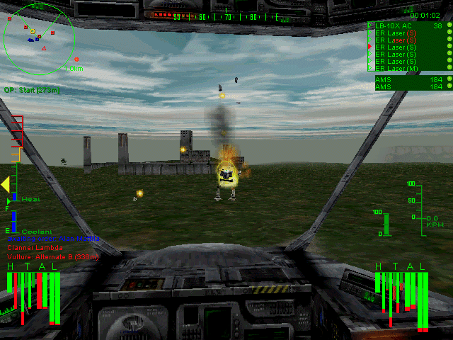
See how clear that is? Left arm gone, left front torso armor stripped. center torso doing fine. Under the yellow/orange/red system, all this would be far less obvious, at least to me.
In any event, since the game has to track these values regardless, and bar graphs are fairly modest in terms of artistic investment, I think it's a small tweak that could benefit gameplay greatly.
The default mech-representation damage readout is fine for starting out, and provides a quick reference for where you're getting hit, sure. But the problem is that the colors are incredibly vague about just how much damage you're taking, which is an especially large problem with Assaults. If I step into enemy fire, I need to know how quickly I'm taking damage, and how much. Is that yellow outline telling me I just got my paint scratched? Or did I just lose a quarter of my armor in one salvo?
It used to be in earlier mechwarrior games that you could toggle between layout-oriented damage readouts, and bar-oriented damage readouts. I propose that MWO would benefit from a similar feature, giving the oppertunity for clearer feedback on just how much damage you're taking in a fight.
See how clear that is? Left arm gone, left front torso armor stripped. center torso doing fine. Under the yellow/orange/red system, all this would be far less obvious, at least to me.
In any event, since the game has to track these values regardless, and bar graphs are fairly modest in terms of artistic investment, I think it's a small tweak that could benefit gameplay greatly.
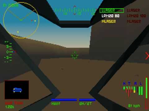
I remember playing this one a lot, still have my copies. It was very handy to have the bar layout. usualy i would keep the bar layout for mine and the Moving doll one for the enemy. then again in this one Adders were a terror and a 6 erppc cauldren born.
i prefer this layout compared to MWO but we can only ask. also passive radar is awesome XD that and selecting body points with the zoom.