EDIT: The question was asked by SmokinDave73. Here's his reddit thread on the matter!
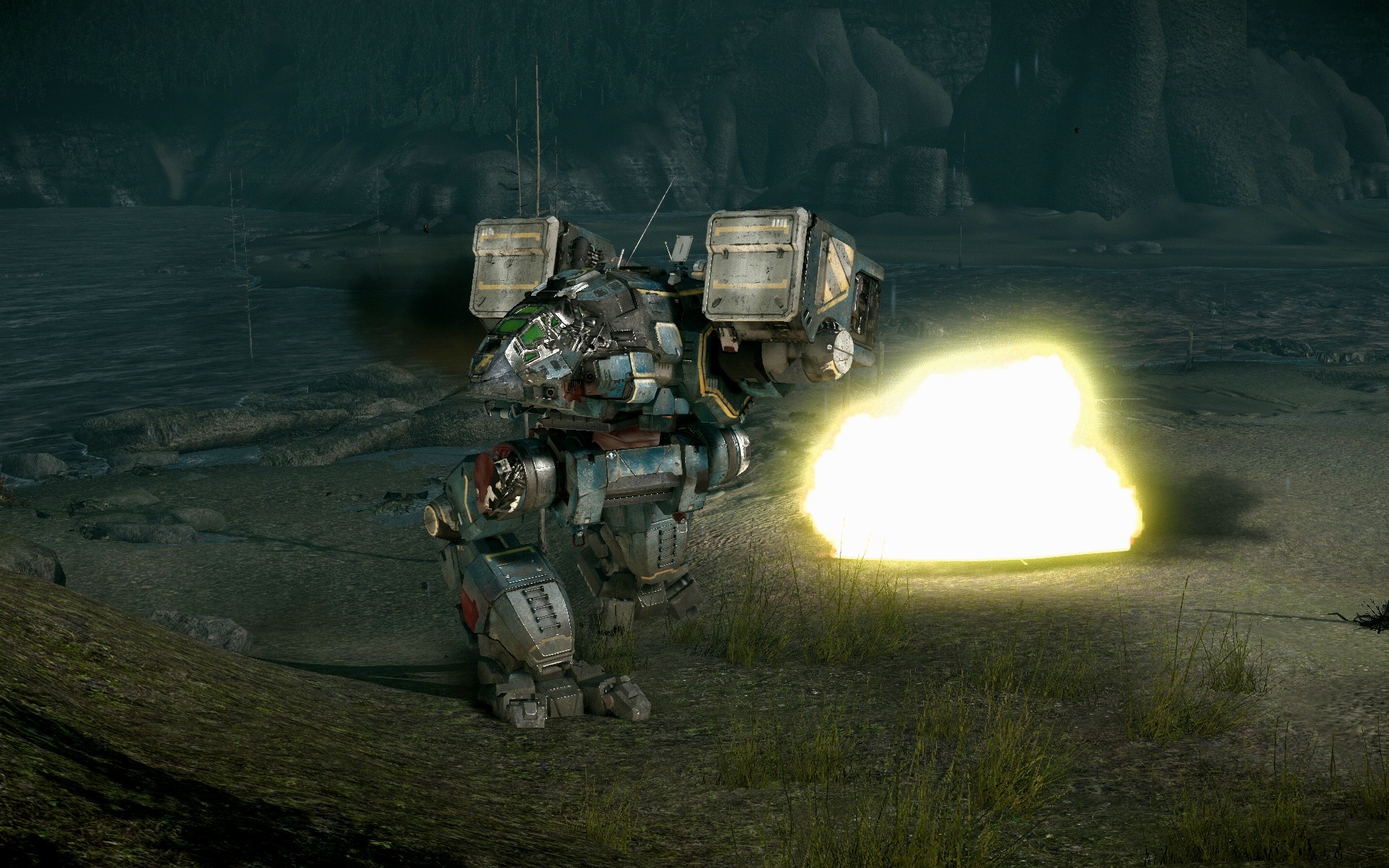
One of my personal biggest disappointments is the removal of inverse kinematics for mechs' legs. For those who don't know what this is: when walking on uneven terrain, IK bends the feet and knees so that they match the slope of the surface and neither stick through or float above it. For example, a screenshot I took of what MWO looks like today:

As you can see, one leg is floating above the mountain, while the other is embedded in it. The legs are posed as though the mech was on flat ground.
Compare that to the following screenshot, where the front right foot of the catapult is aligned to the ground, and the knee is deeply bent so that the back foot doesn't float above the ground or the front foot isn't sticking into it.

Here's another shot of IK at work from the official media on the MWO site; note how the Dragon's left knee is bent so that while the right leg is fully extended the mech stays level without floating or being embedded in the ground.
Another thing to note is that the damage textures on the Catapult's side torso and hip show off the metal underneath the armor and paint; while they weren't terribly high-res textures, they were a glimpse of the mech's internals after the outside had been peeled off. At some point, those textures were changed to a generic bullet impact texture that is a flat grey and shows as bullet holes regardless of whether the damage was caused by a gauss rifle, a flamer, or a laser.
In regards to causing that damage, internal ammo explosions have lost their 'pop.' Here's a video of an ammo explosion from the outside in beta (starts at 20s)
http://youtu.be/rgJ2n5sEn9c?t=20s
and another of the explosion from the inside (starts at 5:20):
http://youtu.be/syyrgIKLim8?t=5m20s
Regarding the ammo itself, the missile flight path changes have been pretty disappointing from a visual standpoint. The swarm effect, the corkscrew, and the undulating paths that we've had at different points in the game all lent missile fire a good amount of visual interest (and gave SRMs a nice added bit of skill ceiling, while leaving the floor intact). The current straight-line flight paths are usable, but ultimately severely lacking in visual interest.
In regards to mapping, it's a bit of a mixed bag. Some pretty cool things were removed, like the blizzard rolling in on Frozen City; now the weather effect just starts and stops, but at one point, you could watch it rolling in over the frozen sea before it hit. Now it's just a fog and snow effect that fades in an out during the match.
After some LOD passes were done, Caustic and River City both looked heinously bad, with buildings and rocks popping in and out of existence on a whim. To PGI's credit, it's been fixed on River City, and the map now looks better than it did before, at least in regards to building LOD. Caustic however, is still awful. Walking in a straight line yields the ground and rocks undulating underfoot every hundred meters or so, changing size and shape as distance closes.
Even Alpine, added quite a while after the old cadre of maps, has had some tuning: the rock texture on the sides of the mountains used to have a depth mapping effect to make the map look less like a series of gentle rolling hills with white painted on the grass.
Another thing that's missing is map interactivity: while it was never huge, there were some great little details that really made them feel a lot better. Watch the following video, starting at 29s:
http://youtu.be/zWZBLA-Y8zg?t=34s
What you're looking for isn't the collision on the mechs; it's under them. The ground used to crater and crack when mechs fell over. And surprise of all surprises, it even used to knock streetlights down if you fell over on them!
Go ahead and rewatch that video and tell me if something feels off about River City to you while you're at it, because it should: RC is gorgeous in that video. It's the same map, more or less, but that wonderful feeling of light and reflection and depth and contrast that the whole video has is something the RC we have now lacks. Well, I thought to myself, maybe it was Kon's settings? Or the video encode? Maybe my memory is just getting dull?
So I went hunting. Here's another screenshot from the official media section of the MWO website. It's got that same feeling as Koniving's video; look at how the glass reflects the light, the way it shines off the side of that catapult, and the great contrast, presumably from the HDR implementation.

Now here's a screenshot of that same intersection (sans mechs) that I took ten minutes ago.

Compared to the first image, it looks... flat. Drab. Shabby. Uninteresting. The windows hardly reflect, and what they do looks bad. The soft fog is gone, the colour palette is less vibrant. It looks like a knock-off of the game the first image is from. It doesn't look bad, per se, but it's not gorgeous like that first shot.
Look at the lighting on the mechs in the first image too- see the way that the Hunchback's side is lit, but the back is dim? Compare that to the first screenshot in the post, and notice how the lighting effect is almost completely gone. The Hunchback on Alpine is lit in a flat, even manner, with every surface as bright as every other. Look back at the beta screenshot again, and the shadowing and bright spots on the shutdown founder's Cat. That kind of light and shadow detail seems to be lostech.
It probably helps in those screenshots that back then, every mech got a custom texture that really drew out the beauty of the model- the stock green camo that comes on most mechs now has nowhere near the same amount of finesse. Furthermore, the older textures seem to have been higher-res; what we have now is a crapshoot, with sizes ranging from 512x512 to 2048x2048. Here's a great post by Lordred showing the various texture sizes on all the mechs.
So Russ, when that question was asked, I have to assume this is what the asker was referencing (and feel free to correct me if I'm wrong). It just feels like the visual quality has slipped significantly since beta in all sorts of little ways; the mech animations don't have the same detail they used to, ER Mlasers cast a green light despite burning yellow, snow shows as white in thermal as though it were hot, etc. It's telling that in a recent video review, TotalBiscuit said of a game that it looked great, like every CryEngine game, and then went on to add, "except Mechwarrior Online."
Addendum: I was going to add to the previous paragraph that mechs no longer left individual footprint decals like they used to, but now they just don't leave footprints at all. Add one more thing to the list of details that have been erased.
Edited by aniviron, 06 October 2014 - 09:09 AM.


