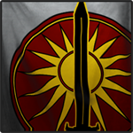
Currently we only have a minimalist approach to information in this section of the screen:
1) Red Sword for attacking, Blue Shield for defending
2) Planet Name
Why not add the most basic information people ask themselves when they look at it:
3) Which faction is it in?
4) How many Attacker Wins are there?
5) How many are in the Que?

Planet Finder Screen: How To Improve It
Started by Docta Pain, Dec 15 2014 01:38 AM
2 replies to this topic
#1
Posted 15 December 2014 - 01:38 AM
#2
Posted 15 December 2014 - 08:01 AM
Yes. And the blue shield should be different for domestic planets (belonging to your faction) and clan front planets. Blue/teal color coding should be enough. Add a dot/slash for color blind.
#3
Posted 15 December 2014 - 08:05 AM
When clicking on the planet list on the top right it would be better if it just zoomed to the planet rather than right into the queue. This way a player can see where the planet is on the map and what faction they will be fighting. Right to the queue I constantly back out to see which border it is on etc.
1 user(s) are reading this topic
0 members, 1 guests, 0 anonymous users


