

A common form of colorblindness is Red-Green colorblindness. Please consult the light diagram below.
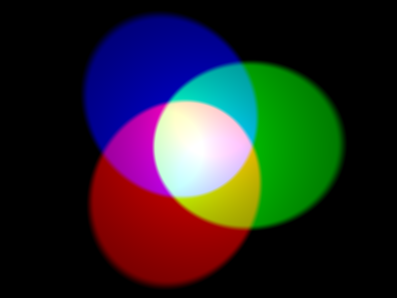
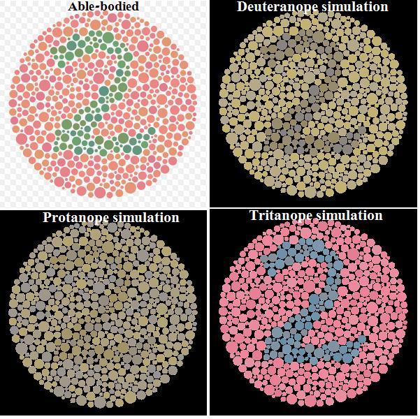
As the name implies this form of color blindness removes the ability to see the Red-Green axis, which takes yellow out as a causality as well. Illumination is still seen, just that the colors are washed out and without a difference between them. See the the diagram below:
So the problem exists within the UI of Inner Sphere mechs. The entirety of the HUD is displayed within the Red-Green color axis. Example below:

This design sets the entirety of the HUD to be washed out and lacking the vital information provided by color and lacking contrast between elements. The HUD becomes hard to see, the information it provides hard to notice and it can be white noise to the rest of the visuals for the game. Imagine the entire HUD displayed being different shades of grey.
So how do you fix this? You add more blue elements and contrasts between UI elements. Even better, this style is already in the game, example below:

Clan Mechs shifted their HUD colors from the Red-Green axis to the Red-Blue axis while using white as a contrast color instead of differing shades of yellow. Though Red elements of the HUD would be washed out in grey they have significantly less presence and don't have any overlap with other elements of the HUD. This could be improved further, mind you, such as replacing the Red-Black contrast of the weapon cooldown timer and heat indicator with Red-Blue.
I do hope this is of assistance to players and designers alike. Comments and insights are welcome.


