Jump to content

I Haven't Even Seen The New Ui Yet, So -


22 replies to this topic

#21 Tarogato

    Member

  • PipPipPipPipPipPipPipPipPipPip
  • Civil Servant
  • Civil Servant
  • 6,558 posts
  • LocationUSA

Posted 07 June 2015 - 12:48 AM

View PostLordKnightFandragon, on 07 June 2015 - 12:29 AM, said:

I dont like PGI's list.....the Mech's hardpoints need to be in a Smurfy style Table....its much less confusing to move about the mech parts when its not in a list. Put hte mech behind the table, then put the table over the mech. Place the lists of weapons we have now off to one side. THat would be cool. But putting all the hardpoints in a list...

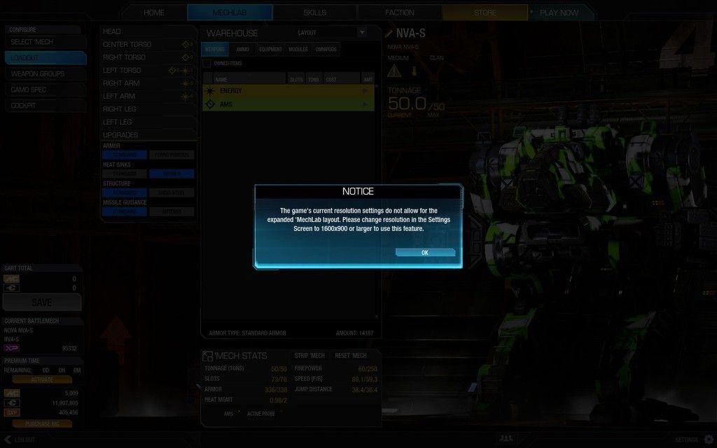
... have you tried changing the layout from Column to Expanded?

#22 Mcgral18

    Member

  • PipPipPipPipPipPipPipPipPipPipPipPip
  • CS 2019 Top 8 Qualifier
  • CS 2019 Top 8 Qualifier
  • 17,987 posts
  • LocationSnow

Posted 07 June 2015 - 12:54 AM

View PostTarogato, on 07 June 2015 - 12:48 AM, said:

... have you tried changing the layout from Column to Expanded?

Posted Image

#23 Tarogato

    Member

  • PipPipPipPipPipPipPipPipPipPip
  • Civil Servant
  • Civil Servant
  • 6,558 posts
  • LocationUSA

Posted 07 June 2015 - 12:55 AM

... touché.


3 user(s) are reading this topic

0 members, 3 guests, 0 anonymous users