 Nightshade24, on 13 July 2016 - 09:14 AM, said:
I also want to see maps covered in like hard fractal crystals everywhere and gravity so hard that even the better jumpjetting mechs can barely get over those and nothing much....
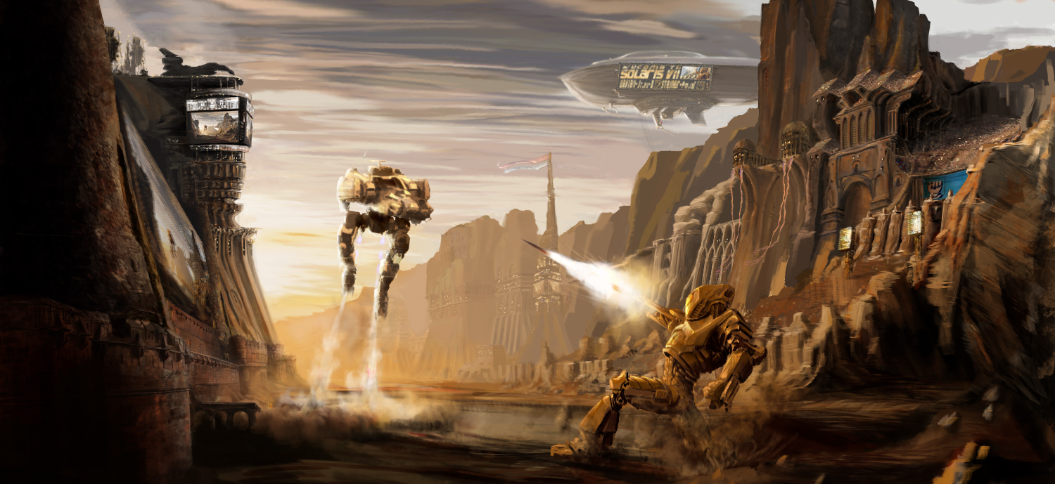
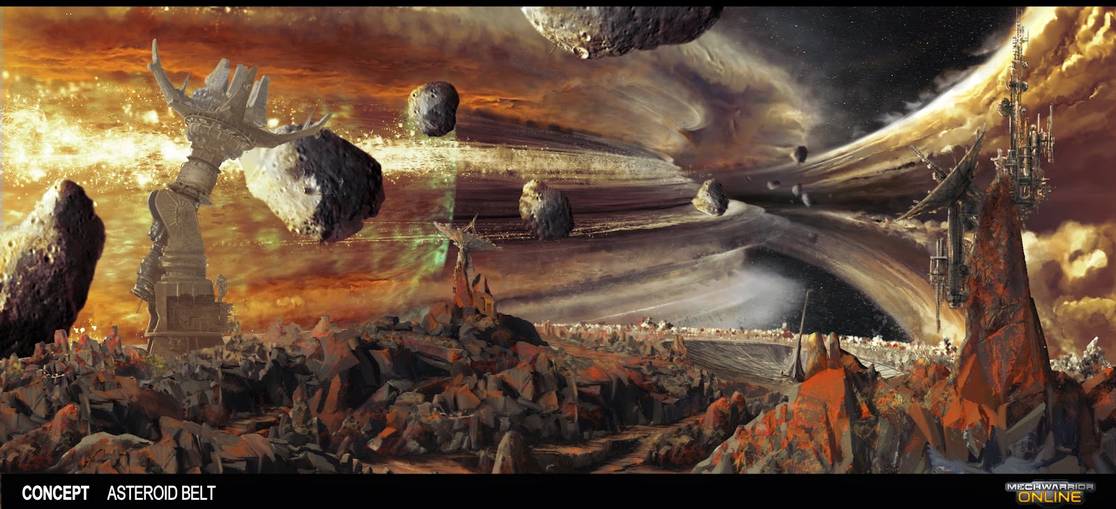
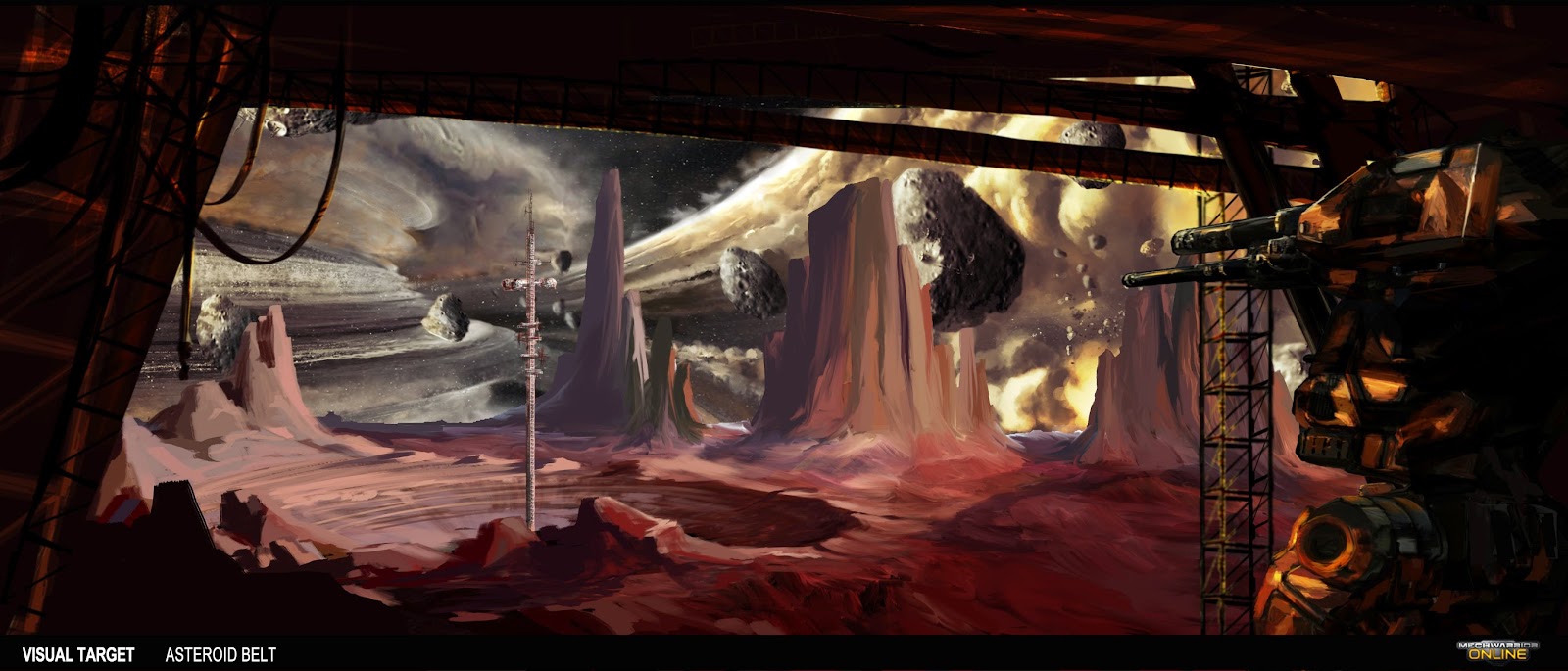
uh, I remember seeing a image similar to this and I tried to google for it but instead I just ran into the MW: O map art director guy thingy and I am impressed... let me share the images of maps that are not in MW: O yet... at least to my knowledge.
How did we get what pathetic excuse for these beautiful concept arts?!?
Once they do a redo of terra therma I want them to look like this. I really love the looks of those open places too!
Reason I posted most of these as these are most likely the soon-to-be maps PGI is making after the redo's.
His Viridian bog post was uploaded a bit before MW: O's release from memory as well as the fact that Solaris VII is a thing happening soon and his latest work- 2016, was just that, Solaris VII in the stiener arena.
That asteroid belt/ring is awesome! These are new, not old concept arts you say? B/c the first volcano shot DOES look like the existing Terra Therma...
 Nightshade24, on 13 July 2016 - 09:20 AM, said:
Do what MW4 does. Have some multi lane roads making a semi wide opening between groups of buildings, have some open areas BUT closed off as well by walls and stuff, Have some areas barricaded (say fallen building? MW4 did it by tank traps, equally likely). Have a park but NOT at the centre, have it like as far out into a corner as possible.
some screenshots...
There are some semi open areas, But mostly long paths down 1 or 2 ways, surrounded by thick urban enviroment with lots of tight roads and such seeping between the main lanes. These roads are only useful to shoot down, Not really an open brawl invitation.
1 thing I think PGI needs to achieve this is to keep t he terrain flat, A problem in Crimson strait, HPG, River city, etc is that the terrain is uneven.
Me likey.
Definitely put the park to the side. Or a beach or smtg--I'm thinking of the
Citadel neighborhood in contemporary Barcelona.
Use Sant Antoni Maria Claret as Left edge, the beach as the right, Passeig de Sant Joan as bottom edge, Rambla do Prim as the top. Couple large avenues--Diagonal and Meridiana crisscrossing, plus Cortes Catalanes running right down the middle. Some small block-sized parks, but most streets two lanes and not much more.
Except for the skyscrapers near the Port Olimpic, and a few buildings elsewhere, all others are 6 stories, effectivley creating the two-level feel that Canyon Network has.
That still puts the Placa de las Glories Catalanes dead center, but the plaza is not that big and I'd imagine in-game it would be approximately equivalent to Theta hill in Canyon Network.
...sh!t, I really like this idea. Call it "The Old City" and just appropriate contemporary Barcelona wholesale. Then maybe throw some background futuristic skyscrapers in the background a la Crimson. We can say the downtown stayed in its "archaic" form while the suburbs modernized throughout the centuries.
 Jables McBarty, on 13 July 2016 - 09:06 AM, said:


.jpg)
.jpg)


