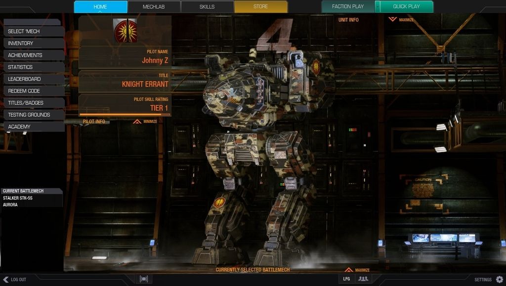
If done right, they would have been cool. You could put little unit symbols on your mech in logical places, maybe give everyone in your unit a number, too, like and so forth. It would have been immersive.
Instead, we get mechs with smiley faces over their heads, [Redacted - inappropriate placement of decals]... and a cadre of white knights or people suffering from Stockholm Syndrome telling us that such nonsense (badly rendered nonsense, I might add) is "immersive" and "what Battletech is really about."
All I ask for is a option toggle that allows me to not see this drek, much like how in World of Warships you can hide the anime skins if you want a more realistic experience. But Wargaming thinks things like this through far better than PGI it seems... of course, we also have at least one nut on this forum who actually feels we should all be FORCED to enjoy mech dongs since he likes them and our opinions don't matter.
Between the idiocy of PGI and the idiocy of some of the user base, I just have to shake my head and laugh.
 MischiefSC, on 20 July 2016 - 02:45 PM, said:
Most mechs in BT had heraldry like this. Both indications of house, unit and often some humor.
Given that mechs are personal property and not military issue gear you're using it is even more likely.
I have no issue with them.
I think they are idiotic and poorly rendered in their current state. Heraldry is one thing, but again, we're talking about mechs with smiley face heads and [Redacted - inappropriate placement of decals]. That's not heraldry or anything else in "real Battletech," whatever the heck that may be.
Again - give us the option to this crud off on our own displays if they can't be bothered to at least make the decals look logical and good.
Edited by draiocht, 21 July 2016 - 12:09 PM.
inappropriate language
 Bishop Steiner, on 20 July 2016 - 02:51 PM, said:


