All Teams Ranking Near The Top 5 On The Standings!
#1
Posted 15 September 2016 - 02:48 PM
I've sent out an email to all teams who are ranked closely to the Top 5 in the Standings, requesting that you respond by the 23rd of September including your TEAM EMBLEM!
That's right, we need your logos! We have a couple team Logo/Emblems still missing, a few teams which are currently placed in the Top 5 which I highly recommend you send them to us before then!
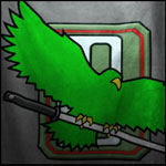
Reason why I'm pushing for it is because we're making these Top 5 teams (of each region) Cockpit items and a Decal which you(the top teams) will be receiving and IF you want these to be special and unique to your team, you should create your own emblem!!
If you do not by the 23rd, it will be too late for the cockpit artist and other Devs to implement them to the patch which we intend to have them in by and we will be forced to create a generic one for you. And by generic I mean, it may not exactly reflect your team spirit or be unique.
So even if you are ranked 6th or 7th or even 8th place, please check your emails and send us back your Team Emblem!! You never know if a team(s) above you drops for whatever reasons.
Note: The Emblem will also be shown at MechCon and all the future Broadcasts you take part of!
#2
Posted 15 September 2016 - 03:04 PM
any plans if the non-top-5 teams will get a "I-was-in-the-first-MWO-world-championship-and-nobody-can-take-that-from-me" souvenir?
#3
Posted 15 September 2016 - 03:12 PM
#4
Posted 15 September 2016 - 05:45 PM
Your logo should maintain it's integrity when:
- Scaled down to 256
- In black and white or de-saturated
- Upside down or flipped
We recommend you to have no background in your logo (white field or alpha instead)
Maximum 3 colours.
Minimalize (or better yet avoid) gradients and textures
Minimum pixel size for outlines should be 4
Negative space is your friend!
Here are some logo examples you could use as reference:
https://www.google.c...iw=1760&bih=977
#5
Posted 15 September 2016 - 11:40 PM
Nice logo tho live!
#6
Posted 16 September 2016 - 12:31 AM
I want something so shiny that it can attract bullets! Or auto-cannon rounds.
Then I'm going to paint it on my already shinny bottom
#7
Posted 16 September 2016 - 07:48 AM
#8
Posted 16 September 2016 - 04:35 PM

#9
Posted 16 September 2016 - 04:39 PM
NA:
-D5-
EmpyreaL
ISENGRIM
KCOM
Lords NA
-SiG-
Steel JaguaR
Storm Jaguar
EU:
9STS
Angry Bears
Black Spikes
Lords EU
Russian CJF
OC:
256 Bear Cav
54th Tsunami
I've received replies with teams saying they will not be in the top 5 and don't find this necessary however even if you are in the top 6, 7 or 8, please submit one as well, you never know if a team above you has to drop out for whatever reason.
Thanks everyone~
We'll talk about participation prizes nearer to the end of the tournament~
#10
Posted 16 September 2016 - 06:21 PM
(note: obviously not all teams are units, but for those that are)
All ARMD members would like access to the ARMD shield if possible (see middle of my sig)
here..........................................................................\/
Edited by slide, 16 September 2016 - 06:25 PM.
#12
Posted 17 September 2016 - 03:52 PM

#13
Posted 18 September 2016 - 06:27 AM

#14
Posted 18 September 2016 - 10:26 AM

Edited by Rushin Roulette, 18 September 2016 - 10:27 AM.
#15
Posted 18 September 2016 - 12:26 PM

Edited by Surn, 18 September 2016 - 10:19 PM.
#16
Posted 19 September 2016 - 04:41 PM
 live1991, on 18 September 2016 - 06:27 AM, said:

There's no real need to include the territory you are from unless there is another team with the exact same name from a different territory. From the other examples you see here in this thread are some excellent designs which are clean and clear and directly relate to the spirit and identity of the team itself. Even the logo in your signature is more of a logo than what is essentially a splash screen you have originally submitted.
To the basics, try to isolate your logo to Squad Foxtrot. A great example is in that google link you posted:

Something along the lines like that. While art is in the eye of the beholder, your logo will portray your team's identity in this tournament. The cleaner and clearer it is, the more easily identifiable it will be. There are potential uses in the client that will require the logo to be shrunk down quite a bit so the less noise and gradients of colors, the easier it will be to read. In the displayed logos in this thread, SRMX and I.S.R.C. will read great at all resolutions and all purposes including in-game and possible print opportunities.
 VVonka, on 16 September 2016 - 07:48 AM, said:
Your submitted logo is fine.. actually quite cool from my point of view.
#18
Posted 19 September 2016 - 08:46 PM
#19
Posted 19 September 2016 - 09:05 PM
 Surn, on 19 September 2016 - 08:46 PM, said:
Yes i understand this, i was just correcting him when it came too our name.
Will try and get someone to create one for us before the cut off.
Edited by live1991, 19 September 2016 - 09:07 PM.
#20
Posted 19 September 2016 - 09:52 PM
Should I put it in here ??
1 user(s) are reading this topic
0 members, 1 guests, 0 anonymous users


