Jump to content

Thug Life (Wip)


11 replies to this topic

#1 Bishop Steiner

    ForumWarrior

  • PipPipPipPipPipPipPipPipPipPipPipPipPipPipPip
  • The Hammer
  • The Hammer
  • 47,187 posts
  • Locationclimbing Mt Tryhard, one smoldering Meta-Mech corpse at a time

Posted 30 September 2016 - 02:35 PM

>Two takes on my favorite Assault Mech, trying decide which route to press on.

v1
Posted Image

v2
Posted Image

Personally, I think I like v2 more overall, though I am thinking of porting the leg structure from v1, at least in part, over.

But, figured I'd pick your guy's brains.... I know for instance Thundergod went in a totally different direction with his version for TRO 3063, but for me it's important to be consistent with the canon design, but hopefully improve it. (and not take the liberties I did on my earlier versions)

#2 ChapeL

    Member

  • PipPipPipPipPipPipPipPip
  • Elite Founder
  • Elite Founder
  • 1,363 posts

Posted 30 September 2016 - 02:51 PM

V2's posture is interesting but V1's lines are cleaner which help focus attention ( That's why I'm having trouble deciding ) Torso, legs, feet assembly it all looks good to me but I'm not so sure about the PPC/fist part especially on V1

From what I understand, the particularity of the Thug is that the lower arm actuator actually ends with the muzzle of a PPC but the hand actuator is kinda recessed into the forearm. Basically if in MWO: The lower arm/ppc points forward but the hand could actually move inwards towards the torso, popping away from the forearm. I see you drew them with that particularity in mind but shouldn't there be a space for the hand to fit into ? ( right now V1's left hand is clipping its PPC housing ) V2 seem's to have solved that problem by bolting the hand on top of the PPC.

I like the Thug. It would be completely harmless in MWO with hardpoint inflation freom hell but I'd love to see your finished work ( and hope someone models it, like the Jackal ) :)

#3 Gnatter

    Member

  • PipPipPipPipPip
  • Bad Company
  • 140 posts

Posted 30 September 2016 - 04:40 PM

I like the torsos and arms from v1, and the legs from v2. Not quite sure why, but the legs on v1 just feel a tiny bit off, almost like they are a hair too skinny. Though I do admit that both versions look good and I can understand the difficulty in choosing one over the other.

-Gnatter

#4 Bishop Steiner

    ForumWarrior

  • PipPipPipPipPipPipPipPipPipPipPipPipPipPipPip
  • The Hammer
  • The Hammer
  • 47,187 posts
  • Locationclimbing Mt Tryhard, one smoldering Meta-Mech corpse at a time

Posted 30 September 2016 - 05:24 PM

View PostChapeL, on 30 September 2016 - 02:51 PM, said:

V2's posture is interesting but V1's lines are cleaner which help focus attention ( That's why I'm having trouble deciding ) Torso, legs, feet assembly it all looks good to me but I'm not so sure about the PPC/fist part especially on V1

From what I understand, the particularity of the Thug is that the lower arm actuator actually ends with the muzzle of a PPC but the hand actuator is kinda recessed into the forearm. Basically if in MWO: The lower arm/ppc points forward but the hand could actually move inwards towards the torso, popping away from the forearm. I see you drew them with that particularity in mind but shouldn't there be a space for the hand to fit into ? ( right now V1's left hand is clipping its PPC housing ) V2 seem's to have solved that problem by bolting the hand on top of the PPC.

I like the Thug. It would be completely harmless in MWO with hardpoint inflation freom hell but I'd love to see your finished work ( and hope someone models it, like the Jackal ) Posted Image

well, as a WIP the line cleanness and stuff are irrelevant tbh, as it's not a finished product. Just the actual design features, ya know?
as for the hands
Posted Image
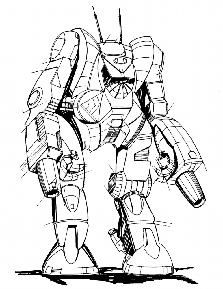
the barrels are inline with the elbows so it does really limit how much I can do. Been a real bear to balance the bulk, angle, etc.
Posted Image
(original mini)

linework will get cleaned up as I finalize stuff. (also when I'll resize the left arm a little smaller to match the right, if I go with that one)

Got a fair bit of tweaking on either before I'm happy... but there is just something...stiff and all on v1 that is bugging me. (plus I really like the bigger paddle elbows on 2 more)

GAH! I do love it when a design just draws itself, like my latest Blackjack.... and hate hate hate it when I have a design I like 75%....but that last 25% just don't wanna flow....

Edited by Bishop Steiner, 30 September 2016 - 05:32 PM.


#5 DaZur

    Member

  • PipPipPipPipPipPipPipPipPipPip
  • Elite Founder
  • Elite Founder
  • 7,511 posts
  • LocationWisconsin

Posted 30 September 2016 - 07:15 PM

I vote for example #2...

I've never been fond of the accordion/dryer-vent joint transitions. I much prefer the ball and socket ones. Posted Image

#6 MadHornet

    Member

  • PipPipPipPipPipPipPip
  • Ace Of Spades
  • 529 posts
  • LocationSomewhere deep in Florida

Posted 30 September 2016 - 10:13 PM

Hatamoto-chi < Thug

No allegiance bias, Thug is tougher.

#7 Gamuray

    Member

  • PipPipPipPipPipPipPip
  • Overlord
  • Overlord
  • 866 posts

Posted 01 October 2016 - 09:53 AM

I like the limbs from V1 and the body from V2. They feel a little more put together (which I'm not sure if it's from the excess lines or not that I think that), it's probably because the joints feel like they're a better size and a bit more connected to the legs/arms. The V1 has a sort of awkwardness in the cockpit, maybe it just sticks out slightly farther..

The V2 feet though. The V2 definitely got the better feet.

#8 Steel Raven

    Member

  • PipPipPipPipPipPipPipPip
  • Ace Of Spades
  • Ace Of Spades
  • 1,372 posts

Posted 01 October 2016 - 05:00 PM

I like the first one, the details on the legs and the proportions are great.

#9 Zypher

    Member

  • PipPipPipPipPipPip
  • Survivor
  • Survivor
  • 418 posts

Posted 02 October 2016 - 07:50 AM

The first one, it looks more finished, you can see it for sure around the cockpit, but as DaZur stated the ball and socket joints make more sense, so maybe incorporate those.

On the second one the shoulders look a bit heavier and start to drift more towards the Zeus design.

#10 TheArisen

    Member

  • PipPipPipPipPipPipPipPipPipPip
  • Ace Of Spades
  • Ace Of Spades
  • 6,040 posts
  • LocationCalifornia

Posted 13 October 2016 - 12:28 AM

I like V2, it looks more menacing & powerful

#11 Funkin Disher

    Member

  • PipPipPipPipPipPipPip
  • The Raider
  • The Raider
  • 590 posts
  • LocationPPC Apocalypse Bunker, Sydney

Posted 13 October 2016 - 05:10 PM

Head and torso from #1, arms and legs of #2


1 user(s) are reading this topic

0 members, 1 guests, 0 anonymous users