Jump to content

That Clan Symbol


9 replies to this topic

#1 Lily from animove

    Member

  • PipPipPipPipPipPipPipPipPipPipPip
  • The Devoted
  • The Devoted
  • 13,891 posts
  • LocationOn a dropship to Terra

Posted 12 December 2016 - 02:12 AM

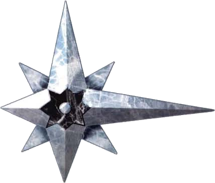
is than canon or a special snowflake version of the clan star?

Posted Image

Edited by Lily from animove, 12 December 2016 - 02:13 AM.


#2 Tibbnak

    Member

  • PipPipPipPipPipPip
  • Survivor
  • Survivor
  • 379 posts

Posted 12 December 2016 - 02:24 AM

Special snowflake probably, because they used the star league signet for the inner sphere (for some reason), and the clan signet is supposed to be highly based on the star league signet (because they WERE the star league before it dissolved).

Here's the canon signet for the clans
Posted Image

Based on the star league signet,
Posted Image


The inner sphere did end up creating the SLDF in 3058, otherwise known as the "Second Star League Defense Force", where they decided to re-use the old star league logo. *shrug*

Maybe the art team was concerned that both sides having basically the same logo rotated 90 degrees would confuse players.

Commstar logo, for reference:
Posted Image

Edited by Tibbnak, 12 December 2016 - 02:25 AM.


#3 Tristan Winter

    Member

  • PipPipPipPipPipPipPipPipPip
  • Ace Of Spades
  • Ace Of Spades
  • 2,530 posts
  • LocationNorway

Posted 12 December 2016 - 02:30 AM

View PostTibbnak, on 12 December 2016 - 02:24 AM, said:

Maybe the art team was concerned that both sides having basically the same logo rotated 90 degrees would confuse players.

It's more confusing that the Clan logo looks nothing like the Clan decal you can put on your mech. In my mind, it would have made more sense to make a new symbol for the IS alliance. Especially because there was no flag or symbol for all major houses fighting the Clans together in lore, as far as I know. But I don't know a whole lot about lore, admittedly.

It doesn't really matter, anyway. It's just a single screen in the UI. In this case, it's almost a good thing that PGI doesn't go very far in creating an immersive game, because the only time you're actually confronted with lore in the UI is when you pick your faction. And then it's gone.

#4 Lily from animove

    Member

  • PipPipPipPipPipPipPipPipPipPipPip
  • The Devoted
  • The Devoted
  • 13,891 posts
  • LocationOn a dropship to Terra

Posted 12 December 2016 - 02:37 AM

View PostTristan Winter, on 12 December 2016 - 02:30 AM, said:

It's more confusing that the Clan logo looks nothing like the Clan decal you can put on your mech. In my mind, it would have made more sense to make a new symbol for the IS alliance.


this,
consistency would have been using the existing symbols for both, or making new ones for both, but not a weird mix.

maybe the designer was already in christmas and winter mood. so inb4 clan cyan snowflake.

I also don't like the subsubscriptions, based on how the random player chooses only on words he will mostlikely choose the IS because more shiny with gold, + words "alliance"

#5 Tristan Winter

    Member

  • PipPipPipPipPipPipPipPipPip
  • Ace Of Spades
  • Ace Of Spades
  • 2,530 posts
  • LocationNorway

Posted 12 December 2016 - 02:48 AM

View PostLily from animove, on 12 December 2016 - 02:37 AM, said:

I also don't like the subsubscriptions, based on how the random player chooses only on words he will mostlikely choose the IS because more shiny with gold, + words "alliance"

Yeah, even I scratched my head at the Clan description, and I hardly know anything about BT lore. Doesn't really cover the whole Warden vs Crusader conflict, or the reasons why the Clans are fighting for Terra. Just makes them sound like the Mongols in the middle ages, which isn't entirely appropriate.

But again, PGI has a very strained relationship with lore.

#6 Tibbnak

    Member

  • PipPipPipPipPipPip
  • Survivor
  • Survivor
  • 379 posts

Posted 12 December 2016 - 03:05 AM

Secret logo unlocked: Clan special snowflake

#7 Vellron2005

    Member

  • PipPipPipPipPipPipPipPipPipPip
  • The Blood-Eye
  • The Blood-Eye
  • 5,446 posts
  • LocationIn the mechbay, telling the techs to put extra LRM ammo on.

Posted 13 December 2016 - 06:21 AM

View PostLily from animove, on 12 December 2016 - 02:12 AM, said:

is than canon or a special snowflake version of the clan star?

Posted Image


I have a keen designer's eye, and here's what I've noticed about the new Clan logo..

1) It still resembles the original in overall shape and form, being sort-off like a star, or the standard "clan dagger"

2) The lower extended "dagger" part has a hidden DNA helix, signifying the clan eugenics program - a very clever design feature.

3) The center of the logo has multiple star-like features, from the outside bigger ones to the inner smaller ones. This could signify the Clan caste system, with only the few blood-named warriors in the center of the star.. Another clever design feature

Overall, I like the design, although, I don't like the color. They should have kept the original red color, or gone with a darker, perhaps purplish hue..

Ideally, silver or blue for IS, and the red for Clans, to be reminiscent of the original logos..

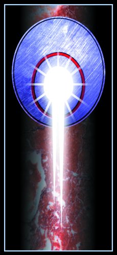
I would also like to point out the detail of the logo backgrounds.. Notice how the IS banner background has a "soft cloth" feel, and is associated with nobility, history, and the old ways, while the Clan banner background has a more high-tech, aggressive look?

The only thing I don't like is the "clans being hellbent" part.. The clans are conquerors, but they, or "we" are not exactly the villains we are portrayed as.. This villainies us..

However..

My compliments to whoever designed this.

Well done. Posted Image

Edited by Vellron2005, 13 December 2016 - 06:31 AM.


#8 Karl Streiger

    Member

  • PipPipPipPipPipPipPipPipPipPipPipPipPip
  • Wrath
  • Wrath
  • 20,369 posts
  • LocationBlack Dot in a Sea of Blue

Posted 13 December 2016 - 06:33 AM

View PostVellron2005, on 13 December 2016 - 06:21 AM, said:


I have a keen designer's eye, and here's what I've noticed about the new Clan logo..

1) It still resembles the original in overall shape and form, being sort-off like a star, or the standard "clan dagger"

2) The lower extended "dagger" part has a hidden DNA helix, signifying the clan eugenics program - a very clever design feature.

3) The center of the logo has multiple star-like features, from the outside bigger ones to the inner smaller ones. This could signify the Clan caste system, with only the few blood-named warriors in the center of the star.. Another clever design feature

Overall, I like the design, although, I don't like the color. They should have kept the original red color, or gone with a darker, perhaps purplish hue..

Ideally, silver or blue for IS, and the red for Clans, to be reminiscent of the original logos..

I would also like to point out the detail of the logo backgrounds.. Notice how the IS banner background has a "soft cloth" feel, and is associated with nobility, history, and the old ways, while the Clan banner background has a more high-tech, aggressive look?

The only thing I don't like is the "clans being hellbent" part.. The clans are conquerors, but they, or "we" are not exactly the villains we are portrayed as.. This villainies us..

However..

My compliments to whoever designed this.

Well done. Posted Image

well, this is a eye opener - indeed. didn't looked twice at the logos but you are right.
they are really well done, but for the sword - it points in the wrong direction Posted Image

Edited by Karl Streiger, 13 December 2016 - 06:33 AM.


#9 Lily from animove

    Member

  • PipPipPipPipPipPipPipPipPipPipPip
  • The Devoted
  • The Devoted
  • 13,891 posts
  • LocationOn a dropship to Terra

Posted 13 December 2016 - 07:04 AM

View PostVellron2005, on 13 December 2016 - 06:21 AM, said:


I have a keen designer's eye, and here's what I've noticed about the new Clan logo..

1) It still resembles the original in overall shape and form, being sort-off like a star, or the standard "clan dagger"

2) The lower extended "dagger" part has a hidden DNA helix, signifying the clan eugenics program - a very clever design feature.

3) The center of the logo has multiple star-like features, from the outside bigger ones to the inner smaller ones. This could signify the Clan caste system, with only the few blood-named warriors in the center of the star.. Another clever design feature

Overall, I like the design, although, I don't like the color. They should have kept the original red color, or gone with a darker, perhaps purplish hue..

Ideally, silver or blue for IS, and the red for Clans, to be reminiscent of the original logos..

I would also like to point out the detail of the logo backgrounds.. Notice how the IS banner background has a "soft cloth" feel, and is associated with nobility, history, and the old ways, while the Clan banner background has a more high-tech, aggressive look?

The only thing I don't like is the "clans being hellbent" part.. The clans are conquerors, but they, or "we" are not exactly the villains we are portrayed as.. This villainies us..

However..

My compliments to whoever designed this.

Well done. Posted Image


a matter of perception, as you said, color is off, and the shape, well I could arrange 8 hearts like this and say : ressemples the rough shape. but that doesn't actually means it's a good choice. not amongst the other near unlimited deisgn chocies that were possible

View PostKarl Streiger, on 13 December 2016 - 06:33 AM, said:

well, this is a eye opener - indeed. didn't looked twice at the logos but you are right.
they are really well done, but for the sword - it points in the wrong direction Posted Image


does it? since the Is is fighting itself, trying to stab yourself seems to be fine :P

#10 Johnny Z

    Member

  • PipPipPipPipPipPipPipPipPipPip
  • Knight Errant
  • 9,942 posts
  • LocationDueling on Solaris

Posted 13 December 2016 - 07:06 AM

Maybe they will get upgraded some time. The Clan one looks like its attacking in all directions kind of thing which makes sense since they are trying to take over the Inner Sphere. The Inner Sphere one looks good I think.

I hope there is the FFA of the various factions returned some time to.

This new update will make FP a lot more playable is the main thing. So this is a great update.

Its still missing some key elements but what is there to say. FP is under construction after all.

Edited by Johnny Z, 13 December 2016 - 07:11 AM.


1 user(s) are reading this topic

0 members, 1 guests, 0 anonymous users