


123 replies to this topic
#41
-

-

- Ace Of Spades

- 418 posts
Member
- LocationSpace The Final Frontier
Posted 04 January 2017 - 02:44 PM
No one cared who I was until I put on the mask.
#42
-
-
- Legendary Founder

- 7,709 posts
Member

Posted 04 January 2017 - 02:53 PM
 Gas Guzzler, on 04 January 2017 - 02:35 PM, said:
Don't hate them because their better than you, and they know it.
No one's better than the Trashman.

#43

Posted 04 January 2017 - 02:56 PM
Really digging the pictures and ideas gentleman! I imagine the battlemaster iic to be an oversized loki(hellbringer) with so many open weapon pod locations that's it super flexible and has ultra optimized torso aim convergence.
It also out sustains every other mech with the super quick that gives it -25 % heat gen for every weapon.
Also has 15 percent range boost for all energy weapons and 10 percent increased heat dissipation.
It also out sustains every other mech with the super quick that gives it -25 % heat gen for every weapon.
Also has 15 percent range boost for all energy weapons and 10 percent increased heat dissipation.
Edited by Natred, 04 January 2017 - 02:58 PM.
#44
-

-
- Giant Helper

- 1,699 posts
Member
- LocationWubbing and dakkaing everyone in best jellyfish mech
Posted 04 January 2017 - 03:25 PM
Juodas Varnas, on 04 January 2017 - 02:13 PM, said:
Well, Clan Diamond Shark is probably the least... Clanny out of all the Clans.
Of course. They are considered the "merchant" clan. Here's a picture of a clan diamond shark true born.
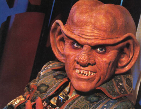
But seriously, good for them capitalizing off of the clan's general stupidity.
#45
-

-
- Big Daddy

- 14,274 posts
Member
- LocationCalifornia Central Coast
Posted 04 January 2017 - 04:05 PM
Arnold The Governator, on 04 January 2017 - 03:25 PM, said:
Of course. They are considered the "merchant" clan. Here's a picture of a clan diamond shark true born.
But seriously, good for them capitalizing off of the clan's general stupidity.
Damn you I have been waiting for the right time to refer to them as the Ferengi Clan.
#46
-

-
- The Solitary

- 2,480 posts
Member
- LocationStationed at the Iron Dingo's Base on Dumassas
Posted 04 January 2017 - 05:52 PM
Clan Diamond Shark is the Billy Mayes Clan, and their stuff is about a sixtieth as good as the stuff he sold.
#47
-
-
- The Defiant

- 2,912 posts
Member
- LocationRUNNING FAST AND TURNING LEFT
Posted 04 January 2017 - 06:05 PM
At this point I'm less excited about the prospect of mechs and more inclined to want some more sustainable stuff. Colorblind support, replay system, better spectator tools, return to the better minimap (honestly, the fact that they shoved that new minimap crap out with 0 player testing is disgusting), new tech and weapons, improvements to game performance, and of course, delivering what was promised for FW... I'm sick of farmville.
#48
-
-
- Big Daddy
- 26,736 posts
Member
- LocationStill doing ungodly amount of damage, but with more accuracy.
Posted 04 January 2017 - 06:27 PM
Bombast, on 04 January 2017 - 12:15 PM, said:
Just what we need. More overweight Clan 2.0 Battlemechs.
Let's get some originality up in here. And failing that, can we at least have the non-tonnage bloated Fiesta duplicate mechs?
Let's get some originality up in here. And failing that, can we at least have the non-tonnage bloated Fiesta duplicate mechs?

Hey, Sombreros are cool!
#49
-

-
- The 1 Percent

- 7,322 posts
Member
- LocationDelios
Posted 04 January 2017 - 06:37 PM
Requiemking, on 04 January 2017 - 05:52 PM, said:
Clan Diamond Shark is the Billy Mayes Clan, and their stuff is about a sixtieth as good as the stuff he sold.
Except we sell things Billy Mays promoted himself. For instance, do you know the Inner Sphere name for HarJel?
#50
-
-
- The Solitary
- 2,480 posts
Member
- LocationStationed at the Iron Dingo's Base on Dumassas
Posted 04 January 2017 - 06:57 PM
RestosIII, on 04 January 2017 - 06:37 PM, said:
Except we sell things Billy Mays promoted himself. For instance, do you know the Inner Sphere name for HarJel?
Yeah no. You're a few thousand years too late to be claiming that. At any rate, most of CDS's mechs that aren't just an outright pile of inefficient, steaming garbage (I'm looking at you FailCat MK2) are so overspecialised they are outright worthless if their specific situation doesn't come up.
Edited by Requiemking, 04 January 2017 - 06:58 PM.
#51
-
-
- Bad Company
- 2,368 posts
Member

Posted 04 January 2017 - 07:24 PM
Bombast, on 04 January 2017 - 02:30 PM, said:
I'm not very good at it to be honest, but I can give it a shot. Did you have any ideas or something?
Well, I'd be fine wit ha generic one. Of course inserting some creepy dolls would be nice, but editing them in would be hard, especially if it's a gif.
Maybe this still can be cropped, edited for transparency, shrunken down and placed on the right side. It'd be a lot of work, though.
Or this on the left side, same as above, text edited out. Higher quality.
Edited by Snowbluff, 04 January 2017 - 07:26 PM.
#52
-
-
- The 1 Percent
- 7,322 posts
Member
- LocationDelios
Posted 04 January 2017 - 07:44 PM
Snowbluff, on 04 January 2017 - 07:24 PM, said:
Well, I'd be fine wit ha generic one. Of course inserting some creepy dolls would be nice, but editing them in would be hard, especially if it's a gif.
Maybe this still can be cropped, edited for transparency, shrunken down and placed on the right side. It'd be a lot of work, though.
Or this on the left side, same as above, text edited out. Higher quality.
Maybe this still can be cropped, edited for transparency, shrunken down and placed on the right side. It'd be a lot of work, though.
Or this on the left side, same as above, text edited out. Higher quality.
Just for fun's sake, I decided to see how terrible I am at editing and tried to clean up that second image to not have the text just as practice. I have a feeling my eyesight has failed me though, because I can't tell if the hair looks **** or not. So I might as well ask you how visible it is.
Spoiler

I can see the line myself, but I have no idea if that's because I did it, or, well, it's way more obvious than my crap eyes can tell. I actually do think that it's theoretically possible to turn the second image into a sig though, just don't know how you'd do that.
#53
-
-
- Legendary Founder
- 7,709 posts
Member
Posted 04 January 2017 - 07:56 PM
Snowbluff, on 04 January 2017 - 07:24 PM, said:
Well, I'd be fine wit ha generic one. Of course inserting some creepy dolls would be nice, but editing them in would be hard, especially if it's a gif.
Maybe this still can be cropped, edited for transparency, shrunken down and placed on the right side. It'd be a lot of work, though.
Or this on the left side, same as above, text edited out. Higher quality.
Maybe this still can be cropped, edited for transparency, shrunken down and placed on the right side. It'd be a lot of work, though.
Or this on the left side, same as above, text edited out. Higher quality.
I'll look into it tomorrow. It's late and my allergies were bad today so I had to take a few extra Diphenhydramine pills. My eyes are swimming a bit too much - Been trying to harvest the right frames for a gif from this video for 30 minutes but I'm having a hard time focusing.
Spoiler
Should have better luck fresh.
Just to be clear though, you'd like a signature with Mad Cat MK II 2017, and dolls from... Rozen Maiden? Will try.
RestosIII, on 04 January 2017 - 07:44 PM, said:
Just for fun's sake, I decided to see how terrible I am at editing and tried to clean up that second image to not have the text just as practice. I have a feeling my eyesight has failed me though, because I can't tell if the hair looks **** or not. So I might as well ask you how visible it is.
I can see the line myself, but I have no idea if that's because I did it, or, well, it's way more obvious than my crap eyes can tell. I actually do think that it's theoretically possible to turn the second image into a sig though, just don't know how you'd do that.
Spoiler
I can see the line myself, but I have no idea if that's because I did it, or, well, it's way more obvious than my crap eyes can tell. I actually do think that it's theoretically possible to turn the second image into a sig though, just don't know how you'd do that.
That's pretty good, actually. I can see it a bit where the hair bends, but only because I know where to look, and it;s more then satisfactory for a signature, since one has to shrink the hell out of it anyway. What's how you do edits - Get the biggest resolution you can, do the best you can, then shrink it a smidge.
#54
-
-
- Shredder

- 1,118 posts
Member
- LocationFeeding the Fires of Rubicon

Posted 04 January 2017 - 08:09 PM
Warhammer is my favorite mech ever in Battletech. I want Whammy IIC so I can go full Clan. I always pick Whammy IIC in Mechwarrior 2 & Ghost Bear's Legacy. Too bad they removed in Mercenaries because Harmony Gold still salty.

#55
-
-
- Bad Company
- 2,368 posts
Member
Posted 04 January 2017 - 08:42 PM
Bombast, on 04 January 2017 - 07:56 PM, said:
That's pretty good, actually. I can see it a bit where the hair bends, but only because I know where to look, and it;s more then satisfactory for a signature, since one has to shrink the hell out of it anyway. What's how you do edits - Get the biggest resolution you can, do the best you can, then shrink it a smidge.
I agree, shrinkage will fix it.
No that came out wrong don
#56
-
-
- The 1 Percent
- 7,322 posts
Member
- LocationDelios
Posted 04 January 2017 - 08:56 PM
Snowbluff, on 04 January 2017 - 08:42 PM, said:
I agree, shrinkage will fix it.
No that came out wrong don
No that came out wrong don

#57
-
-
- Legendary Founder
- 7,709 posts
Member
Posted 04 January 2017 - 09:41 PM
Snowbluff, on 04 January 2017 - 08:42 PM, said:
I agree, shrinkage will fix it.
No that came out wrong don
No that came out wrong don
Or came out right.
Anyway... first draft. Ideas, criticism, concerns and change requests, please. All the individual assets are saved separate, so it's no big deal to change anything.

I know the text is a bit rough, but I wasn't sure what to go with and as far as a first attempt at textured text, Gothic (Rozen uses gothic text I think?) is annoying.
RestosIII, on 04 January 2017 - 08:56 PM, said:
Spoiler
Such (false) sensitivity.
By the way, you should probably save that sig to your own account if you haven't already. I ahve no plans to delete it, but you never know.
Made two versions, in case you didn't see.
Spoiler


Edited by Bombast, 04 January 2017 - 09:43 PM.
#58
-
-
- Bad Company
- 2,368 posts
Member
Posted 04 January 2017 - 10:08 PM
RestosIII, on 04 January 2017 - 08:56 PM, said:

Bombast, on 04 January 2017 - 09:41 PM, said:
Or came out right.
Anyway... first draft. Ideas, criticism, concerns and change requests, please. All the individual assets are saved separate, so it's no big deal to change anything.
I know the text is a bit rough, but I wasn't sure what to go with and as far as a first attempt at textured text, Gothic (Rozen uses gothic text I think?) is annoying.
Okay, first things first I think you and a certain cover editor might have the same fonts.


Second, loving the font, but I am not enamored by the texturing. A flat, light color might pop better against the dark forum shades. Maybe zoom Kira out a little. A smidge.
Thanks <3
#59
-

-
- The Nimble

- 16,810 posts
Member
Posted 04 January 2017 - 10:10 PM
Kasumi Sumika, on 04 January 2017 - 08:09 PM, said:
Warhammer is my favorite mech ever in Battletech. I want Whammy IIC so I can go full Clan. I always pick Whammy IIC in Mechwarrior 2 & Ghost Bear's Legacy. Too bad they removed in Mercenaries because Harmony Gold still salty.
But, the Clans already have a Warhammer. It's called the Hellbringer.

#60
-
-
- The 1 Percent
- 7,322 posts
Member
- LocationDelios
Posted 04 January 2017 - 10:14 PM
Snowbluff, on 04 January 2017 - 10:08 PM, said:

Okay, first things first I think you and a certain cover editor might have the same fonts.
Second, loving the font, but I am not enamored by the texturing. A flat, light color might pop better against the dark forum shades. Maybe zoom Kira out a little. A smidge.
Thanks <3
I keep forgetting to watch Madoka. Dangit.


1 user(s) are reading this topic
0 members, 1 guests, 0 anonymous users


