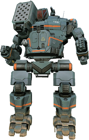
I'm currently on the search for the old (and awesome looking) Hunchback 4J game renders from back before the weapon meshes were introduced. It's my favorite take on the 4J, as I hate the current weapon mesh available (wish PGI would fix that).
I've done some google searches for reasonably size renders of the older skin, front profile view. However, all I can find are ones at 3/4th angle or are extremely low size.
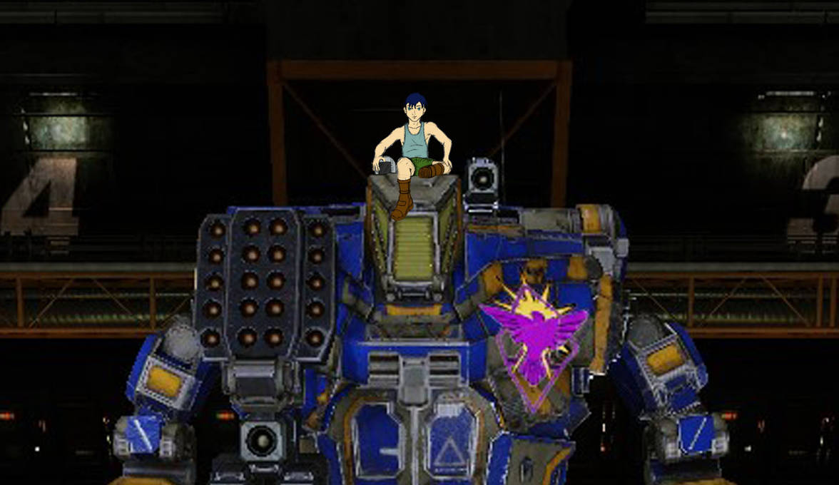
To let it be known about my intentions, I've drawn a picture where I have a pilot sitting on top of a mech. I've already hand drawn the 4J and the pilot, but was really hoping I could forgo the coloring of the 4J I drew by just (temporarily) adding my artwork interposed over a good quality screenshot instead.
I almost did it with the new 4J for convenience... but the more I look at it, the more I hate how low that hunch has become. Something about that taller hunch with flatter launcher facings just appeals to me more.
I would appreciate any assistance people can provide me. If I must, I'll not be lazy and color the version I drew...

Looking For Old Hunchback 4J Images
Started by Tesunie, Feb 22 2019 06:49 PM
5 replies to this topic
#1
Posted 22 February 2019 - 06:49 PM
#2
Posted 22 February 2019 - 07:01 PM
http://assets-cloud....nal/3033700.jpg
Just from a quick Google search. I never owned the 4J. I got the 4SP, instead. :/ Thus I never noticed that they standardized the artwork. I thought the old laser mounts made the Hunchback look unique, and original. Oh well...
Just from a quick Google search. I never owned the 4J. I got the 4SP, instead. :/ Thus I never noticed that they standardized the artwork. I thought the old laser mounts made the Hunchback look unique, and original. Oh well...
#3
Posted 22 February 2019 - 07:12 PM
 C337Skymaster, on 22 February 2019 - 07:01 PM, said:
http://assets-cloud....nal/3033700.jpg
Just from a quick Google search. I never owned the 4J. I got the 4SP, instead. :/ Thus I never noticed that they standardized the artwork. I thought the old laser mounts made the Hunchback look unique, and original. Oh well...
Just from a quick Google search. I never owned the 4J. I got the 4SP, instead. :/ Thus I never noticed that they standardized the artwork. I thought the old laser mounts made the Hunchback look unique, and original. Oh well...
My own Google search showed me that picture as well. It's of the newer launcher style, which is the same as in game currently. The 4J is one mech I wished they never changed it's visuals. Honestly, I don't know why they had to change it like they did. Could have still had the older hunch with the newer missile port and been fine.
AKA: They just need to move the current missile hunch up and making it slightly taller than the head.
Hum... That gives me an idea. I could always take the current image if I must, and then digitally move the missiles up higher for the appearance I am looking for...
Anyway. Thanks for the help. The effort is still greatly appreciated.
Edit: For your reference, it use to look like this:

Edited by Tesunie, 22 February 2019 - 07:13 PM.
#4
Posted 23 February 2019 - 09:27 AM
My ending "proxy" picture. Not with the visual I want, but it will do for now. Screenshot was taken from the current game. (Maybe I'll move that missile pod up more some day... or color in my actual drawn version of it.)


#5
Posted 26 February 2019 - 08:13 AM
I actually miss the old 4J, looked much better then what we currently have.
#6
Posted 26 February 2019 - 04:59 PM
 Number767, on 26 February 2019 - 08:13 AM, said:
I actually miss the old 4J, looked much better then what we currently have.
I wonder if enough people miss that higher missile pod (it's the biggest thing that bugs me with the new model) that if we petitioned if PGI might consider reverting (in part at least) the change.
I loved the flat missile pod look of old, but if they wanted to keep their current dynamic pod looks (with the missile tubes being center and then on each side of the center launcher) and just nudge it up so it's just a little above the cockpit, I think I'd be happy. I hate how that shoulder pod is not lower than the shoulders, when it's suppose to (and looks better) be above the shoulder line, even by a little bit. (But then we have hit boxes, damage dynamics, blah...)
1 user(s) are reading this topic
0 members, 1 guests, 0 anonymous users


