Jump to content

New Art Style? Thoughts?


58 replies to this topic

#21 The1WithTheGun

    Member

  • PipPipPipPipPip
  • 110 posts
  • LocationRight behind you

Posted 02 November 2011 - 06:01 PM

I think the art looks great. I mean - the new Jenner actually looks like it can stand up and move without immediately falling over. And it can now torso-twist! And this is a problem for MANY mechs - I mean I still don't know how a Stalker, Hussar or King Crab can walk based on it's original design.

Let's face it - the mech art in the various TROs - for the most part - have been bad to sub-par. It's only VERY recently (TRO 3067 and up) that they have been starting to improve.

#22 CrescentHawk

    Member

  • PipPipPip
  • Bad Company
  • Bad Company
  • 77 posts

Posted 02 November 2011 - 07:41 PM

I really like the new art style and hope they stick with it. I would love to see the Dervish and Battlemaster in this style.
Can't forget the Archer and T-bolt. Really I would love to see em all :)

Edited by CrescentHawk, 02 November 2011 - 07:43 PM.


#23 juxstapo

    Member

  • PipPipPipPipPipPipPipPip
  • FP Veteran - Beta 1
  • FP Veteran - Beta 1
  • 1,683 posts
  • Locationmy Tier is bigger than yours.

Posted 02 November 2011 - 07:51 PM

Honestly, I'm a 100% behind these three new designes. As has been stated over and over, they look more plausible, more like equipment, and more military. I'd even be tickled if the game maintained the almost-cell-shaded look from the concepts... happy days

#24 Vortigern

    Rookie

  • 9 posts

Posted 02 November 2011 - 07:51 PM

I think the art style looks quite good. I didn't like how cartoonish things got in MW4 so this is a step in the right direction, BT should be nice and gritty.

#25 Drakken

    Member

  • PipPip
  • Elite Founder
  • 48 posts

Posted 02 November 2011 - 08:48 PM

I think the art rocks. I agree it looks a lot more in-your-face, and believable. That's what I hope to see in the game: a Battletech that is not so 'clean'. It's hard-hitting. Lose the squeeky-clean polish and put the warpaint on. :)

A huge, huge deal to me is damage models. Sure, you can reflect a mech that has its limb blown off, but if I blow away all his armor on a certain part of the mech, I want to see INTERNALS! I want to see **** comin' out of his mech's guts if I open it up with a laser, I want to see craters in his armor if I hit it with AC or missiles....give that to me, and you'll go a long way towards "selling" the feeling that I'm in a war zone....and that's what I want.

Edited by Drakken, 02 November 2011 - 08:50 PM.


#26 bert bargo

    Member

  • PipPipPip
  • 53 posts

Posted 02 November 2011 - 09:14 PM

The concept art looks pretty cool.. I get some wanzer vibrations from it, for better or worse. I REALLY like the demo movie from a few years ago, though... hope the game looks like that

#27 DoubleD

    Member

  • PipPipPip
  • Survivor
  • Survivor
  • 60 posts
  • LocationDixie, Lyran Commonwealth

Posted 02 November 2011 - 09:54 PM

I like the new style. The only complaint I really have is the Atlas' head. I miss the grinning teeth part. I cannot wait to see other designs that are going to be in the game.

#28 Scurvy

    Member

  • PipPipPip
  • 50 posts
  • LocationTexas

Posted 02 November 2011 - 10:20 PM

I love the new direction in art they've taken.

I really did not like the Atlas in the trailer. But this new concept is breath taking.

#29 Andrew Harvey

    Member

  • PipPipPipPipPip
  • 142 posts
  • LocationCornfield, Indiana

Posted 02 November 2011 - 10:24 PM

A large part of the artistic direction seems to be coming from FlyingDebris aka Alex Iglesias, which is a good thing in my opinion. His designs seem a lot more practical and realistic, as others have said. I just hope they don't decide to only use him for the teaser artwork that's already been shown.

FlyingDebris DeviantArt
The link above connects to FlyingDebris' art gallery which includes Battletech among other things.
The link below connects to content some may consider violent. User discretion is advised.
You know you want to...

Edited by andrew harvey, 02 November 2011 - 10:24 PM.


#30 Xhaleon

    Member

  • PipPipPipPipPipPipPip
  • The Money Maker
  • The Money Maker
  • 542 posts

Posted 02 November 2011 - 10:49 PM

View Postandrew harvey, on 02 November 2011 - 10:24 PM, said:

The link below connects to content some may consider violent. User discretion is advised.
You know you want to...


So that's WHERE it was! I could not for the life of me understand why his gallery was so limited. **** you deviantart and your multiple gallery sections!

Like I said though, the new MWO Atlas looks a bit too modern-Western, Bayformer-esque to me. Like it'll make WOOP WOOP WHIIIRRRR sounds when it moves its head around. I much prefer that image of the Atlas. Imposing, but doesn't try to so hard to be "realistic" that it falls on its face (and loses some teeth).

Brotip: "military" and "utilitarian" does not mean more visible gizmos and doodads on a machine. If anything, a realistic mech would have very simple and smoothed armor sections to prevent bullet traps and gaps in armor. A 40K Space Marine is a reasonable design for that exact reason, decorative elements aside, if you want an example.

#31 Odin

    Member

  • PipPipPipPipPipPip
  • Legendary Founder
  • Legendary Founder
  • 498 posts

Posted 03 November 2011 - 12:44 AM

Absolutely love the way he leads the Mech art to something, yes well, genuine grave looking seriousness.
Mech art being mature. This are tanks, armour, you see that!

Then again the mech art we saw in books is notoriously bad, with some few exceptions.
About time someone with skill is looking into it - awesome, even the Jenner and Hunch is looking great!

Edited by Odin, 24 November 2011 - 08:33 AM.


#32 HanaYuriko

    Member

  • PipPipPipPipPipPipPip
  • Knight Errant
  • 588 posts
  • LocationPNW

Posted 03 November 2011 - 01:11 AM

I like the new Atlas as well. It looks big, mean and ugly. While the older Atlas designs also looked big, mean, and ugly, it was in the same way that He-Man was the epitome of masculinity in the 1980s. As a friend of mine put it, this reworked design looks more like an ogre.

#33 FireBlood

    Member

  • PipPipPip
  • The Spear
  • 97 posts

Posted 03 November 2011 - 01:35 AM

That style has a rough, very realistic feel to it. His Crab and King Crab are incredible, maybe even better than Mekteks MW4 Crab. Don't get me started on that Catapult either, it's fantastic!

If that's how good all the mechs will look I am going to have a tough time deciding what to pilot.

Edited by FireBlood, 03 November 2011 - 01:36 AM.


#34 John Clavell

    Member

  • PipPipPipPipPipPipPipPip
  • 1,609 posts

Posted 03 November 2011 - 02:41 AM

I really like the art style, and all the designs so far for each mech are awesome. The one thing you have to keep in mind is that this is for a computer game, the design of the mech has to translate well to being built in polys. Also mechanics like some mechs having no torso twist puts them at a massive disadvantage compared to mechs with do in a computer game. So there will be some differences from the TRO art for sure.

#35 Woodstock

    Member

  • PipPipPipPipPipPipPipPip
  • Mercenary
  • Mercenary
  • 1,166 posts
  • LocationKrakow

Posted 03 November 2011 - 03:09 AM

I like the new look. As the OP said ..they look like machines ... but anything has to be better than the tech readouts of post 3055.

#36 Phytochrome

    Member

  • PipPip
  • 47 posts
  • LocationUK

Posted 03 November 2011 - 03:37 AM

Yeah, the art released so far is a real breath of fresh air. It's nice to see mech designs with limbs that could actually articulate, unlike some of those in the TROs.

#37 Woodstock

    Member

  • PipPipPipPipPipPipPipPip
  • Mercenary
  • Mercenary
  • 1,166 posts
  • LocationKrakow

Posted 24 November 2011 - 04:18 AM

THE NEW DRAGON

I have to say of the heavy mechs of the period I never really thought much of the Dragon/Grand Dragon.

It always looked like it had a big nose.

But the new rendering of it I think looks pretty ominous and imposing. So a big thumbs up from me!

Generally I think the art for this game is looking pretty good.

#38 Cattra Kell

    Member

  • PipPipPipPipPipPipPipPip
  • Ace Of Spades
  • Ace Of Spades
  • 1,858 posts
  • LocationFredericton, NB, Canada

Posted 24 November 2011 - 06:44 AM

Always been a fan of FD's work for quite some time. He takes the old designs and make them look military practical and like a realistic machine of war while also applying some of his own personal style.

Might just be my opinion but the large number of Battletech art pieces he has done I don't think I have found one I did not like.

#39 Demi-Precentor Konev

    Member

  • PipPipPipPipPipPip
  • Knight Errant
  • Knight Errant
  • 386 posts
  • LocationDnepropetrovsk, Galedon Military District

Posted 24 November 2011 - 07:06 AM

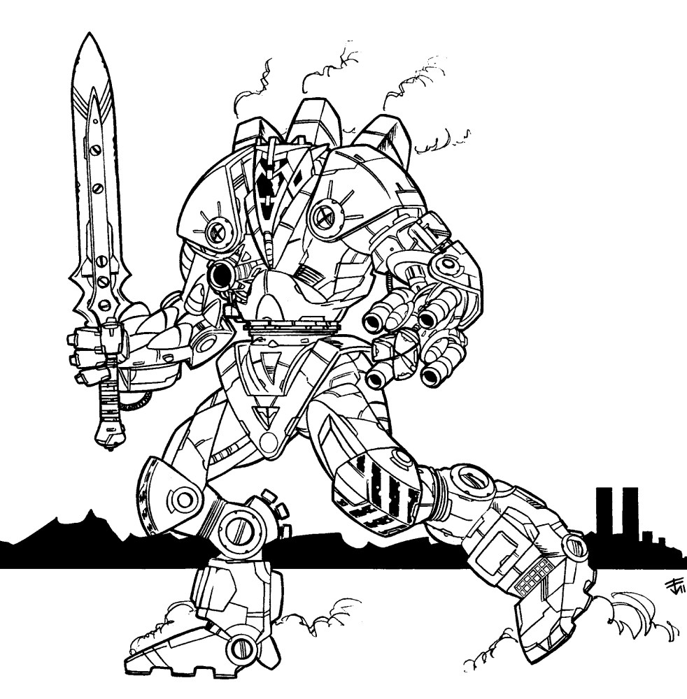
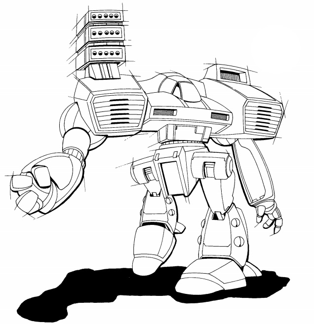
Looks great. Yeah they're much more similar in design than the art from the TROs and stuff but... let's be honest: a LOT of the 'Mechs needed a redesign. The biggest issue I've noticed is unbelievably thin legs - which FD is addressing in all of his artwork it seems. Here are some great examples of my biggest complaints:

Posted Image
Posted Image
Posted Image

Often feels like half of the BT universe is stuck in the '80s. If the trade off for avoiding more of that ^ is some more similarities in artistic elements - I'll take it. Besides, sometimes the variety goes a little too far and you have mechs that look like they're from Macross fighting stuff from the Gundam series alongside Warhammer Titans.

Edited by lahyenne, 24 November 2011 - 07:07 AM.


#40 EDMW CSN

    Member

  • PipPipPipPipPipPipPipPip
  • Knight Errant
  • Knight Errant
  • 1,073 posts
  • LocationOutreach

Posted 24 November 2011 - 07:11 AM

I always like FD's work. He makes the mechs, look plausible !


2 user(s) are reading this topic

0 members, 2 guests, 0 anonymous users