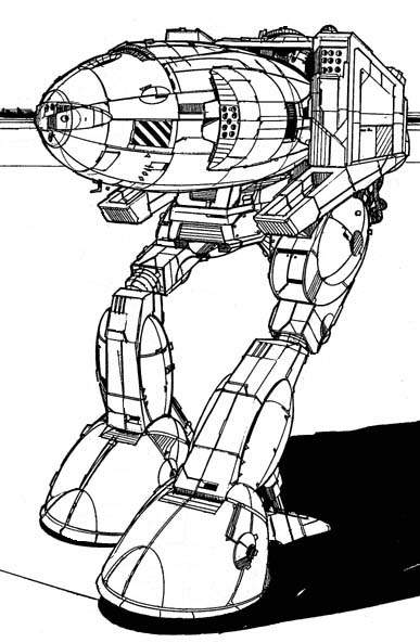
Stalker From Concept Art? Or Current Model
#21
Posted 13 December 2012 - 11:45 AM
#22
Posted 13 December 2012 - 11:47 AM
#23
Posted 13 December 2012 - 11:48 AM
 Tennex, on 13 December 2012 - 11:38 AM, said:
Because the post was emotionally charged. Despite how the forum goers seem, most people would rather say something is okay, than paint it as negative.
It said the stalker was ugly and many people said the stalker is supposed to be ugly.
This is poll completely neutral and preference based, "do you like it to look this way? or another way?"
#24
Posted 13 December 2012 - 11:49 AM
 AgroAntirrhopus, on 13 December 2012 - 11:28 AM, said:
I've read the article. Several times. What part of my statement of agreement indicated I didn't grasp the concept? I'm le confused.
That's because you're not used to people agreeing on forums
#25
Posted 13 December 2012 - 11:49 AM

#26
Posted 13 December 2012 - 11:51 AM
 Armorpiercer M82, on 13 December 2012 - 11:48 AM, said:
presentation i suppose. That poll doesn't exactly give an alternative either, where people can just look at it and go " i like this one, or i like this one."
The other poll asked people to say " i dont like this" or "i like this"
People prefer to not dislike things, so makes the poll biased
Edited by Tennex, 13 December 2012 - 11:52 AM.
#27
Posted 13 December 2012 - 11:52 AM
#28
Posted 13 December 2012 - 11:55 AM
I am disappoint.
Edited by pesco, 13 December 2012 - 11:55 AM.
#29
Posted 13 December 2012 - 12:04 PM
 stjobe, on 13 December 2012 - 11:49 AM, said:
Ah! Gotcha!
#30
Posted 13 December 2012 - 12:06 PM
#31
Posted 13 December 2012 - 12:22 PM
 Tennex, on 13 December 2012 - 11:47 AM, said:
The problem was that the arms where too low. Moving them forward would not fix the issue. Unless you moved them all the way to the tip of the nose. Then it would actually look worst then the mechwarrior 4 stalker, and I don't even think you can make a mech that looks as awful as that.
#32
Posted 13 December 2012 - 12:34 PM
 Tennex, on 13 December 2012 - 11:29 AM, said:
Just pick whichever one then lol. really a preference thing.
Theres really nothing we can do about it now. I just would appreciate it if any changes are made they would at least let us know. Since its a deviation from concept art and we were not allowed a chance for input before changes were made.
I looked forward to the Stalker and the Raven. But they changed both from concept and i really hate looking forward to a mech for weeks and being dissapointed
Are you FN serious here? Do you want this game to ever be finished? If the devs had to come back to YOU and get YOUR approval for every change they make from concept to live then we would never have ANYTHING finished. You people need to grow up and realize you aren't designing the game. 5 people will say it's great, 5 people say it's awful, who do you listen to in a situation like that?
I can just see the modelling team: "The original design is clipping, we're going to have to raise it just a bit."
Management: "Ok but let's discuss this change first with Tennex and his crew, I wouldn't want to change it too much from the concept without getting his ok first."
My god some people are so petty and self centered it's INSANE.
#36
Posted 13 December 2012 - 12:52 PM
I'm just curious how it scales compared to the Fatlas and the
#37
Posted 13 December 2012 - 12:53 PM
#38
Posted 13 December 2012 - 01:25 PM
The Stalker is the assault mechs assault mech, up until after the clan invasion quite possibly *the* most common assault mech. I don't really mind that they changed the legs to bird legs, I think it looks better then the original counterbalanced but leaning human legs seen in the pic at the end of my post. IMO, upsize the torso massively, it *should* extend sideways past the hips, and it definitely should extend forward more, currently it looks like someone smashed a Catapult...

#39
Posted 13 December 2012 - 01:27 PM
 OneManWar, on 13 December 2012 - 12:34 PM, said:
Are you FN serious here? Do you want this game to ever be finished? If the devs had to come back to YOU and get YOUR approval for every change they make from concept to live then we would never have ANYTHING finished. You people need to grow up and realize you aren't designing the game. 5 people will say it's great, 5 people say it's awful, who do you listen to in a situation like that?
I can just see the modelling team: "The original design is clipping, we're going to have to raise it just a bit."
Management: "Ok but let's discuss this change first with Tennex and his crew, I wouldn't want to change it too much from the concept without getting his ok first."
My god some people are so petty and self centered it's INSANE.
Uhh...it's a F2P game that relies on people making microtransactions for it to be successful. People buy Mechs. Mechs cost in-game credits or money. If people don't like the way it looks, they will not buy it. No ticky, no laundry. So, you better listen to the people making comments about models, weapons, balance, etc. etc..THEY are the ones keeping this game alive. No microtransactions, no Mechwarrior game. If they leave, this game dies. PERIOD.
If you show people one thing and then produce something that different, don't expect them to just switch their opinions. We get it, YOU want the game done ASAP. Apparently, producing something as quickly as possible will ensure the game gets completed in your timeframe.
Do, I want the game done? Yes, but not at the expense of quality.
#40
Posted 13 December 2012 - 01:30 PM
1 user(s) are reading this topic
0 members, 1 guests, 0 anonymous users


