Stinks, give me back the old one.
Can't find my modules.

Ui
Started by Banjar, Feb 04 2014 12:47 PM
47 replies to this topic
#2
-

-

- Ace Of Spades

- 3,806 posts
Member
- LocationStuck on a piece of Commando in my Ice Ferret

Posted 04 February 2014 - 12:53 PM
Really? I think it smells nice.
#3
-
-
- Legendary Founder

- 5,469 posts
Member
- LocationEast Coast
Posted 04 February 2014 - 01:02 PM
Read before writing.
#4
-

-
- Bad Company

- 174 posts
Member
- LocationIn transit, ETA unknown.
Posted 04 February 2014 - 01:08 PM
Anyone figure out how to save weapons in the slot you want them? That was supposed to be a feature with the new UI. I saved a BLR-1G with 2 ERLL in the topmost torso slots. Launch the game and they revert to random. What is the point of assigning weapon groups if you still can't pick the correct slot?
#5
-
-
- The 1 Percent
- 57 posts
Lord of Urbanmechs
Posted 04 February 2014 - 01:11 PM
has any one figured out how to sell weapons? xD
#6
-

-
- Little Helper
- 68 posts
Member
Posted 04 February 2014 - 01:20 PM
 Whitewolf95, on 04 February 2014 - 01:11 PM, said:
has any one figured out how to sell weapons? xD
Go to home -> inventory -> wep systems. click wep. then sell
#7
-

-
- Elite Founder
- 23,969 posts
Member
Posted 04 February 2014 - 01:22 PM
hunt for the module minigame is new "feature"
#8
-
-
- 4,589 posts
Member
- LocationCanada, eh
Posted 04 February 2014 - 01:30 PM
The nerve of PGI, expecting that their users had the ability to take 5 minutes to learn a new UI.
THE NERVE
THE NERVE
Edited by cSand, 04 February 2014 - 01:31 PM.
#9
-
-
- Elite Founder
- 2,269 posts
Member
- LocationThe cockpit of my Jenner
Posted 04 February 2014 - 01:32 PM
How does this have anything to do with a "Mechs and Loadouts" subforum?
#10
-
-
- 43 posts
Member
- LocationRhode Island, US
Posted 04 February 2014 - 01:59 PM
It is in this forum because of the clunky, crappy interface that pervents me from managing my mechs and loadout.
The new UI is a huge obstacle. It displays a lot of low interest stats and hides what I want to know and do to play a game.
Caused me to quit after ONE game this afternoon. Now that is a lousy product.
The new UI is a huge obstacle. It displays a lot of low interest stats and hides what I want to know and do to play a game.
Caused me to quit after ONE game this afternoon. Now that is a lousy product.
Edited by Banjar, 04 February 2014 - 01:59 PM.
#11
-
-

- 629 posts
Member
Posted 04 February 2014 - 02:14 PM
Why make this HUUUUGE interface for us to work with then make HUUUUGE icons with such tiny text that strain your eyes. Everything looks so zoomed in an clogs up every inch and makes every bit info you want to see tiny as heck.
also can't you put something to separate equipped items and modules from each other instead of just colored columns where the only thing separating them is a white text?
And another point. Why could not the mechlab configuration window be in one big section like in the Smurfy mechlab???
Click on Left arm? Tiny equipment window on the right with a HUUUUUUUUGE inventory screen in the middle that makes no frakking sense!
It should have a been a tiny inventory window on the right with ALL the mech sections in the middle of the screen. It would be so much better! You could highlight the section and the inventory window would display equipment available for that section. It kinda already does that but the inventory window and configuration screen are wrong. Swap them, please!
Mech customization should be easy and work smoothly. But with what we have now I have to move the mouse all over the screen, faceplant into the screen to read the text and do lots of unnecessary actions to perform a simple task.
It's NOT a good interface in this current state.
Edited by Funky Bacon, 05 February 2014 - 03:13 AM.
#12
-

-
- Overlord
- 772 posts
Member

Posted 04 February 2014 - 02:16 PM
its easy.
go to inventory>mechs>click through mechs, modules appear in loadout, same as it used to be.
go to inventory>mechs>click through mechs, modules appear in loadout, same as it used to be.
#13
-
-
- Knight Errant
- 1,466 posts
Member
Posted 04 February 2014 - 03:29 PM
DEMAX51, on 04 February 2014 - 01:32 PM, said:
How does this have anything to do with a "Mechs and Loadouts" subforum?
At first I would agree with you, but then I think that properly using the MechLab is pretty much a requirement for discussing Mech Loadouts.
For example I am now having a hell of a time figuring out what sized engines each of my mechs has. The only thing I have found is to actually dive into the mechlab, two menus deep and look at it directly. I don't see anywhere else where your engine type and size would be listed.
Or heat sink counts for that matter. As near as I can tell you have no info on how many heat sinks your mech has at all.
Hell, I would be happy if the listed loadout would resemble the old TRO books format, just changing the speed from hexes per turn to KPH values and keep the rest.
Edited by Hans Von Lohman, 04 February 2014 - 03:31 PM.
#15
-

-
- Ace Of Spades

- 457 posts
Member

Posted 04 February 2014 - 05:48 PM
UI 2.SLOW
I am sorely disappointed with this very non-intuitive piece of crap. Loading a mech out feels like I am entring nuclear launch codes. How many frakking menus do we need to change an engine? And forget about finding modules.
How about this for a loadout screen...
Big fornicating paperdoll in the middle. Click a section, get a menu down the left. Choose component type, drag and drop from menu. Simple. What we have now is a shitbeast of menu levels and completely unneeded graphics.
Really? This took a year to develop?
#16
-

-
- Ace Of Spades

- 12 posts
Member
Posted 04 February 2014 - 06:12 PM
How in the world do I save my modified loadouts? I don't see a save button and it discards my changes if I exit the mechlab.
#17
-
-
- Philanthropist

- 606 posts
Member
Posted 04 February 2014 - 06:18 PM
Norgenhiemer, on 04 February 2014 - 06:12 PM, said:
How in the world do I save my modified loadouts? I don't see a save button and it discards my changes if I exit the mechlab.
"Checkout" in the lower left is the new save button.
If there's no price listed, it won't cost you anything.
Just like the old Save button, different word.
[Personally I dislike it. But I'm an old hand.]
Edited by DanNashe, 04 February 2014 - 06:19 PM.
#18
-
-
- Ace Of Spades
- 12 posts
Member
Posted 04 February 2014 - 06:20 PM
DanNashe, on 04 February 2014 - 06:18 PM, said:
"Checkout" in the lower left is the new save button.
If there's no price listed, it won't cost you anything.
Just like the old Save button, different word.
[Personally I dislike it. But I'm an old hand.]
Thanks a lot! That was driving me nuts. What a horrible name for the button though. The word "Checkout" is ingrained in my mind as something I do when I'm spending money in an online store. Knowing that MWO is a game with micro transactions I thought the checkout button was something to be used when spending real money.
Edited by Norgenhiemer, 04 February 2014 - 06:24 PM.
#19
-

-
- 40 posts
Member
- LocationLow Earth Orbit
Posted 04 February 2014 - 06:40 PM
Hans Von Lohman, on 04 February 2014 - 03:29 PM, said:
At first I would agree with you, but then I think that properly using the MechLab is pretty much a requirement for discussing Mech Loadouts.
For example I am now having a hell of a time figuring out what sized engines each of my mechs has. The only thing I have found is to actually dive into the mechlab, two menus deep and look at it directly. I don't see anywhere else where your engine type and size would be listed.
Or heat sink counts for that matter. As near as I can tell you have no info on how many heat sinks your mech has at all.
Hell, I would be happy if the listed loadout would resemble the old TRO books format, just changing the speed from hexes per turn to KPH values and keep the rest.
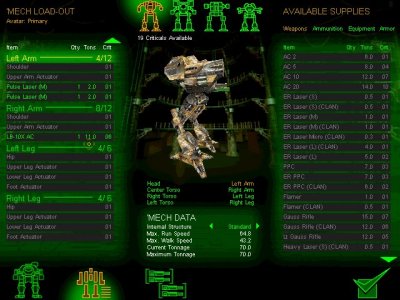
In addition, you can't look at a basic loadout of what your mech carries. If you already have a mech built, or are looking at a new one, rather than have an interface that shows what gear a mech carries, you see nothing.
The old interface allowed you to hover over different locations, hover over the hardpoints, hover over the locations, and see the equipment.
It wasn't great, but was somewhat intuitive.
This is easy to navigate - you can see where your gear is, you can see a gear summary, and armor is easy to read:

Things are aligned like how the mech stands.
This is easy to navigate - you can see locations and gear at a glance, and work with it from there:

This is easy to navigate (arguably the best part of the old interface):

You can hover over your limbs for hardpoints, you can hover over your equipment details on where it's located, you can see what your mech is loaded out with in the summary at right.
And individual locations were just as easy, with a diagram that makes sense, and represents the layout of the mech itself.
You could select locations, and during build they were aligned with what you're looking at.

And you could zoom back out and get your summary of the mech with your loadout listed. Would've been handy to see an ammo counter someplace - that would've been helpful, but overall it wasn't too bad.
This 2.0 crap is crap, where every location is compacted on the left side of the screen, they can't all be seen at once, equipment and hardpoints are hidden under menus, the location loadout shows up on the right while the list of locations is on the left, icons are pointlessly huge for no reason (the only difference in the vast majority of engines is the numbers - not the pictures) and etc:

This is counterintuitive to decades of Battletech and Mechwarrior games. The interface is the easiest thing to get right. You even can do a vertical list without making it difficult to use.
You don't split locations across the screen, and make them only accessible one at a time - you put them together.
Simple, easy to read, and a complete summary, and it even makes the vertical menu readable if that was something that somebody at PGI just had to have:
But see that - there's a "current loadout" tab that shows what you carry, that gives basic info on the whole mech, and lets you know what your build is.
UI2 doesn't have any of that.
It was "fixed" into being overcomplicated, counterintuitive, incomprehensible to new players and old.
-
The ability to look at all purchaseable mechs at once is nice... but you can't look at their loadouts or locations either... which defeats the whole damned purpose.
#20
-
-
- Elite Founder
- 888 posts
Member
Posted 04 February 2014 - 08:22 PM
TheMightyServo, on 04 February 2014 - 06:40 PM, said:
In addition, you can't look at a basic loadout of what your mech carries. If you already have a mech built, or are looking at a new one, rather than have an interface that shows what gear a mech carries, you see nothing.
The old interface allowed you to hover over different locations, hover over the hardpoints, hover over the locations, and see the equipment.
It wasn't great, but was somewhat intuitive.
This is easy to navigate - you can see where your gear is, you can see a gear summary, and armor is easy to read:
Things are aligned like how the mech stands.
This is easy to navigate - you can see locations and gear at a glance, and work with it from there:
This is easy to navigate (arguably the best part of the old interface):
You can hover over your limbs for hardpoints, you can hover over your equipment details on where it's located, you can see what your mech is loaded out with in the summary at right.
And individual locations were just as easy, with a diagram that makes sense, and represents the layout of the mech itself.
You could select locations, and during build they were aligned with what you're looking at.
And you could zoom back out and get your summary of the mech with your loadout listed. Would've been handy to see an ammo counter someplace - that would've been helpful, but overall it wasn't too bad.
This 2.0 crap is crap, where every location is compacted on the left side of the screen, they can't all be seen at once, equipment and hardpoints are hidden under menus, the location loadout shows up on the right while the list of locations is on the left, icons are pointlessly huge for no reason (the only difference in the vast majority of engines is the numbers - not the pictures) and etc:
This is counterintuitive to decades of Battletech and Mechwarrior games. The interface is the easiest thing to get right. You even can do a vertical list without making it difficult to use.
You don't split locations across the screen, and make them only accessible one at a time - you put them together.
Simple, easy to read, and a complete summary, and it even makes the vertical menu readable if that was something that somebody at PGI just had to have:
But see that - there's a "current loadout" tab that shows what you carry, that gives basic info on the whole mech, and lets you know what your build is.
UI2 doesn't have any of that.
It was "fixed" into being overcomplicated, counterintuitive, incomprehensible to new players and old.
-
The ability to look at all purchaseable mechs at once is nice... but you can't look at their loadouts or locations either... which defeats the whole damned purpose.
wait wait wait... your telling me that PGI over complicated something and then failed to explain it properly?
surly you jest
1 user(s) are reading this topic
0 members, 1 guests, 0 anonymous users


