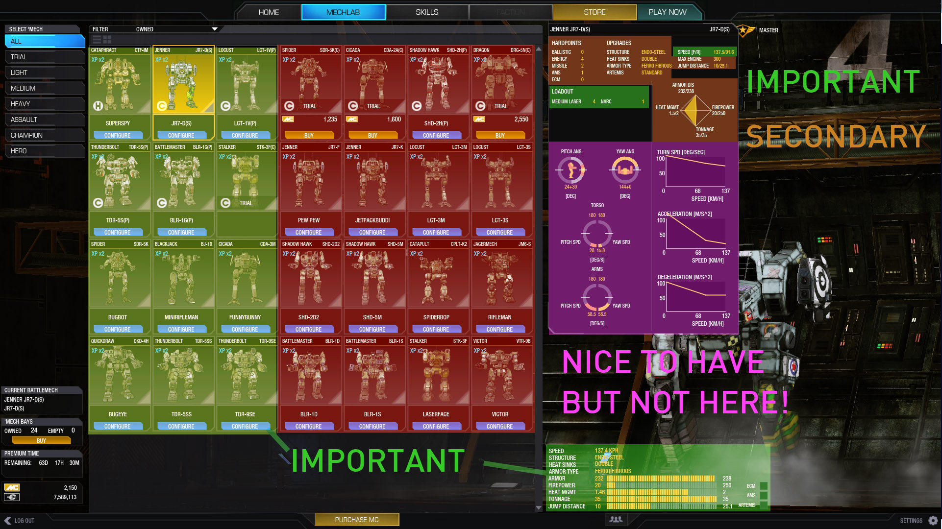
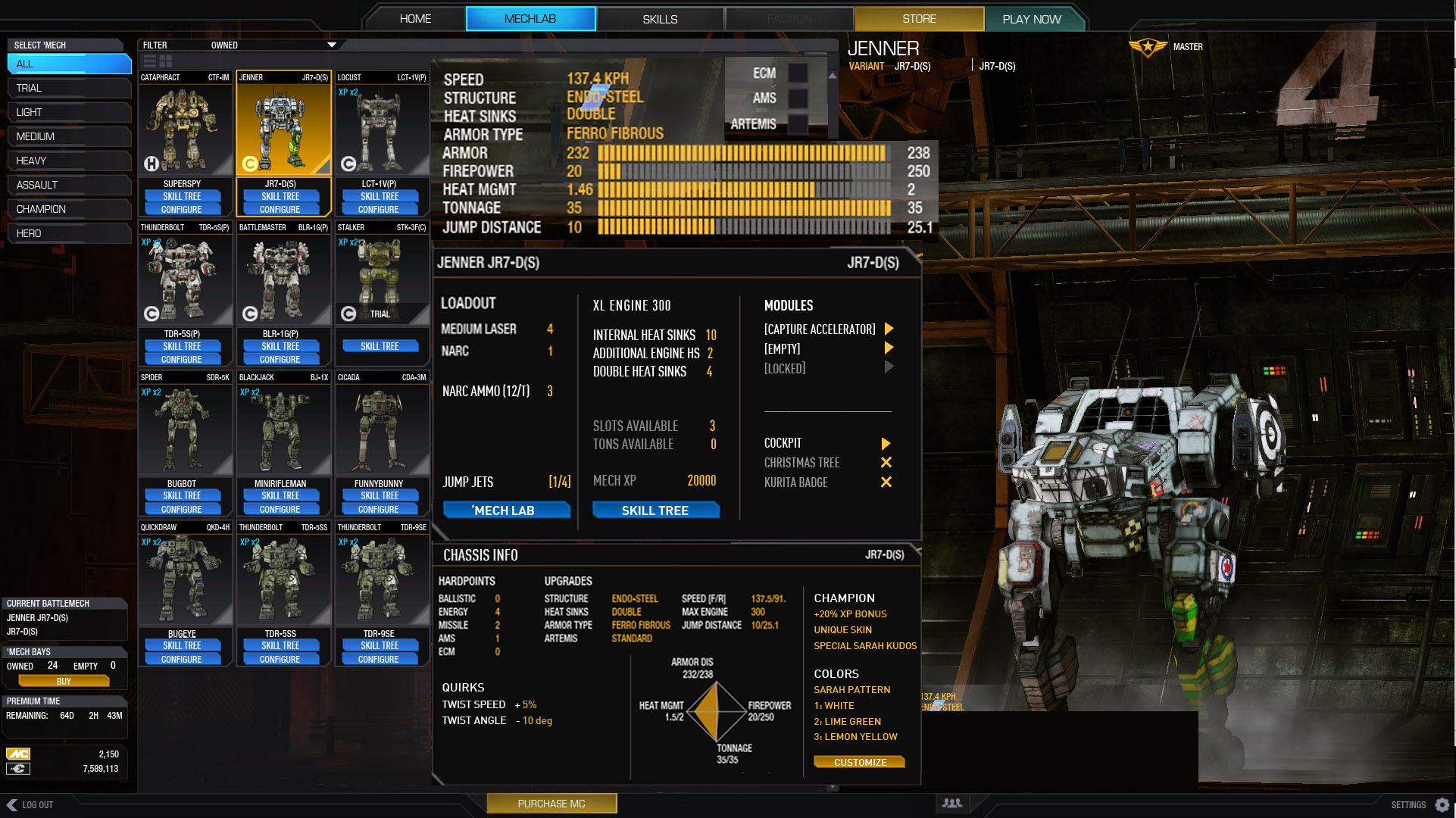
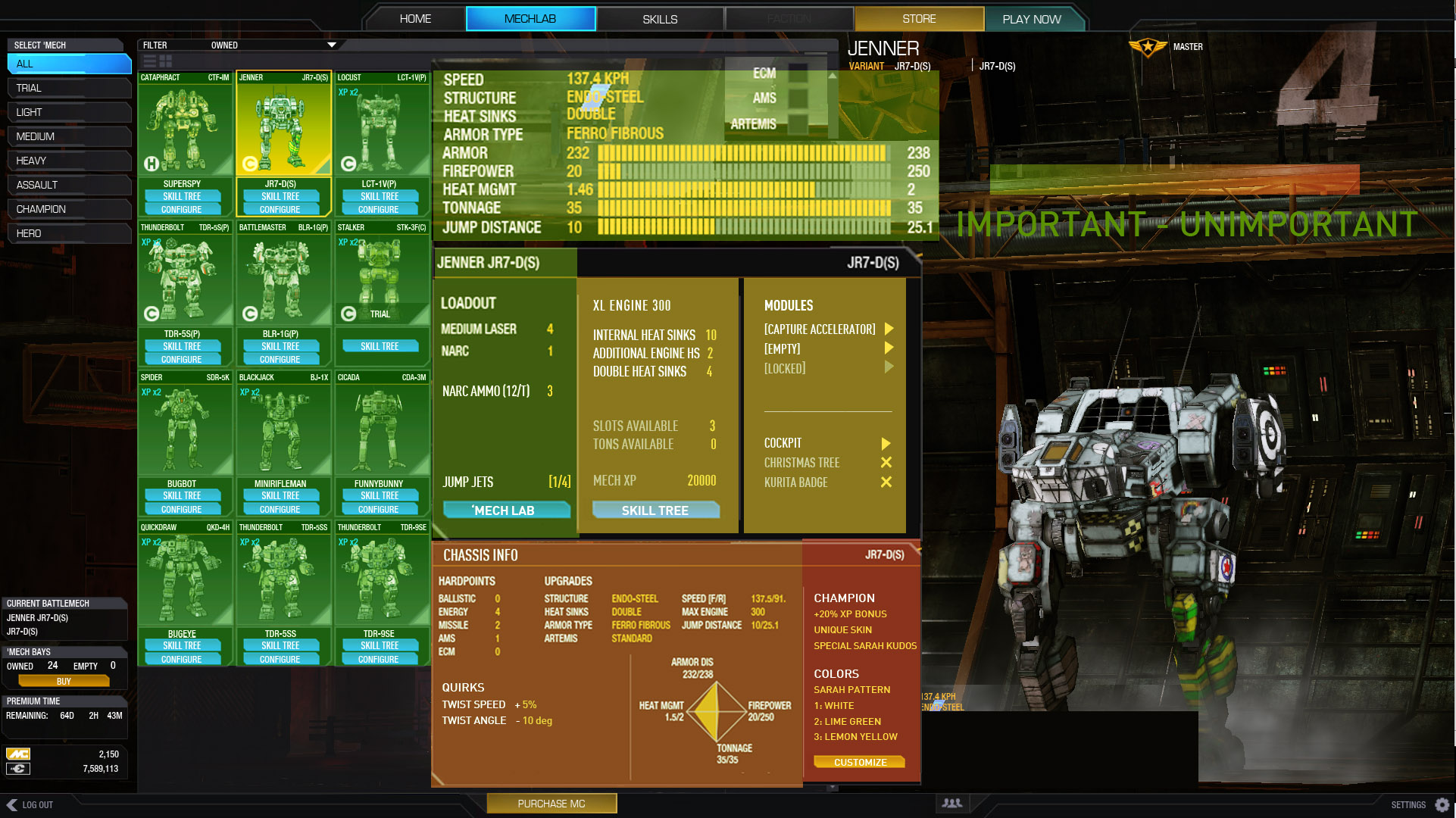
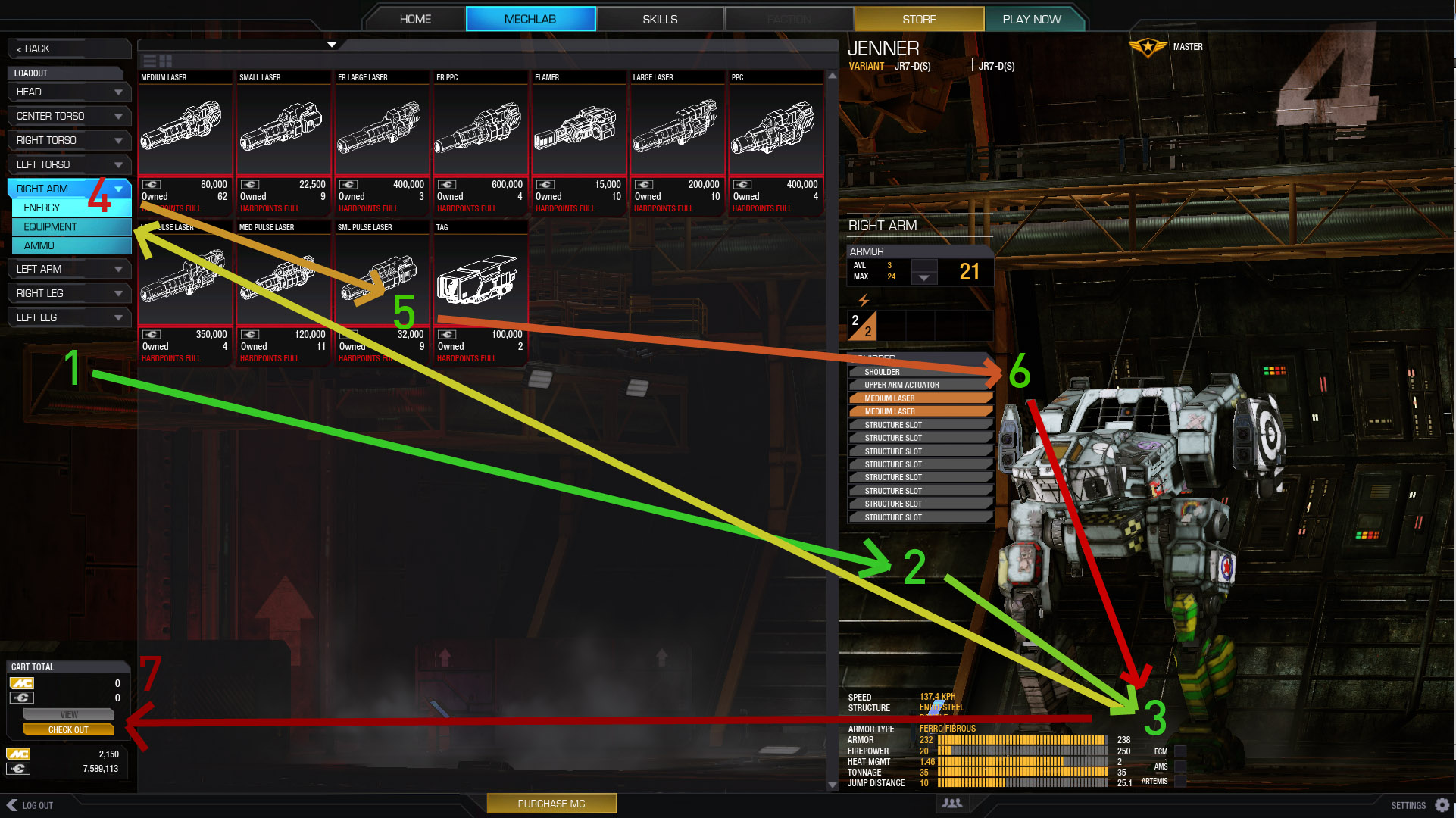
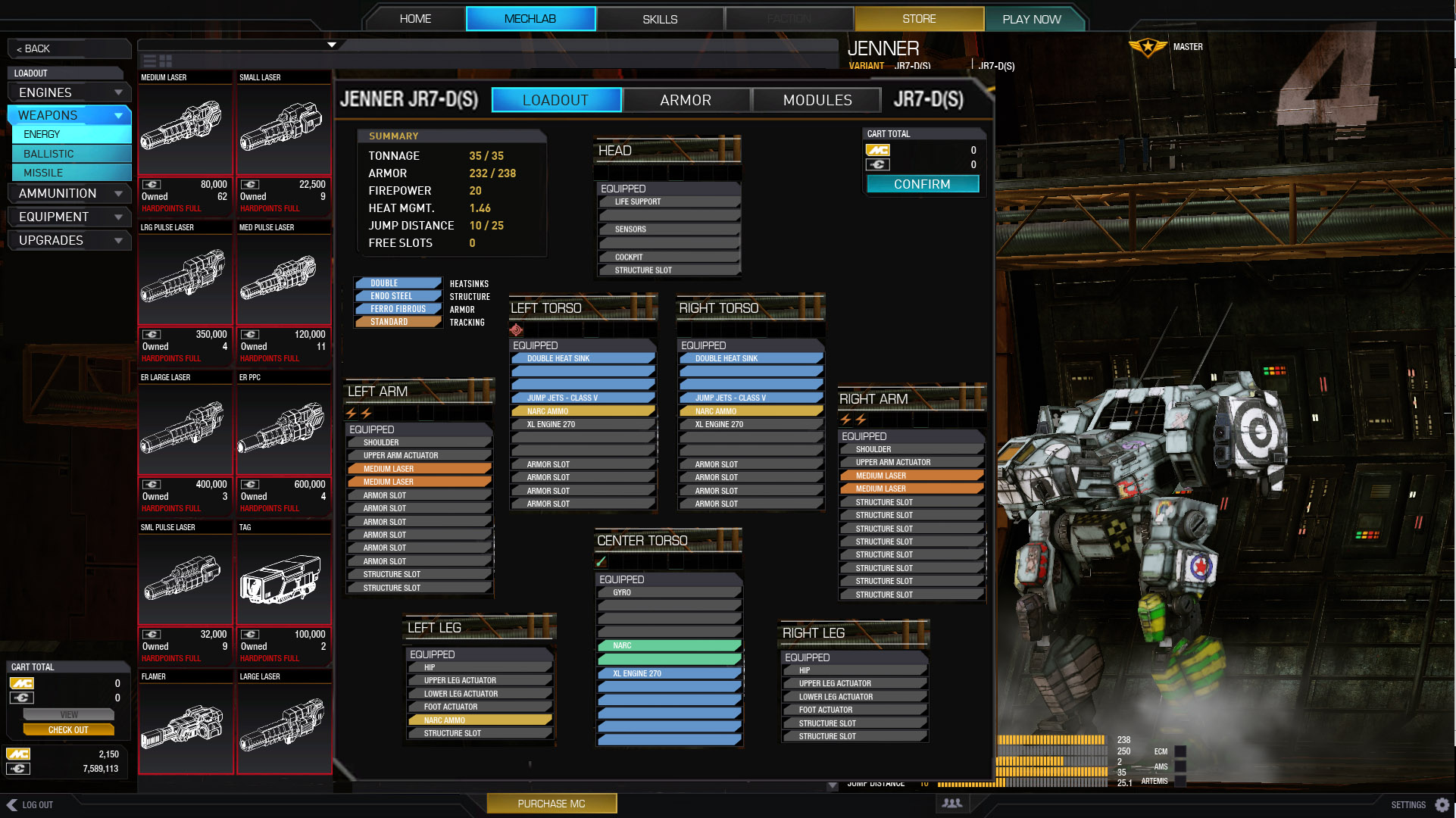
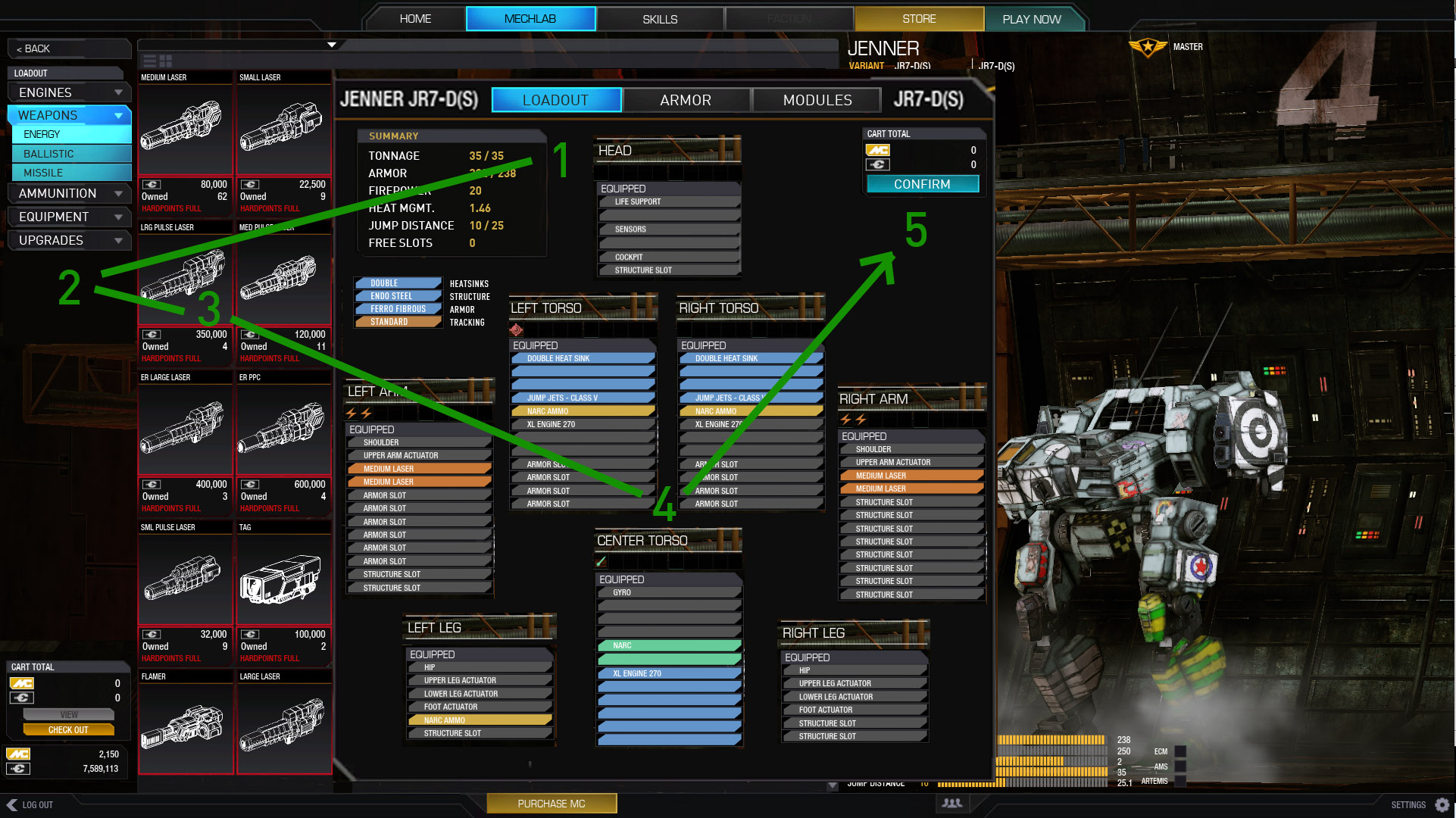
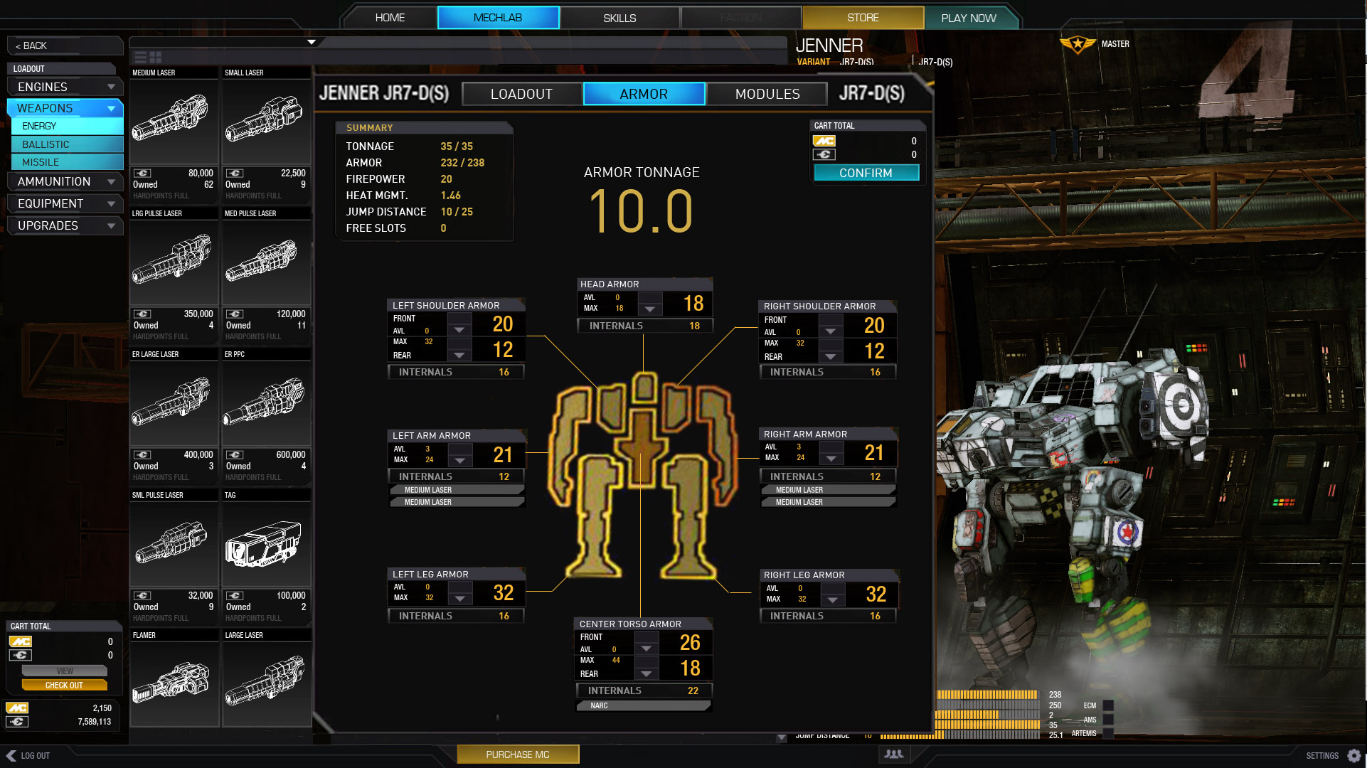
But before I dive into the UI design, I will point out all the offending items I currently see (granted there are more) with the UI 2.0 Mechlab, and focus on the Mechlab as that is the bread and butter. Diagrams are always easier than large blocks of text. Hopefully this image hosting site doesn't fall through.

Ok, as to my suggestions, for the first one, besides making it look more like smurfy there are a few things going on here.
- The washed out green, yellow, orange, and blue colours to denote missiles, ammo, and energy weapons, and engines respectively. I darkened those slightly to make it easier to read the text. When you have white text siting on top of a washed out colour, it makes it difficult to read.
- Streamlined the bulky armor panes into something more compact but still readable. Went with plus and minus, instead of up and down, because you're not moving numbers, or things up and down, you're adding and subtracting numbers, plus and minus.
- Removed fruitless panes that were just black boxes.
- Moved the hardpoints to the top because it looks neater that way.
- Removed hardpoint icons, because that was straight from kindergarten, if you'll excuse my bluntness, sorry.
- Reduced the panes girth, as there no point to them being that wide. It's still able to fit 4 hardpoint fractions, and in the oft chance a rare future Mech should happen to fit all 5 (missile, energy, ballistic, ams, ecm) why not just lump ams and ecm in the same category of equipment, in the UI only.
- Treated the image in photoshop, the same way you would treat an overexposed image. Found out that those little computers in the corner, actually have stuff on them.

My next set of suggestions pertains to the menu buttons on the side.
- Firstly, I've removed 'Loadout' and replaced it with 'Weapons,' 'Equipment,' 'Engines,' and 'Ammo.' So basically, when you want to go back and forth between different sections, you don't have to do several clicks it's just all there on the side, you just click once.
- Whichever section you are in, will stay a blue colour on the menu buttons. For example on this image, we're in the 'Engines' section, so the button for that will stay blue. I noticed this happening in the 'Loadout' section but not so much others. Basically, this is something you need, so that the user knows exactly where they are at all times, so the UI doesn't become confusing or alien.
- Removed 'Check out' button, and replaced with 'Save 'Mech config.' The 'Save 'Mech config' button only appears whenever there has been a change to your Mech, so that way, you know if there are unsaved changes or not, I also made it yellowish in colour as to distinguish it apart from the other buttons.

Ok, the last image. I know I don't have 2.5 tones free, but just for example, pretend that I do have 2.5 tones free.
- Skooched the Mech over a bit to make room.
- Changed the items window, from obnoxiously large icons format, to a list format, and shrunk it down to a respectable size.
- Added Headers to give more control over the item panes. The Headers have plus and minus buttons on them to expand or collapse each category.
- Moved all the non-critical information to the item info window, and added 'slots,' and 'tones.'
- Increased the lightness on the item panes, to better differentiate them, and move them slightly more apart.
- Instead of have text "that's too heavy" printed over and over, simply turned the free tonnage required number to red, and grayed out the pane. This green is for go, and red is for stop thing doesn't really work like that. When something is grayed out, everyone intrinsically knows that you can't use it, it's different for red.
- Put all the information about your Mech in the Mech info window, shortened the bars as there's no reason for them to be that long, and added a back bg with 60% opacity in the chosen style of specific chamfer edges. Some things you can get away with, but strictly speaking, you really can't have bits of stray text and numbers just floating around the joint.
- Tried to put as much info as possible in the item info window, and used the larger icon, because, well, it looks better.

Revised the layout after Kushko gave me an idea. Basically it now has 90% more Mech porn. Just for the example, pretend that the list doesn't repeat XL 170 more than once, but here's what I did.
- Moved the Mech right over.
- Extended the items list all the way to the bottom, so it has more height, placed it on the left side.
- Changed the item info from a vertical window to a horizontal one. Removed the bars, as those just aren't needed. Placed it to the right of the items list.
- Placed the Mech sections under the item info, and right of the items list.
- Toned Mech info bg opacity down to 50%, so you can see the Mech better. Placed to the right of the Mech section near the bottom.

Edited by Moromillas, 15 February 2014 - 12:06 AM.


