Jump to content

New Ui Terrible, Horrible, Worst Thing In Gaming. We Want The Old Ui Back.


103 replies to this topic

#1 Shadowdusk

    Member

  • PipPipPip
  • The Forbidden
  • The Forbidden
  • 72 posts
  • LocationIn the depths of nowhere.

Posted 16 June 2015 - 04:20 PM

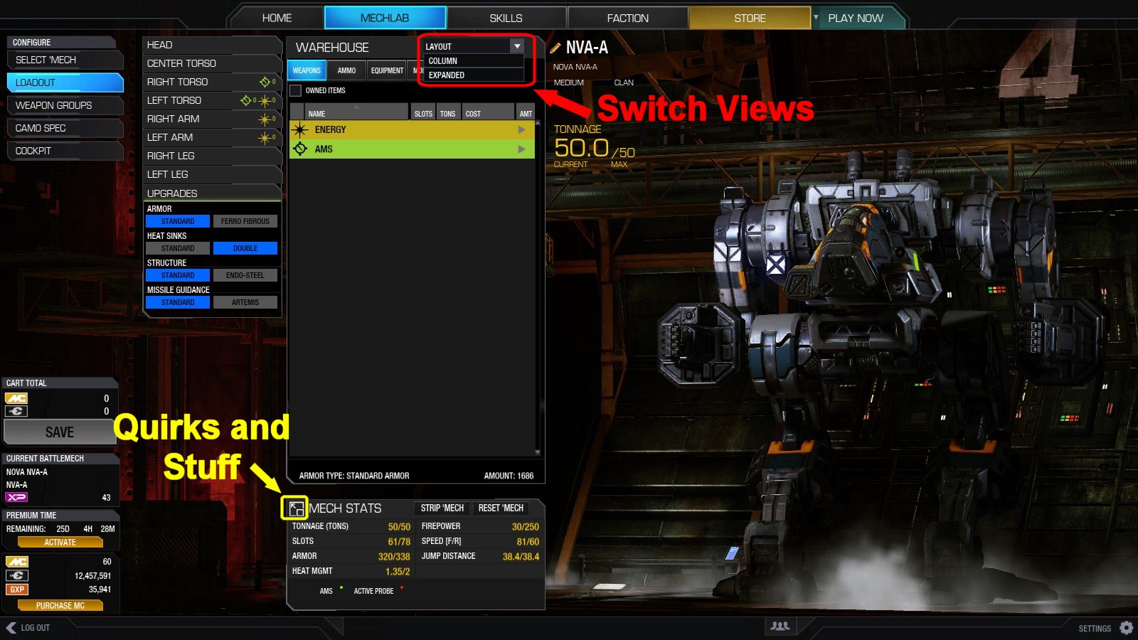
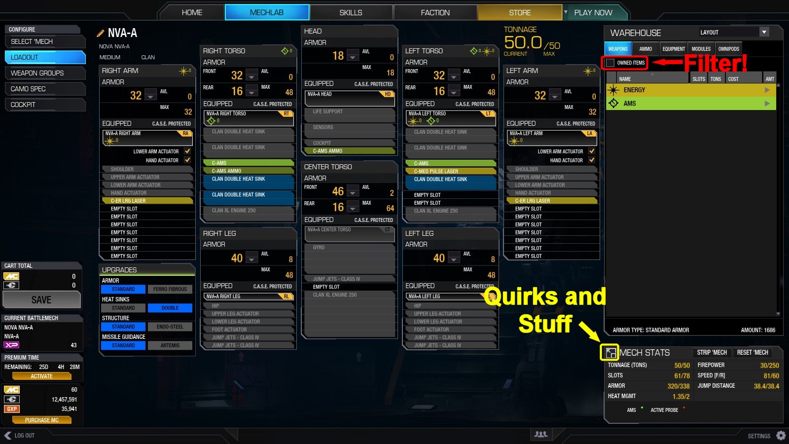
This is the worst thing I have ever experienced in terms of UI in ANY game. I find myself dicking around in this UI longer then I would have in the old UI. Does anyone know how to see the perks the mechs have anymore?

Did PGI removed the ability to see what quirks mechs have? How do I see what quirks mechs have without having to tab out and spend unnecessary amount of time looking at OTHER sites instead of the ingame UI like we used to. I spent the past half hour trying to see what perks my firebrand have and what current perks my Jaguar has and I can't freaking find them without having to go out of my way to another site to see them.

This UI is terrible. Why is PGI making these things harder and harder and more confusing? The old UI was way better and more efficient. This is just wrong.

Edited by Shadowdusk, 16 June 2015 - 04:31 PM.


#2 Ironwithin

    Member

  • PipPipPipPipPipPipPipPipPip
  • Overlord
  • Overlord
  • 2,613 posts
  • LocationGermany

Posted 16 June 2015 - 04:59 PM

It wouldn't let me quote Wildstreak's post so I just blatantly stole his images (after liking the post):

Posted Image
Posted Image

#3 GnawTsatyr

    Member

  • PipPipPipPipPipPipPip
  • Overlord
  • Overlord
  • 730 posts
  • LocationFrog-humping you like a Jenner

Posted 16 June 2015 - 05:09 PM

If you're on a 720p TV like I am, then the expanded view does not work. None of the convenient "Smurfy"-type things work for me.

I would also like to point out that my Mechstats window expands to the left of my screen, so my quirks are hidden by the Premium Time and C-Bill/MC/GXP window. The only way I am able to see my quirks are by going to the store. Consequently, I am unable to view quirks for any mechs that are not for sale in the Store tab.


*EDIT*

My 20 minutes of patching and repair tooling have finally finished and I am happy to point out that my Mechstats window now expands to the right and I am able to see my quirks again. Thank you for fixing this, PGI.

I am still not able to use Expaned View for my Warehouse, but being able to see my quirks without leaving the Mechlab is a step in the right direction.

Edited by GnawTsatyr, 16 June 2015 - 05:13 PM.


#4 Kinead

    Member

  • Pip
  • The Scythe
  • The Scythe
  • 16 posts

Posted 16 June 2015 - 06:07 PM

The new UI is still garbage. Mech select has become a stupid list. It's the same garbage they tried with CW but at least for that portion it made sense. Now they've stolen all my mechbays because it doesn't feel like anything physical anymore, I can't twist my mechs around, take a look at each of them. It's just this big ugly ass list of stupid information I couldn't give a F about anymore. They've stolen any of the magic or fun of the game away and turned it into Meta-game lists and numbers. Woo! Some of us actually played the game for the feel and they've gone ahead and ruined that. Thanks PGI.

#5 Slambot

    Member

  • PipPipPipPipPipPip
  • The Warden
  • The Warden
  • 203 posts

Posted 16 June 2015 - 08:41 PM

Dont you think you are being a bit overly critical? I mean the things you mention as garbage are really minor changes. And if this is the worst UI you have even seen in gaming, then you dont play many games.

#6 Troutmonkey

    Member

  • PipPipPipPipPipPipPipPipPip
  • Moderate Giver
  • Moderate Giver
  • 3,776 posts
  • LocationAdelaide, Australia

Posted 16 June 2015 - 09:17 PM

View PostSlambot, on 16 June 2015 - 08:41 PM, said:

Dont you think you are being a bit overly critical? I mean the things you mention as garbage are really minor changes. And if this is the worst UI you have even seen in gaming, then you don't play many games.

This is the worst UI I've played with in years, and I play quite a lot of games.

There are so many issues with it it would take too long for me to list them all. Anyone who's studied UI could easily see how PGI have failed even the most basic of UI Heuristics test.

Bad Fonts, bad Scaling, too many clicks, needless drop down menus, needless prompts, prompts without enough context ("Item Redeem"), too much mouse travel, confusing button labels, confusing icons, poor sorting/grouping of items, inconsistent behaviour, wasted screen space, too much information to remember between screens - the list goes on.

While each is a "minor" issue on it's own, PGI have managed to combine everything that could be wrong with a UI into a single, horrible interface.

We have been consistently calling PGI out on this, especially when they opened the test servers for UI2.0 and the latest update. Both times community suggestions and fixes were completely ignored. The latest update fixes one issue (weapon sorting) but still leaves many many more.

#7 Kmieciu

    Member

  • PipPipPipPipPipPipPipPipPip
  • Urban Commando
  • Urban Commando
  • 3,437 posts
  • LocationPoland

Posted 16 June 2015 - 10:31 PM

The quirk list is particularly atrocious to use. When you expand the "mech stats" window, it covers the left leg section. And you have to scroll to see all the quirks!

Warehouse and Mech stats windows should be scalabe. If it's beyond their ability, they should make the mech stats window twice as tall , so all the quirks are displayed.

#8 Anunknownlurker

    Member

  • PipPipPipPipPipPip
  • Bad Company
  • Bad Company
  • 362 posts
  • LocationBetween here and there

Posted 16 June 2015 - 11:11 PM

Lot of fuss about nothing. It's just a UI, seen worse, seen better. You can't really believe PGI is actually trying to make things worse? Where would be the point of that? Their team clearly thinks these changes have been positive and, therefore, if you don't agree you should outline your issues clearly, positively and calmly (i.e. not "this is the worst UI ever"), and propose alternatives which would work for you.

@Troutmonkey - whilst I agree with you to a certain extent I do not have the same issues in the mechlab,it's OK for me but then I have only played for a few months and expect to have to work a bit to navigate around.

Yes, there are issues and I am sure that, given time and enough negative feedback and positive solutions, most of them will be sorted.

#9 Modo44

    Member

  • PipPipPipPipPipPipPipPipPip
  • Bad Company
  • 3,559 posts

Posted 16 June 2015 - 11:31 PM

Please cut the "we" from your atrocious thread title. You only speak for yourself.

#10 Telmasa

    Member

  • PipPipPipPipPipPipPipPip
  • Bad Company
  • Bad Company
  • 1,548 posts

Posted 17 June 2015 - 12:25 AM

It takes a lot of nerve to yell about UI changes when people have been beating their chests about how awful the last UI was for eons. Have a little patience and play with this one awhile before giving a verdict.

#11 MarineTech

    Member

  • PipPipPipPipPipPipPipPipPip
  • The Patron
  • The Patron
  • 2,969 posts
  • LocationRunning rampant in K-Town

Posted 17 June 2015 - 01:13 AM

SOMEBODY MOVED MY CHEESE!!!!

Posted Image


#12 Jay Kerensky

    Member

  • PipPipPipPipPipPip
  • Legendary Founder
  • Legendary Founder
  • 209 posts
  • LocationJumpship in the Periphery

Posted 17 June 2015 - 03:15 AM

Posted Image

#13 Ironwithin

    Member

  • PipPipPipPipPipPipPipPipPip
  • Overlord
  • Overlord
  • 2,613 posts
  • LocationGermany

Posted 17 June 2015 - 03:42 AM

View PostJay Kerensky, on 17 June 2015 - 03:15 AM, said:

Posted Image


I see what you did there.

#14 Idealsuspect

    Member

  • PipPipPipPipPipPipPipPipPip
  • The 1 Percent
  • The 1 Percent
  • 2,127 posts

Posted 17 June 2015 - 03:44 AM

Change modules from mech to mech is a real pain.. but i am sure the dev don't feel it as they don't play their own game or UI will be different for sure...

PS: It's a good way for sell more modules coze i have buy one or 2 module i didn't need just too lazy for search where they are and too lazy for long clicking adventures...

#15 DrSlamastika

    Member

  • PipPipPipPipPipPipPip
  • Ace Of Spades
  • Ace Of Spades
  • 702 posts
  • LocationSlovakia

Posted 17 June 2015 - 03:52 AM

UI and mechlab is great, but mech sellection is just wierd . . .

#16 Gallowglas

    Member

  • PipPipPipPipPipPipPipPip
  • Ace Of Spades
  • Ace Of Spades
  • 1,690 posts

Posted 17 June 2015 - 04:09 AM

Mech selection definitely took a step backwards, but most of the rest seems okay once you learn how to get into expanded view.

#17 Kmieciu

    Member

  • PipPipPipPipPipPipPipPipPip
  • Urban Commando
  • Urban Commando
  • 3,437 posts
  • LocationPoland

Posted 17 June 2015 - 04:52 AM

View PostJimmy DiGriz, on 16 June 2015 - 11:11 PM, said:

You can't really believe PGI is actually trying to make things worse? Where would be the point of that?

Yes, I think they are actively trying to discourage module and engine swapping by making it as cumbersome as possible. They think they will make me buy premium time, in order to grind C-Bills for more modules.

Guess what? I've got banked premium time I do not wish to activate. I rather spend my free time (and money!) on some other activity that is less frustrating than this.

I encourage everyone who is dissatisfied with the current UI to do the same.

Edited by Kmieciu, 17 June 2015 - 04:53 AM.


#18 Anunknownlurker

    Member

  • PipPipPipPipPipPip
  • Bad Company
  • Bad Company
  • 362 posts
  • LocationBetween here and there

Posted 17 June 2015 - 05:10 AM

Overreact much Kmieciu! If you are put off an online, multiplayer combat game by the UI then I think you have other, deeper issues with the game and need to take a break. Honestly, no intention to seem patronising.

Whatever you do, have fun!

#19 Fatbat

    Member

  • PipPipPip
  • 75 posts
  • LocationCosta del Sol, Spain

Posted 17 June 2015 - 07:45 AM

View PostJimmy DiGriz, on 17 June 2015 - 05:10 AM, said:

If you are put off an online, multiplayer combat game by the UI...


Yes, it's an online, multiplayer combat game. However, the mech building part of the Battletech franchise is about as important as the actual combat, and always has been. If the UI is a pain in the ass to use, then that effects the entire experience negatively.

While the title of this thread is ridiculous, and will do little to help the cause, the UI has been atrocious for a very long time. While it's certainly being improved upon, it's still got a long ways to go.

For myself, the scaling issue is the biggest problem. Support for high DPI monitors doesn't exist and I have yet to see anything official on the subject from PGI, which is a bit discouraging.

Edited by Fatbat, 17 June 2015 - 08:01 AM.


#20 Roaxis Stalomainis

    Member

  • PipPipPipPipPip
  • Urban Commando
  • Urban Commando
  • 143 posts
  • LocationOn a dropship

Posted 17 June 2015 - 08:48 AM

View PostKinead, on 16 June 2015 - 06:07 PM, said:

The new UI is still garbage. Mech select has become a stupid list. It's the same garbage they tried with CW but at least for that portion it made sense. Now they've stolen all my mechbays because it doesn't feel like anything physical anymore, I can't twist my mechs around, take a look at each of them. It's just this big ugly ass list of stupid information I couldn't give a F about anymore. They've stolen any of the magic or fun of the game away and turned it into Meta-game lists and numbers. Woo! Some of us actually played the game for the feel and they've gone ahead and ruined that. Thanks PGI.


Sorry bud, but it's still better than the Beta UI.


1 user(s) are reading this topic

0 members, 1 guests, 0 anonymous users