Jump to content

Hunchback


51 replies to this topic

#1 Rejarial Galatan

    Member

  • PipPipPipPipPipPipPipPipPip
  • Elite Founder
  • Elite Founder
  • 4,312 posts
  • LocationOutter Periphery

Posted 24 May 2012 - 10:30 PM

Ok, This may sound a bit weird but, I think the Hunchback we will see in this game is an odd departure from the Hunchback as listed in the TRO stuff and on Sarna. Example: Posted Image

that pic is from sarna, what Id like yall to notice is how ROUND the torso is as well as its 'calves' then look at the Hunchback as we have it here in game. THAT is more boxy than the image in my post. Anyone else slightly confused by the visual change? Not saying it wont be a wicked mech, just sayin the visual looks a lil odd based on the above.

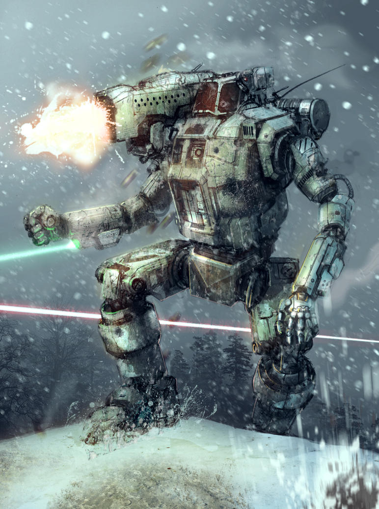
just to make it easy here is the MWO Hunchback: Posted Image

#2 pursang

    Member

  • PipPipPipPipPipPipPipPip
  • 1,877 posts
  • LocationSurrey BC, Canada

Posted 24 May 2012 - 10:31 PM

Considering how ugly the original TRO artwork for it is, I'm extremely glad they went with this direction.

#3 Shiinore

    Member

  • PipPipPipPipPipPip
  • Legendary Founder
  • Legendary Founder
  • 483 posts

Posted 24 May 2012 - 10:32 PM

Nitpick moar plz.

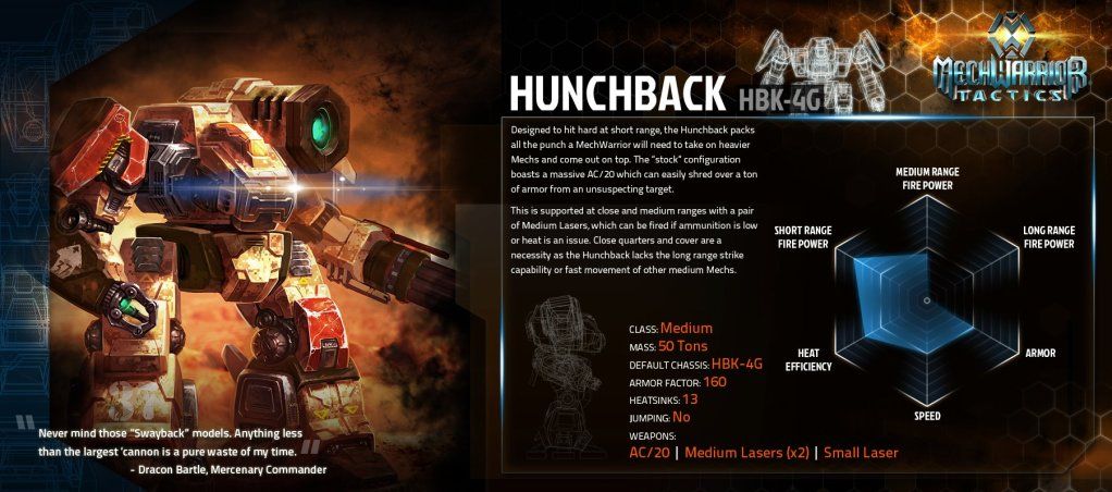
We should be honored that FD came up with such an amazing re-design of the Hunchback. We're worlds apart from what MW:T got.

Posted Image

#4 pursang

    Member

  • PipPipPipPipPipPipPipPip
  • 1,877 posts
  • LocationSurrey BC, Canada

Posted 24 May 2012 - 10:35 PM

The hell is that?! That looks like the horrible lovechild of a Dragon and a Hunchback, with a little Legionnaire thrown in for good measure.

/Gag

#5 theginganinja

    Member

  • PipPipPipPipPip
  • Philanthropist
  • Philanthropist
  • 192 posts
  • LocationMinnesota

Posted 24 May 2012 - 10:36 PM

It's supposed to look different. The developers want this game to have its own unique feel; they don't want it to be the same Battletech that has been around since the 80s. They want to revitalize the franchise, and part of that is bringing the look of the 'Mechs up to date. So far, this means improvements all across the board, as well as a style that will likely be a bit more appealing to "outsiders". In addition, this sort of visual overhaul is our only hope of seeing many of the most iconic Battletech designs, due to some unfortunate legal issues with a certain, extremely annoying company

*Edit* Also, that... thing from MW:T is hideous. I don't suppose we can trade it to Harmony Gold for the Shadow Hawk or something...

Edited by irishwarrior, 24 May 2012 - 10:37 PM.


#6 Durian Blake

    Rookie

  • 7 posts
  • LocationGermany - Münster

Posted 24 May 2012 - 10:36 PM

looks like a 40k termi i'd say.

I'm pretty pleased with most of the designs in mw:o. They look more "beefy" as if they could take a hit or two.

#7 Mute82

    Member

  • Pip
  • Knight Errant
  • Knight Errant
  • 14 posts
  • LocationWarsaw

Posted 24 May 2012 - 10:36 PM

Well the game Hunchback is different, but IMO in a good way. FD is doing a great job at re-imagening these classic mechs, makes them look more 'real' and machine-like. All the mechs he has done so far are awsome.

Edited by Mute82, 24 May 2012 - 10:37 PM.


#8 Rejarial Galatan

    Member

  • PipPipPipPipPipPipPipPipPip
  • Elite Founder
  • Elite Founder
  • 4,312 posts
  • LocationOutter Periphery

Posted 24 May 2012 - 10:40 PM

im fine with a little visual tweaking to update it, but, well, idk, something just doesnt sit right with me on this. BUT, we COULD go with the clan take, meet the Hunchback IIC Solahma disposal mech <as it was intended atleast> : Posted Image

I guess it just struck me funny is all. BUT atleast it doesnt look like the IIC, which looks like someone beat a trashcan with the even uglier ugly stick

#9 Tarellond

    Member

  • PipPipPip
  • 92 posts
  • LocationEU (Czech Republic)

Posted 24 May 2012 - 10:42 PM

I am glad they changed the design a bit. Anyway, what is the thing in the first picture, in the cetral torso? A coffee vending machine?

#10 Rejarial Galatan

    Member

  • PipPipPipPipPipPipPipPipPip
  • Elite Founder
  • Elite Founder
  • 4,312 posts
  • LocationOutter Periphery

Posted 24 May 2012 - 10:44 PM

View PostTarellond, on 24 May 2012 - 10:42 PM, said:

I am glad they changed the design a bit. Anyway, what is the thing in the first picture, in the cetral torso? A coffee vending machine?

honestly? no clue, but, maybe a place to sit and throw things into the trashcan...err...urbanmech...er...trashcan :(

#11 John Clavell

    Member

  • PipPipPipPipPipPipPipPip
  • 1,609 posts

Posted 24 May 2012 - 11:11 PM

I don't dislike the Hunchback concept and in game assets, at least it takes the essence of the TRO and updates it somewhat. I don't like the arms, truth be told. If I had to pick one it would be this one.

Posted Image

Edited by John Clavell, 24 May 2012 - 11:12 PM.


#12 Risky

    Member

  • PipPipPipPipPipPip
  • 474 posts
  • LocationPanhandle, Florida.

Posted 24 May 2012 - 11:13 PM

Seeing the original artwork is very old and from a different perspective of a different artist.

#13 Sparks Murphey

    Member

  • PipPipPipPipPipPipPipPipPip
  • Bridesmaid
  • Bridesmaid
  • 2,953 posts
  • LocationAdelaide, Australia

Posted 24 May 2012 - 11:15 PM

View PostTarellond, on 24 May 2012 - 10:42 PM, said:

I am glad they changed the design a bit. Anyway, what is the thing in the first picture, in the cetral torso? A coffee vending machine?


Little known fact: When Komiyaba Industries first designed the Hunchback in 2572, they had plans for a series of 'Mechs with a full range of kitchen appliances. Sadly, the "CookMech" technology was lost in the Succession Wars, though rumours are some prototypes survive in ComStar caches. The Hunchback's coffee machine is removed from most models, since 1-ton reloads of instant coffee are almost impossible to find now.

#14 DireWolf307

    Member

  • PipPipPipPipPipPip
  • Legendary Founder
  • Legendary Founder
  • 404 posts
  • LocationSt. Ives, St. Ives Compact

Posted 24 May 2012 - 11:17 PM

View PostSparks Murphey, on 24 May 2012 - 11:15 PM, said:


Little known fact: When Komiyaba Industries first designed the Hunchback in 2572, they had plans for a series of 'Mechs with a full range of kitchen appliances. Sadly, the "CookMech" technology was lost in the Succession Wars, though rumours are some prototypes survive in ComStar caches. The Hunchback's coffee machine is removed from most models, since 1-ton reloads of instant coffee are almost impossible to find now.


HBK-MRCOFFEE

#15 Jacough

    Member

  • PipPip
  • Big Brother
  • 35 posts

Posted 24 May 2012 - 11:26 PM

View Postpursang, on 24 May 2012 - 10:35 PM, said:

The hell is that?! That looks like the horrible lovechild of a Dragon and a Hunchback, with a little Legionnaire thrown in for good measure.

/Gag


Doesn't even have the right weapons either. The AC20 looks more like some kind of energy weapon, and instead of two medium lasers it looks like it's only got one medium laser and some kind of RAC

#16 Dirk Le Daring

    Member

  • PipPipPipPipPipPipPipPipPip
  • 2,083 posts
  • LocationAustralia

Posted 24 May 2012 - 11:28 PM

Of all the artwork I have seen, I have to say that Flying Debris work is the best by far to date.

I'm not saying I have seen it all, but the current style is, in my opinion the best. :(

And how they have translated into what we have seen......well, cannot be more happy with it, as a consumer. :rolleyes:

#17 Daveisanut

    Rookie

  • 2 posts
  • LocationNewport News Virginia

Posted 24 May 2012 - 11:36 PM

So far I have loved all of the new designs. The only mechs I will lament seeing changed are the Warhammer and Marauder, I love the oridginal designs for those, but perhaps I will be pleasantly surprised by something even better looking.

#18 Leetskeet

    Member

  • PipPipPipPipPipPipPipPipPip
  • Bad Company
  • 2,101 posts

Posted 24 May 2012 - 11:42 PM

Sigh.

Yeah, those old, horrible line drawings sure are cool looking. They don't look like they were drawn by a middle school student with no concept of functionality. or hell, no concept of how to not make something look ridiculous.

This is the same thing as when people say they like the old Centurion "art" over the new concept. I don't even operate on the same wavelength. It simply does not compute.

#19 DireWolf307

    Member

  • PipPipPipPipPipPip
  • Legendary Founder
  • Legendary Founder
  • 404 posts
  • LocationSt. Ives, St. Ives Compact

Posted 24 May 2012 - 11:51 PM

View PostLeetskeet, on 24 May 2012 - 11:42 PM, said:

Sigh.

Yeah, those old, horrible line drawings sure are cool looking. They don't look like they were drawn by a middle school student with no concept of functionality. or hell, no concept of how to not make something look ridiculous.

This is the same thing as when people say they like the old Centurion "art" over the new concept. I don't even operate on the same wavelength. It simply does not compute.


Totally agree. I think it's because the old artwork holds a special place, but as long as a new design captures the "spirit" of the original, something the new Hunchback design does just fine, I see no problem with it.

#20 Hayden

    Member

  • PipPipPipPipPipPipPipPip
  • Little Helper
  • Little Helper
  • 1,997 posts

Posted 24 May 2012 - 11:54 PM

Yeah, I have to say I'm very pleased with Alex's Hunchback. Glad to see them lose the platform shoes :(

And the MW:T 'mech... honestly, I won't be playing that game.


1 user(s) are reading this topic

0 members, 1 guests, 0 anonymous users