Jump to content

- - - - -

Ui 2.0 - Feedback


1095 replies to this topic

#821 Papaspud

    Member

  • PipPipPipPipPipPipPip
  • Elite Founder
  • Elite Founder
  • 643 posts
  • LocationIdaho, USA

Posted 06 February 2014 - 06:16 AM

View PostKishPrime, on 05 February 2014 - 07:27 PM, said:

This is, at best, a sideways step. I personally think it is a huge step backwards on all of your goals. Can anyone who beta'd this explain why you liked it?


We didn't, or at least everybody I talked to,they went ahead with the **** anyway.

#822 Josef Nader

    Member

  • PipPipPipPipPipPipPipPipPip
  • Elite Founder
  • Elite Founder
  • 2,243 posts

Posted 06 February 2014 - 06:31 AM

UI 2.0 has a lot of really solid stuff in it, and it is actually really exciting. You guys have done a really good job in cramming a lot of really useful information in, and while the layout could be improved upon, it's really nice to have that information within arms reach.

My biggest problem/complaint with UI 2.0 is that it takes no less than 4 clicks to do anything. If I want to pull an engine out of one mech and slap it into another, I feel like it takes me a lot more clicks than it should. My friends and I have actually stopped using Artillery and Air Strikes when gaming together, because it takes so long to get into the modules screen and add the consumables again.

The new UI would benefit greatly from you guys sitting down and working out your screen flow a bit better. Try to imagine being a player wanting to make a quick change or two to his loadout, add his modules, and change a color on his mech. Work on getting the number of required clicks and the amount of time it takes to do those three tasks down as low as you can. Right now, it just takes too long and requires too many clicks to make changes that players are constantly making between matches. Remember, we want to get back into the action as quickly as possible, and the longer it takes to do so in your UI the more frustrated players are going to be.

#823 Nathaniel Kell

    Member

  • PipPipPip
  • Philanthropist
  • 67 posts

Posted 06 February 2014 - 06:31 AM

I think it would help a lot if it was easier to tell what each component was at a glance.

EX:

All the thumbnails for the XLs look about the same. You have to really struggle to quickly see the engine rating,

Perhaps make the numbers bigger?


EX 2:

I'ts pretty hard to see what each lazor is at a glance too. make them.... better?? I don't know.


But my whole takeaway is this:

Unfinished, sure. But its about as "good" as UI1.5, but has way more potential. I can deal with a few frustrations until they get it just right.


Edit:
Forgot another one. If I am placing ammo in one section, when I select another section it should still be on the ammo list.

Edited by Nathaniel Kell, 06 February 2014 - 06:33 AM.


#824 Aurrous

    Member

  • PipPipPipPipPipPip
  • The 1 Percent
  • The 1 Percent
  • 331 posts

Posted 06 February 2014 - 06:34 AM

Sighs.. So much bashing and frustration.. I'm going to hope the devs are looking for positive criticism, and remove half of these comments..
For the most part, good job on the UI 2.0.. Even though i will still call it U Lied 2.0... (jokingly)

Home Screen...

Overall.. move the mech to the left.. move the "Current Battlemech" to the right, Make it bigger.
Add the Mech Exp To it, Show the base stats, add a configure button, and Skills tree option Button (that goes to that mech)
Show the Modules in it, and a quick list of engine and weapons.. (you have the room) and add a launch button/ social button..
And a button to change mechs.
I just opened the game, i have a mech.. can't do anything without clicking things i dont want to click on..
Add a button to see the Paint job..
Put the focus back on mech editing, Your mech.,Playing .. not the fancy back drop..
which is huge, and the menus are so small and non existing.

Select mech goes to the Mechlab. (I guess i would be fine with that, if there was a properly sorted display, and a list option.)
I'll break that down later.))

Home> Inventory >
Here is a list of things i think could be improved menu wise..
Battlemechs > Fine (can you add a horizontal Tabs at the top to sort by weight please.)
(when item is clicked add a "Ready" Mech Button, and a "Configure" mech button) (would speed things along.)
(also Add a module Icon to the right of the mechs to see which ones have modules.) Ohh YEAH, AND BIGGER!! the selected mech takes up a 1/4 of the screen.. and that screen is 2/3 full..
And engines on mech are not listed on the stats..

Weapon Systems > Fine (can you add a horizontal Tabs at the top for Grouping.. Laser / Missile /Ballistic)
(when item is clicked, Add a buy function, and a up down scroll to sell in bulk.)
(there should probably be a higher option for Equipped, and Unequipped.)
(The Equipped would group the weapons by type, and show a list of mechs they are on)

Modules > Fine ( Higher Sort function / tab for Equipped, and Unequipped/ and Buy. ) Doesn't seem like much love or thought was given to this..

Home > Statistics > Do i really need to leave the screen for this?? insert small UI window here..
Home > Redeem Code > needs more codes.. hahah
Home > Testing ground > System Nominal.

Mechlab Button..
I click the button, and the once empty home screen SLAPPS ME IN THE FACE WITH INFO OVERLOAD..
There are stats popping up and lists of things all over the place.. BAM BAM BAM.. i have two black eyes..

When i open the mech lab... Please Un-click my mech stats.. start with the list /icon groups.. And no mech clicked by default.
Next the SMALL drop down menu.. OWNED / PURCHASABLE / TRIAL Tab that out and mack it bigger..

Then SORT the mechs,, by owned and Purchasable..

All owned mechs should have a "READY BUTTON".
All owned Mechs should have the Modules ICONS displayed in the corner.. Beside the H/C
And the Default Color on the Lower Right Tab should be colored to match the BASIC / Elite Color..

Make the Mechs i OWN pop up first.. and hide the Purchasable ones on the other TAb..
the ALL MECHS is... overwhelming mix of confusion..

Next .. when i click on the mech, or mouse over it.. Move the Base Stats to the Top Right (not the bottom).. Make it bigger, Add the hard points to the BASE Stats to the bottom of the top. then put your fluffy movement BS under the base stats, not over them..

Mech Lab > Trial Mechs.
There is a bug with the Champion MECH list..
If you own a non-champion version on the Mech.. the option to buy the mech does not show up..
There should also be a button to ready up the mechs above the BUY button..
The rest of the menus going down.. If you place the Tabs and separate OWNED / PURCHASE / HERO / CHAMP..
I think it would be Far more intuitive..

Skills
Mech Tree > i don't have to many comments on this..
Pilot Tree > Here is where things get all disorganized again.. And confusing..
Horizontal Tabs.. MODULES / Consumables.
Gunnery Tree > put all the gunnery items there, and Sort by ALL / LASERS / Missile / Ballistics..
I think that would make the world right again..

Last Tab = STORE
HOME PAGE = WORST SALES TEAM EVER!!!
you have a mech up for sale.. When you click on it.. NOTHING..
You have Champ mechs for SALE.. NOT found here..

Battlemechs.. (sort tabs please) L/M/H/A If i own it/ why would i buy it again.. Take the ones i own out..

MECH BAYS = THIS BURNS MY but.. I had 8 open mech bays before the Ui Conversion.. now they are all gone..
I bought an Ember.. and had to buy another mech bay .. WTF!!! How many mech bays do i have now??
What ever.. Move this to the home screen and drop this button..

And where are the COCKPIT ITEMS FOR SALE??!!? for a company selling 500 gold mechs for money.. you think you would of spent more time on the STORE button.. missed the boat a little.. (p.s. for 500$ should should send people a set of gold plated small figurines for their money.. You could also Sale small Figurines with packages.. Just throwing it out thier.. NO MECH MERCH.. no wonder your popularity is so low..) Buy a virtual mech.. get a mech T-shirt.. i digress..

Im done with this main UI 2.0 critique.. there will be a whole another one for configuring a mech.. WOW.. that's painful now..

Edited by Aurrous, 07 February 2014 - 04:20 AM.


#825 Nathaniel Kell

    Member

  • PipPipPip
  • Philanthropist
  • 67 posts

Posted 06 February 2014 - 06:42 AM

No negativity here. Though I do think that some folks here will go off about anything.....

#826 MisterPlanetarian

    Member

  • PipPipPipPipPipPipPip
  • Ace Of Spades
  • Ace Of Spades
  • 910 posts
  • LocationStockholm

Posted 06 February 2014 - 06:43 AM

It flows better, Full Screen is nice and the menus are not that bad once you get used to them, just a lil different.

Wishlist so far:

-Smurfy mechlab, absolutely essential imo but its in the pipe.

-Inventory filter function that provides the ability to see equipped weapons and modules aswell as which mech they are equipped on and in what number.

For example, you list Lasers only and it will show you pulse/beam, small, medium and large. You select large lasers and it will show you 5 equipped and 6 in inventory for example. If you click your equipped batch you will get a menu showing a list detailing every mech the 5 large lasers are equipped on and how many are on each mech.. For example: AWS-9M, 3x Large Laser, AS7-D-DC 2x Large Laser. Each mech on the list comes with a "configure" button shortcut to the mechlab so you can easily get your gear without having to crawl to your mechlab and manually find the mech you had it on.

This would really help me keep track on everything I own as my inventory currently only shows stuff I have not yet equipped.

Edited by MisterPlanetarian, 06 February 2014 - 06:45 AM.


#827 Imperius

    Member

  • PipPipPipPipPipPipPipPipPipPip
  • The God
  • The God
  • 5,747 posts
  • LocationOn Reddit and Twitter

Posted 06 February 2014 - 06:56 AM

I have a feeling this thread will be 300+ rage thread by Sunday. :)
If they didn't release UI 2.0 this would be a 300+ rage thread about missed deadlines. B)

Summary: They are damned if the do damned if they don't.

Please be constructive with your posts, and save us the I'm not paying money, I'm leaving, and I could do better posts.

That said.

"Checkout" button rename it to "Save/Checkout" or add a "Save Mech" button just for saving the latter would be better.

Use of a drop down list would be better than using the back button every time.

Remove modules from all mechs and attach it to the pilot not the individual mech. I use the standard 3-4 modules all the time. If the mech doesn't have the extra module slot then it would gray out one.

Figure out a way to reduce clicks.

I would like the paper doll back or the hard points to show up in the mech we can spin. Better yet make the mech the paper doll and where we can click the weapons and stuff on the mech. Also showing the hard points (like the original UI)

#828 Bubba Wilkins

    Member

  • PipPipPipPipPipPipPip
  • 688 posts

Posted 06 February 2014 - 07:26 AM

Updated the client last night to just take a peak. Haven't really been following things close for some time, so I'm not sure what is and isn't implemented at this point.


Missing spare mechbays?

Load Out? Mechlab is frustrating right now. I like all the new card like icons and such, but now there is no easy way to get a feel for your overall loadout. Missing the paper doll and such big time.

Looking at new mechs? At least the previous UI, you could see the buildout and have a feel for what you are getting. Now? tells you nothing other than the base chasis/variant.

I grew frustrated with the UI and closed the game. Maybe next patch will be more enticing.

#829 Aurrous

    Member

  • PipPipPipPipPipPip
  • The 1 Percent
  • The 1 Percent
  • 331 posts

Posted 06 February 2014 - 07:28 AM

View PostImperius, on 06 February 2014 - 06:56 AM, said:

I have a feeling this thread will be 300+ rage thread by Sunday. :)
If they didn't release UI 2.0 this would be a 300+ rage thread about missed deadlines. B)

Summary: They are damned if the do damned if they don't.


actually 36 of these pages were before it came out.. so its not that bad..

#830 Mycrus

    Member

  • PipPipPipPipPipPipPipPipPipPip
  • Overlord
  • Overlord
  • 5,160 posts
  • Google+: Link
  • Twitter: Link
  • LocationFilipino @ Singapore

Posted 06 February 2014 - 07:39 AM

new ui sux amazeballs...

#831 AlmightyAeng

    Member

  • PipPipPipPipPipPipPipPipPip
  • Bad Company
  • Bad Company
  • 3,905 posts

Posted 06 February 2014 - 07:44 AM

View PostImperius, on 06 February 2014 - 06:56 AM, said:

I have a feeling this thread will be 300+ rage thread by Sunday. B)
If they didn't release UI 2.0 this would be a 300+ rage thread about missed deadlines. :lol:

Summary: They are damned if the do damned if they don't.

Please be constructive with your posts, and save us the I'm not paying money, I'm leaving, and I could do better posts.


To be fair, a lot of the comments that have 'UI 2.0 Rage' also point out WHY they don't like it. Constructively. A lot of the "positive" posts I'm seeing are pretty scant, from seldom posting users. I'm seeing "I like it." vs. itemized lists of specific things people don't like, and pointed out in test after test.

Granted, you also get Mycrus' "sux amazeballs" posts... :)

Edited by Ghost Badger, 06 February 2014 - 07:45 AM.


#832 Imperius

    Member

  • PipPipPipPipPipPipPipPipPipPip
  • The God
  • The God
  • 5,747 posts
  • LocationOn Reddit and Twitter

Posted 06 February 2014 - 08:26 AM

View PostAurrous, on 06 February 2014 - 07:28 AM, said:


actually 36 of these pages were before it came out.. so its not that bad..


Yet... The weekend isn't here yet. I hope you're right, but this a lot of this community is good at one thing, and that's crying about everything and anything. Hypocotaclg I'm complaining about the complaining but it is wearing on me. It like here we go again... I feel for PGI. Sure there are some things that can be done better (opinion), but it's how you share that opinion that matters.

View PostGhost Badger, on 06 February 2014 - 07:44 AM, said:


To be fair, a lot of the comments that have 'UI 2.0 Rage' also point out WHY they don't like it. Constructively. A lot of the "positive" posts I'm seeing are pretty scant, from seldom posting users. I'm seeing "I like it." vs. itemized lists of specific things people don't like, and pointed out in test after test.

Granted, you also get Mycrus' "sux amazeballs" posts... :)


Let's hope when the weekend gets here I'm like the weather man and just blowing wrong predictions out my scrap. B)

Edited by Imperius, 06 February 2014 - 08:26 AM.


#833 Gallowglas

    Member

  • PipPipPipPipPipPipPipPip
  • Ace Of Spades
  • Ace Of Spades
  • 1,690 posts

Posted 06 February 2014 - 08:40 AM

I have to say, with all due respect, I do a lot of UI work in my profession and simplicity and coherency is always the best rule of thumb. Sure, it *looks* nice, but I think you have a few basic organizational problems with the new interface:

1) The social windows need to be either non-modal, free-floating windows, or else they need to be in a window that minimizes or maximizes when you press the button. Hiding the entire rest of the interface while you have the social window up isn't a good idea for a whole host of reasons.

2) You need to make the nomenclature for the "checkout" button less confusing. I think "Save Loadout" is much more intuitive. Simply have a popup confirmation that indicates what the cost will be if there are purchased items in the new loadout.

3) We need a way to review the whole mech loadout at once. The current mechbay tools seem like a step backwards. Take a look at Smurfy and learn from what they've done there. It's streamlined and elegant. I think you're placing too much of an emphasis on always using text buttons, but in this case, it communicates much less information.

4) Provide a breadcrumb system for your command options instead of requiring players to press the "back" button 5 million times. Showing Home > Mechlab > Catapult-K2 > Left Torso with each item as a clickable link makes a lot more sense and provides a lot less frustration. It also lets you feel a lot less lost once you're 5 layers deep.

5) The symbols for the weapon that indicate restrictions with a green or red indicator will be MAJORLY confusing for new players. How are they supposed to know what that even means?

Edited by Gallowglas, 06 February 2014 - 09:00 AM.


#834 Kesslan

    Member

  • PipPipPip
  • Knight Errant
  • Knight Errant
  • 62 posts

Posted 06 February 2014 - 08:43 AM

Honestly?

I'm hating most of it and here's why:

Constant having to use the back button instead of just going to the next pull down menu.

It's cluttered. Seriously cluttered. Stats are all over the damn place. Left screen, lower right hand corner, cramed down in the lower left or what have you.

Mech Listing: You can only sort alphabetically or by price. Not by weight class (Though there's a totally different, unrelated tab where it's all neatly sorted by weight class but anyway)

I have no idea where it lists my spare available mech bays, I can only see wehre I can purchase additional ones.

Confusing loadout interface. Seriously. I can't quickly and easily tell what the hell is loaded on my mech where when I go to customize it. The paper doll interface was pretty intuitive and easy to use. The new setup is a serious pain in the ass becuase it also now lists all the crap you /could/ put in it, as well as what's actually there and it's easy to momentarily loose track of what section of the mech you are presently viewing. This is the part of the UI I hate the most to be honest. This whole section of it just feels clunky, hard to use etc.

Also cramming the heat, firepower etc all in the lower right hand corner in this tiny little hard to read bar doesn't help.

Changing the mech you are using is now very cumbersome. You can't just scroll through a handy list that's right there, you have to go to some other screen and pick the mech from that spot instead as far as I can tell.

The UI itself isn't intuitive and easy to use in many cases. I think it's going to scare off a lot of new and older players because you actually have to stop and think about what the hell screen you are on, and how bloody many clicks and where you need to to even get to the screen you want, and then you have to try to interpret the huge mass of seemingly random stuff it then presents you with to filter out what is where, what you own when trying to make a purchase etc. I mean sure you gave us a fairly nice full inventory listing for assorted things, but that nice listing doens't come into play when trying to actually customize the mechs or anything. The 'cards' look ok but that's not the problem.

The problem is when I say, go to see if I have ammo in the leg of my mech it presents me with ALL the ammo possible to store there and then I have to wander about the interface to see what actually is there, and then if I want to double check what weapons I actually have in the mech, I then have to click back like 4-5 times just to see what the hell is in the mech, possibly more. In the old setup you just clicked on the location and there you go, a full nice and easy to read listing of what was actually in the location, followed by a list of things you could add to the location on the other side. Now those two lists are just confusingly merged together.

Either way, by the end of it all I'm seriously disliking the 2.0 interface and I find it's got very few redeeming qualities.

#835 DirePhoenix

    Member

  • PipPipPipPipPipPipPipPip
  • 1,565 posts
  • Google+: Link
  • Facebook: Link
  • LocationSan Diego

Posted 06 February 2014 - 08:49 AM

View PostVictor Morson, on 06 February 2014 - 02:28 AM, said:
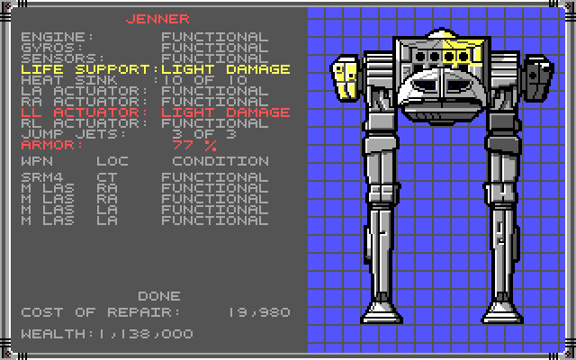

I did and I stand by it. To be frank, this mechlab would be worse than MW1's, but MW1 didn't have one. heh


I'm pretty sure MW1 did have a Mechlab.

Posted Image

However, your proposition that MW1 and MW2's mechlabs are better than MWO still comes off as a childish "Ugh anything is better than this!" rant.

#836 Waladil

    Member

  • PipPipPipPipPipPip
  • Legendary Founder
  • Legendary Founder
  • 286 posts

Posted 06 February 2014 - 08:54 AM

View PostImperius, on 06 February 2014 - 06:56 AM, said:


Summary: They are damned if the do damned if they don't.


I've seen several people make this argument and I do not get it. It's like you believe there are two possible options: Release a POS "feature," or release a good feature late.

But given the vast amounts of time they've had to work on it, and the several people who pointed out that there is little-to-no difference between the "public test" builds and the "full release" builds of UI 2.0, that brings us to question whether or not there was a third possibility:

DEVELOP. THE. GAME. Improve and tune the UI based on the community feedback people provided during the tests. People wouldn't be complaining so much if there had been significant improvements after the tests. Doesn't have to be perfect, but actually making stuff better would be nice.

Let me explain with an analogy. I'm a university student, and I'm sure there's a bunch of other people in similar situations around. If you're past that age, then recall your college years. Or maybe just recall some similar post-college situations. Anyway, imagine you had an assignment to write a paper. This assignment was given to you at the beginning of the semester, and was due on the final day. Two weeks before the end of the semester, a rough draft was due and you would have a meeting with the professor to discuss how the draft is doing and what could be improved before you hand in the final paper. So you write... something and go into your rough draft meeting. The professor reads over your paper, gives you a stern look, and proceeds to detail all the things you've done that were unacceptable to the guidelines of the assignment. Two weeks later you hand in the exact same paper that the professor had just torn to metaphorical pieces, except you fixed one run-on sentence. When he gives you a poor grade you complain, saying that you could either turn in a bad paper now or a better paper later.

You know what'd happen if I tried to pull that? I'd get a shit grade because I deserved it. There's no reason we should be nice to PGI after they've released a shit UI. And it's considerably worse: THEY set the deadline, THEY arranged the tests, and they've got the bollocks to tell us this shit don't stink.

#837 Bacl

    Member

  • PipPipPipPipPipPip
  • Knight Errant
  • Knight Errant
  • 260 posts
  • LocationUsually between a rock and a Atlas

Posted 06 February 2014 - 09:13 AM

It does look cool and having a better view of your mech on the side of the creen is nice since the mech design are sooo sexy, never noticed that my Awesome 9M had blue eyes!

Menu wise however.... The first one was good in therm of fonctionality but just neede the information upgrade ( ghost heat, screen shake potential, etc), i could refit a mech in the old UI in 30 seconds stop watch. This is so messy, so counter- intuitive so small.... I have a 20/20 vision and i feel i need binoculars to make sure i read the numbers properly. yes the look is cool and the extra information you get is good ( not more not less) but the buying mech information is gone, like the grinding process wasnt bad enough now you buy them blindly, i wonder how this will affect the gameplay on the long run.

WAY way too much stuff happeneing on the screen, just selecting your engine give you a buffet of all available options which is nice since you can easily find those who would fit your machine but part from that detail the whole " go back and click the tiny little button" to select the next part of your mech to want to work on is just plain stupid. Still no info on ghost heat so noobs STILL need to ask a veteran or go on the forum to actualy try and have fun with their creation otherwise the whole thing can melt in their face.

I could go on and on about every single detail but TBH i dont even think they tried to do something better but they did make something different... I wonder why is the ammount of cash that got invested in this, not a complete failure since a few things about it i do like but all in all its more a mess than a upgrade, i would rate it 25% win against 75% fail, looks good and some more extra infos is nice.

#838 ChewBaka

    Member

  • PipPipPipPipPipPip
  • Caladbolg
  • Caladbolg
  • 264 posts

Posted 06 February 2014 - 09:14 AM

OK, which IDIOT thought it was a good idea to prioritize form over function? Sure, it looks oh-so-pretty but its impractical and completely unintuitive.

Sorry to have to put it like that but I think if I said it politely than the impact wouldn't be there. Whoever is responsible for the design of this new UI needs to go take a professional course on UI design, seriously...

It reeks of laziness, as though the programmers can't even be bothered to include simple shortcut functions like having the 'Esc' or 'Backspace' keys return to the previous screen instead of needing to click the 'Back' button all the time. Is that so hard to implement? And how about 'CTRL-S' as a shortcut to save the mech setup? Won't touch on the stupid checkout button...I believe that has already been bashed several times by now.

Did no one think it might be a good idea to include a filter in the MechLab in order to reduce clutter and make it easier to configure our mechs? It absolutely needs a simple checkbox or a listbox (whichever) that will filter out only the items that we currently own. I do not always need to see all the various engine types or weapons when I'm configuring my mech. Mostly, I just need to see what I already have in my inventory and I am sure many others feel the same.

Honestly, this new U.I just made me lost motivation to continue playting this game even further. I actually prefer the old UI. Its not perfect, but at least I managed to get things done with it. This UI? It takes me far too long to configure my mechs by swapping out engines and modules. As many have already suggested by now - give us SMURFY. I'd rather have something that is not pretty but functional compared to something that is pretty but borked. Ugh...

#839 Victor Morson

    Member

  • PipPipPipPipPipPipPipPipPipPip
  • Elite Founder
  • 6,370 posts
  • LocationAnder's Moon

Posted 06 February 2014 - 09:18 AM

View PostDirePhoenix, on 06 February 2014 - 08:49 AM, said:


I'm pretty sure MW1 did have a Mechlab.

Posted Image

However, your proposition that MW1 and MW2's mechlabs are better than MWO still comes off as a childish "Ugh anything is better than this!" rant.


MW1 had a detailed repair system, not a mechlab.

MW2's mechlab is absolutely superior to UI 2.0. I'll stand by that. Why?
  • While too low res to fit EVERY location on the screen, it fits as many on the screen at once as it can.
  • Drag & Drop lists
  • Clearly listed information like free tonnage and space
  • Clearly listed information like engine type, armor type, and structure type.
  • The variant browser displays ALL important information while you look through it.
  • It also had atmosphere. It was seeped in BattleTech lore and feeling beyond a giant half-the-screen spinning 'mech.
So no, this isn't a case of me just being a jerk. I'm not saying the MechCommander 1 Mechlab was better or anything. I'm saying that MW2 - I won't even mention MW2 : Mercs which upgraded this a whole lot and is far superior to UI 2.0 - has a superior mechlab to what we have now. Because it is actually true, as sad as that is.


Look, the engine is listed! The amount of ammo AND the ammo tonnage is listed! All the exact weapons are visible flicking through the 'mechs without changing to three different screens!

Edited by Victor Morson, 06 February 2014 - 09:23 AM.


#840 Xenosphobatic

    Member

  • PipPipPipPipPipPip
  • Ace Of Spades
  • Ace Of Spades
  • 213 posts
  • LocationMidwest USA

Posted 06 February 2014 - 09:22 AM

If it's possible, removing the requirement that someone has to be in your friends list to be in your group should help ease the burden on the social tab.

For example, I doubt Phil/Sean Lang (NGNG) will play with a lot of the random PUGs that he streams with more than once or twice. In this case, having to add friends puts unnecessary burden on the function, causing what I can only assume is the delay to pulling up the social window.

Being able to add people into a group via username would save a lot of time, and would make the friends list more relevant as actual friends.


5 user(s) are reading this topic

0 members, 5 guests, 0 anonymous users