
I just want to see the ability to chat with other MWO players in the client. And player created channels would be great as well.

-
 This topic is locked
117 replies to this topic
#102
-

-

- FP Veteran - Beta 1

- 10 posts
Member
- LocationGermany

Posted 10 September 2013 - 09:17 AM
Hi all!
This is my first post in the forum.
I think the "social" UI should be improved. I think online friends should always be visible in main menu (you should not have to click the "social button" in order to see them). Furthermore there should be an acoustic feedback if one of your friends initiates a new chat. Of course users should be able to disable this sound. I think it would be best if this sound would even be audible "In Game".
Kind regards,
Alex
#103
-
-
- Ace Of Spades

- 1,629 posts
Member
Posted 14 September 2013 - 11:30 AM
Communication between players has already been adressed so far. But I (didnt read through all the thread and) think that this should also inculde ways to contact the support or at some level the developers ingame.
There needs to be a way to adress the support fast and ingame to report players. A ticketing system implemented in the UI should be considered as it is a lot more inuitive than contacting the support via e-mail.
For developer contact you should totally do that community polls in the ui as they have been suggested in the latest ask the devs, it's a great idea to recive information from players that are not active on the forums.
My thoughts on that: Do a new poll once a week. That give enough time to the playerbase to participate, just make sure that they had enough time to form an opinion towards something before.
To make people participate you could give away small perks that are limited for an hour and let players get double XP / C - Bills if they active them.
#104
-

-
- FP Veteran - Beta 1

- 32 posts
Member

Posted 24 September 2013 - 12:39 PM
How about something as simple as creating an actual focus group for the testing of the UI 2.0?
If you have a good mix of candidates, they should give you pretty accurate information relative to the community at large.
If you have a good mix of candidates, they should give you pretty accurate information relative to the community at large.
#105
-

-
- Legendary Founder

- 793 posts
Member
Posted 24 September 2013 - 01:03 PM
 Utilyan, on 14 May 2013 - 08:11 AM, said:
The Main Lobby chat room should be a Solaris Arena with players actually fighting in a sandbox play ground where everyone can spectate as an actual spectator to the fight......
A F2P game called APB Reloaded back in 2010 actually had a sandbox lobby called the Social District. Its where you went to design your avatar, upgrade stuff and socialize.
#106
-

-
- 283 posts
Member
- LocationDenmark
Posted 13 November 2013 - 11:45 AM
So then, is this happening. Are we getting social tools with UI 2.0?
#107
-

- Knight Errant
- 1 posts
Rookie

Posted 25 November 2013 - 07:43 AM
I would like the ability to turn off the chat stream altogether. Back in World of Tanks you couldn't go a single match without the words '*****', '{Dezgra}' or 'noob' being spammed by guys who are already dead. I see this community is no different. It would be nice to shoot at giant metal robots without a bad taste in my mouth from the chatter.
#108
-
-
- Elite Founder
- 3,510 posts
Member
- LocationHouston, Tx

Posted 25 November 2013 - 07:45 AM
Hey guys, ya'll are getting all riled up over nothing. It isnt 2015, we still have some time before UI 2.0 gets completed.
#109
-
-
- Big Brother

- 4,939 posts
Member
Posted 10 December 2013 - 09:07 AM
We should have a system to send in-game messages to people in UI 2.0. This would be a welcome feature for people who want to recruit members better, send message to people who logged out, talk to people after or before a match, and talk to faction/merc corps members privately.
Edited by Will9761, 10 December 2013 - 09:09 AM.
#110
-

-
- Ace Of Spades
- 542 posts
Member
- LocationFlorida, USA
Posted 16 December 2013 - 08:46 AM
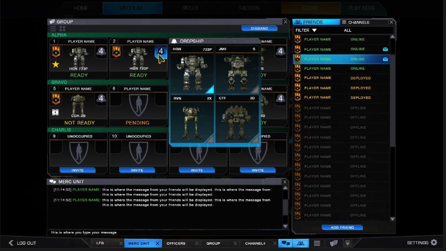
During the pre-drop team setup phase the following would be very good to have in UI 2.0:
 
1. All pilots on the team can see all team mate graphical avatars of the Mechs they will be piloting and the configuration of each mech. (i.e. weapons, modules, armor, speed etc.)
 
2. As each pilot configures his/her mech, during the pre-drop phase, changes to each mech are updated on the team avatar display screen in real time. This will be accomplished through client server communication.
 
This capability will help with pre-drop configuration an coordination with the Drop Commander.
 
This type of capability would apply only to organized teams not random public drops.
Would it be possible to get all 12 mechs in this grid view? And when you hover the mouse pointer over an avatar a fly out would display the mech configuration for a mech in Ready status? What do you think?
 

Edited by Aidan, 16 December 2013 - 09:20 AM.
#111
-

-
- Knight Errant
- 9,942 posts
Member
- LocationDueling on Solaris
Posted 21 December 2013 - 01:50 AM
Ulfhir, on 25 November 2013 - 07:43 AM, said:
I would like the ability to turn off the chat stream altogether. Back in World of Tanks you couldn't go a single match without the words '*****', '{Dezgra}' or 'noob' being spammed by guys who are already dead. I see this community is no different. It would be nice to shoot at giant metal robots without a bad taste in my mouth from the chatter.
This gave me an idea. Like real sports only the captains or assist can talk with the ref, this is to avoid alot of problems and also add to the game as a whole(rivalry etc.) And teams dont chat with each other at all.... Anyway Mechwarrior can go a long way to improve the quality of these matches very easily. Sometimes I think some people dont like video games and try to ruin them as much as possible by removing some key elements of sportsmanship and game play.
Team chat should be general chat in these matches. Warhorns and maybe purchasable taunts and medium lasers should be the only form of chatting between opposing teams.
#112
-
-
- The 1 Percent

- 331 posts
Member
Posted 07 February 2014 - 04:27 PM
Can you add an option Button to the Social Box for.. Looking for a Group.. This would show people on your freinds list that you are looking for a group.
Also, if you could make the small blinking half inch sized button, blinking Button Bigger. no another way to help you notice it's blinking..
Also, if you could make the small blinking half inch sized button, blinking Button Bigger. no another way to help you notice it's blinking..
#113
-

-

- 531 posts
Member
Posted 08 February 2014 - 04:10 AM
Just to remember that one bug (friends disappearing) is still around:
1. Block friend
2. Unblock friend
3. Friend is gone!
Before any feature adding, we need this sorted out, as this is a problem carried from UI1.5 (so it should be server related - my guess).
1. Block friend
2. Unblock friend
3. Friend is gone!
Before any feature adding, we need this sorted out, as this is a problem carried from UI1.5 (so it should be server related - my guess).
#114
-
-
- Legendary Founder
- 9,498 posts
Member
- LocationOn your six, chipping away at your rear armour.
Posted 08 February 2014 - 04:21 AM
Not wholly related to the new UI, but can we for the love of all that's good and right in the world get keyboard chat shortcuts?
We've been nagging you about this for the last 18 months or so, and still nothing.
Examples:
F1: "Enemy [mech variant] spotted in grid [grid ref]"
F2: "Attack target [my current target]"
F3: "Need assistance in grid [grid ref]"
F4: "Narcing target [target designation], fire at will".
And so on. This would help IMMENSELY with PUG coordination, as you can't really take time off to type in chat while maneuvering and fighting.
Please? Pretty please with an UrbanMech on top?
#115
Posted 08 February 2014 - 06:59 AM
stjobe, on 08 February 2014 - 04:21 AM, said:
Not wholly related to the new UI, but can we for the love of all that's good and right in the world get keyboard chat shortcuts?
We've been nagging you about this for the last 18 months or so, and still nothing.
Examples:
F1: "Enemy [mech variant] spotted in grid [grid ref]"
F2: "Attack target [my current target]"
F3: "Need assistance in grid [grid ref]"
F4: "Narcing target [target designation], fire at will".
And so on. This would help IMMENSELY with PUG coordination, as you can't really take time off to type in chat while maneuvering and fighting.
Please? Pretty please with an UrbanMech on top?
We've been nagging you about this for the last 18 months or so, and still nothing.
Examples:
F1: "Enemy [mech variant] spotted in grid [grid ref]"
F2: "Attack target [my current target]"
F3: "Need assistance in grid [grid ref]"
F4: "Narcing target [target designation], fire at will".
And so on. This would help IMMENSELY with PUG coordination, as you can't really take time off to type in chat while maneuvering and fighting.
Please? Pretty please with an UrbanMech on top?
Pretty please?!
#116
Posted 10 February 2014 - 02:46 PM
http://www.reddit.co..._it_would_look/
MWO is a social game. I like this author's post:

MWO is a social game. I like this author's post:
Quote
The best feature of MWO is it's community and the game needs to take advantage of that. It really should have an awesome chat system and easy to use grouping system. That is VITAL for a team based game like this. Obviously this will only get more important once features like community warfare and custom units are introduced in the game.
Edited by MavRCK, 10 February 2014 - 02:46 PM.
#117
-
-
- Knight Errant
- 1,511 posts
Member
- LocationMalaysia
Posted 15 February 2014 - 09:39 PM
You hear about a new themed bar that has great food, drinks and many fans of said theme and you decide to go check it out.
When you get there, they blindfold you, stuff your ears with earplugs and gag you after taking your first order before letting you in. In the bar, you grope around until you bump into someone.
You then have 15 minutes to communicate by touch to figure out if you want to get to know this person better. If you decide not to or run out of time, you then repeat the entire process again. When you finally find someone, you drag them back to your table and you realize your group has to be limited to a maximum of 4 people because that's all you can seat at your table.
By this time, you're ready for another round and you start collecting everyone's order and realize that one of your group has gone of to the toilet. Funnily enough, the only way back from the toilet is to leave the bar through the back, go round the block and re-enter from the front.
After a couple of drinks, you find out from your new friends that a large number of fans go to other similarly themed bars that don't have the great food & drinks but lets you socialize without the handicaps. However, most of the fans just drop by this bar to eat and/or drink alone as it is too troublesome socializing here.
TL;DR
Why does this game STILL not have a persistent chat box in the UI that allows a new player to instantly get in touch with other players the moment they start the client and log in?
Why does the UI's social element seem to be designed around a gamepad or console controller rather than a mouse and keyboard like most other multiplayer PC games that have social interaction as a core game element?
Why is it better to make players have to open and close the social window before and after each match when you're already in a group?
Why is it players are forced to actually leave the Mechbay before they can ready up?
Why? Why? Why?
Is my dissatisfaction with the social element in the UI coming through or do I need to do a multi page report with screenshots and diagrams?
#118
-
-
- The Nightmare

- 18 posts
Member
Posted 09 March 2014 - 12:57 AM
i just want to touch base on the actual changes made to the mechlab, you guys in the pgi world totally screwed the pooch on this one, it has become incredibly cluttered, the info that used to be presented is not in any way comparitably convenient; as in, before 2.0. in 1.0 or whatever you want to call it, you had your lists of equipment nicely aranged, not cluttered with an icon for each and every item put on the screen like a windows 98 flashback nitemare.
you went and took a working user interface, and microsofted all over a beautiful accomplishment. double face palm fellas, bring back the menu you had before, you know, the one that resembled mechwarrior dating back as early as mech2 and all the way through past 4, with the item lists, stat info and all that like it was before 2.0, not so cluttered and dumbed down for appearance and prettiness.
the info that is given i realize is based on a card game, but im not holding a card when im clicking my mouse. i grew up reading the books, and playing the video games. now we have a lazy man's mechassault mechlab and i dont want to see this game fail due to some cosmetic oversight when you're so close to actually making a playable game.
menus, as opposed to a cluttered scroll down mess please, like if i gotta scroll, it should be through a list of names, ac2, ac5 ac10 ac20, 1 ICON IN TOTAL TO SHOW IM LOOKING AT BALLISTIC WEAPONS IS ENOUGH. Not 4 identical icons taking up the better part of my screen, with the same info shown over and over, with less info than what used to be shown before the "improved" updates that stripped the mechlab's efficiency for quickly building a mech.
if i know i want to put 4 lasers and an ac5 on a hunchback, it should take about 5 mins and 2 menus. not 15 mins and 8 menus. dont overthink it guys, you had an efficient system going, why did you go and do such a drastic unnecessary change in the cosmetic design of the lab? i understand that it may have posed issues from a programming angle, as to get the ui ready for full blown cw but that shouldnt be a cosmetic effect.
the mech bays are a mess man, can we please clean it up and lose the clutter of an icon for every item that gets manifested in every list. i shouldnt have to order a mochafrapalotapissmeoff just to select the mech i want to use before i can even pic the arm of my mech and then another grandecrapelatte mcgriddle biscuit so i can even put a weapon on it. but i must also offer some kudos, i like the new modules with the weapon range enhancements etc, that is a good twist to the game.
the mechlab disgusts me, it was hard to keep this rant clean... thanks for listening, can we please fix it as soon as humanly possible, like before adding more mechs and maps and banners and hanging items? those, also cosmetic, details are taking away from your main goal i think. the money will come when the game is boss. focus guys, looks dont mean much to a hulking metal beast that wants to stomp on your pretty icons anyway. the hulking metal beast only wants to stay a hulking metal beast, paint gets scratched, burned up and dented. the myomer cables are what makes it work. get the game done, stop fooling around with the look and make it feel like a mech game not a dressup flash macro.


2 user(s) are reading this topic
0 members, 2 guests, 0 anonymous users


