Jump to content

Foxdie's Mwo Style Concepts Updated 7/10/13


43 replies to this topic

#21 NautilusCommand

    Member

  • PipPipPipPipPipPipPip
  • Ace Of Spades
  • Ace Of Spades
  • 695 posts

Posted 04 July 2013 - 08:06 PM

View PostFoxdie, on 04 July 2013 - 04:12 PM, said:

Updated and added the Bushwacker,Thor/Summoner, Guillotine, and the Dire Wolf / Daishi. Working on (per request) the Osiris, Nova Cat, Annihilator, as well as profile/portrait of Timberwolf and Mad Dog.

Can we get an Owens? please.

#22 Foxdie

    Member

  • PipPipPipPipPip
  • Overlord
  • Overlord
  • 109 posts
  • LocationUSA

Posted 05 July 2013 - 03:23 AM

View PostNautilusCommand, on 04 July 2013 - 08:06 PM, said:

Can we get an Owens? please.


Sure, I'll see what I can do.

#23 Iqfish

    Member

  • PipPipPipPipPipPipPipPipPip
  • 3,488 posts
  • Google+: Link
  • LocationGermany, CGN

Posted 05 July 2013 - 04:47 AM

View PostFoxdie, on 19 May 2013 - 09:53 AM, said:

Posted Image
Posted Image


Holy Cow! These are my two most favourite Mechs in the Whole BT-Universe and they look sexier than everbefore *_* Great Work!

Edited by IqfishLP, 05 July 2013 - 04:49 AM.


#24 The Blazer of Lasers

    Member

  • PipPipPip
  • Elite Founder
  • Elite Founder
  • 80 posts
  • LocationIn a peaceful meadow on terra pondering the meaning of flamers.

Posted 05 July 2013 - 05:01 AM

Best Direwolf I've ever seen.

#25 Foxdie

    Member

  • PipPipPipPipPip
  • Overlord
  • Overlord
  • 109 posts
  • LocationUSA

Posted 05 July 2013 - 02:45 PM

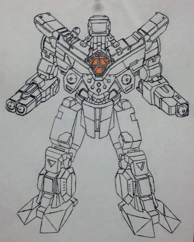
Updated: Added Annihilator, Owens, and Nova Cat. --still working on Osiris and portrait/profile of Mad Dog and Timberwolf

#26 Bishop Steiner

    ForumWarrior

  • PipPipPipPipPipPipPipPipPipPipPipPipPipPipPip
  • The Hammer
  • The Hammer
  • 47,187 posts
  • Locationclimbing Mt Tryhard, one smoldering Meta-Mech corpse at a time

Posted 05 July 2013 - 04:47 PM

Like the annihilator, though the arms didn't mount dual ACs.... was one in each arm and each torso, with the second barrel in the arms housing the laser (and 2 more in the CT). Unfortunately even the Clan LB-X ACs took 5 crits per gun, meaning no LA (elbow) actuator.

Looks wicked though.

#27 Foxdie

    Member

  • PipPipPipPipPip
  • Overlord
  • Overlord
  • 109 posts
  • LocationUSA

Posted 05 July 2013 - 04:55 PM

View PostBishop Steiner, on 05 July 2013 - 04:47 PM, said:

Like the annihilator, though the arms didn't mount dual ACs.... was one in each arm and each torso, with the second barrel in the arms housing the laser (and 2 more in the CT). Unfortunately even the Clan LB-X ACs took 5 crits per gun, meaning no LA (elbow) actuator.

Looks wicked though.


Yeah ....just matching it to the game designs, and I guess I misread when I read the variant. Thought it was 4 x lbx 10s .....not AC10s. So yeah that's a huge fail on my part.

#28 Bishop Steiner

    ForumWarrior

  • PipPipPipPipPipPipPipPipPipPipPipPipPipPipPip
  • The Hammer
  • The Hammer
  • 47,187 posts
  • Locationclimbing Mt Tryhard, one smoldering Meta-Mech corpse at a time

Posted 05 July 2013 - 05:50 PM

View PostFoxdie, on 05 July 2013 - 04:55 PM, said:


Yeah ....just matching it to the game designs, and I guess I misread when I read the variant. Thought it was 4 x lbx 10s .....not AC10s. So yeah that's a huge fail on my part.

not huge... still looks good!

And the original 3025 era was 4 ac10, 1 each in the RA, LA, LT & RT + 4 Medium lasers, in the RA, LA and two in the CT.

The 3050 TRO it was upgraded to 4 LB-10X, and 4 Medium Pulse Lasers, in the same locations. Always thought it was a stupid "upgrade" though, as it did nothing to address the actual flaws in the design, being low armor, low speed and low ammo.

I always preferred to simply swap in an XL 300 (with bigger Gyro it adds 2 tons) upgrade to 10 DHS (from the 17 single), use the remaining 5 tons to bring the armor up to 16.5 tons + CASE in each torso, switching to LB-10X and doubling the Ammo load. (2 tons each torso and arm). 60 pt alpha, and if standing still ZERO waste heat.

I also had a version packing 4 PPC, 4 Medium Lasers and TSM called Greased Lightning.

Edited by Bishop Steiner, 05 July 2013 - 05:59 PM.


#29 Foxdie

    Member

  • PipPipPipPipPip
  • Overlord
  • Overlord
  • 109 posts
  • LocationUSA

Posted 05 July 2013 - 10:35 PM

View PostBishop Steiner, on 05 July 2013 - 05:50 PM, said:

not huge... still looks good!

And the original 3025 era was 4 ac10, 1 each in the RA, LA, LT & RT + 4 Medium lasers, in the RA, LA and two in the CT.

The 3050 TRO it was upgraded to 4 LB-10X, and 4 Medium Pulse Lasers, in the same locations. Always thought it was a stupid "upgrade" though, as it did nothing to address the actual flaws in the design, being low armor, low speed and low ammo.

I always preferred to simply swap in an XL 300 (with bigger Gyro it adds 2 tons) upgrade to 10 DHS (from the 17 single), use the remaining 5 tons to bring the armor up to 16.5 tons + CASE in each torso, switching to LB-10X and doubling the Ammo load. (2 tons each torso and arm). 60 pt alpha, and if standing still ZERO waste heat.

I also had a version packing 4 PPC, 4 Medium Lasers and TSM called Greased Lightning.


Minus the failed weapon slots....what do you think of the translation ?

#30 Bishop Steiner

    ForumWarrior

  • PipPipPipPipPipPipPipPipPipPipPipPipPipPipPip
  • The Hammer
  • The Hammer
  • 47,187 posts
  • Locationclimbing Mt Tryhard, one smoldering Meta-Mech corpse at a time

Posted 06 July 2013 - 10:12 AM

View PostFoxdie, on 19 May 2013 - 09:53 AM, said:

LOVE to see it. Also I love feedback. Posted Image


Well, tbh, a lot of what I like about yours is because it is not dissimilar to the approach I took with my own redo.
-Squared up the basic design to give it a military/industrial feel
-De-emphasized the legs, which were always WAY too massive, considering the mech was dirt slow, and had 75% of it's mass in the upper body.
-Sensible arm armor and actuator layout, very similar to the approach I took with mine.

Most important, you took the overall outline and aesthetic of the mech, and kept it, while improving what needed improving. My knock with guys like David White isn't their art (far better than I am) but that they stick TOO closely to the designs, even retaining the parts that are just flat ridiculous or would be impossible, like half the hip and knee designs in the TROs.

Or Shortpainter, who has such a strong style and unified aesthetic to his own work they almost don't feel like they belong in the grungy Btech Universe anymore, but in his own ubercool game. (O wait.. they are... except that Game IS Btech Universe! ;) )

I have always personally tried to take the design, the spirit it was meant in, and then "fix" the parts that just didn't make sense. You seem to have a similar approach.

MY only "criticism" would just be to continue to tighten up the actual line art itself, so that your angles are contiguous and you proportions are in line, then maybe to work on adding some shading, which IMO, helps give any line art more sense of depth.

And hey, instead of feeling like you screwed up with the AC placement, design your own ANH-1 variant to explain those weapon placements. With minor tweaks those could easily become PPC or LPL barrels. The Dragoons built an all energy weapon version after Misery for cost effectiveness and logistics simplicity. Take a similar approach!

And keep drawing! :)

#31 NautilusCommand

    Member

  • PipPipPipPipPipPipPip
  • Ace Of Spades
  • Ace Of Spades
  • 695 posts

Posted 07 July 2013 - 07:17 AM

My god, I love the Nova Cat and the Owens! Very good work!

#32 Hebdomas

    Member

  • PipPipPipPipPip
  • Knight Errant
  • Knight Errant
  • 155 posts
  • Locationoutside Seattle, WA

Posted 07 July 2013 - 09:22 AM

Nice. For some reason I'm really liking the color of orange you use on the cockpits.

#33 Foxdie

    Member

  • PipPipPipPipPip
  • Overlord
  • Overlord
  • 109 posts
  • LocationUSA

Posted 08 July 2013 - 04:53 AM

View PostNautilusCommand, on 07 July 2013 - 07:17 AM, said:

My god, I love the Nova Cat and the Owens! Very good work!

Thanks!

View PostHebdomas, on 07 July 2013 - 09:22 AM, said:

Nice. For some reason I'm really liking the color of orange you use on the cockpits.

LoL yeah it does work great! It's just a basic Sharpie Orange that I had at work, too. Office supplies FTW.

View PostBishop Steiner, on 06 July 2013 - 10:12 AM, said:


Well, tbh, a lot of what I like about yours is because it is not dissimilar to the approach I took with my own redo.
-Squared up the basic design to give it a military/industrial feel
-De-emphasized the legs, which were always WAY too massive, considering the mech was dirt slow, and had 75% of it's mass in the upper body.
-Sensible arm armor and actuator layout, very similar to the approach I took with mine.

Most important, you took the overall outline and aesthetic of the mech, and kept it, while improving what needed improving. My knock with guys like David White isn't their art (far better than I am) but that they stick TOO closely to the designs, even retaining the parts that are just flat ridiculous or would be impossible, like half the hip and knee designs in the TROs.

Or Shortpainter, who has such a strong style and unified aesthetic to his own work they almost don't feel like they belong in the grungy Btech Universe anymore, but in his own ubercool game. (O wait.. they are... except that Game IS Btech Universe! :D )

I have always personally tried to take the design, the spirit it was meant in, and then "fix" the parts that just didn't make sense. You seem to have a similar approach.

MY only "criticism" would just be to continue to tighten up the actual line art itself, so that your angles are contiguous and you proportions are in line, then maybe to work on adding some shading, which IMO, helps give any line art more sense of depth.

And hey, instead of feeling like you screwed up with the AC placement, design your own ANH-1 variant to explain those weapon placements. With minor tweaks those could easily become PPC or LPL barrels. The Dragoons built an all energy weapon version after Misery for cost effectiveness and logistics simplicity. Take a similar approach!

And keep drawing! ;)


I appreciate the feedback! I was really thinking about coloring these but haven't got the amount of feed back to really push me to do them. These were just quick sketches to just get them outta my head. Do you have links to your designs here too?

#34 Bishop Steiner

    ForumWarrior

  • PipPipPipPipPipPipPipPipPipPipPipPipPipPipPip
  • The Hammer
  • The Hammer
  • 47,187 posts
  • Locationclimbing Mt Tryhard, one smoldering Meta-Mech corpse at a time

Posted 08 July 2013 - 08:50 AM

View PostFoxdie, on 08 July 2013 - 04:53 AM, said:

Thanks!


LoL yeah it does work great! It's just a basic Sharpie Orange that I had at work, too. Office supplies FTW.


I appreciate the feedback! I was really thinking about coloring these but haven't got the amount of feed back to really push me to do them. These were just quick sketches to just get them outta my head. Do you have links to your designs here too?

Quote, I used to, and still run some through here on occasion, but I dislike the verbage in the EULA, and so I yanked my TRO.
http://bishopsteiner...allery/43578500

#35 Stingray Productions

    Member

  • PipPipPipPipPipPipPipPip
  • 1,906 posts

Posted 08 July 2013 - 04:15 PM

those pics are beautiful!

#36 Max OConnor

    Member

  • PipPipPipPipPipPipPip
  • The Phoenix
  • The Phoenix
  • 731 posts
  • Google+: Link
  • Facebook: Link
  • LocationLebanon, TN

Posted 09 July 2013 - 07:14 AM

OMG I so love this rendering of the Guillotine.
I want this version as a figure BAD.
BEST version Ive ever seen.
SOO MUCH GOOD......

Posted Image

#37 Bishop Steiner

    ForumWarrior

  • PipPipPipPipPipPipPipPipPipPipPipPipPipPipPip
  • The Hammer
  • The Hammer
  • 47,187 posts
  • Locationclimbing Mt Tryhard, one smoldering Meta-Mech corpse at a time

Posted 09 July 2013 - 08:59 AM

View Postmaxoconnor, on 09 July 2013 - 07:14 AM, said:
OMG I so love this rendering of the Guillotine.
I want this version as a figure BAD.
BEST version Ive ever seen.
SOO MUCH GOOD......

Posted Image

about the only thing I would "fix" on it might be the AMS pod being at an angle. I would probably give a flat platform for it for a variety of functionality reasons, but it is pretty epic. And maybe put the paul;drons on hinges. LOVE the overall transformation

Edited by Bishop Steiner, 09 July 2013 - 09:00 AM.


#38 Foxdie

    Member

  • PipPipPipPipPip
  • Overlord
  • Overlord
  • 109 posts
  • LocationUSA

Posted 09 July 2013 - 01:56 PM

Updated: Added my Marauder Concept and the Osiris

#39 Maestro Baits

    Member

  • PipPipPip
  • Legendary Founder
  • Legendary Founder
  • 60 posts

Posted 09 July 2013 - 04:15 PM

Mauler looks great, but damn that Osiris!

#40 Foxdie

    Member

  • PipPipPipPipPip
  • Overlord
  • Overlord
  • 109 posts
  • LocationUSA

Posted 10 July 2013 - 01:46 PM

Update: Added Warhammer Concept. --Also-- Working on coloring one of these to see how well received it is.


3 user(s) are reading this topic

0 members, 3 guests, 0 anonymous users