Marauder Concept / Design Contest - (Unofficial) - Ended
#261
Posted 08 November 2013 - 09:45 PM
#262
Posted 08 November 2013 - 09:46 PM
Odanan, on 08 November 2013 - 09:08 PM, said:
It's seriously work-in-progress (I can't continue any longer... it's 3 AM here and I'm almost fainting over my keyboard). If you never see me again in the forums is because my wife killed me.
It's based on this:
really liking it!
#263
Posted 08 November 2013 - 09:59 PM
My first attempt at painting in photoshop... Drew this Sunday then have been messing with it in photoshop learning as I go.
#264
Posted 08 November 2013 - 10:39 PM
Odanan, on 08 November 2013 - 09:08 PM, said:
It's seriously work-in-progress (I can't continue any longer... it's 3 AM here and I'm almost fainting over my keyboard). If you never see me again in the forums is because my wife killed me.
It's based on this:
Great one!
Nice to see someone else with "shields"
I think the legs on mine are too skinny (reseen ones)
Fherot, on 08 November 2013 - 09:59 PM, said:
My first attempt at painting in photoshop... Drew this Sunday then have been messing with it in photoshop learning as I go.
This one turned out great too!
I like the reptilian look, the arms could be a bit bigger
Edited by Reno Blade, 08 November 2013 - 10:41 PM.
#265
Posted 08 November 2013 - 10:50 PM
Odanan, on 08 November 2013 - 09:08 PM, said:
It's seriously work-in-progress (I can't continue any longer... it's 3 AM here and I'm almost fainting over my keyboard). If you never see me again in the forums is because my wife killed me.
It's based on this:
the legs, the arms and shields are from existing designs. apart of that - nice one. ah... an torso.
Edited by vetal l, 08 November 2013 - 10:57 PM.
#266
Posted 08 November 2013 - 10:54 PM
Shimmering Sword, on 08 November 2013 - 01:51 AM, said:
I worked up a mixture of my past Marauder design while referencing MWO concept art to get the style closer (properly emulating Alex's art style would be quite time consuming). I pulled in a few MWO Cataphract details to round it out.
For those wondering about the relation between my original design and the official MAD-4X. Mine came first, or rather mine was done at the same time the 4X was being designed. Catalyst saw my version and asked to use it, swapping and modifying a few parts to fit the loadout and existing concepts. I then painted the official cover art to handle payment for my design work, while Matt Plog finished his job of making the lineart.
This is my favourite thing.
Edited by dak irakoz, 08 November 2013 - 10:54 PM.
#267
Posted 09 November 2013 - 02:01 AM
good luck everyone!
#268
Posted 09 November 2013 - 02:06 AM
Kain, on 08 November 2013 - 11:57 AM, said:
Shimmering Swords design has a lot of quality, but the mech has also taken alot of carbs.
i keep thinking of a catapult when i see it though, the legs the cockpit ct and even the shoulder joints are taken from the missle rack joints of a catapult... is it just me seeing too much catapult in that design?
#269
Posted 09 November 2013 - 03:02 AM
EviceratorN, on 08 November 2013 - 09:45 PM, said:
It's not my favorite rendition so far, but it has its appeal.
From your WIP, I kinda like this one the best. I'd still ditch the missile launcher, probably, but this might require a few further steps to "balance" the top. The WIP feels "retro".
And is it just me, or does this Marauder look like it's smoking a cigarette? Maybe it's the "Lucky Luke" Marauder hero?
Odanan, on 08 November 2013 - 09:08 PM, said:
It's seriously work-in-progress (I can't continue any longer... it's 3 AM here and I'm almost fainting over my keyboard). If you never see me again in the forums is because my wife killed me.
It's based on this:
Yours seems to be the original design done in good. I like it.
#270
Posted 09 November 2013 - 03:16 AM
Quote
#271
Posted 09 November 2013 - 04:18 AM
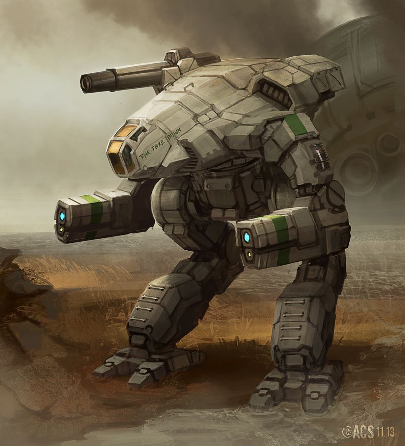
Here is my submission, I had a lot of fun working on it:
Edited by ResidentCrow, 09 November 2013 - 04:34 AM.
#272
Posted 09 November 2013 - 04:22 AM
i kind of doubt i will be meeting the deadline, so i decided to just quickly sketch the concept in gimp and post anyway, for people to see what is going on so far...
*edit*
hmmm... it looked better when i was still drawing on paper...
Edited by Zephiris2, 09 November 2013 - 04:24 AM.
#273
Posted 09 November 2013 - 04:42 AM
vetal l, on 08 November 2013 - 10:50 PM, said:
And everything.
Odanan, on 08 November 2013 - 09:08 PM, said:
this is just my humble (and flawed) vision of the Reseen Marauder, made with parts of MWO mechs.
As I can't draw, I did it the hard way (or the easy way?). Everything is from some MWO mech - the legs are clearly from the Cataphract, like they are supposed to.
Why I did the Reseen? Because the Unseen Marauder is like that perfect ex-girlfriend you used to love deeply but got married with a NBA player. You need to let go.
I don't know if I will be able to finish it in time, so this is my entry.
#274
Posted 09 November 2013 - 04:44 AM
I get the feeling many are messing with the cockpit location. Not the thing i would change. I would make the legs slimmer at the end and mess with the 60° angle but still keep the leg joints hidden in the torso. Sadly i'm no artist.^^
Edited by JohnnyWayne, 09 November 2013 - 04:46 AM.
#275
Posted 09 November 2013 - 04:44 AM
ResidentCrow, on 09 November 2013 - 04:18 AM, said:
Here is my submission, I had a lot of fun working on it:
Holly mother! This is beast!
#276
Posted 09 November 2013 - 06:05 AM
ResidentCrow, on 09 November 2013 - 04:18 AM, said:
Here is my submission, I had a lot of fun working on it:
funny thing i've noticed. most artists do not compare sizes of elements with human size. steps on armor plates for example. i do not mean only this design but most of them. even official ones.
no offence but elements must be functional. if you make an air intake why make air intake above first one? there's no sense in it.
the legs on this one are good ones. because i can imagine how to make turn on this mech. most mechs have hips and knees and even ankles but legs can only bend. this one as far as i can see can make a turn around ankle.
#277
Posted 09 November 2013 - 06:18 AM
vetal l, on 09 November 2013 - 06:05 AM, said:
no offence but elements must be functional. if you make an air intake why make air intake above first one? there's no sense in it.
the legs on this one are good ones. because i can imagine how to make turn on this mech. most mechs have hips and knees and even ankles but legs can only bend. this one as far as i can see can make a turn around ankle.
Actually I was imagining the vents are for heat sinks, so I felt okay putting them near eachother as a mech can have many in the same part. I'm glad to hear when things like that dont communicate to the viewer properly though, so thanks for the comment! Gives me things to work on.
Edited by ResidentCrow, 09 November 2013 - 06:18 AM.
#278
Posted 09 November 2013 - 06:38 AM
ResidentCrow, on 09 November 2013 - 06:18 AM, said:
Actually I was imagining the vents are for heat sinks, so I felt okay putting them near eachother as a mech can have many in the same part. I'm glad to hear when things like that dont communicate to the viewer properly though, so thanks for the comment! Gives me things to work on.
nice to hear =). also that things on legs under the knees. that looks like smoke grenade launchers. they wouldn't allow legs to bend in knees i guess.
and the things that looks like blast shields around lasers and cockpit. they surely add details but do not add sense =)
i really like your model. do you have a back side view?
#279
Posted 09 November 2013 - 06:52 AM
vetal l, on 09 November 2013 - 06:38 AM, said:
and the things that looks like blast shields around lasers and cockpit. they surely add details but do not add sense =)
i really like your model. do you have a back side view?
Ah, yeah, the blast shields around the lasers are just for styling, The pipes under the knees could probably be pushed to the side a smidge to make it clear the top can fit into them too.
The back 3/4 sketches I did for myself aren't really presentable. I really wanted to finish one, or maybe some orthographics but I only found out about this recently and had to finish in a short amount of time.
I appreciate the interest though, makes me want to do a few tweaks and add the extra view.
#280
Posted 09 November 2013 - 07:04 AM
ResidentCrow, on 09 November 2013 - 06:52 AM, said:
Ah, yeah, the blast shields around the lasers are just for styling, The pipes under the knees could probably be pushed to the side a smidge to make it clear the top can fit into them too.
The back 3/4 sketches I did for myself aren't really presentable. I really wanted to finish one, or maybe some orthographics but I only found out about this recently and had to finish in a short amount of time.
I appreciate the interest though, makes me want to do a few tweaks and add the extra view.
you must be perfect in skinning 3D models. so many small details... i like em.
2 user(s) are reading this topic
0 members, 2 guests, 0 anonymous users