the only real difference is that they took the time to actually detail out the entire mech. that used to be cost prohibitive.

Favorite Mechs Aesthetically, You Should Post Some.
Started by dal10, Oct 23 2013 05:09 AM
49 replies to this topic
#21
-
-

- Philanthropist
- 4,525 posts
Member
- Locationsomewhere near a bucket of water and the gates of hell.
Posted 24 October 2013 - 02:22 PM
#22
-

-
- Liquid Metal

- 574 posts
Member
- LocationPoland
Posted 24 October 2013 - 02:59 PM
 Sadistic Savior, on 24 October 2013 - 12:56 PM, said:
Yeah, that was my point. Battletech was NOT about anime mechs in the beginning. It took designs and made them gritty and realistic.
The Battlemaster in Battletech source books does not look cartoony like the original Anime version. Which was my point.
The Battlemaster in Battletech source books does not look cartoony like the original Anime version. Which was my point.
Ok, i saw people defending classic unseen designs from a lot of angles (mostly nostalgic or ironic ones), but "gritty and realistic" is a first. You can draw some more lines on Zentraedi Glaug Officer's Battle Pod, but at the end it's still Zentraedi Glaug Officer's Battle Pod.
And it looks as "gritty and realistic" as, well, ponies. Or something that passed for them in early 80s.
Edited by ssm, 24 October 2013 - 02:59 PM.
#23
-
-
- 574 posts
Member
Posted 24 October 2013 - 03:18 PM
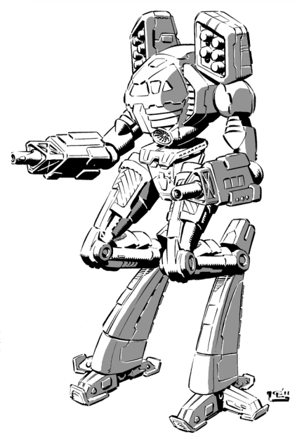
I think it's less about general shape, and more the art style itself. Consider the Centurion. . .
I don't really love the first picture, but to me it at least looks like it belongs in a technical manual. The second picture, while obviously the same machine, looks like it belongs in a comic book. I like my BattleMechs to look like they walked off an assembly line, and not out of a children's cartoon.
MWO does it right, IMHO.
#24
-
-
- Liquid Metal
- 574 posts
Member
- LocationPoland
Posted 24 October 2013 - 03:27 PM
Spokes, on 24 October 2013 - 03:18 PM, said:
I think it's less about general shape, and more the art style itself. Consider the Centurion. . .
I don't really love the first picture, but to me it at least looks like it belongs in a technical manual. The second picture, while obviously the same machine, looks like it belongs in a comic book. I like my BattleMechs to look like they walked off an assembly line, and not out of a children's cartoon.
MWO does it right, IMHO.
I don't really love the first picture, but to me it at least looks like it belongs in a technical manual. The second picture, while obviously the same machine, looks like it belongs in a comic book. I like my BattleMechs to look like they walked off an assembly line, and not out of a children's cartoon.
MWO does it right, IMHO.
When I saw Centurion TRO drawing you posted, first thing that came to my mind was "Let's draw something that we'll be easily able to convert into metal miniature in 80s". Still, better than most Unseens.
Edited by ssm, 24 October 2013 - 03:39 PM.
#25
-
-
- Urban Commando

- 1,250 posts
Member
- LocationInner sphere drop point
Posted 24 October 2013 - 05:16 PM

#26
-
-
- Philanthropist
- 4,525 posts
Member
- Locationsomewhere near a bucket of water and the gates of hell.
Posted 24 October 2013 - 05:26 PM
^this guy knows what is going on.
#27
-

-
- Legendary Founder

- 2,107 posts
Member
- LocationOH, USA
Posted 24 October 2013 - 09:03 PM
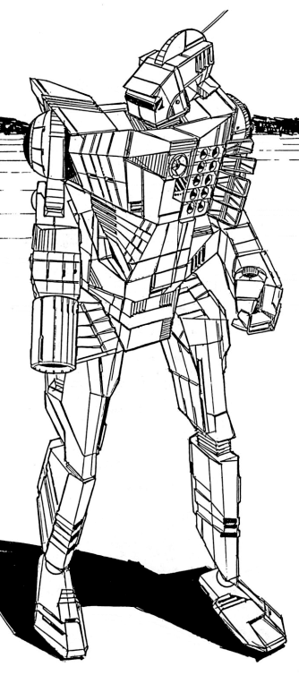
Marauder {disclaimer, this isn't my art and credit goes to whomever the orignal artist[s] is/are}

OR
OR
Spoiler


#29
-
-
- Wrath

- 20,369 posts
Member
- LocationBlack Dot in a Sea of Blue
Posted 25 October 2013 - 12:53 AM
Spokes, on 24 October 2013 - 03:18 PM, said:
I think it's less about general shape, and more the art style itself. Consider the Centurion. . .
I don't really love the first picture, but to me it at least looks like it belongs in a technical manual. The second picture, while obviously the same machine, looks like it belongs in a comic book. I like my BattleMechs to look like they walked off an assembly line, and not out of a children's cartoon.
MWO does it right, IMHO.
I don't really love the first picture, but to me it at least looks like it belongs in a technical manual. The second picture, while obviously the same machine, looks like it belongs in a comic book. I like my BattleMechs to look like they walked off an assembly line, and not out of a children's cartoon.
MWO does it right, IMHO.
I have to add - that the later model is a Retro Tech Centurion - "not" the High Tech variant of the Centurion A
made by Chris Lewis:
And of course he has made really good stuff too:
or
YOu like the first Centurion - made by Duane Loose in 86's?
but he also did this:

Or those semi - digital - pictures of the MHI Defense AA Tank from TRO 3145 (picture not available) - i really dislike.
Same goes for the Trajan Infantry fighting tank from TRO 3085 - although i like Justin Nelsons Barghest (2nd Post in this Topic)
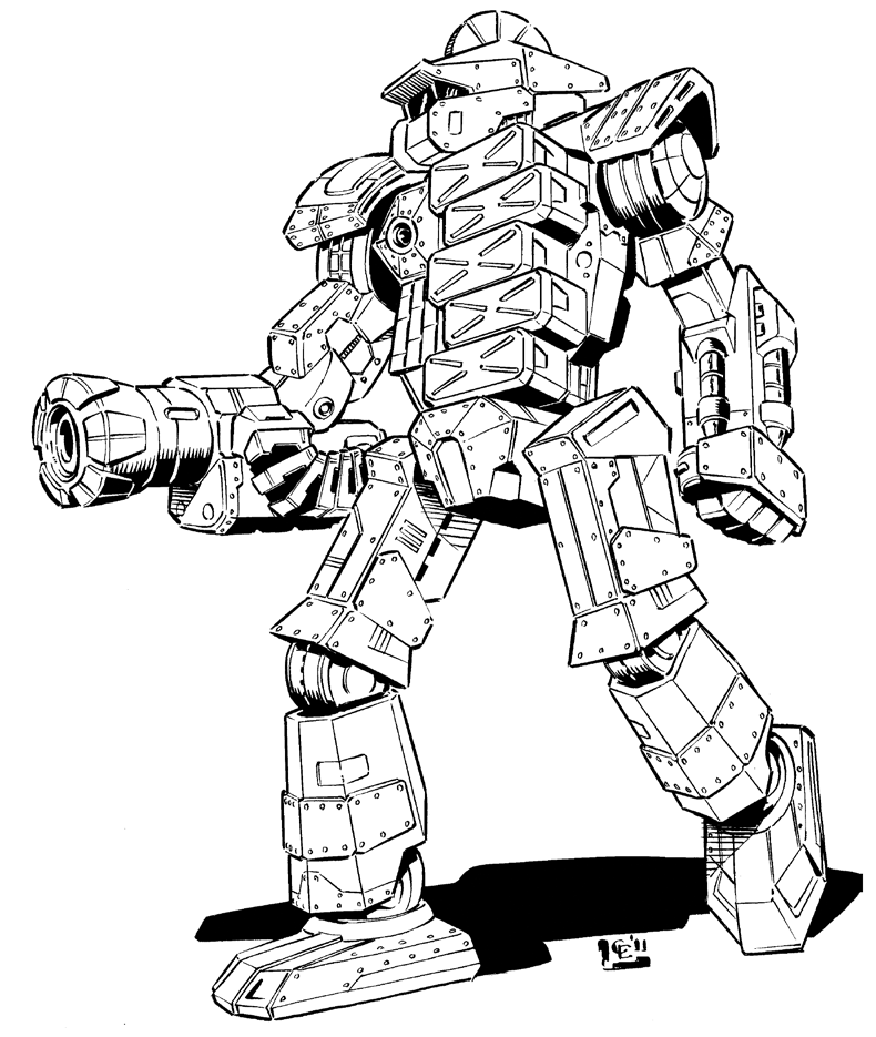
The Deva - made by Brent Evans - same as the TRO 3050 U pictures - funny he made both:
here is his take on the
Centurion:

to make the CN9-series complete:
by David White:

#30
-
-
- Little Helper
- 439 posts
Member
Posted 25 October 2013 - 07:04 AM
I am stuck between the Mech Assault 2 version of the Blood Asp and Star Adder.
They just look so great when they fire off a plasma ppc alpha! Yeah, I know. It's not canon, but launching a plasma ppc alpha into the face of a critical Ymir is and always will be my fondest experience of anything related to Mechwarrior.
Blood Asp

and Star Adder (firing plasma ppc alpha)

They just look so great when they fire off a plasma ppc alpha! Yeah, I know. It's not canon, but launching a plasma ppc alpha into the face of a critical Ymir is and always will be my fondest experience of anything related to Mechwarrior.
Blood Asp
and Star Adder (firing plasma ppc alpha)
Edited by shellashock, 25 October 2013 - 07:11 AM.
#31
-
-
- Elite Founder
- 335 posts
Member
- LocationGallifrey

Posted 25 October 2013 - 08:20 AM
For me, I find that I like the mech designs in the 3025, 3050 and 3058 TROs the most. There are some in the others that are ok, but there are many that just make me go WTF? I like a clean design to a mech, something that just looks elegant. I'll post a pic or two a bit later........gotta get some work done first.
#32
-
-
- The Wolf
- 2,984 posts
Member
Posted 25 October 2013 - 12:22 PM

3025 WLF-1 Wolfhound was one of my favorites and then the 2X came along.
Even the Thunder Fox cannot compete with those looks when it comes to quads.
#33
-
-
- 907 posts
Member
Posted 25 October 2013 - 01:13 PM
ssm, on 24 October 2013 - 02:59 PM, said:
Ok, i saw people defending classic unseen designs from a lot of angles (mostly nostalgic or ironic ones), but "gritty and realistic" is a first. You can draw some more lines on Zentraedi Glaug Officer's Battle Pod, but at the end it's still Zentraedi Glaug Officer's Battle Pod.
You can make real life tanks look cartoony too by removing some lines. So what?
#34
-
-
- Legendary Founder
- 2,107 posts
Member
- LocationOH, USA
Posted 25 October 2013 - 01:27 PM
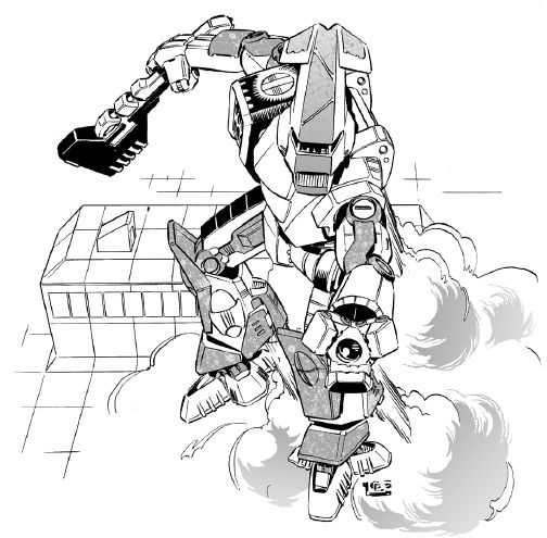
Karl Streiger, on 25 October 2013 - 12:53 AM, said:
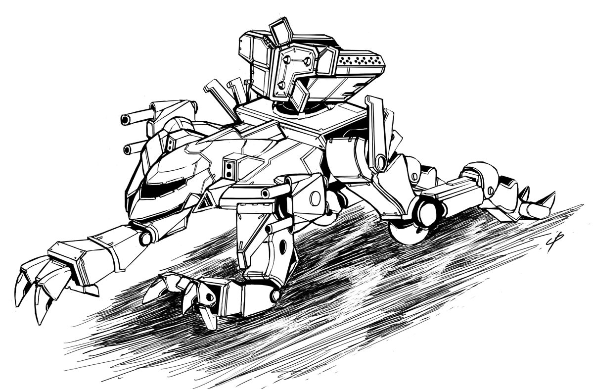
I'm actually hoping when the clans are implemented that the Mad Dog looks like that, I never liked the closed housing laser arms and chin turret Mad Dog [see spoiler]. There's something about the "lance" like arms that make it look cooler.
Spoiler

Edited by Iron Harlequin, 25 October 2013 - 01:33 PM.
#35
-
-
- 574 posts
Member
Posted 25 October 2013 - 01:44 PM
ssm, on 24 October 2013 - 03:27 PM, said:
When I saw Centurion TRO drawing you posted, first thing that came to my mind was "Let's draw something that we'll be easily able to convert into metal miniature in 80s". Still, better than most Unseens.
You know, now that you mention it I can see it too. There is a good deal of repetition in the original 3025 TRO, the same blocky shapes and postures. I'd never really thought about it before, but those old metal miniatures might well have had something to do with it. My box set came with cardboard cut outs.

I've heard it said that WWII was the golden age of aircraft aesthetics-- aerospace designers hadn't figured everything out yet, and so there was more freedom to try different things. Manufacturers produced aircraft that were unique to their design team-- though it was outclassed by 1944, the Allies deployed the P-38 in large numbers during the Normandy landings simply because they felt that nervous Allied gunners would never mistake it for an enemy fighter.
The original 3025 TRO gives me the same feeling, and I think the various Unseen models are the reason why. Individually, some may look better than others, but taken together they are all different. Because they came from different sources, I think the Unseen really helped promote the feeling that the BattleMechs in that readout were coming from different companies on different worlds. They look like they came off of different drawing boards because they did.
Karl Streiger, on 25 October 2013 - 12:53 AM, said:
I have to add - that the later model is a Retro Tech Centurion - "not" the High Tech variant of the Centurion A
Both of the "Retro Tech" Centurion (die Dark Age, die) and the artwork you linked have the exact same problem. I look at those images, and my brain screams "comic book".
Karl Streiger, on 25 October 2013 - 12:53 AM, said:
You like the first Centurion - made by Duane Loose in 86's?
No, not really. But I like it better than the "Retro tech" artwork. Yes, the RT is more detailed. But it doesn't look like a war machine, it looks like a cartoon character. It's almost cute. It looks like it needs a lunch box in its left hand and I just want to pinch its cheeks and wish it good luck on it's first day at little 'Mech school.
Of all the images you linked above, the only one I like is the Mad Dog. The others look like characters out of a graphic novel to me.
#36
-
-
- Liquid Metal
- 574 posts
Member
- LocationPoland
Posted 25 October 2013 - 02:50 PM
Sadistic Savior, on 25 October 2013 - 01:13 PM, said:
You can make real life tanks look cartoony too by removing some lines. So what?
Oh no, you won't - that's the point. There is a lot more to making something either "gritty and realistic' or "cartoonish" than adding/removing some lines. Some designs just belong to 80s anime series, and should stay there.
I've had similar discussion not long ago, so've decided to do an experiment. Namely, re-read "Decision at Thunder Rift", classic BT book prominently featuring Marauder. Every time I tried to imagine aforementioned mech as classic, unseen design, my immersion broke (while reading about how badass and fearsome Marauder is, I snorted). So I've imagined Shimmering Sword's Marauder instead.
I understand people who started playing BT in 80s and have strong feelings for Unseens. But let's be serious - BT is barely sustaining itself, one of the main reasons being horrible artwork*. The last thing it needs is bringing back 80s anime designs into it.
*In any case, I don't consider unseen Marauder artwork bad. It's pretty cool. But it belongs in Super Dimensional Fortess Macross, and not because of legal reasons, but design ones.
Edited by ssm, 25 October 2013 - 03:13 PM.
#37
-

-
- Legendary Founder

- 1,436 posts
Member
- LocationTerra
Posted 25 October 2013 - 03:18 PM
I do like the aesthetics of the Great Turtle, that and it's better armored than a lance of Atlai 

#38
-

-
- Overlord

- 78 posts
Member
- LocationOntario
Posted 26 October 2013 - 01:16 PM
Always liked the look of the Albatross, too bad there's not much artwork of it, at least not artwork I can find. 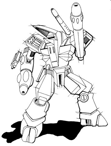
#39
-
-
- Knight Errant

- 165 posts
Member
Posted 30 October 2013 - 06:15 PM
One from the Civil War era. The Anubis!
I never liked the dark age much, nor the Jihad either. My time line stops after the Civil war era.
I never liked the dark age much, nor the Jihad either. My time line stops after the Civil war era.
Edited by Nathan Bloodguard, 30 October 2013 - 06:16 PM.
#40
-
-
- Bridesmaid
- 2,953 posts
Member
- LocationAdelaide, Australia
Posted 30 October 2013 - 06:48 PM
M Jordanus Sicarius, on 26 October 2013 - 01:16 PM, said:
Always liked the look of the Albatross, too bad there's not much artwork of it, at least not artwork I can find.
There's a good colour rendering of the Albatross in the background of Field Manual: FWL


8 user(s) are reading this topic
0 members, 8 guests, 0 anonymous users


