This topic is locked

 Marcobra, on 19 November 2013 - 02:46 AM, said:
Fherot, Bishop, thank you guys for the quality feedback. I'll admit that I sometimes cringe at paintovers (even from my AD, hehe) but don't worry I don't let that gut reaction take away from the intended message. I think you guys are both right about pulling the torso forward more. There's a lot of little things that will always bother me about the image, but isn't that always how it is?
Here are some quick crits to return the favor...
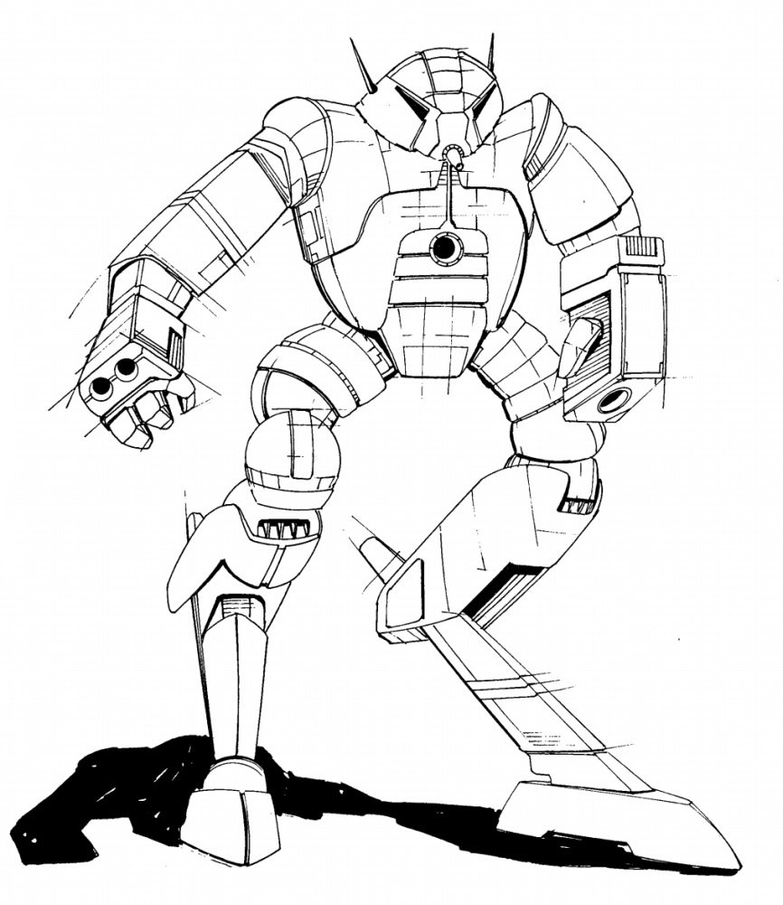
Fherot - You have some really solid linework here, something I personally admire because I'm so lousy at it I understand that you're not fully comfortable painting up your images yet, but I don't think you have anything to worry about there. If anything I'd say the technical issue that made this difficult to read was the choice of lighting. Backlighting is a tricky thing to pull off if you're just starting out with rendering. It requires a lot of commitment to hard shadows and a pretty advanced knowlege of form. It's generally used for dramatic effect and it's not typically good at showcasing design either. I would recommend sticking with a more simple overhead lighting situation until you feel comfortable moving on to a bigger challenge. I really do dig the design and it was an easy "like" from me. I do think the cockpit is a touch on the tiny side, but that's just my personal taste.
Bishop - Another easy "Like" with this one. You mentioned having some trepidation towards going digital but I honestly think your designs would really sing with some cleaned up linework which I think you could easily handle in Photoshop. Yours was easily one of my favorite designs in the contest. My only real crit would be that the angle and pose that you selected make it difficult to see what's happening with the legs. I think that if the torso is going to be so twisted, then we should be able to see both hips for a quicker read. I also think hiding the rear foot behind the hill makes it look a bit awkward, but the clarity of the front foot certainly helps. To be honest, while I really liked your design, it wasn't my #1 pick in the beginning. However there are a lot of elements that really resonate with me and the more I look at it the better I appreciate it. In fact, my final vote came down between you and crow, and I think you might be surprised by who I went with
Here are some quick crits to return the favor...
Fherot - You have some really solid linework here, something I personally admire because I'm so lousy at it
I understand that you're not fully comfortable painting up your images yet, but I don't think you have anything to worry about there. If anything I'd say the technical issue that made this difficult to read was the choice of lighting. Backlighting is a tricky thing to pull off if you're just starting out with rendering. It requires a lot of commitment to hard shadows and a pretty advanced knowlege of form. It's generally used for dramatic effect and it's not typically good at showcasing design either. I would recommend sticking with a more simple overhead lighting situation until you feel comfortable moving on to a bigger challenge. I really do dig the design and it was an easy "like" from me. I do think the cockpit is a touch on the tiny side, but that's just my personal taste.Bishop - Another easy "Like" with this one. You mentioned having some trepidation towards going digital but I honestly think your designs would really sing with some cleaned up linework which I think you could easily handle in Photoshop. Yours was easily one of my favorite designs in the contest. My only real crit would be that the angle and pose that you selected make it difficult to see what's happening with the legs. I think that if the torso is going to be so twisted, then we should be able to see both hips for a quicker read. I also think hiding the rear foot behind the hill makes it look a bit awkward, but the clarity of the front foot certainly helps. To be honest, while I really liked your design, it wasn't my #1 pick in the beginning. However there are a lot of elements that really resonate with me and the more I look at it the better I appreciate it. In fact, my final vote came down between you and crow, and I think you might be surprised by who I went with
Great feedback!
And an admission, the stupid foot ended up hid behind the hill because I was having one of those days I just couldn't get it to look right!!!!

My trepidation is more in going to purely digital, as I have used gimp as an editing tool a fair bit. I am having trouble divorcing myself from the concept of looking at what my pen is doing. Never had any art classes or training, so the whole "look at the nude model not your painting thing" never really was learned!