
Visual Feedback On Ui + Revamp Mockups
#41
Posted 13 February 2014 - 06:15 AM
@Valcrow: Great work!
It could be so easy... PGI get's their homework done for free! Btw... how long did it take them to just design UI2.0?
#42
Posted 13 February 2014 - 11:33 AM
#43
Posted 13 February 2014 - 12:19 PM
#44
Posted 13 February 2014 - 12:37 PM
 Valcrow, on 10 February 2014 - 03:57 AM, said:
Like many, I've had my share of frustration with the new UI. Although I appreciate the new graphics, and obviously a nicer backend to the UI, the functionality is not quite as we'd hoped. I think you've swayed a bit too much in the artistic direction and not enough on the user experience.
Instead of voicing the dissatisfaction through a wall of text. I thought it actually faster for me to just mock something up instead so maybe we can pinpoint our grips.
I've even mocked up an example of what I think would be pleasant to use, in keeping with your framework and art direction. -in hopes that it is easy to implement. Though I know, stuff's always harder than it looks.
I think the biggest problem lies in the hierarchy of information and underutilized screen realestate. And possibly a lack of consideration for function of the mech selection screen.
IMO, The FUNCTION of this page is to SELECT your mech. Get an OVERVIEW, and either launch or decide to REFIT.
For that, we need the following information in order of priority:
1. Mechs in bay
2. Loadout of selected mech
3. Information relating to decision to refit
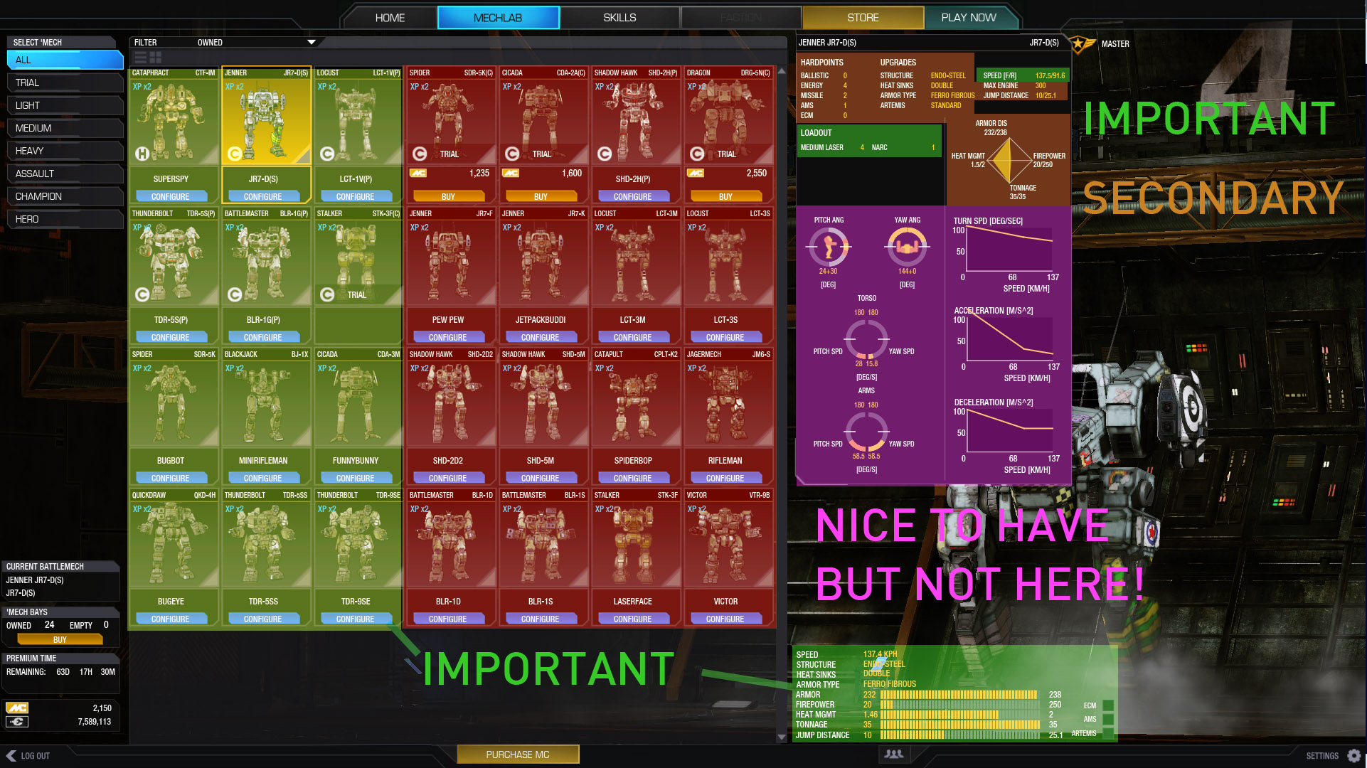
Currently, There are a few major problems:
The important stuff as I perceive it is in the corners and tiny. The best realestate in the center is taken up by 16 redudant mech portraits that could be solved by scrolling or filtering.
When I choose a mech, I need to see what it has immediately to decide if I want to use that one. Currently it requires a buggy 'mouse over', and information on that mech is incomplete and also tiny.
Important stuff should be in the center, and your eyes should go in a natural flow.
I propose the following:
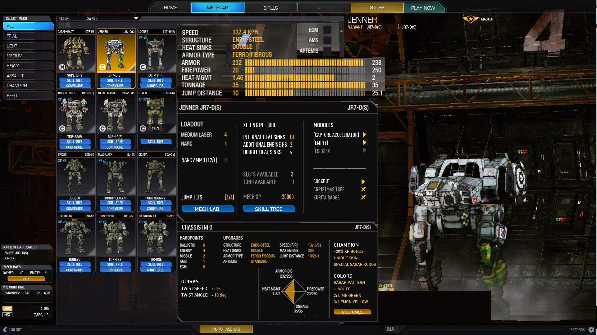
This layout follows my decision making process more fluidly providing much more info.
The first panel, is the overview.
The second panel, the loadout (including missing information like modules, ammo, slots, HS.)
The third, Chassis info that you 'might' need
Each panel gets more specific as it flows so you naturally get from generic to specific until you make your decision to launch or refit.
Additional stuff that I'd like on the page integrated into layout:
SKILL tree included on top of the configure button.
Easy access to modules for stuff like arty strikes.
Quirk information.
Bonus XP/Cbills info
Cockpit items - for easy removal to put in other mechs.
Removed the arm/yaw information
Although pretty, very rarely do you need that specific information...
All we loose to the currently layout is 16 mech portraits that we can scroll to get.
Here is the arrangement of importance on this layout:
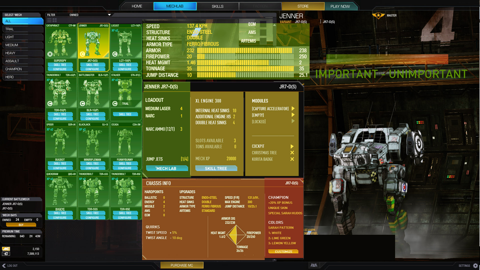
LOADOUT!
Loadout screen has more issues than the mech selection IMO. It takes ages to do anything. There is no overview perspective. I'm willing to bet the vast majority of people will find the OLD UI quicker to setup mechs than this..
I think this is due to the placement of buttons, the steps you need to take to do anything requires you to go across the screen to the left and right constantly. Whle the middle is not being used. Picture to illustrate.
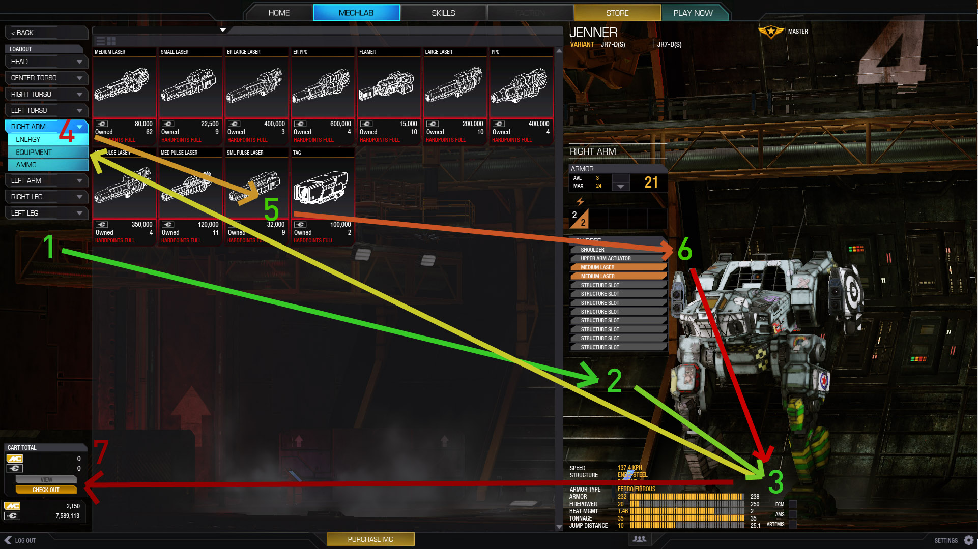
1, select a point to view
2. figure out which slots are free
3. check weight (its tiny and in the corner.. this is the most common thing to look at when customizing.. tonnage)
4. Select a catagory of item (ok in theory, but problems exaggerated by not being able to see more than 1 part at a time.)
5. click and drag, no double click? also, uses too much prime realestate (THE CENTER OF YOUR SCREEN)
6. drag part onto here. That works. What doesn't work is that you don't know how that relates to your other parts of the mech.
7. Check out is bottom left? Most naturally, done, ok or close buttons are on the bottom right, or sometimes top right. Never left.
You can see that your eyes and mouse are constantly going across the middle... eating up brain energy. We're also missing critical infomration for customization like free critical slots. And an overview.
Just imagine adding heat sinks to each part, and realizing you need to get .5 tons somewhere... Nightmare.
Ok, so... Here's my proposal:
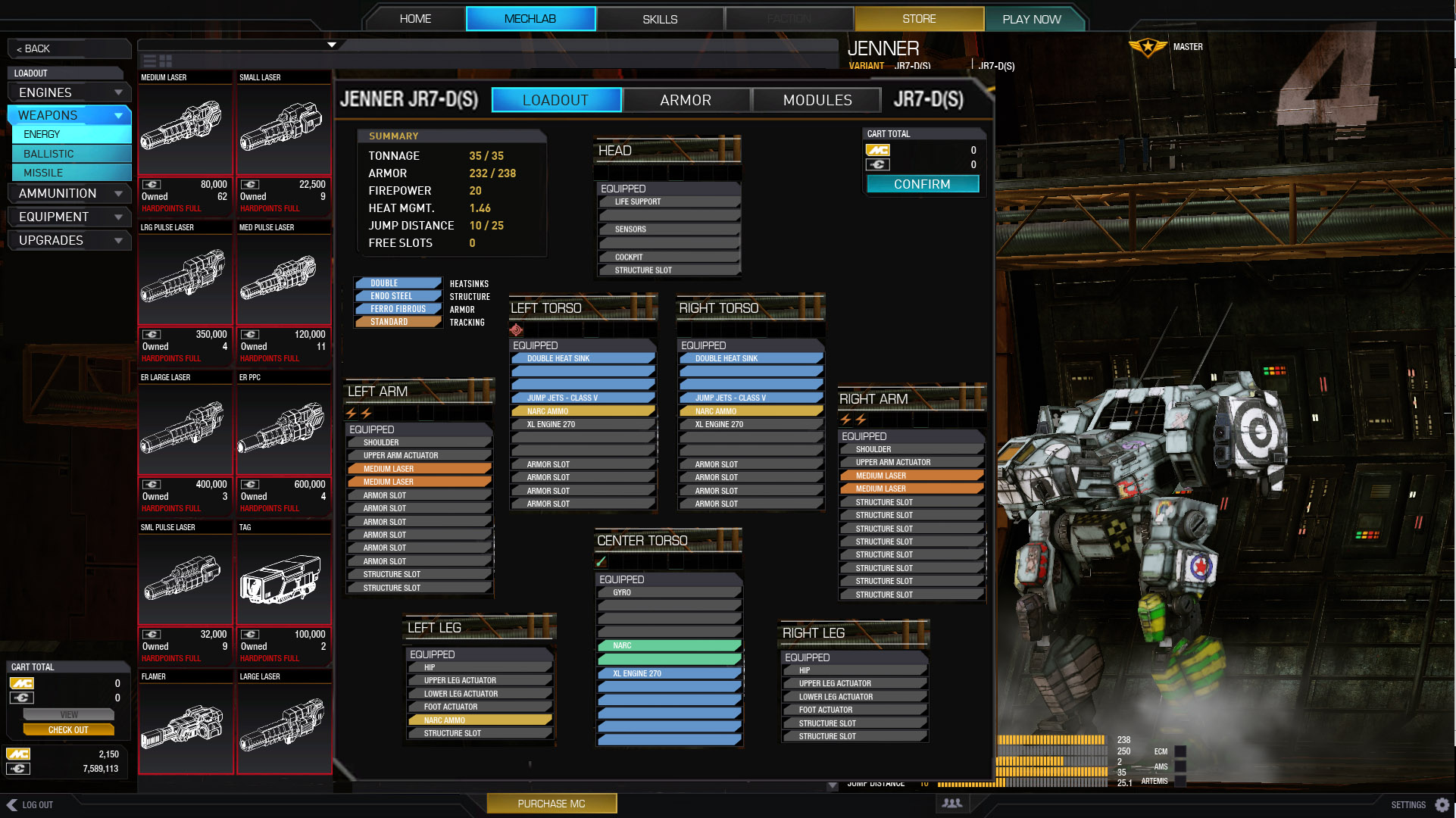
I don't think I need to explain this.
Note that I've removed armor into another tab.
Hardpoints don't need to be as complicated as they are. 2 lighting bolts = 2 energy hardpoints.
Tonnage, firepower etc is easily referenced in the middle of the screen.
Still have enough space to mouse over anything for expanded info.
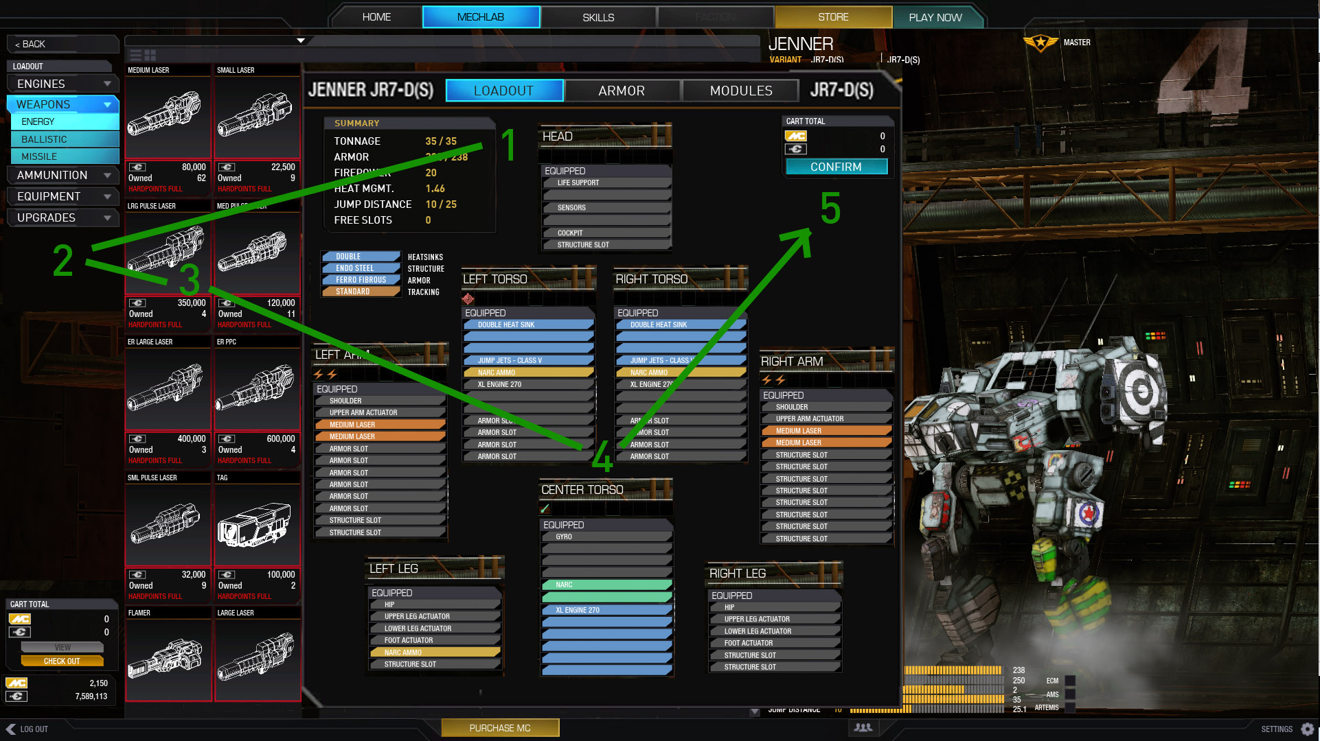
Here is the flow:
1. check overview/ tonnage
2. pick what you want
3. drag it over
4. make sure everything fits.
1. check tonnage (visually close)
5. repeat/confirm or go to armor.
Most of the function is in the middle of the page. and going in a natural circle. Most importantly you have at a glance all the information you need to decide what to do.
Armor...
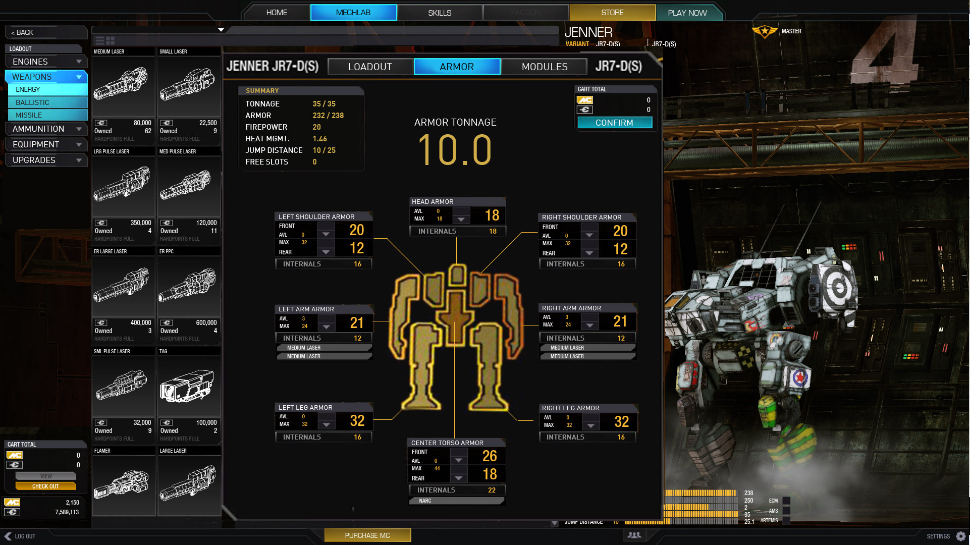
Again, I need not explain really.
Shows you where your guns are, so you can make sure those spots have more armor than your disposable arms.
Internal point value showing! (we need this!)
And armor tonnage totals, for getting those .5t and 1.0 values.
__________________________
I know UI 2.0 is at it's early stages, but holy cow I didn't think it would be that infuriating to use.
It does look pretty though.
I hope this helps illustrate specifically the gripes we have with 2.0.
Let me know if you all agree/disagree. Thoughts, critiques.
Thanks for looking.
Dude, that's totally awesome work!
I'd absolutely appreciate your design of the new mechlab, allthough I got used to the actual one.
Finally this is one of the best criticism-threads I've seen in the forums so far. Please go on like that. I will vote for your vision of an good and more intuitive mechlab. Thumbs up, pal!
#45
Posted 13 February 2014 - 03:32 PM
Second, how scary is it that we have to actually point this all out to the Devs in the first place. If this was an Alpha game, I would not even blink, but a 2.0 UI that is this awful, this far along in the game, is just unbelievable. . .
#46
Posted 13 February 2014 - 11:22 PM
#47
Posted 14 February 2014 - 01:11 AM
Even if they don't run with your suggestions, they should still blatantly see the inefficiency of their own. Having cross all they way across the screen multiple times to change item locations, let alone the click click click, really takes the fun out of mechbuilding.
Edited by Cest7, 14 February 2014 - 01:11 AM.
#48
Posted 14 February 2014 - 07:36 AM
Question is will PGI take anything from this? They should offer you a job!
#49
Posted 15 February 2014 - 03:31 AM
#50
Posted 15 February 2014 - 05:32 AM
#51
Posted 15 February 2014 - 11:14 AM
 Valcrow, on 10 February 2014 - 03:57 AM, said:
Like many, I've had my share of frustration with the new UI. Although I appreciate the new graphics, and obviously a nicer backend to the UI, the functionality is not quite as we'd hoped. I think you've swayed a bit too much in the artistic direction and not enough on the user experience.
[...]
Like it very much! The loadout screen could have a text based armor allocation for quicktuning.
Edited by Rauchsauger, 15 February 2014 - 11:15 AM.
#52
Posted 15 February 2014 - 11:28 AM
There are two things still missing though to make it ~10/10
1: Engine rating equipped i.e. STD260 or XL340
2: Free slots
A verry big issue with buying mechs now is that I used to buy a certain chassis/type before I would buy something else. That was the engine rating. I don't buy lose engines, I buy them when it comes equipped with a mech. If I need a 260STD I could buy a Jager. If I wanted a 300XL I would buy the Atlas that comes with it (the K varaint?). Now I don't know what mech comes with what.
 Firewuff, on 15 February 2014 - 05:32 AM, said:
You can use ALT+F4 again to instant quit.
Edited by RadioKies, 15 February 2014 - 11:30 AM.
#53
Posted 15 February 2014 - 12:00 PM
I have been playing this game since closed BETA and have been invovled in the competitve community with SwK, Swords of Kentares, since open BETA.
Needless to say, I cannot believe this piece of crap they call UI 2.0. Having said that, I'd rather have it out and be like this than continue the overly extended waiting game, so they at least feel the pressure to fix it, but to me this UI clearly shows us a few things about PGI.
THEY DON'T PLAY THIS GAME ENOUGH OR AT ALL...
If they did, they would know which information is useful to a player, ie. where modules are, what engine you have on, how many double heat sinks, etc. without having to click 10+ times to get to such crucial information.
The first thing I did in this UI was strip and rebuild a mech...I know it's a new UI, but it's extremely unituitive and not user friendly. Once again, new players are getting the shit end of the stick more than anyone.
We are all holding on to something we all believe can be GREAT, but continually get disappoint by silly shit like this that could have been EASILY avoided had they listened to their player base or had more experienced and informed QA testers.
Time and time again we have seen bad decisions and broken promises whilst this community pours its heart out only to get 90% of these fantastic ideas ignored.
Keep up the great work Valcrow, though it may not get recognized by PGI, the community salutes your efforts.
Edited by Black Alexidor, 15 February 2014 - 12:11 PM.
#54
Posted 16 February 2014 - 01:05 AM
 RadioKies, on 15 February 2014 - 11:28 AM, said:
There are two things still missing though to make it ~10/10
1: Engine rating equipped i.e. STD260 or XL340
2: Free slots
That's all in the middle panel, middle section. Engine, heat sinks and slots. That panel's intended for all the stuff that's equiped on a mech at a glance including modules and cockpit items too.
so.. 10/10?

#55
Posted 16 February 2014 - 01:16 AM
is this Mechlab ,all what PGI in Months can doing? ...better MWO going in Future to a Community Mod as a F2P Game..
sorry for the Bad english, never had it at school, and taught himself...its my shame
Edited by CSJ Ranger, 16 February 2014 - 01:21 AM.
#56
Posted 16 February 2014 - 05:51 AM
This is basically what I was expecting of UI2, not the frankenstein it is currently.
#57
Posted 16 February 2014 - 06:46 AM
Thank you for the time and effort!
Question is will PGI take anything from this?
Edited by Yori, 16 February 2014 - 07:00 AM.
#58
Posted 16 February 2014 - 11:53 AM
#59
Posted 16 February 2014 - 12:10 PM
#60
Posted 16 February 2014 - 02:50 PM
I like the style of the new UI but please fix the bugs and make it more intuitive.
1 user(s) are reading this topic
0 members, 1 guests, 0 anonymous users


