
Well truth be told, the devs probably dont have rigs that could run much more than 1080P, I see like a handful of u madmen, with 6core I7s, 2011LGAs and 2X titans or 780tis..........running 1200P, or higher, They are clearly learning to accept the fact that unoptimized BOAT ANCHOR needs realistically more processing power than the average person has between their whole families current listing of laptops, smartphones and gaming consoles combines into one thermal nuclear time bomb!

Russ Says The Font In Ui2.0 Is ''very Readable''
Started by Appogee, Feb 21 2014 12:34 AM
116 replies to this topic
#22
-

-

- 1,393 posts
Member
Posted 21 February 2014 - 04:42 AM
We asked (politely) starting on day 1 of UI2.0.
And we provided screenshots. Those are pictures takes directly from our screen. Directly as they appear. On our screen.
Since my thread with the Screenshots was deleted without comment (Thank you Mods) here we go again.
Taken with the Print key.


I use full screen. In windowed mode it looks like this:

No, you can´t move the window to see the buttons. But now try to read the one button you can see. Do it.

Very readable.
No, you can´t. We are telling you you can´t. Since day 1. We provide you with pictorial evidence. We are not making this up to troll you. If I wanted to troll you, I would troll you with because of your outrageous pricing policy.
But if you, Russ Bullock, say there is no problem, then clearly the fault lies with me. Looks like I need to see a doctor...
And we provided screenshots. Those are pictures takes directly from our screen. Directly as they appear. On our screen.
Since my thread with the Screenshots was deleted without comment (Thank you Mods) here we go again.
Taken with the Print key.


I use full screen. In windowed mode it looks like this:

No, you can´t move the window to see the buttons. But now try to read the one button you can see. Do it.

Very readable.

No, you can´t. We are telling you you can´t. Since day 1. We provide you with pictorial evidence. We are not making this up to troll you. If I wanted to troll you, I would troll you with because of your outrageous pricing policy.
But if you, Russ Bullock, say there is no problem, then clearly the fault lies with me. Looks like I need to see a doctor...
Edited by Molossian Dog, 21 February 2014 - 05:16 AM.
#23
-

-
- Bad Company
- 3,559 posts
Member

Posted 21 February 2014 - 04:53 AM
@Smokeyjedi
I realize you are kidding. In case you are not, my rig is a 3 years old mid-range gaming PC: Windows 7 Pro x64, Core i5 2500, 8 GB of RAM, Radeon HD 6950 with 2 GB of VRAM. My monitor is a 5 years old (!) Dell 3008WFP. None of this can be called new tech that caught the developers by surprise.
I realize you are kidding. In case you are not, my rig is a 3 years old mid-range gaming PC: Windows 7 Pro x64, Core i5 2500, 8 GB of RAM, Radeon HD 6950 with 2 GB of VRAM. My monitor is a 5 years old (!) Dell 3008WFP. None of this can be called new tech that caught the developers by surprise.
#24
-

-
- The 1 Percent

- 3,920 posts
Member
- LocationThe Omega Company compound on Outreach

Posted 21 February 2014 - 05:13 AM
I really don't see what everyone's upset about, the font looks fine to me.
#25
-

-
- Overlord

- 1,309 posts
Member
Posted 21 February 2014 - 05:26 AM
I may have, or was going to mention something in the feedback thread about how the UI does not scale properly at diff resolutions. If you run the game in windowed 1440 x 900 the scale of the UI feels about right. People expect to see the UI scale up into higher resolutions however the buttons stay the same size no matter what, as if the UI were designed around 720.
I can see the font and read it clearly but the fact that it doesn't scale is one of those picky things I dislike. Like being able to organize my 'mech bay the way I see fit, PGI, I swear to goodness you promised I would be able to organize my bay however I damn well please and I will not let you forget it!
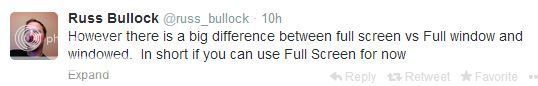
EDIT: Russ did say, "If you can use full screen for now."
Keywords for now, I bet this is something on their minds to fix, just not right this moment. I can hope anyway.
EDIT: Found this from the last NGNG podcast, "
22:20 It's not easy for the engineers to move parts of the mechlab around, it is Flash driven, UI 2.0 was dependent on rewriting the CryEngine in the first place. Bryan references this post: [/color]http://mwomercs.com/...history-lesson/[color=#959595] [PGI owns a version of the CryEngine, but did not elect to get support from the CryEngine company to help it evolve along with their work. Cheaper in the short run, but puts all the work on the engineers who both have to learn how to change/adapt the CryEngine AND progress MWO itself. -Peiper] Adapting and or changing mechlab is easier than it used to be, but still not easy. UI 2.0 has been built with the lowest (technical) common denominator in mind -1024 x 768 DPI screen resolution. That means 4:3 ratio screens, which means that all the stuff has to fit into a conventional/tube type monitor. However, they are working toward making the game have a second mode, which caters to wide-screen monitors, that would give more information on one screen. Bryan says that this is basically why there is so much unused space in the current mechlab for most players. [Perhaps why the font is so small too? - Peiper]
"
bolded the parts that stood out to me
I can see the font and read it clearly but the fact that it doesn't scale is one of those picky things I dislike. Like being able to organize my 'mech bay the way I see fit, PGI, I swear to goodness you promised I would be able to organize my bay however I damn well please and I will not let you forget it!
EDIT: Russ did say, "If you can use full screen for now."
Keywords for now, I bet this is something on their minds to fix, just not right this moment. I can hope anyway.
EDIT: Found this from the last NGNG podcast, "
22:20 It's not easy for the engineers to move parts of the mechlab around, it is Flash driven, UI 2.0 was dependent on rewriting the CryEngine in the first place. Bryan references this post: [/color]http://mwomercs.com/...history-lesson/[color=#959595] [PGI owns a version of the CryEngine, but did not elect to get support from the CryEngine company to help it evolve along with their work. Cheaper in the short run, but puts all the work on the engineers who both have to learn how to change/adapt the CryEngine AND progress MWO itself. -Peiper] Adapting and or changing mechlab is easier than it used to be, but still not easy. UI 2.0 has been built with the lowest (technical) common denominator in mind -1024 x 768 DPI screen resolution. That means 4:3 ratio screens, which means that all the stuff has to fit into a conventional/tube type monitor. However, they are working toward making the game have a second mode, which caters to wide-screen monitors, that would give more information on one screen. Bryan says that this is basically why there is so much unused space in the current mechlab for most players. [Perhaps why the font is so small too? - Peiper]
"
bolded the parts that stood out to me
Edited by M4NTiC0R3X, 21 February 2014 - 05:48 AM.
#26
-

-
- Mercenary
- 180 posts
Member
Posted 21 February 2014 - 06:29 AM
I want to thank those of you who have posted pictures to help demonstrate this problem. Sadly, I am one who suffers from not being able to read the font within mech lab. I'm running 1920x1080 full window (monitor's native resolution).
Mr. Bullock - I guess those of us who claim to have this problem are just lying? Why in the world would someone claim to have problems reading a font, or problems with items colors, or any other issue? Your attitude towards your customer is going to do more harm to this game than the actual problems with the game.
Mr. Bullock - I guess those of us who claim to have this problem are just lying? Why in the world would someone claim to have problems reading a font, or problems with items colors, or any other issue? Your attitude towards your customer is going to do more harm to this game than the actual problems with the game.
#27
-
-
- 684 posts
Member
- LocationKitchener, Ont.
Posted 21 February 2014 - 06:35 AM
 Appogee, on 21 February 2014 - 03:16 AM, said:
Here is a comparison of the size+font of the MWO Forums to the size+font of UI2.0. (I screencapped some sample text from the forums at, and pasted a screen cap from UI2.0 directly on top of it.)
Observations:

Observations:
- UI2.0 font seems to be about 80% the size of the standard MWO web font, reducing legibility.
- UI2.0's kerning - that is, the space between the letters - is much less than the forum, reducing legibility.
- UI2.0's leading - that is, the vertical space between lines of text - is much less than the forum, reducing legibility.
- UI2.0's ALL CAPS makes the shape of each word a rectangle. Because our brains first try to decode the shape of words, this too reduces legibility.
- UI2.0's semi-transparent background behind text means that background colors sometimes bleed through, blurring the edge of some letters, reducing legibility.
- UI2.0's white text on bright color backgrounds (notably, the white on green of STREAK SRM) reduces legibility.
I have a difficult time reading the text in the ui. Thank you for proving it an issue.
NOW PLEASE FIX IT PGI IT IS A HUGE PROPLEM FOR A LOT OF PEOPLE. For F%@* sakes listen to your community and the people that pay your bills!
#28
-

-
- 209 posts
Member

- LocationMassachusetts
Posted 21 February 2014 - 08:25 AM
Evil Ed, on 21 February 2014 - 01:30 AM, said:
Sorry guys, if Russ says itäs not a problem it's not a problem. Maybe you can run your monitors at half resolution? After all, Russ has ran some tests that proves that a large group of his costumers are wrong. See, I have already adapted and started to use smallest font available in the MWO-forums.
Could you increase the font so we can read this Thanks
#29
-
-
- Big Brother

- 221 posts
Member

Posted 21 February 2014 - 08:32 AM
nightsniper, on 21 February 2014 - 08:25 AM, said:
Could you increase the font so we can read this Thanks
That's the joke.

#30
-

-
- Littlest Helper

- 29,240 posts
Member
- Location#NOToTaterBalance #BadBalanceOverlordIsBad
Posted 21 February 2014 - 08:37 AM
The proper response is supposed to be:
I cannot read your position at this time.
When I have to actually lab, I have to actually squint to look for the tonnage indicator. That's unfortunately not helpful. Even UI 1.5 (the old UI) had it readily visible and enjoyed a nicer sized font.
I cannot read your position at this time.
When I have to actually lab, I have to actually squint to look for the tonnage indicator. That's unfortunately not helpful. Even UI 1.5 (the old UI) had it readily visible and enjoyed a nicer sized font.
Edited by Deathlike, 21 February 2014 - 08:39 AM.
#31
-
-
- 209 posts
Member
- LocationMassachusetts
Posted 21 February 2014 - 09:05 AM
Goosfraba, on 21 February 2014 - 08:32 AM, said:
That's the joke.
I see sarcasm was lost on you, just like the font

#32
-
-
- The Messenger

- 249 posts
Member
- LocationRuss's Island
Posted 21 February 2014 - 09:51 AM
It takes like 5 minutes to change the font, I would do it myself but gamedata.pak is checked for consistency.
So with that in mind we take 5 minutes of work + PGI = 60-90 days.
People have complained about the font in the UI2.0 feedback threads since the first test, which explains why Russ had no idea the font was an issue.
http://mwomercs.com/...nt+hard+to+read
Also the font does not change in anyway when changing fullscreen/windowed/fullwindow which once again proves Russ has no idea what he is talking about.
Edited by Infernus1986, 21 February 2014 - 10:02 AM.
#33
-
-
- The Angel
- 889 posts
Member

Posted 21 February 2014 - 09:59 AM
I'm glad that someone else found Bryan's comment on NGNG #103. I was shocked as well to realize that after such fervent promotion of UI 2.0's scaling abilities, Bryan even had a 4K monitor from nVidia, that the target for it was still 1024 x 768 regardless of your display resolution. I honestly thought it was 720p. A quick trip over the Steam's Hardware Survey shows that the most popular Primary Display Resolution is a whopping 1920 x 1080p at 32.51%.
If you're going to cover all your bases, one would hope that UI 2.0 would have had two targets that would alter how content is displayed based on the client's resolution. One target for 720p and then another for 1080p that would handle resolutions above and beyond that. I'm sure you'd see such things as larger fonts or more paint/pattern options without being limited to the tiny font, a handful of paint/pattern options, and 75% empty space.
If you're going to cover all your bases, one would hope that UI 2.0 would have had two targets that would alter how content is displayed based on the client's resolution. One target for 720p and then another for 1080p that would handle resolutions above and beyond that. I'm sure you'd see such things as larger fonts or more paint/pattern options without being limited to the tiny font, a handful of paint/pattern options, and 75% empty space.
#34
-
-
- Ace Of Spades

- 10,967 posts
Member
- LocationOn planet Tukayyid, celebrating victory
Posted 21 February 2014 - 10:02 AM
Infernus1986, on 21 February 2014 - 09:51 AM, said:
So with that in mind we take 5 minutes of work + PGI = 60-90 days.
It's worse than that. PGI doesn't even plan to change it.
#35
-
-
- The Angel
- 889 posts
Member
Posted 21 February 2014 - 10:17 AM
Appogee, on 21 February 2014 - 10:02 AM, said:
[/size]
It's worse than that. PGI doesn't even plan to change it.
It's worse than that. PGI doesn't even plan to change it.
To be honest, I'd rather ask Bryan since communication from the two somehow has a habit of contradicting itself. I recall in NGNG #103 that Bryan mentioned that they were looking at addressing the issues on higher resolution displays. Russ tends to do more harm than good from his Twitter from my experience.
#36
-
-
- 209 posts
Member
- LocationMassachusetts
Posted 21 February 2014 - 10:18 AM
I have been following many of the threads on UI 2.0 and commented on a few because I have seen the issues first hand and been frustrated with the results of the long awaited roll out. This font issue is just one but a very important line in the sand for me at least. Balance is the other (different Thread) but that has a different place to talk about.
Does anyone wonder WHY? PGI seems to be on a path of creating just as many problems as they seem to be solving 2 steps forward 3 back. Then Comments seem to wind up with a host of attack dogs swarming in to drive off the OP. Not true here yet.
I too believe the font issue to be relatively minor certainly a fix that would throw the faithful a bone so I ask again why be so damn stubborn and lie about the issue.
Shaking my head makes no logical sense.
Laser Angel may be correct some one should take Russ's smart phone and throw it in the pacific.
Edited by nightsniper, 21 February 2014 - 10:21 AM.
#37
-
-
- 1,393 posts
Member
Posted 21 February 2014 - 10:51 AM
What is written on twitter:
What I see:
Believe it or not this issue is a valid concern. If we just wanted to troll we would do things like this:
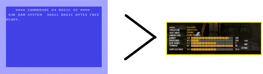
But we are not, so...
What I see:

Believe it or not this issue is a valid concern. If we just wanted to troll we would do things like this:

But we are not, so...
Edited by Molossian Dog, 21 February 2014 - 11:07 AM.
#38
-

-
- 25 posts
Member
Posted 21 February 2014 - 12:01 PM
Molossian Dog, on 21 February 2014 - 10:51 AM, said:
Believe it or not this issue is a valid concern. If we just wanted to troll we would do things like this:
But we are not, so...
But we are not, so...
Hey, that's no trolling, the c64 screen is more customizable than UI 2.0!
(gotta love them poke commands)
Edited by Rounin, 21 February 2014 - 12:02 PM.
#39
-
-
- 345 posts
Member
Posted 21 February 2014 - 12:29 PM
I just wonder why they seem to be struggling with resizing the font/button sizes. ActionScript is capable of such things
#40
-
-
- Ace Of Spades
- 10,967 posts
Member
- LocationOn planet Tukayyid, celebrating victory
Posted 21 February 2014 - 12:43 PM
JimboFBX, on 21 February 2014 - 12:29 PM, said:
I just wonder why they seem to be struggling with resizing the font/button sizes. ActionScript is capable of such things
They're not "struggling". They have said point blank ''there is no problem''. They have no intention of fixing it.


1 user(s) are reading this topic
0 members, 1 guests, 0 anonymous users


