Jump to content

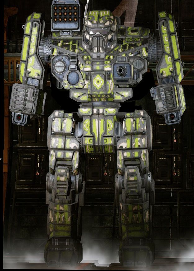
Banshee I Expected A Bit More


64 replies to this topic

#61 LordLosh

    Member

  • PipPipPipPipPipPip
  • The Blood-Eye
  • The Blood-Eye
  • 409 posts

Posted 07 March 2014 - 07:35 PM

View PostCarrioncrows, on 06 March 2014 - 09:47 PM, said:

This is what I was more expecting.

Posted Image


Iconic sunglasses

Raised gun ports to be right under the armpits.

narrower frame, I am fine with it being taller than an atlas.


Can i plz have this one. Look at what a small change can do. This is what the banshee should look like and it looks Bad Ass

#62 LordLosh

    Member

  • PipPipPipPipPipPip
  • The Blood-Eye
  • The Blood-Eye
  • 409 posts

Posted 08 March 2014 - 11:14 PM

I noticed that the laser in the mouth is not even CENTERED! The regular variants will look a lot better as you can see the demon type mouth with the laser gone. I just hope they do something color or graphics wise to make it stand out and pop.

Holding out hope the Phranken camo will be done right

#63 SweetJackal

    Member

  • PipPipPipPipPipPipPip
  • Urban Commando
  • Urban Commando
  • 968 posts

Posted 08 March 2014 - 11:37 PM

View PostMavairo, on 07 March 2014 - 06:23 PM, said:


Thank you for beating me to it.
Problem: the 1953 Corvette still looks great today.
the 2014 Stingray is a gorgeous Corvette.

The Banshee by contrast.. is a miserable failure looks wise.

I think the Banshee's kinda...fugly.
I thought the Highlander looked hideous. Some how they managed to trump the Highlander's hideousness!

To be fair, the highlander always looked like a toy robot with a TV for a head. It wasn't something beautiful or stunning, it looked rather silly and was brutal while doing it. The fact that it was a 90 ton mech that could do a DFA attack made it something akin to the sweet smile on the manic psycho as it carved things up. Something so silly or cute looking that you felt like you shouldn't take it seriously, yet it was one of the most dangerous things you could face in the right environment.

Compared to the source I think the Highlander was an improvement, less silly and more militant. That said, the Banshee is not what I was expecting or wanting at all. Betrays the source material in all the wrong places and looks entirely like recycled assets.

This is coming from someone that loves the way The Raven has been transitioned over.

#64 SgtMagor

    Member

  • PipPipPipPipPipPipPipPipPip
  • Survivor
  • Survivor
  • 3,542 posts

Posted 09 March 2014 - 08:01 AM

imho, the cammo and the weapon in the mouth covered over most of the detail on the head of the Banshee. but it is kewl looking If you can see past the cammo and dark textures they used., and Alex seemed to have followed the outline of the Banshee, which was brought up in another thread. so yea, we got a good representation of the original art.

Edited by SgtMagor, 09 March 2014 - 08:05 AM.


#65 Bishop Steiner

    ForumWarrior

  • PipPipPipPipPipPipPipPipPipPipPipPipPipPipPip
  • The Hammer
  • The Hammer
  • 47,187 posts
  • Locationclimbing Mt Tryhard, one smoldering Meta-Mech corpse at a time

Posted 09 March 2014 - 08:10 AM

View PostSgtMagor, on 09 March 2014 - 08:01 AM, said:

imho, the cammo and the weapon in the mouth covered over most of the detail on the head of the Banshee. but it is kewl looking If you can see past the cammo and dark textures they used., and Alex seemed to have followed the outline of the Banshee, which was brought up in another thread. so yea, we got a good representation of the original art.

Followed the outline, yes. Then fed it donuts til it bloated like Zangief. The Mech is about the right height, but far too wide to be "a good representation". And CarrioCrows demonstrated how easy the Ray Bans would have been to add on another post.


5 user(s) are reading this topic

0 members, 5 guests, 0 anonymous users