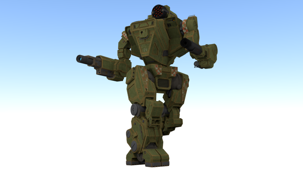
Edited by Joe3142, 03 September 2014 - 12:54 PM.

Posted 12 March 2014 - 02:07 PM

Edited by Joe3142, 03 September 2014 - 12:54 PM.
Posted 12 March 2014 - 02:19 PM
Posted 12 March 2014 - 11:52 PM
Posted 13 March 2014 - 05:03 PM
Posted 23 March 2014 - 05:51 AM
Posted 24 March 2014 - 02:23 AM
Posted 07 April 2014 - 04:17 AM
Posted 07 April 2014 - 06:38 AM
Edited by zagibu, 07 April 2014 - 06:39 AM.
Posted 07 April 2014 - 07:33 AM
Posted 07 April 2014 - 07:53 AM
 zagibu, on 07 April 2014 - 06:38 AM, said:
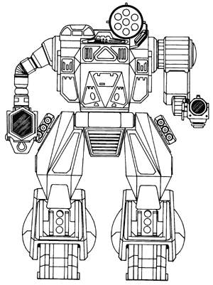
Edited by Foxx, 07 April 2014 - 07:53 AM.
Posted 07 April 2014 - 08:23 AM
Posted 07 April 2014 - 09:28 AM
Posted 07 April 2014 - 02:07 PM
Posted 19 April 2014 - 02:35 PM
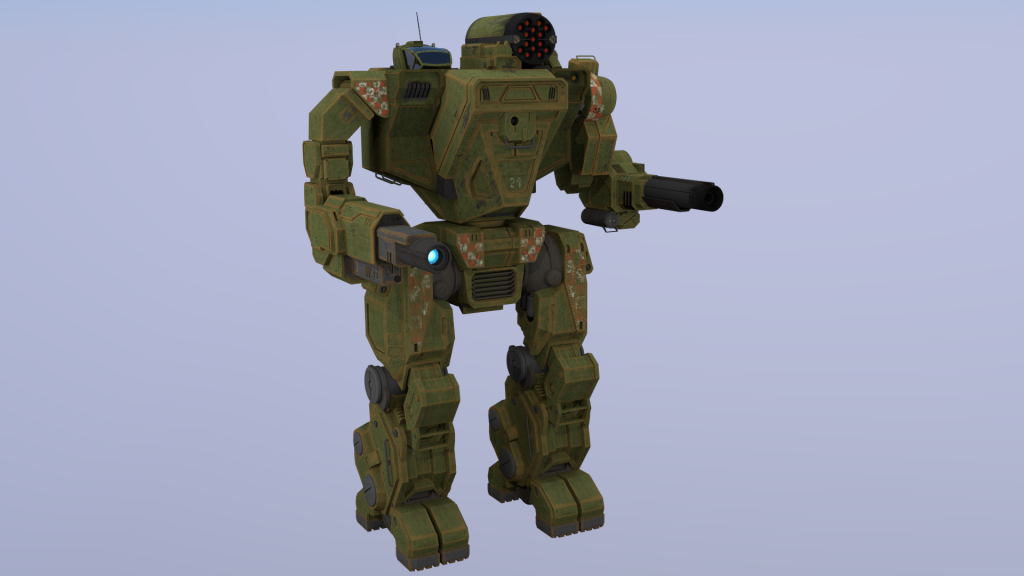
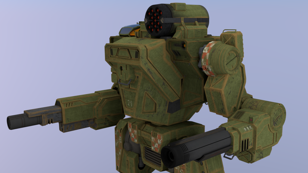
Posted 21 April 2014 - 06:50 PM
Posted 16 May 2014 - 04:27 PM
0 members, 1 guests, 0 anonymous users