If anybody from PGI's art department reads this, please make a note about sufferings of an esthete
Visual customization added for missile weaponry on Catapult model is good thing, but it's done quite slovenly, IMO. Can we hope for some kind of attention from your team on that?
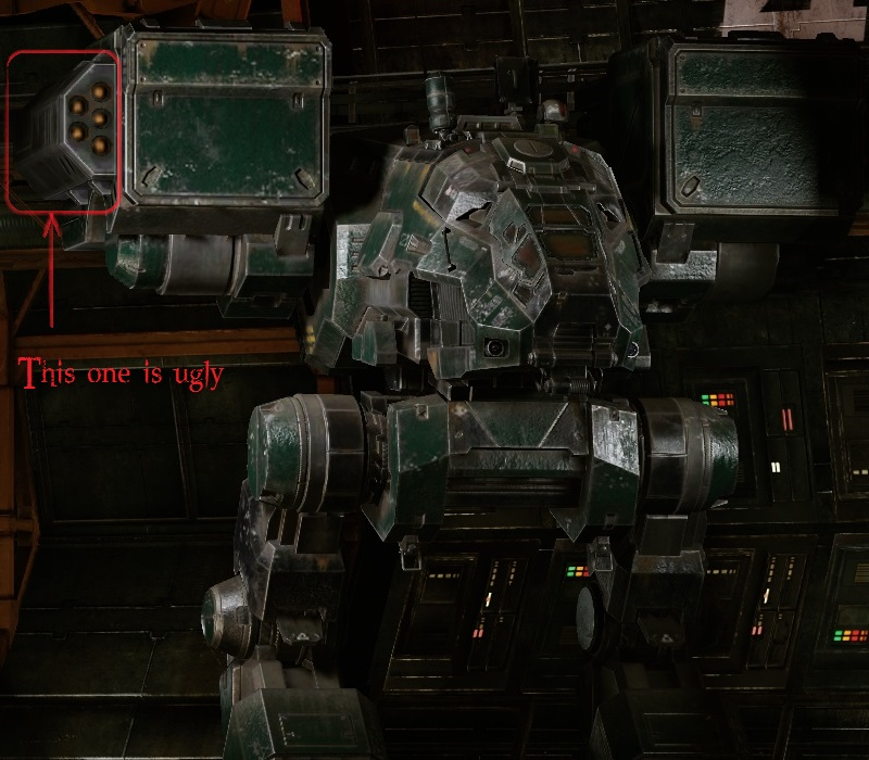
- Catapults A1 and C4 have HUGE arm boxes with maximum 20 missile tubes in each - why do you insist on adding (ugly looking) side launchers when number of tubes used by installed missile weapons is less than 20? It's especially irritating to see when you install SSRMs on A1. Instead, you could add different textures for tubes inside arm box or even different arm boxes! I know it would take time and resources to redo, but I don't understand why in first place it has been done so slovenly, without love to details and without technical logic used.
- When installing 2nd and, in A1 case, 3rd missile launcher we have no choice, but to follow imagination of your 3D artist
 , which definitely lacked, well, some measure of taste. Could we actually choose which additional set of tubes will be used on our 'Mechs 3D model? I'll show on pictures.

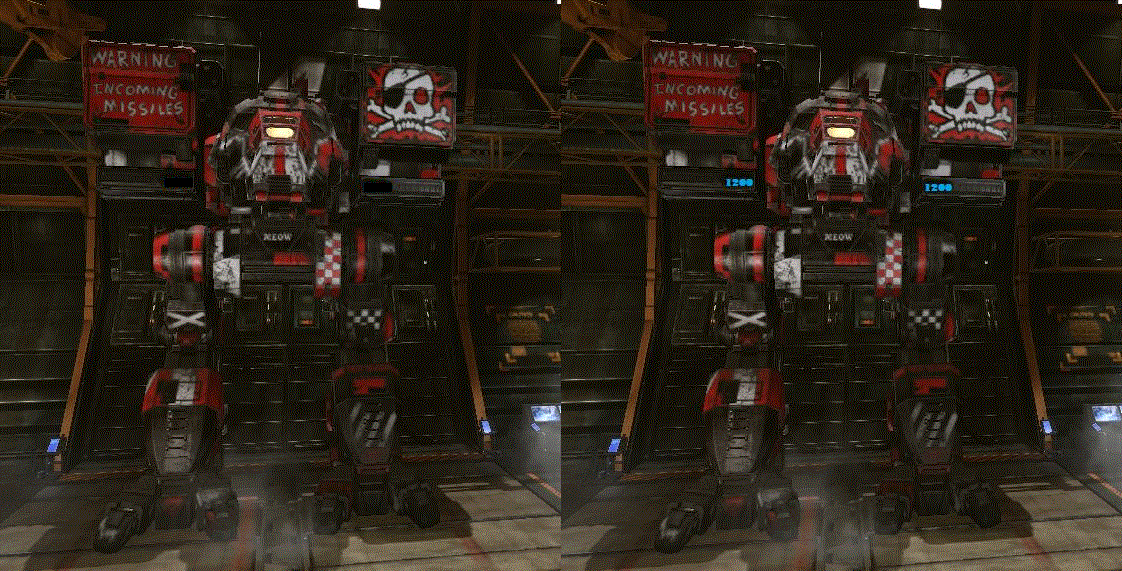
If a choice would be given, I would take lower additional tubes position any day:
 Why? Lower tube sets add massive look and birdy aggressiveness to Catapult profile, while side tubes look just like quickie from 3D modeler which don't like MWO or his/her job.
I ask for your attention to this small detail, it won't take many time to fix: just change order of appearance of additional LRM tubes sets. It's just few elements of array to swap. Please.


