Jump to content

Updated! Timber Wolf Screen Shots Revealed


950 replies to this topic

#701 Navid A1

    Member

  • PipPipPipPipPipPipPipPipPip
  • CS 2022 Gold Champ
  • CS 2022 Gold Champ
  • 4,938 posts
  • LocationVancouver, BC

Posted 12 April 2014 - 07:42 PM

View PostI Zeratul I, on 12 April 2014 - 05:32 PM, said:

I see people changing the proportions, making edits. Try using this as a base.
...
...


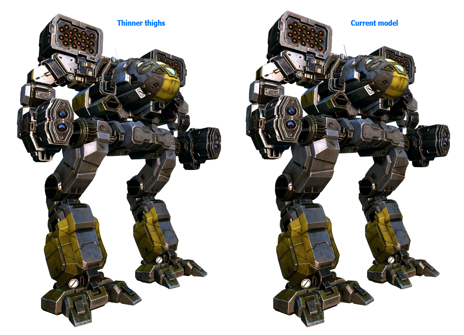
Ok... a quick edit:
Thighs are made a little bit smaller and the the stance is about 5 degrees more crouched (same thigh length)... small changes at first glance... but i like it with thinner thighs.


Posted Image

Edited by Navid A1, 12 April 2014 - 07:46 PM.


#702 Gas Guzzler

    Member

  • PipPipPipPipPipPipPipPipPipPipPip
  • Big Daddy
  • Big Daddy
  • 14,257 posts
  • LocationCalifornia Central Coast

Posted 12 April 2014 - 07:49 PM

I think it looks great and looks like it belongs in the game.

Some of you guys sound like spoiled children. See how everyone has their "perfect" idea of what a Timber Wolf is? Lots of different opinions on here, there is no way they could please everyone. Luckily, these Mechs are not here for a community judged fashion show. They are here to blow stuff up. I doubt you will notice what it looks like when you are sitting in the cockpit.

#703 Manei Domini Krigg

    Member

  • PipPipPipPipPipPipPipPipPip
  • Overlord
  • Overlord
  • 2,005 posts
  • Locationred team

Posted 12 April 2014 - 07:53 PM

this i want to see ))
Posted Image

#704 GalaxyBluestar

    Member

  • PipPipPipPipPipPipPipPipPip
  • 3,748 posts
  • Location...

Posted 12 April 2014 - 08:03 PM

View PostNavid A1, on 12 April 2014 - 07:42 PM, said:


Ok... a quick edit:
Thighs are made a little bit smaller and the the stance is about 5 degrees more crouched (same thigh length)... small changes at first glance... but i like it with thinner thighs.


Posted Image


perfect example of a little change going a long long way, gorgeous!

#705 Prc

    Member

  • PipPipPipPipPip
  • FP Veteran - Beta 1
  • 191 posts
  • LocationBuenos Aires - Argentina

Posted 12 April 2014 - 08:04 PM

View PostGas Guzzler, on 12 April 2014 - 07:49 PM, said:

I think it looks great and looks like it belongs in the game.

Some of you guys sound like spoiled children. See how everyone has their "perfect" idea of what a Timber Wolf is? Lots of different opinions on here, there is no way they could please everyone. Luckily, these Mechs are not here for a community judged fashion show. They are here to blow stuff up. I doubt you will notice what it looks like when you are sitting in the cockpit.


people sounds like players who care about the game and don't agree with the most iconic mech in the whole game unnecessarily being retouched...
people here cares about details and such don't expect a semi decent madcat and no negative feedback, just my opinion.
not saying it looks terrible and has no effort put into it just needs changes here and there and it will be that much better.

Edited by Prc, 12 April 2014 - 08:08 PM.


#706 Navid A1

    Member

  • PipPipPipPipPipPipPipPipPip
  • CS 2022 Gold Champ
  • CS 2022 Gold Champ
  • 4,938 posts
  • LocationVancouver, BC

Posted 12 April 2014 - 08:08 PM

View PostGas Guzzler, on 12 April 2014 - 07:49 PM, said:

I think it looks great and looks like it belongs in the game.

Some of you guys sound like spoiled children. See how everyone has their "perfect" idea of what a Timber Wolf is? Lots of different opinions on here, there is no way they could please everyone. Luckily, these Mechs are not here for a community judged fashion show. They are here to blow stuff up. I doubt you will notice what it looks like when you are sitting in the cockpit.


hmmm... good point.
i wonder about the wide variety of colors and camo patterns... and the MC i've spent on some of those :)

anyway... this mech is not released yet... so there is chance that they will see the feedback and alter it a bit (and by alter i just mean thinner thighs... that's all)...
so maybe crying loader will get someone's attention...
i have no problem (and will even be happy) if the mech releases like this...i like the design. But its yet to be released... so...

#707 Smitti

    Member

  • PipPipPipPipPipPip
  • Overlord
  • Overlord
  • 475 posts
  • Twitter: Link
  • LocationFrog-blasting between BioVent Core #88A and #88B

Posted 12 April 2014 - 08:29 PM

View PostNavid A1, on 12 April 2014 - 07:42 PM, said:


Ok... a quick edit:
Thighs are made a little bit smaller and the the stance is about 5 degrees more crouched (same thigh length)... small changes at first glance... but i like it with thinner thighs.


Posted Image


I'd hit that... with an AC/20.

Quote

Posted Image


Also like the legs on that one posted above.

If they concede to the concerns outlaid in here and get the Twolf to start skipping leg day tweak the legs a little, then fantastic. But I won't be unhappy if they don't.

Mister Bluestar, where did that "Look out, the stick poker is here!" go? That was pretty funny.

#708 SgtMaster

    Member

  • PipPipPipPipPipPip
  • Knight Errant
  • Knight Errant
  • 247 posts
  • LocationMontreal

Posted 12 April 2014 - 08:46 PM

View Postverybad, on 11 April 2014 - 11:59 AM, said:


OK, so if all they get are compliments, then how the heck will they ever to their job better?

While some of the remarks re. PGIs work may hurt their feeling, the fact remains that they are a company that relies on pleasing their customers in order to stay afloat.

If people that don't like the design for the Madcat released here. (and this appears to be a large majority so far). Simply don't like the design, but say nothing, and then don't buy the design, or even stop playing because they aren't enjoying themselves either due to game play, artwork, lack of depth in the meta, or other reasons, well then "being nice" is actually DAMAGING to PGI.

There is no more useful communication between a company that relies on sales and it's company than criticism, there is a common thread in the dislike for this version of the Madcat so far, it's bulky, chunky, doesn't look "right" for a Madcat.

Now there will always be "mean" criticism" here because it is a video game, it's got a huge history with lots of very longtime fans, and this is the internet.

So they can take that useful criticism (with some spice added to keep them aware of what their customers want, or they can pretend that the forums are a marketing device and censor disparaging remarks in the hopes that new consumers will think it's perfect. In the end, I think taking the spicy remarks will be more helpful for a long term strategy.

This Madcat looks nothing like the concept art that probably sold quite a few clan packs. It's very bulky, and looks like the modeler/artlead might be technically capable, but not so much at overall design. It's simply not a good looking version of this mech in the overall history of it's various visions. It doesn't look agile, doesn't have the feel of being different like the clans had when first introduced. It seems like an ostensibly different Cataphract. (probably certainly uses the same animation)

It wouldn't take that many changes to make the mech look better, slightly thinner pelvis with the upper legs moved in, and a similarly modified upper arm (just thinner upper are, not necessarily like the original, just a bit thinner)

IT looks like an Inner Sphere version of the Madcat, not a clan Madcat.


This:

Simply don't like the design, but say nothing, and then don't buy the design, or even stopped playing because they aren't enjoying themselves either due to game play, artwork, lack of depth in the meta and many many other reasons...

#709 GalaxyBluestar

    Member

  • PipPipPipPipPipPipPipPipPip
  • 3,748 posts
  • Location...

Posted 12 April 2014 - 09:25 PM

View PostSmittiferous, on 12 April 2014 - 08:29 PM, said:


Mister Bluestar, where did that "Look out, the stick poker is here!" go? That was pretty funny.


saddly the website used to create and upload such images crashed a moment ago and i've just emailed the webmaster to fix it.

it happened sometime last year and took a few days to get going again. ho hum...

edit;

Memes online

laughs online

references online

all parody nominal

Edited by GalaxyBluestar, 12 April 2014 - 10:26 PM.


#710 Smitti

    Member

  • PipPipPipPipPipPip
  • Overlord
  • Overlord
  • 475 posts
  • Twitter: Link
  • LocationFrog-blasting between BioVent Core #88A and #88B

Posted 12 April 2014 - 11:21 PM

View PostGalaxyBluestar, on 12 April 2014 - 09:25 PM, said:


saddly the website used to create and upload such images crashed a moment ago and i've just emailed the webmaster to fix it.

it happened sometime last year and took a few days to get going again. ho hum...

edit;

Memes online

laughs online

references online

all parody nominal


And that's why i (mostly) love these forums.

Edited by Smittiferous, 12 April 2014 - 11:23 PM.


#711 ViridianKnight

    Member

  • PipPip
  • Overlord
  • Overlord
  • 46 posts
  • LocationThe Underdark

Posted 13 April 2014 - 01:40 AM

View PostNavid A1, on 12 April 2014 - 07:42 PM, said:


Ok... a quick edit:
Thighs are made a little bit smaller and the the stance is about 5 degrees more crouched (same thigh length)... small changes at first glance... but i like it with thinner thighs.


Posted Image


like it much more that way to !!


great looking mech, but from the pictures i would say
_ legs too long
_ torso not long enugh, it looks a littel bit like it's compacted to much , more lika a ball then an egg
this effect is increased by the long (and quite big) legs, or from the angel of photgraph

why dont u give us a plain front and side view, vith the horizon im the center of the picture ;?!!?!?


https://static.mwome...rwolf_paint.jpg
for comparrison


otherwise great!

Edited by ViridianKnight, 13 April 2014 - 02:04 AM.


#712 Magos Titanicus

    Member

  • PipPipPipPipPipPip
  • Liquid Metal
  • Liquid Metal
  • 282 posts
  • LocationSagittarius A

Posted 13 April 2014 - 01:44 AM

adjust it to that

Posted Image

i'd love to maraud around with that one, PGI your version looks a little ******** sadly :D ;)

#713 ssm

    Member

  • PipPipPipPipPipPipPip
  • 574 posts
  • LocationPoland

Posted 13 April 2014 - 02:02 AM

View PostMagos Titanicus, on 13 April 2014 - 01:44 AM, said:

adjust it to that

Posted Image

i'd love to maraud around with that one, PGI your version looks a little ******** sadly :D ;)

It's just a incredibly cool and favorable rendition of plain old TRO-style Mad Cat. If you gave so much visual flair to drawing of MWO one it would look even better than this.

Edited by ssm, 13 April 2014 - 02:15 AM.


#714 Navid A1

    Member

  • PipPipPipPipPipPipPipPipPip
  • CS 2022 Gold Champ
  • CS 2022 Gold Champ
  • 4,938 posts
  • LocationVancouver, BC

Posted 13 April 2014 - 02:31 AM

View PostViridianKnight, on 13 April 2014 - 01:40 AM, said:


great looking mech, but from the pictures i would say
_ legs too long
_ torso not long enugh, it looks a littel bit like it's compacted to much , more lika a ball then an egg
this effect is increased by the long (and quite big) legs, or from the angel of photgraph


why dont u give us a plain front and side view, vith the horizon im the center of the picture ;?!!?!?
....
....
https://static.mwome...rwolf_paint.jpg
for comparrison

otherwise great!


This is the closest thing matching your request... but to have a clear view, a front-side snapshot is necessary .!

Posted Image

Edited by Navid A1, 13 April 2014 - 02:32 AM.


#715 Elric von Rabenfels

    Member

  • PipPipPipPipPip
  • 110 posts

Posted 13 April 2014 - 03:31 AM

Do we know if at least one variant will have MG's in EACH side torso, or have them in the CT?
It really bugs me that the one in the sceenshots doesn't have them MG's where they are supposed to be. ;)

#716 ZachMan119

    Member

  • PipPipPipPipPip
  • Little Helper
  • Little Helper
  • 115 posts
  • Google+: Link
  • Facebook: Link
  • LocationCalifornia somewhere...

Posted 13 April 2014 - 03:44 AM

View PostMagos Titanicus, on 13 April 2014 - 01:44 AM, said:

adjust it to that

Posted Image

i'd love to maraud around with that one, PGI your version looks a little ******** sadly :D ;)

Or some thing LIKE that.
P.S. I LOVE this picture!

Edited by ZachMan119, 13 April 2014 - 03:45 AM.


#717 El Bandito

    Member

  • PipPipPipPipPipPipPipPipPipPipPipPipPipPip
  • Big Daddy
  • Big Daddy
  • 26,736 posts
  • LocationStill doing ungodly amount of damage, but with more accuracy.

Posted 13 April 2014 - 04:36 AM

View PostNavid A1, on 13 April 2014 - 02:31 AM, said:

This is the closest thing matching your request... but to have a clear view, a front-side snapshot is necessary .! Posted Image


God, that leg is ugly. The knee joint, PGI, why couldn't you just keep the Timberwolf's iconic knee joint, and instead recycled some dime a dozen chicken walker leg model?!

I can somehow accept those chubby and blocky arms, but those legs are disgraceful.

Edited by El Bandito, 13 April 2014 - 04:50 AM.


#718 KuroNyra

    Member

  • PipPipPipPipPipPipPipPipPip
  • Legendary Founder
  • Legendary Founder
  • 2,990 posts
  • LocationIdiot's Crater.

Posted 13 April 2014 - 05:33 AM

Posted Image

#719 Aurawind

    Member

  • PipPip
  • The Nightmare
  • The Nightmare
  • 33 posts

Posted 13 April 2014 - 06:16 AM

View PostKrigg, on 12 April 2014 - 07:53 PM, said:

this i want to see ))
Posted Image


Perfect legs!

#720 Aidan

    Member

  • PipPipPipPipPipPipPip
  • Ace Of Spades
  • Ace Of Spades
  • 542 posts
  • LocationFlorida, USA

Posted 13 April 2014 - 07:04 AM

The arms are WRONG !

Otherwise a fearful sight for any Inner Sphere MechWarrior to behold !


14 user(s) are reading this topic

0 members, 14 guests, 0 anonymous users