Jump to content

Timberwolf Spotted


152 replies to this topic

#41 KuroNyra

    Member

  • PipPipPipPipPipPipPipPipPip
  • Legendary Founder
  • Legendary Founder
  • 2,990 posts
  • LocationIdiot's Crater.

Posted 10 April 2014 - 09:42 PM

View PostBlazing Angel, on 10 April 2014 - 03:33 PM, said:

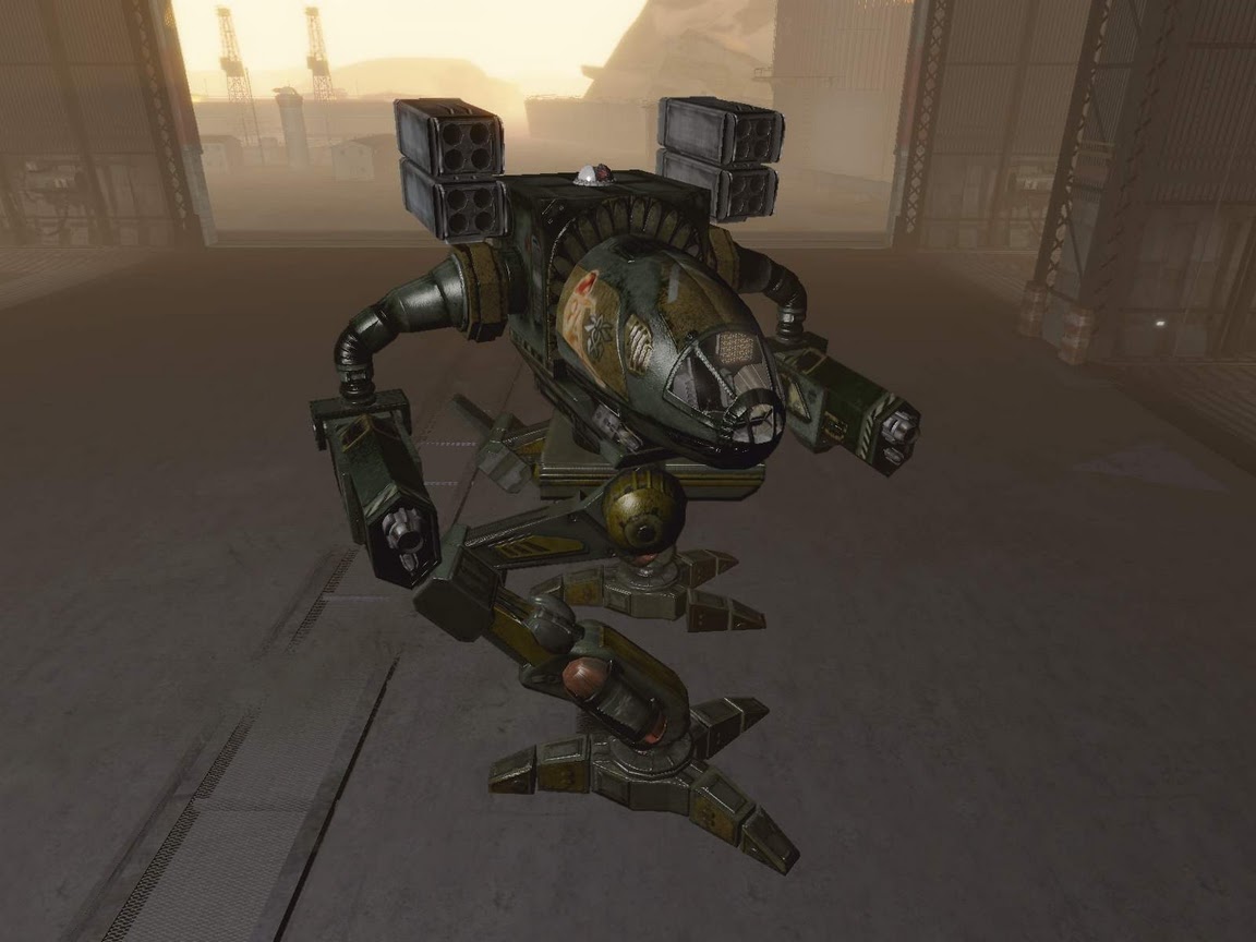
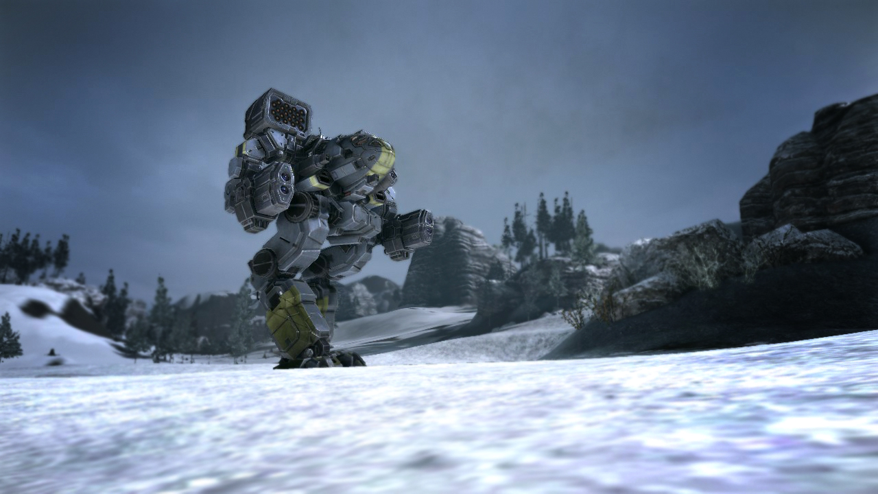
Can all of you calm down? Seriously, it's just the angle of the photo, not the actual mech design. Have any of you ever played with perspective with a camera? The legs are actually not all that bulky, it's the position of the photo.


EVEN with the position of the photo, the legs look simply too much straight and tall.
Seriously the leg's are 2/3 of the mech!


THAT'S a Timber Wolf, the only nice stuff on that one are the renforced arm. And I kinda like the "bulky" look of the leg's, but they are still TOO DAMN TALL!
Spoiler


I'm gonna start a petition! Burn a forest or two! And create the Association for the Protection of Clan BattleMech!
(and also a petition to at least build a TB-TT. :) )


No, I just can't like these legs.... They really ruin the whole design who looked awesome. (not, not the mech.)

#42 SethAbercromby

    Member

  • PipPipPipPipPipPipPipPip
  • Urban Commando
  • Urban Commando
  • 1,308 posts
  • LocationNRW, Germany

Posted 10 April 2014 - 09:53 PM

View PostEm3r4ld, on 10 April 2014 - 08:18 PM, said:

Someone hasn't read the dev blog on how they're trying to balance omnitech...

I feel that they did the right move. If all clan 'Mechs had Omni hardpoints exclusively, the 'Mechs most players would choose to play would boil down to which has the best hardpoint locations. It would make combat a little uninteresting to me. From a customization perspective, Omnis are awesome, from a gameplay perspective, not so much.

EDIT: What's with people liking these stick legs? They look ugly and impractical. No thank you, I like the Timber Wolf the way it is now.

Edited by SethAbercromby, 10 April 2014 - 09:55 PM.


#43 anonymous161

    Member

  • PipPipPipPipPipPipPipPip
  • FP Veteran - Beta 2
  • FP Veteran - Beta 2
  • 1,267 posts
  • LocationIowa

Posted 10 April 2014 - 10:06 PM

Meh the art looks a lot better, the actual in game model looks rather clunky. Super glad I did not buy them with real money. Hell I will be lucky to ever have enough cbills for one clan mech, I hardly play the game. Work 12 hour days.

#44 Mordin Ashe

    Member

  • PipPipPipPipPipPipPipPip
  • 1,505 posts

Posted 10 April 2014 - 10:38 PM

So much negativity... But perhaps I am only a weirdo not knowing what is nice, I do like the MW4 model after all ;-) While I understand that many of you have learned to appreciate older designs, do you honestly expect that huge conical cockpit thrusting to the front would work in MWO?

Anyway, two things.
First, I have a new wallpaper.
Second, I am glad I purchased this Mech. I feared hitboxes may be an issue but I like what I see.

Keep at it, PGI!

#45 Gat

    Member

  • PipPip
  • Ace Of Spades
  • Ace Of Spades
  • 22 posts

Posted 10 April 2014 - 11:13 PM

View PostDakkaface, on 10 April 2014 - 06:37 PM, said:

Someone on reddit posted up two more screenshots - It's infinitely better looking in these.

Posted Image
Posted Image


Best theory I've seen so far is that they snapped the image from a free-floating cockpit cam, but the .cfg was set for a wide FOV. Combined with the low angle it gives a fish-eye effect.


That looks better, thanks. I can understand why the cockpit was made a little more squat for survivability. Being a k2 pilot there are some drawbacks to a jutting CT. They have made it a little too squat.

Second, I do like that they made it tall. After piloting a Cataphract nothing is more irritating than not having arm mounted weapons clear terrain.

The main thing is the legs look really off. They just look too blocky/beefy and the legs don't accentuate the reverse knee joint. As stated by another poster, this is a fairly fast mech for its size but this model's legs make it look more lumbering. I am not saying the legs need to be spindly but they are too far in the other direction.

I believe artistic liberty is great and needed, but there are some key features to these defining mechs that need to be maintained. Yeah, I may have jumped on the hyperbole train a little fast, but the concept art seemed spot on where this model just looks meh.

Edited by Gat, 10 April 2014 - 11:28 PM.


#46 Gasoline

    Member

  • PipPipPipPipPipPip
  • Elite Founder
  • Elite Founder
  • 338 posts

Posted 10 April 2014 - 11:33 PM

View PostDakkaface, on 10 April 2014 - 02:53 PM, said:

Huh. Had a brief discussion with a Kenku - fellow Nova Cat & MW:DA vet about the screenshots. Came to the conclusion that it actually resembles a Mad Cat Mk. III. Foreshortened cockpit, chunkier arms, squat rectangular missile pods, long legs. MWO's Timber Wolf looks like's it's Mk. III cousin.

Deja vu...
Spoiler


#47 SethAbercromby

    Member

  • PipPipPipPipPipPipPipPip
  • Urban Commando
  • Urban Commando
  • 1,308 posts
  • LocationNRW, Germany

Posted 10 April 2014 - 11:50 PM

Now THAT's a Stalker I'd like to pilot. When is that baby due? 3140 time-skip, anyone?

Just kidding. (Maybe...)

#48 kapusta11

    Member

  • PipPipPipPipPipPipPipPipPip
  • Little Helper
  • Little Helper
  • 3,854 posts

Posted 11 April 2014 - 12:29 AM

View PostCHH Badkarma, on 10 April 2014 - 01:51 PM, said:

I think it needs adjustment. Way to leggy AND way to blocky.


QFT, I'm disappointed.

Edit: well, not so leggy but still too blocky

Edited by kapusta11, 11 April 2014 - 12:54 AM.


#49 Jam the Bam

    Member

  • PipPipPipPipPipPipPip
  • 535 posts

Posted 11 April 2014 - 02:19 AM

Personal Opinion: I like it, legs are maybe a bit wide, but I far prefer the blockier design to the older spindly armed and legged designed, it just looked a bit weird.

#50 no one

    Member

  • PipPipPipPipPipPipPip
  • Bad Company
  • 533 posts

Posted 11 April 2014 - 03:08 AM

So yeah hammered at gimp for an hour or two and it turns out. . . I'm really bad at image editing. Really, really bad. Maybe someone else can take a crack at it.

Posted Image


Clan 'Mechs are supposed to look a lot more sleek and finished than IS 'Mechs. The current design is a bit too angular and hurky looking. The launchers are a bit too wide. I know that's an aspect of the features where it's closest to the original design, but it's a very broad 'Mech and they look awkward positioned like that. Mostly though I dislike like the style of knee joint and lower leg on this one. The offset joint looked much better -

https://0-media-cdn....38716845712.jpg

The arms could stand to be readjusted too. They don't need to be this twig-skinny but they could stand to be less busy looking.

Edited by no one, 11 April 2014 - 03:12 AM.


#51 GalaxyBluestar

    Member

  • PipPipPipPipPipPipPipPipPip
  • 3,748 posts
  • Location...

Posted 11 April 2014 - 03:10 AM

have to agree with the blocky camp... really expected a new design philosophy for clan mechs... we're still getting lego land humanoid styled mechs for our chicken walkers. the concept art showed the arms thickness would mean you'd almost fit 4 arms for the hieght of the torso {excluding missile racks} but now it's more like 3. gorrila arms and the bulkiness of the original shins have been lost to more bulk in the knee and upper leg. that and the stubby cockpit i feel the timberwolf essence has been lost :)

#52 IraqiWalker

    Member

  • PipPipPipPipPipPipPipPipPipPip
  • FP Veteran - Beta 1
  • FP Veteran - Beta 1
  • 9,682 posts
  • LocationCalifornia

Posted 11 April 2014 - 03:30 AM

My main point for liking this design over the older one, is that this one looks combat viable. Unlike the old spindly one which quite frankly doesn't look like it can take a hit from anything stronger than a gentle breeze.

I understand both sides of this argument, and I'm not claiming one is better than the other, this is my personal preference.

#53 AUSSIETROOPER4

    Member

  • PipPipPipPipPip
  • Knight Errant
  • Knight Errant
  • 180 posts

Posted 11 April 2014 - 03:33 AM

View PostCyclonerM, on 10 April 2014 - 01:23 PM, said:

TIMBERWOLF! ;D

I was really excited when i heard there were screenshots.. But.. But...

Overall it is cool, but... I can understand the almost flat CT, but the legs! They look too bulky compared to the rest of the 'Mech.

It will be really easy to blow up.. Just leg it! :-\


It looks like too much the MW4 version..
Spoiler

Sorry, but the MW2 and MW:LL TW are the best ones.

oops. I just started a thread on the legs.

#54 Mordin Ashe

    Member

  • PipPipPipPipPipPipPipPip
  • 1,505 posts

Posted 11 April 2014 - 05:07 AM

View PostIraqiWalker, on 11 April 2014 - 03:30 AM, said:

My main point for liking this design over the older one, is that this one looks combat viable. Unlike the old spindly one which quite frankly doesn't look like it can take a hit from anything stronger than a gentle breeze.

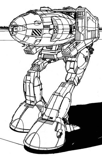
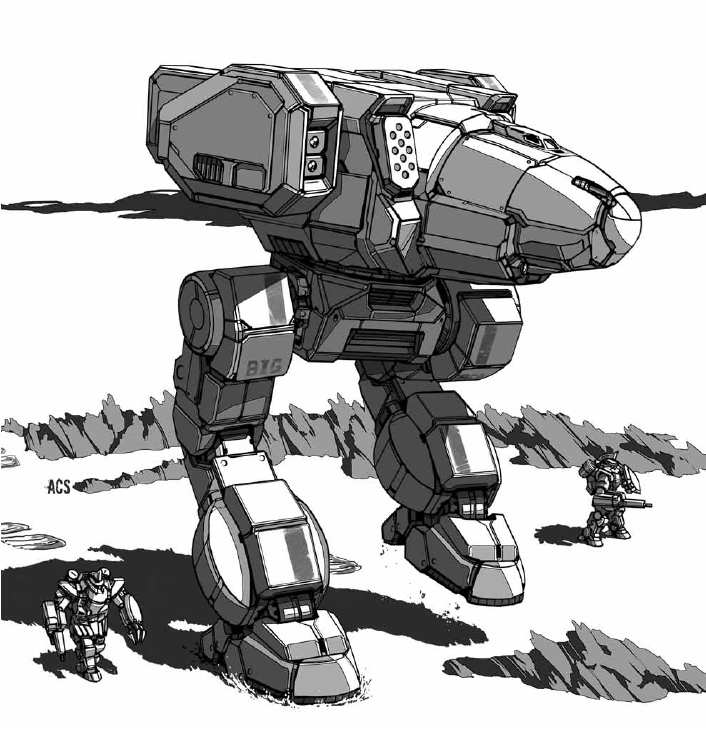
This. While this game is a sci-fi genre, every bit of realism we can have is what we must get. That old Stalker picture above is, with all the respect to everyone who likes it, a joke. It is basically a Hindenburg airship with two ugly legs that could be so terribly dispositioned only because of the huge nose lifting the whole thing. Plus an ugly Mech parts stuck on its rear. Is really this how we should envision BATTLEtech? A needle with a pointy end would kill it.

Btw did anyone of you notice that some of the Clan mechs have filled their module slot numbers? Could it be a sign that they are close to finished with their paper stats and now convert them to models?

#55 Remarius

    Banned - Cheating

  • PipPipPipPipPipPipPip
  • Legendary Founder
  • Legendary Founder
  • 820 posts
  • LocationBrighton, England

Posted 11 April 2014 - 05:19 AM

Happy with the look. Used to think the TRO one was odd and much prefer this one. It actually looks like a mech you could swap pods in and out for the current hard point system they're using.

#56 CyclonerM

    Tina's Warrior

  • PipPipPipPipPipPipPipPipPipPip
  • FP Veteran - Beta 2
  • FP Veteran - Beta 2
  • 5,685 posts
  • LocationA 2nd Wolf Guards Grenadiers JumpShip

Posted 11 April 2014 - 05:44 AM

View PostCHH Badkarma, on 10 April 2014 - 04:31 PM, said:

proper proportions are an upcoming feature that will be introduced at a time yet to be determined.

Soon®

View PostMordin Ashe, on 10 April 2014 - 10:38 PM, said:

So much negativity... But perhaps I am only a weirdo not knowing what is nice, I do like the MW4 model after all ;-) While I understand that many of you have learned to appreciate older designs, do you honestly expect that huge conical cockpit thrusting to the front would work in MWO?

1 added meter of lenght would be enough to make it look like a Timberwolf IMHO.


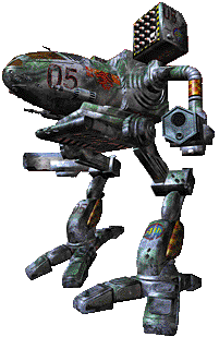
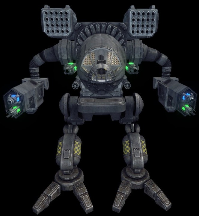
Find the differences! Posted Image

Posted Image

Anyway, more pics Posted ImagePosted Image

Edited by CyclonerM, 11 April 2014 - 06:20 AM.


#57 CyclonerM

    Tina's Warrior

  • PipPipPipPipPipPipPipPipPipPip
  • FP Veteran - Beta 2
  • FP Veteran - Beta 2
  • 5,685 posts
  • LocationA 2nd Wolf Guards Grenadiers JumpShip

Posted 11 April 2014 - 06:20 AM

Posted Image

#58 Mordin Ashe

    Member

  • PipPipPipPipPipPipPipPip
  • 1,505 posts

Posted 11 April 2014 - 08:06 AM

View PostCyclonerM, on 11 April 2014 - 05:44 AM, said:

1 added meter of lenght would be enough to make it look like a Timberwolf IMHO.

It would! At the same time it may make it dead.
But hey, they can always make a hero Timber Wolf that would look like MW4, with its freakish legs and long pointed nose. I would buy it.

Edited by Mordin Ashe, 11 April 2014 - 08:12 AM.


#59 Pariah Devalis

    Member

  • PipPipPipPipPipPipPipPipPipPip
  • The Clan Cat
  • The Clan Cat
  • 7,655 posts
  • Google+: Link
  • Twitter: Link
  • LocationAboard the NCS True Path

Posted 11 April 2014 - 08:51 AM

I am glad I waited to see if they would release a new photo of the thing.

Overall? I like it. It looks like a Timber Wolf. It has the essence of it. It looks dangerous. Is it perfect, though? No. It could stand to take some more design queues from the legacy incarnations of it. Specifically, the arms look a bit chunky and the lack of a side by side upper/lower leg knee actuator with the extended lower leg spine is an odd exclusion. The nose is a little smushed in too much too, but that will add to the mech's survivability, I suppose.

Keep in mind, though, that the legs of the Timber Wolf have always been long.

All in all, while it is not perfect, it is not bad at all. I like it. I look forward to retrofitting it into one of a couple loadouts:

AMS, 2 ERPPC, 2 ERMLas, 2 SSRM4

AMS, 2 ERPPC, 2 ERMLas, 2 LRM10

2 ERPPC, 2 ERMLas, UAC5

All are welcome. All are welcome.....


Edit: More new pictures!

Posted Image

Posted Image

Huh. DOES have the lower leg spike, but it is just toned down.

Edited by Pariah Devalis, 11 April 2014 - 09:10 AM.


#60 KuroNyra

    Member

  • PipPipPipPipPipPipPipPipPip
  • Legendary Founder
  • Legendary Founder
  • 2,990 posts
  • LocationIdiot's Crater.

Posted 11 April 2014 - 09:22 AM

View PostPariah Devalis, on 11 April 2014 - 08:51 AM, said:

I am glad I waited to see if they would release a new photo of the thing.

Overall? I like it. It looks like a Timber Wolf. It has the essence of it. It looks dangerous. Is it perfect, though? No. It could stand to take some more design queues from the legacy incarnations of it. Specifically, the arms look a bit chunky and the lack of a side by side upper/lower leg knee actuator with the extended lower leg spine is an odd exclusion. The nose is a little smushed in too much too, but that will add to the mech's survivability, I suppose.

Keep in mind, though, that the legs of the Timber Wolf have always been long.

All in all, while it is not perfect, it is not bad at all. I like it. I look forward to retrofitting it into one of a couple loadouts:

AMS, 2 ERPPC, 2 ERMLas, 2 SSRM4

AMS, 2 ERPPC, 2 ERMLas, 2 LRM10

2 ERPPC, 2 ERMLas, UAC5

All are welcome. All are welcome.....


Edit: More new pictures!

Posted Image

Posted Image

Huh. DOES have the lower leg spike, but it is just toned down.

I can live with it...

But if only the leg's could be less bulky. >_<


1 user(s) are reading this topic

0 members, 1 guests, 0 anonymous users