If you look at the cockpit of a modern aircraft, there is a logic to everything: The most important information (i.e. flight and navigation data) is put right in front of the pilot to make it as accessible as possible. The same goes for master warning and caution lights, which are also very important. Secondary information (such as engine and systems status) is put a bit to the side, but still very visible. Buttons and switches that you may need to operate in flight are very often located on (or very close to) the control stick/wheel and throttle. Other switches, that you mainly use during start-up and shut-down, are typically located in the roof or on a console below the main informations displays (whether these are screens or gages).
This picture will serve to visualize what I mean:

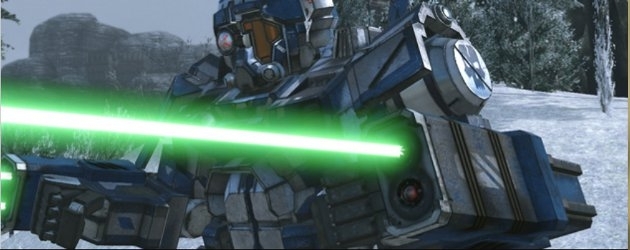
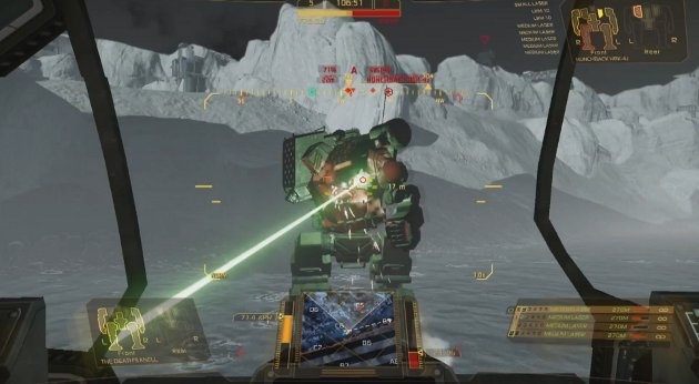
Now, if you compare this design philosophy to the cockpits on the MWO 'Mechs, the latter seem much more random and haphazardly thrown together: There are screens and switches spread all over on many of them, and there seems to have been no ergonomic considerations made during their design (those poor, poor 'Mech pilots
 ).
).This is definitely not something I would like to see prioritized by PGI, as there are lots of other and more important aspects to be included in the game. However, if a cockpit redesign is ever contemplated, may I humbly suggest that some inspiration is gathered from modern aircraft cockpits to make the 'Mech cockpits seem more realistic and thought through? At least to me, this would increase immersion quite a bit.

(Oh, and PLEASE make the pilot push the throttle FORWARD when increasing speed - moving it backwards like now - at least I've seen this happen on some 'Mechs - seems a bit silly...
 )
)EDIT: I added a poll, as that seems to be more or less the standard for topics in this section. Besides, it would be interesting to see what more people think of my ideas.
Edited by Garegaupa, 01 May 2014 - 12:56 AM.