#1
Posted 30 April 2014 - 05:09 PM
Fortunately, Smurfy has allowed the fruits of his labors to freely be shared, and PGI has allowed me to use their most excellent artwork (Alex, you rock man!) in the pursuit of that idea.
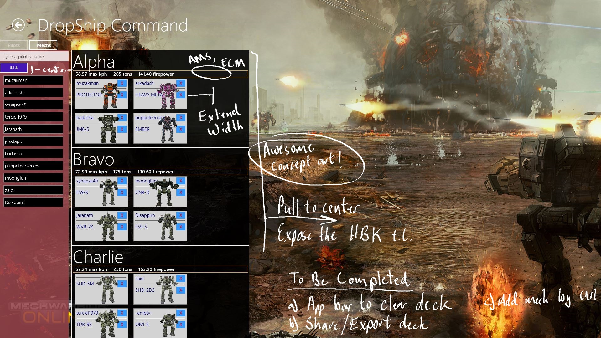
Head to http://mwocommand.liquidelectron.com to download the app, see screenshots, and read more about the MWO Command Console app.
As of right now, the app is available only for Windows 8.1 users. The next release, hopefully within the next week or two, is scheduled to support Windows Phone 8 as well.
I hope you find the app useful, and I'd love to hear people's thoughts on how to make it moreso.
Enjoy!
#2
Posted 11 May 2014 - 08:00 AM
#3
Posted 11 May 2014 - 06:42 PM
#4
Posted 11 May 2014 - 07:24 PM
#5
Posted 11 May 2014 - 08:57 PM
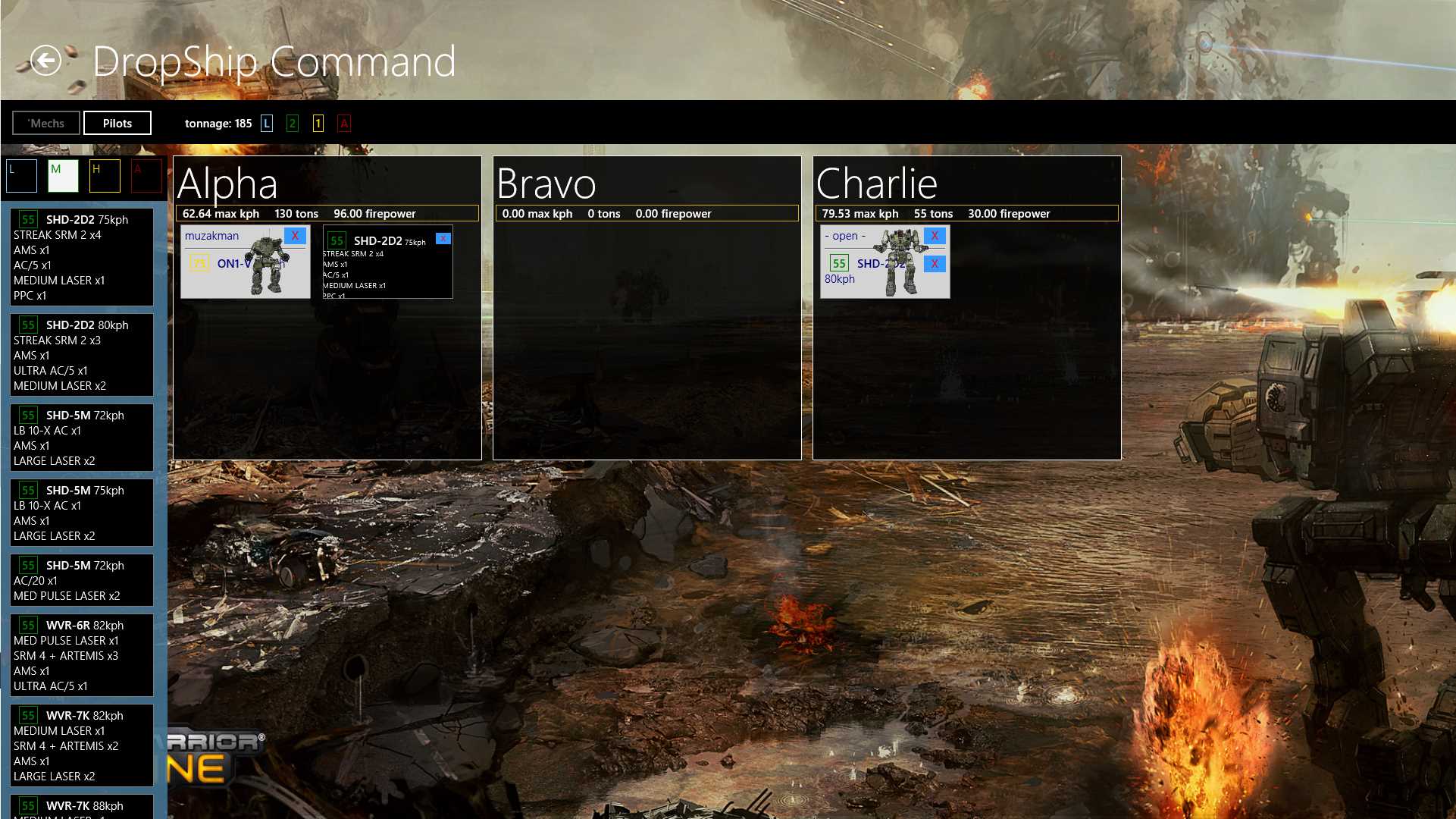
EDIT: the screenshot shows a hover (mouse) or hover-intent (touch) view of the load's details
Edited by Muzakman, 11 May 2014 - 08:58 PM.
#6
Posted 12 May 2014 - 09:06 PM
#7
Posted 13 May 2014 - 12:15 PM
#8
Posted 13 May 2014 - 12:35 PM
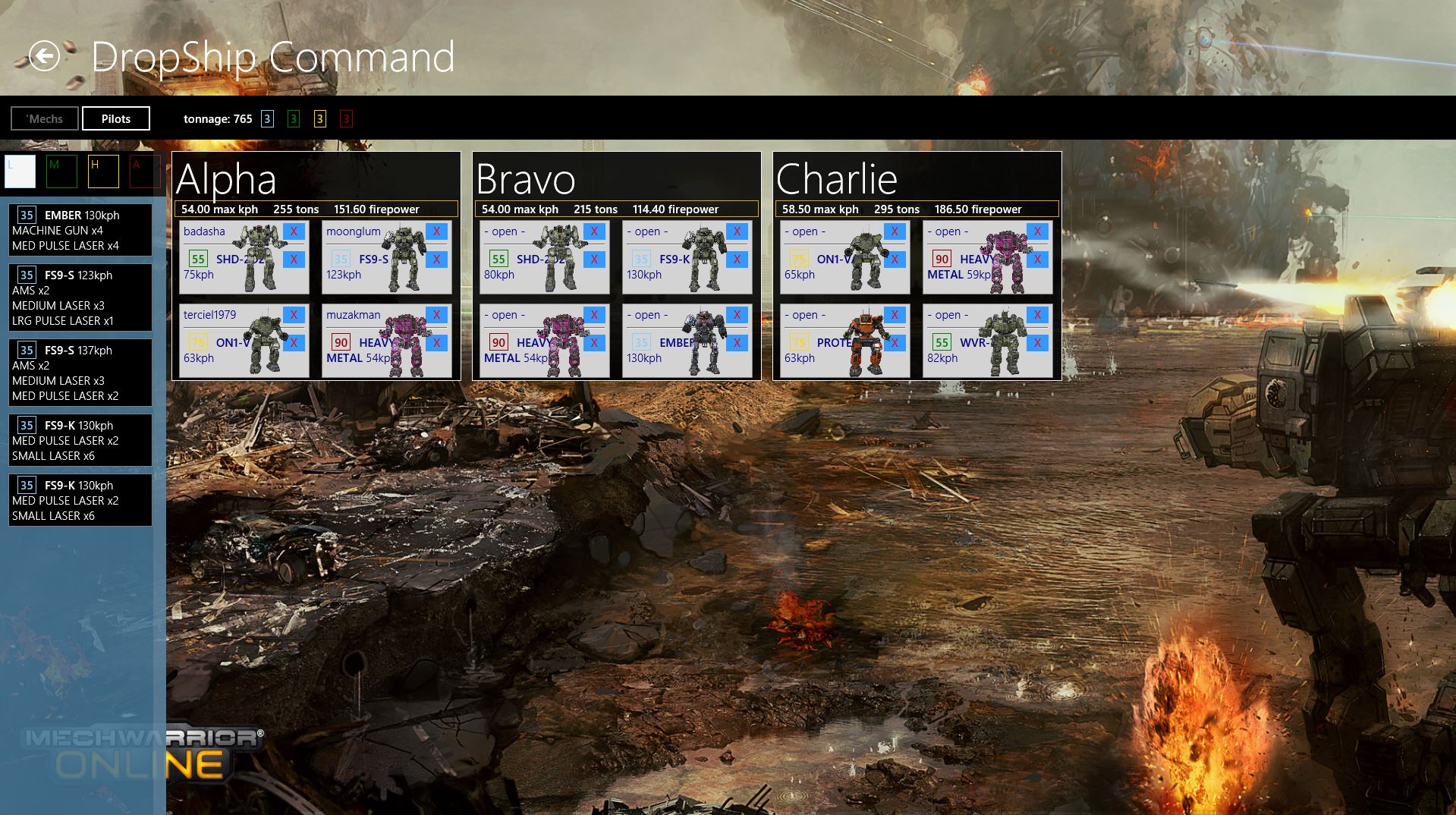
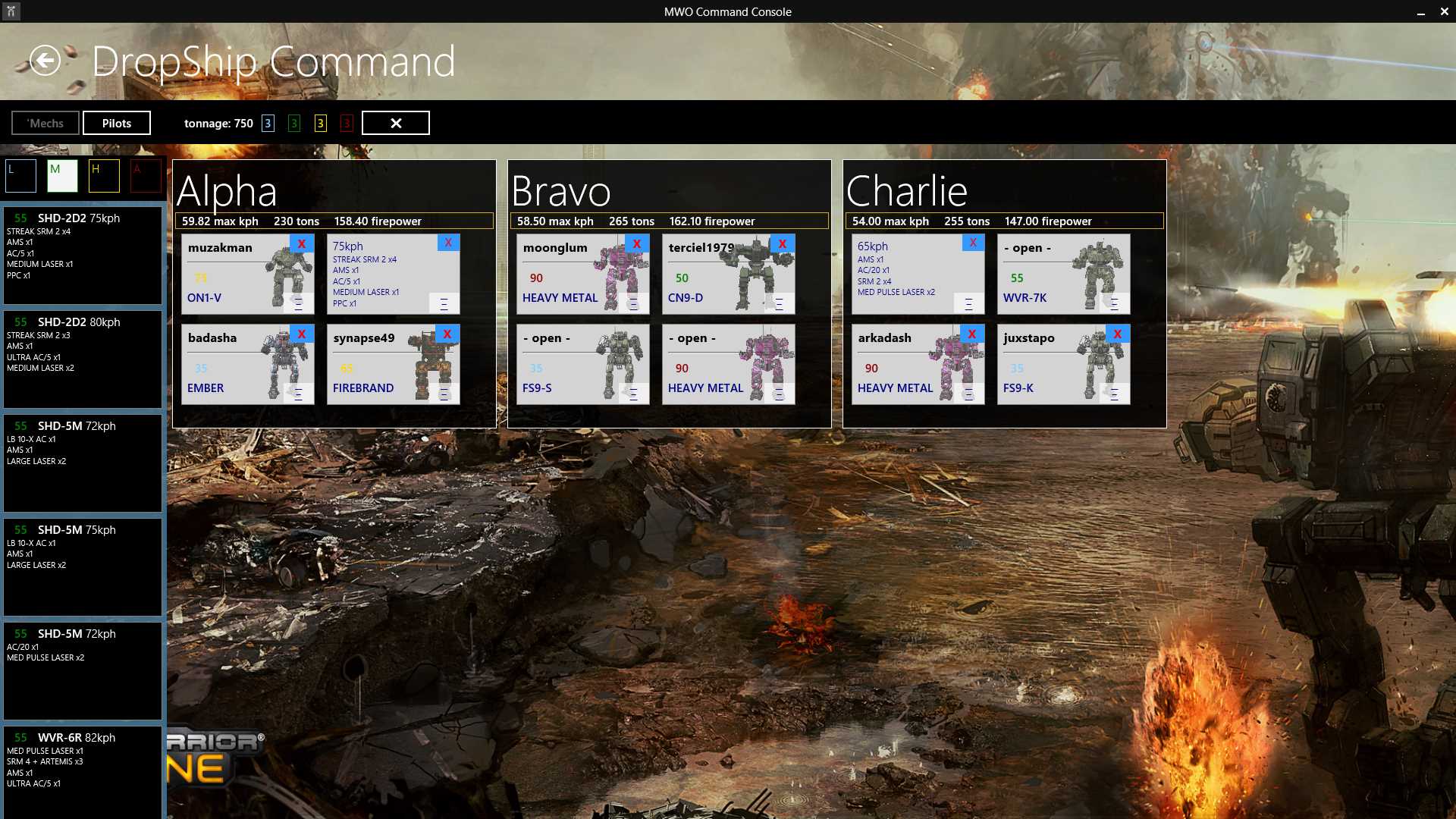
- See the title bar? That only shows up when I'm using a mouse. That's part of a recent Windows 8.1 update.
- Show or hide different weight classes in the left-hand side "well" of loads by tapping or clicking on one of the colored boxes at the top of the well. In the screenshot below, only Medium weight class 'Mechs are displayed.
- You can also see an aggregate count of the company's tonnage and class distribution at the top of the screen below the header.
- Clicking the "X" next to the header will clear the current DropDeck.
- Your deck will be saved automatically a short interval after you make any change.
#9
Posted 13 May 2014 - 01:22 PM
#10
Posted 14 May 2014 - 10:16 AM
I'm a pretty crappy front-end developer, so the styles and layout aren't nearly where I want to be (any HTML / CSS gurus wanna contrib?), but if I waited to release until I was satisfied, the app would never come out!
hopefully this app become a useful tool in people's MWO toolbox
#11
Posted 10 June 2014 - 08:41 AM
- Tag loadouts in the MechBay
- UI changes:
- better-looking delete handles in DropDeck for pilots and mechs
- DropDeck cards now aggregate weapons to show the unique count and type of weapons in the well
- Once much elements are assigned to a lance, flipping the card over reveals loadout details
- MechBay color-codes equipment and upgrades:
- JumpJets
- ECM
- Ferro
- Endo
- DHS
- Hub view of 'MY Mechs' improved
- displays chassis info per variant now to reduce clutter
- variants have hardpoint info overlaid on their image
#12
Posted 24 July 2014 - 05:09 PM
#13
Posted 25 July 2014 - 02:30 PM
- Fixed crash-upon-launch problem caused by network timeouts and errors in loading codex data
- Improved handling of network unavailable situations
- Bug fixes in many areas
- MWO static data API integration (beta)
- DropDeck - instead of displaying loadouts in the load well, cards for available chassis and variants are displayed.
- Clan invasion updates
- Known issue: clan mech hardpoints all say "0" for their count in summaries (omnipod data reading issue)
#14
Posted 25 July 2014 - 02:40 PM
 Jester McCloud, on 24 July 2014 - 05:09 PM, said:
I'd love to reach the broadest base of people possible, but my resources are quite limited, and don't have any allowance for that at this time. That said, I'm examining some possibilities that could neatly avoid the issue altogether...
Windows 8.1 is really quite a huge improvement from Windows 8 (and it doesn't cost anything to upgrade from 8 -> 8.1). You even have your start menu back... it can take up the whole screen if you want it! There's other benefits too - I've seen folks gain 10-15fps in the MWO client after an upgrade from 7.
#15
Posted 25 July 2014 - 03:04 PM
#16
Posted 25 July 2014 - 03:20 PM
Edited by Pezzer, 25 July 2014 - 03:20 PM.
#17
Posted 26 July 2014 - 01:10 PM
#18
Posted 26 July 2014 - 02:05 PM
However this does sound like a cool app. Should it see an android release I would grab it in a heartbeat
#19
Posted 30 July 2014 - 11:59 AM
This app looks like pretty much what I want for MWO to help co-ordinate and manage my unit. A pity it's only for windows 8.
And for the record, without changing to windows 8.1, I get 60 FPS, even on my older machine, at high resolution settings in MWO.
#20
Posted 31 July 2014 - 08:58 AM
 JennerCrusher, on 30 July 2014 - 11:09 PM, said:
Call me old fashioned, but I don't want my interface to look like that - it looks, for lack of a better term, too childlike, akin to some of the child protection software of the 90s where it created an 'safe' interface over the OS to keep kids out of dangerous things. And some of the network functionality has caused -massive- headaches for me and my company. A basic network connection should not require 'pro' anything.
Further more, you can't easily tweak it. Hell, even the 'Windows 7' interface program doesn't fix most of my issues - it allows more control, but you still have the network issues and the inflexibility in dealing with certain things.
Granted, you have some of that in Windows 7 as well, but it's substantially more tech/IT friendly for many things - I don't need to pay more to get what is a basic functionality with windows 7 home basic, for example.
Much like Vista before it, Windows 8 is just too restrictive on too many levels. And 8.1 is worse. And the interface, though simple, reminds me of a smart phone - not what I want my computer to be like.
1 user(s) are reading this topic
0 members, 1 guests, 0 anonymous users


