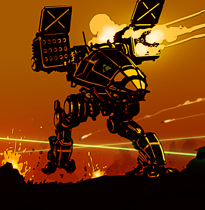
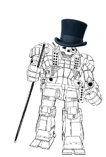
Jump to content

What will the 'Mechs look like?


22 replies to this topic

#1 Arnie1808

    Member

  • PipPipPipPipPipPipPip
  • The Predator
  • The Predator
  • 546 posts
  • LocationUK

Posted 17 November 2011 - 01:34 PM

I am just wondering what the 'Mechs will actually look like when this comes out. Personally I am hoping they will look more like they did in MW3 and MW4 BUT look nothing like they did in the Mechassault crap!

I liked the look of the 'Mechs in MW3 They just seemed to be more mechanical and kinda stood out so they looked like they were walking tanks -
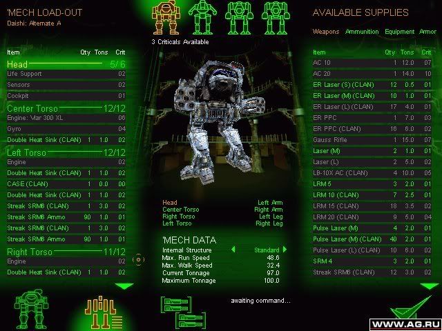
Posted Image

MW4 kinda made them look too soft for my liking if you understand what I mean?
They looked for lack of a better word cartooney -
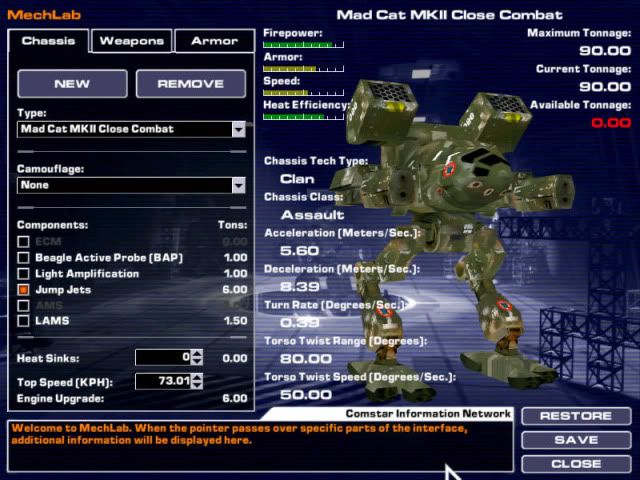
Posted Image

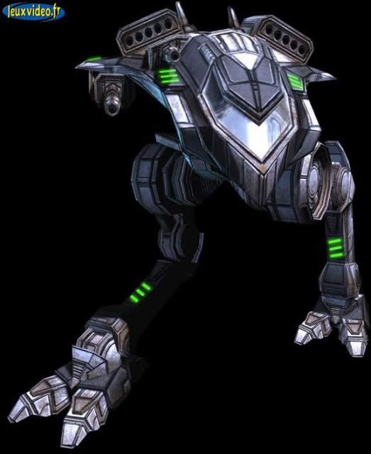
This is a a total pile of poo -

Posted Image

I remember the first 'Mech game I owned was Mechcommander, I can remember sitting on the bus going home reading the book with the different 'Mechs that was in the game and was totally in awe thinking how cool is it going to be to command these things in battle. I then found I had a copy of WM2 but had never played it.

When I read a novel and I imagine the 'Mechs they look more like this because of the Manual for Mechcommander -
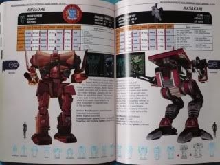
Posted Image

Edited by Arnie1808, 17 November 2011 - 01:38 PM.


#2 ELHImp

    Com Guard

  • PipPipPipPipPipPipPipPip
  • 1,846 posts
  • Google+: Link
  • LocationRussia

Posted 17 November 2011 - 01:36 PM

Quote

What will the 'Mechs look like?

Maybe like this?
Posted Image

#3 Arnie1808

    Member

  • PipPipPipPipPipPipPip
  • The Predator
  • The Predator
  • 546 posts
  • LocationUK

Posted 17 November 2011 - 01:56 PM

I have seem the art work of some of the 'Mechs but that doesn't look right to me, it looks nothing like what the atlas looks like in the TRO's
I understand that they will tweek the look but that does not resemble the Atlas that I know. Its has been messed with too much.

I think if it looked like it did in this * then I would be happy (even though it has no hands) -
*

Edited by Arnie1808, 17 November 2011 - 02:02 PM.


#4 LordxMugen

    Member

  • Pip
  • 10 posts

Posted 17 November 2011 - 02:00 PM

i would actually be interested in a Mech Warrior game that used similar graphics to Borderlands (which the concept art TOTALLY looks like). it means the game could look ALOT more detailed while also having something very distinct about itself.

Edited by LordxMugen, 17 November 2011 - 02:00 PM.


#5 Arnie1808

    Member

  • PipPipPipPipPipPipPip
  • The Predator
  • The Predator
  • 546 posts
  • LocationUK

Posted 17 November 2011 - 02:06 PM

Personally the trailer above looks outstanding because it is the Unreal Engine 3 which suits MW very well because it makes things look metallic and has a sheen that makes the 'Mechs look so much better.

#6 Arnie1808

    Member

  • PipPipPipPipPipPipPip
  • The Predator
  • The Predator
  • 546 posts
  • LocationUK

Posted 17 November 2011 - 02:09 PM

The main thing I am trying to say is this -
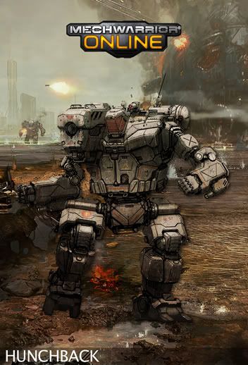
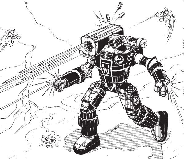
Posted Image

Does not resemble this doe it -
Posted Image

Edited by Arnie1808, 17 November 2011 - 02:11 PM.


#7 KnowBuddy

    Member

  • PipPipPipPipPipPip
  • Legendary Founder
  • Legendary Founder
  • 435 posts

Posted 17 November 2011 - 02:24 PM

View PostArnie1808, on 17 November 2011 - 02:09 PM, said:

The main thing I am trying to say is this -
<snip pic>
Does not resemble this doe it -
<snip pic>


Looks very similar to me. If the concept art version were turned a bit counter-clockwise, it would almost be identical, except for the fact that the arms/legs have been made a bit more blocky which feels more believable to me than the TRO cylinders.

#8 CoffiNail

    Oathmaster

  • PipPipPipPipPipPipPipPipPip
  • The Cub
  • The Cub
  • 4,285 posts
  • Facebook: Link
  • Twitter: Link
  • LocationSome place with other Ghost Bears. A dropship or planet, who knows. ((Winnipeg,MB))

Posted 17 November 2011 - 02:25 PM

No the FD one looks ten times better. Real and deadly. It is their game, and they want to update the mechs for our time frame while keeping the core look.

#9 Andrimner

    Member

  • PipPip
  • 22 posts

Posted 17 November 2011 - 02:40 PM

The one thing everyone seems to agree about on this forums is that they like the look of the mechs(no necessarily the HUD) in that 2009 trailer so that should be a hint to the developers what we want.

#10 Arnie1808

    Member

  • PipPipPipPipPipPipPip
  • The Predator
  • The Predator
  • 546 posts
  • LocationUK

Posted 17 November 2011 - 03:14 PM

All I am trying to say is every 'Mech is different and has its own character and I wouldn't like it if that changed and they all looked like similar to each other except for 'Mechs that are meant to i.e the Supernova and the Nova (Black Hawk). I agree with Andrimmer, if the 'Mechs look like they do in that trailer I would be more than happy!

#11 Gaius Cavadus

    Member

  • PipPipPipPipPipPip
  • The Spear
  • The Spear
  • 404 posts
  • LocationNova Roma, Alphard

Posted 17 November 2011 - 03:44 PM

The Jenner and Hunchback look great but the Atlas in the MW3015 trailer looks better than Alex's concept. It's really just that damn head being lower than the shoulders. It throws the entire mech off and it makes it look like a Thug or something.

#12 Five by Five

    Member

  • PipPipPipPipPip
  • 191 posts

Posted 17 November 2011 - 04:05 PM

When they were releasing the pic fragments, there was a period there when I thought it might have been a reimaged Zues, mainly based on the shoulders.

Yeah, that particular Atlas looks a little off, but the general direction looks good and the other concepts look great (really like the Hunchback reimage). I'm looking forward to see how the designs evolve.

#13 Zakatak

    Member

  • PipPipPipPipPipPipPipPip
  • Elite Founder
  • Elite Founder
  • 1,673 posts
  • LocationCanadastan

Posted 17 November 2011 - 04:10 PM

"Mechassault is crap" applies to ALL other possible discussions, but not this one, because Mechassault had the best looking mechs in Battletech.

MW2, well, early-90's graphics don't leave a lot of room for judging the designs.

MW3 mechs had the center of gravity right on the heel of the mechs, a bird could knock it over by running into it. The Timberwolf cockpit was an atrocity.

MW4 destroyed the beauty of the Catapult, and while the new practical/industrial look of mechs like Mad Dog were improved, designs really lacked inspiration.

MA mechs are hot. The best for sure. The rest of the game may suck, but this is what they got right.

Edited by Zakatak, 17 November 2011 - 04:11 PM.


#14 Iron Horse

    Member

  • PipPipPipPipPipPip
  • 207 posts
  • LocationIjima, Xinyang; Benjamin Military District, DC (IRL: Inglewood, CA)

Posted 17 November 2011 - 04:21 PM

I don't know where all the MA hate comes from. MA2? I get that one, but MA was a near-perfect imagining of a console-style BT game IMO.

#15 The1WithTheGun

    Member

  • PipPipPipPipPip
  • 110 posts
  • LocationRight behind you

Posted 17 November 2011 - 04:24 PM

View PostArnie1808, on 17 November 2011 - 02:09 PM, said:

The main thing I am trying to say is this -
*snip pic*
Does not resemble this doe it -
*snip pic*

You are correct - the two hunchbacks are different, but the MWO version looks 10x better (as does the MWO Atlas and Jenner) IMHO.

Edited by The1WithTheGun, 17 November 2011 - 04:25 PM.


#16 Zakatak

    Member

  • PipPipPipPipPipPipPipPip
  • Elite Founder
  • Elite Founder
  • 1,673 posts
  • LocationCanadastan

Posted 17 November 2011 - 04:33 PM

Flyingdebris (MWO art guy) made this image of the Catapult.


Posted Image

Awwwwwwwww yeeeeeaaaaaaa!

It better look like that!

#17 theginganinja

    Member

  • PipPipPipPipPip
  • Philanthropist
  • Philanthropist
  • 192 posts
  • LocationMinnesota

Posted 17 November 2011 - 04:36 PM

They will look like this
Posted Image

#18 Eckerson

    Member

  • Pip
  • Knight Errant
  • 10 posts

Posted 17 November 2011 - 04:43 PM

To me, the new Atlas kind of looks like a cross between the classic and the design in Age of Destruction (minus the features that made the AoD version look like a hockey goalie). So far I've been enjoying the updated look.

#19 LordxMugen

    Member

  • Pip
  • 10 posts

Posted 17 November 2011 - 04:46 PM

View PostIron Horse, on 17 November 2011 - 04:21 PM, said:

I don't know where all the MA hate comes from. MA2? I get that one, but MA was a near-perfect imagining of a console-style BT game IMO.
Why would anybody hate on that game? MA was a great arcade-style mech game. It showed me how much fun being a Raven pilot (Corvus variant with target jamming ability) really is in a CTF game. It was also damn fun using a Cougar, and it was good looking mech too. so yeah, it had probably some of the best designs Battletech will probably see for awhile.

#20 Brohymm

    Member

  • Pip
  • Elite Founder
  • Elite Founder
  • 18 posts

Posted 17 November 2011 - 04:52 PM

Well in one of the interviews with the artist he said that some of the mechs designed we're tweek/changed to make them look more modern and believable.... IE if you look at how the original TRO stalker is drawn it really doesnt make sense how it was able to keep it's balance.


4 user(s) are reading this topic

0 members, 4 guests, 0 anonymous users