
Edited by BLOOD WOLF, 03 June 2014 - 09:33 AM.

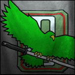
Redesigned Clan Logos
Started by CoffiNail, Jun 03 2014 09:14 AM
316 replies to this topic
#21
-

-

- The Jaws

- 6,368 posts
Member
- Locationnowhere
Posted 03 June 2014 - 09:32 AM
THE OLD ONES, they do not exactly have to be the same but......................these are doppelgangers, not the True signs of the Clans
#22
-

-
- FP Veteran - Beta 2

- 5,685 posts
Tina's Warrior
- LocationA 2nd Wolf Guards Grenadiers JumpShip
Posted 03 June 2014 - 09:32 AM
Well, when i first saw them i had to say they are actually cool. They made them quite more menacing.
Sure, i will always be loyal to the originals, but i would say that apart from cropping and style these are not too different from the classics. And anyway still better than nothing (though the Marik eagle is far from being ugly ). While looking endlessly for fixes for my crashes i kept refreshing the forum index with ansiety -then i saw CoffiNail with a Ghost Bear icon!

What worries me, however, is that these icons are not going to fit well on a 'Mech IMHO. On my war machines i would totally prefere the classic logo , plus Galaxy, Cluster and trinary emblem/number. But for the forums these are good enough.
P.S. just noticed - why are the stars on the Wolf logo empty inside?! They are supposed to be full yellow... They would have looked quite better..
P.P.S. The Bear on the CGB logo looks a bit weird, but i must say that the CJF logo is very cool.
Sure, i will always be loyal to the originals, but i would say that apart from cropping and style these are not too different from the classics. And anyway still better than nothing (though the Marik eagle is far from being ugly
). While looking endlessly for fixes for my crashes i kept refreshing the forum index with ansiety -then i saw CoffiNail with a Ghost Bear icon! What worries me, however, is that these icons are not going to fit well on a 'Mech IMHO. On my war machines i would totally prefere the classic logo , plus Galaxy, Cluster and trinary emblem/number. But for the forums these are good enough.
P.S. just noticed - why are the stars on the Wolf logo empty inside?! They are supposed to be full yellow... They would have looked quite better..
P.P.S. The Bear on the CGB logo looks a bit weird, but i must say that the CJF logo is very cool.
Edited by CyclonerM, 03 June 2014 - 09:36 AM.
#23
-
-
- The Named

- 159 posts
Member
- LocationTranquil
Posted 03 June 2014 - 09:35 AM
Can't get my head around it. There is NO reason for changing them! They are what we have identified ourselves with for decades!
Go ahead and try to change the US flag and see what happens! STRAVAG!
Completly no reason to mess with the logos. None.
Go ahead and try to change the US flag and see what happens! STRAVAG!
Completly no reason to mess with the logos. None.
#24
-

-
- 56 posts
Member
- LocationUS
Posted 03 June 2014 - 09:36 AM
Honestly, I don't particularly care if it's true to the original. It gets the idea across well, looks sharp, and does not affect gameplay in ANY negative manner.
So everyone, let's be happy that we HAVE clan insignia in the first place rather than *****ing all over them.
So everyone, let's be happy that we HAVE clan insignia in the first place rather than *****ing all over them.
#25
-

-
- 35 posts
Member
- LocationHuntress
Posted 03 June 2014 - 09:37 AM
I think the other 3 faction logos are atleast recognizable right away. The smoke jag one....well....I guess. Since I knew there would only be 4. hah Like others I don't see why there needed to be such an overhaul compared to the IS logos but happy to finally have something.
Edited by Jehdin, 03 June 2014 - 09:38 AM.
#26
-
-
- The Devoted

- 1,375 posts
Member
- LocationBetween the Flannagan's Nebulea and the Pleiades Cluster
Posted 03 June 2014 - 09:38 AM
I have to say, well done PGI! Now you can be much prouder Clan warriors, congrats!
#27
-
-
- Elite Founder

- 1,363 posts
Member
Posted 03 June 2014 - 09:38 AM
These are forum faction icons, so I'm not too worried. On the other hand when/if these show up on mechs in game eventually, I'm afraid the Wolf's and Jaguar's will have visibility problems.( and I prefered the Wolf without iris ) The Ghost Bear has a little "cat beard" thing going ( google it) and the Jade Falcon's looks pretty good IMO.
#28
-

-
- Legendary Founder

- 367 posts
Member
- LocationOutreach

Posted 03 June 2014 - 09:39 AM
Extremely pissed off at the re-design. I wouldn't have minded if they did a re-design of the IS ones too, but they didn't. That being said, they do look interesting, but it's not the clan logos.
Would like to see what he says, if he responds.
 CoffiNail, on 03 June 2014 - 09:29 AM, said:
I asked Russ via Twitter, with luck he will respond.
Would like to see what he says, if he responds.
#29
-
-
- The Jaws
- 6,368 posts
Member
- Locationnowhere
Posted 03 June 2014 - 09:41 AM
CyclonerM, on 03 June 2014 - 09:32 AM, said:
Well, when i first saw them i had to say they are actually cool. They made them quite more menacing.
Sure, i will always be loyal to the originals, but i would say that apart from cropping and style these are not too different from the classics. And anyway still better than nothing (though the Marik eagle is far from being ugly ). While looking endlessly for fixes for my crashes i kept refreshing the forum index with ansiety -then i saw CoffiNail with a Ghost Bear icon!
What worries me, however, is that these icons are not going to fit well on a 'Mech IMHO. On my war machines i would totally prefere the classic logo , plus Galaxy, Cluster and trinary emblem/number. But for the forums these are good enough.
P.S. just noticed - why are the stars on the Wolf logo empty inside?! They are supposed to be full yellow... They would have looked quite better..
P.P.S. The Bear on the CGB logo looks a bit weird, but i must say that the CJF logo is very cool.
Sure, i will always be loyal to the originals, but i would say that apart from cropping and style these are not too different from the classics. And anyway still better than nothing (though the Marik eagle is far from being ugly
). While looking endlessly for fixes for my crashes i kept refreshing the forum index with ansiety -then i saw CoffiNail with a Ghost Bear icon! What worries me, however, is that these icons are not going to fit well on a 'Mech IMHO. On my war machines i would totally prefere the classic logo , plus Galaxy, Cluster and trinary emblem/number. But for the forums these are good enough.
P.S. just noticed - why are the stars on the Wolf logo empty inside?! They are supposed to be full yellow... They would have looked quite better..
P.P.S. The Bear on the CGB logo looks a bit weird, but i must say that the CJF logo is very cool.
I actually think these current images would look better on the sides of Mechs
#31
-
-
- Elite Founder
- 111 posts
Member
- LocationToronto, ON

Posted 03 June 2014 - 09:41 AM
I actually quite like the redesigns for the most part, though SJ seems a little 'meh'.
#32
-
-
- Elite Founder
- 1,120 posts
Member
Posted 03 June 2014 - 09:42 AM
Looks like they are trying to make them look life like. I was kind of hoping for the classic design, but I do like how fierce they look. And its a lot better then those DAM LONE WOLF TAGS that I will never wear again. I'm kind of wondering what nova cat and steel viper will look like, and if they make goliath scorpion a faction it would look cool to see a redesign of the scorpion symbol!
#33
-
-
- The Named
- 159 posts
Member
- LocationTranquil
Posted 03 June 2014 - 09:43 AM
With a more than disappointing result and for completly no reason something that has been a part of BattleTech has been changed.
Can't understand the motivation.
Deeply puzzled.
Can't understand the motivation.
Deeply puzzled.
Edited by Meldric, 03 June 2014 - 09:52 AM.
#34
-
-
- Overlord

- 185 posts
Member
Posted 03 June 2014 - 09:43 AM
I'm not a decades long battletech fan so to me the new logos seem fine, I think you guys are just displaying conservative attitudes because of your long and intense fandom. Because as an outsider looking on Sarna a lot of the art displayed for mechs and stuff is fairly naff.
Not saying these new logos are better than the old ones but you should at least give it some time to get used to them before you complain, they might not seem so bad then.
I mean myself prefer being able to see the whole of the Jade Falcon without shadow but eh it's fair enough.
Not saying these new logos are better than the old ones but you should at least give it some time to get used to them before you complain, they might not seem so bad then.
I mean myself prefer being able to see the whole of the Jade Falcon without shadow but eh it's fair enough.
Edited by Mockeryangel, 03 June 2014 - 09:51 AM.
#35
-

-
- Elite Founder
- 2,277 posts
Member
Posted 03 June 2014 - 09:45 AM
Eh. To me this is a bad change. The only icon that looks even remotely right is the Jade Falcon one. I think these icons would work a lot better as optional decals we could put on our mechs. For simple faction affiliation they should be the standard icons we are all used to.
I'm not likely to change my unit affiliation regardless but some of these faction symbols make my eyes bleed. I'm looking at you Clan wolf though I am trying hard not to.
I'm not likely to change my unit affiliation regardless but some of these faction symbols make my eyes bleed. I'm looking at you Clan wolf though I am trying hard not to.
#36
-
-
- The 1 Percent
- 5,879 posts
Member
- Twitch: Link
- LocationPeriphery of the Inner Sphere, moving toward the core worlds with each passing day.
Posted 03 June 2014 - 09:45 AM
Glad we got them, I do like the Wolf emblem best of the redesigns...
I would have preferred something slightly truer to form, though I am by no means in a mood to complain. I am no longer a lone wolf! Glad that we can actually show our colors now...
I would have preferred something slightly truer to form, though I am by no means in a mood to complain. I am no longer a lone wolf! Glad that we can actually show our colors now...
#37
-
-
- The Sickle

- 2,161 posts
Member

Posted 03 June 2014 - 09:45 AM
Jehdin, on 03 June 2014 - 09:37 AM, said:
I think the other 3 faction logos are atleast recognizable right away. The smoke jag one....well....I guess.
The Smoke Jaguar seems close enough to me. It is better on details and still captures the original "theme" well. The Wolf, on the other hand, is FUBAR. It is not Clan Wolf, it is Clan Flesh Hound http://whfb.lexicanu...iki/Flesh_Hound
#38
-
-
- Legendary Founder
- 367 posts
Member
- LocationOutreach
Posted 03 June 2014 - 09:46 AM
Mockeryangel, on 03 June 2014 - 09:43 AM, said:
I'm not a decades long battletech so to me the new logos seem fine, I think you guys are just displaying conservative attitudes because of your long and intense fandom. Because as an outsider looking on Sarna a lot of the art displayed for mechs and stuff is fairly naff.
Not saying these new logos are better than the old ones but you should at least give it some time to get used to them before you complain, they might seem so bad then.
I mean myself prefer being able to see the whole of the Jade Falcon without shadow but eh it's fair enough.
Not saying these new logos are better than the old ones but you should at least give it some time to get used to them before you complain, they might seem so bad then.
I mean myself prefer being able to see the whole of the Jade Falcon without shadow but eh it's fair enough.
My issue is that they only changed the Clan logos, they didn't change the IS ones at all. Seems like a slap to the face, honestly.
#39
-
-
- FP Veteran - Beta 2
- 5,685 posts
Tina's Warrior
- LocationA 2nd Wolf Guards Grenadiers JumpShip
Posted 03 June 2014 - 09:46 AM
And actually now that i look more closely at the Falcon icon .. It looks like a pigeon rather than a Falcon No offense Falcons but it looks a bit strange..
As usually,i have mixed feelings
EDIT: @Saber: i like the IS emblems, they are very close to the originals but still more modern and streamlined. They are pretty much perfect IMHO.
And i actually think, my fellow Wolf, that i would never want these icons anywhere near my 'Mech!
The classic one is perfect for decals IMHO.
No offense Falcons but it looks a bit strange..As usually,i have mixed feelings
EDIT: @Saber: i like the IS emblems, they are very close to the originals but still more modern and streamlined. They are pretty much perfect IMHO.
BLOOD WOLF, on 03 June 2014 - 09:41 AM, said:
I actually think these current images would look better on the sides of Mechs
And i actually think, my fellow Wolf, that i would never want these icons anywhere near my 'Mech!
The classic one is perfect for decals IMHO.
Edited by CyclonerM, 03 June 2014 - 09:50 AM.
#40
-
-
- Big Brother

- 4,944 posts
Member
Posted 03 June 2014 - 09:47 AM
Personally I think that the Wolf and Jade Falcon Icons look badass, but the Ghost Bear Icon doesn't look intimidating as the previous design and the Smoke Jaguars look decent. But I'm glad we have the faction icons.
Edited by Will9761, 03 June 2014 - 09:50 AM.


1 user(s) are reading this topic
0 members, 1 guests, 0 anonymous users


