Either way, the fact that they're so ready to make changes by request of the player base definitely says good things.

Clan Logos Update - Feedback
Started by Kyle Polulak, Jun 06 2014 11:05 AM
24 replies to this topic
#21
Posted 09 June 2014 - 08:57 AM
I can't say the redesigns bother me all that much, as I was expecting a degree of artistic liberty. It's understandable that fans them to look more accurate to the originals, but it doesn't seem like much of a pressing issue.
Either way, the fact that they're so ready to make changes by request of the player base definitely says good things.
Either way, the fact that they're so ready to make changes by request of the player base definitely says good things.
#22
Posted 09 June 2014 - 11:33 AM
 Foxx, on 09 June 2014 - 08:57 AM, said:
I can't say the redesigns bother me all that much, as I was expecting a degree of artistic liberty. It's understandable that fans them to look more accurate to the originals, but it doesn't seem like much of a pressing issue.
Either way, the fact that they're so ready to make changes by request of the player base definitely says good things.
Either way, the fact that they're so ready to make changes by request of the player base definitely says good things.
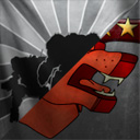
As a side note, I like your version of the Clan Wolf logo. It has much better contrast than the original. That is where I hope PGI improves on the original too.
#23
Posted 09 June 2014 - 12:44 PM
I don't want mild refresh logos, I wanna be a Jade Falcon not Jade Fatty Bird. But alas the only people interested in this are the old logo diehards so we're going to have a poll with a very limited group of people voting on it, so the "mild refresh" option will obviously win.
Woe if only PGI grew the fanbase for this game instead of shrunk it.
Woe if only PGI grew the fanbase for this game instead of shrunk it.
#24
Posted 09 June 2014 - 01:16 PM
They would get much larger poll numbers if they advertised it on the launcher, instead of just the forums.
#25
Posted 09 June 2014 - 05:54 PM
I like the new artwork (and the old), here is my constructive criticism - banners and logos (look up medieval heraldry for example) are supposed to use contrasting colors, be. Please just change the banner in the background to a more distinct color for Wolf (right now its a red blob). For Ghost Bear, turn the face down so you can see it more distinctly, or even do a slight side turn if needed for copyright/artwork issues. The Jade Falcon should be holding a sword...... its not really clear what that is. Sorry. That's it, thanks for the great art!
1 user(s) are reading this topic
0 members, 1 guests, 0 anonymous users

 This topic is locked


