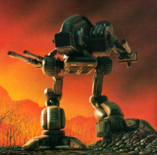
Where The Mad Dog (Vulture) Went Oh So Wrong. Offically Closed! Problem Fixed!
#41
Posted 24 September 2014 - 07:30 AM
Needing long barrels on the arms purely astetic and doesnt need to be changed IMO.
The current model looks great it shouldnt change.
#42
Posted 24 September 2014 - 07:32 AM
 Anarcho, on 24 September 2014 - 07:27 AM, said:
There is some charm to the old designs

LOL
I can understand some of the old IS mechs (they do look dated), but the Clan mechs are designed pretty nice. I think the designs of the clanners mechs hold up well.
It's all a matter of opinion anyway.
#43
Posted 24 September 2014 - 07:33 AM
#44
Posted 24 September 2014 - 07:35 AM
they should have added a AC hard point on one side of the head and a laser hard point on the other side
and when they cry about how over powered it is then you know you got it right
how about a monster Mad Dog with arms going up you know a four armed monster
#45
Posted 24 September 2014 - 07:35 AM
 Lily from animove, on 24 September 2014 - 07:27 AM, said:
The original legs were well shaped in earodynamic ways and got their durability by some depth.
Yes 90kph or only a measly 56mph .. thats not too fast.
Have you seen these before?

Large flat surface area but moves much fast than 90kph
Edited by Beliall, 24 September 2014 - 07:37 AM.
#46
Posted 24 September 2014 - 07:37 AM
#47
Posted 24 September 2014 - 07:37 AM
#48
Posted 24 September 2014 - 07:38 AM
 Anarcho, on 24 September 2014 - 07:27 AM, said:
While I'll second you for a lot of mechs, I must respectfully disagree on quite a few others.
There's no need to re-design for the sake of redesigning. I don't doubt PGI had reasons for many of the differences (let's be fair here, it's not just aesthetic reasons that drive the creative process, it's also functional, technical and administrative reasons), but that does mean there'll always be a risk of making changes that players don't like.
The OP pointed out a few things he doesn't like and said how he thought they could be tweaked to make the Mad Dog look more like the Mad Dog in canon. Nothing wrong with that.
#49
Posted 24 September 2014 - 07:43 AM
#50
Posted 24 September 2014 - 07:43 AM
Rather than risk an accidental rant, I will bullet point my bullet points in favour of this argument, for the good of everyone.
1 - Mad Dog design good in many respects, and kudos was gained for adding the chassis to the game. However...
2 - Arms/barrels too short (stubby) and arms too wide. A important aspect of the design in many pilots eyes, the classic silhouette is undeniably destroyed by this design choice. It's at least as bad as MW4.
3 - Legs too fat. See above.
4 - No C variant. Maybe a blessing in disguise? For the C to be truly viable it would need the alternate (higher) ballistic arm pods anyway, and really long barrels. Gauss lances basically.
5 - The concept art was really good! What in the ten hells happened?
#51
Posted 24 September 2014 - 07:52 AM
 Lily from animove, on 24 September 2014 - 07:27 AM, said:
The original legs were well shaped in earodynamic ways and got their durability by some depth.
I have two problems with this. First, 90 kph isn't that fast, in the scheme of things. Second, if you start applying real world physics to giant space robots, everything starts to fall apart really fast.
EDIT:
 Ozric, on 24 September 2014 - 07:43 AM, said:
I'm not sure the C would have been decent, anyway. You'd either have too little ammo, or too little armor, or (more likely) both.
Edited by Asyres, 24 September 2014 - 07:54 AM.
#52
Posted 24 September 2014 - 07:54 AM
#53
Posted 24 September 2014 - 07:55 AM
 Ozric, on 24 September 2014 - 07:43 AM, said:
5 - The concept art was really good! What in the ten hells happened?
Limitations with the game engine would be my guess...
That or having to use some parts from mechs that it shares those parts with, like the legs of the Timber Wolf...
Surprisingly I find that it has decent hit boxes and good survivability with the way that Clan XL engines work, took a few shots from a dual gauss War Hawk to lay them out, when I fought against SRM36 vomit ones last night. And with only 60 less max armour than a Timber Wolf, they can take a beating too.
#54
Posted 24 September 2014 - 07:57 AM
#56
Posted 24 September 2014 - 08:04 AM
 Bishop Steiner, on 24 September 2014 - 05:08 AM, said:
So considering the way in which we have gotten it, being heavily critical of the design may seem highly ungrateful. But, there is just so many things, that have gone so wrong, in the in game model, both from the original design, and Alex's gorgeous re-imagining.
Let us begin:

The Vulture- One of the most visually arresting designs in the classic Battletech game.


Several design elements of note:
Slender, but tall profile. Long/Deep torso
Long arm weapons barrels
Deeply flexed, ostrich legs.
Shoulders far behind hips.

The issues:
1) The deep but slender profile was changed to a much stubbier version. This is actually understandable, and much more survivable, fro side shots, than the original, much as the way the bullet snout of the Timber Wolf was reined in.
2) Long weapon arms? Nope. Stubby as heck. PGI modelers have done a lot of things right in this game, but the dynamic weapons are very hit and miss. In this instance, even using the generic "box" lasers, they are at the least, 2-3 times too short in barrel length. The PPC also could use a boost. This also largely points out the ludicrous nature of using the same little barrel for a .5 ton Small Laser and a 7 Ton Large Pulse Laser.
3) The Legs. IMO, the biggest deal breaker. 12-15 too large in general, and certainly 10% too thick in the thighs. I get that they followed the lore premise of re-using the legs from the Timberwolf (though even on the Timby they are borderline too thick). No, for me, the biggest issue is the posture. Far too erect and upright. Look at the original design, and it is deeply flexed, dynamic, looking ready to spring into motion. This one might actually be pretty easy to fix. Even if they simply re-rig the legs to a deeper bow, it would do wonders for the look, and perceived size, of the mech. Hardest part would probably be re-doing the walking animation.
4) The Shoulder placement. It is behind the hips. Perhaps, visually it would look nicer, further back, but with the changes made for viability, it would also probably expose the side torso to easier shots. So IMO; it's livable.
TR;DR:
Russ, not to sound ungrateful, but is there any way to have the weapon barrels looked into and given more of the flavor of the mech? And while a rescaling of the legs by 12.5% would be preferred, would it be too difficult to have the legs re-rigged (and walk re-done) to give the "proper" bowed look and gait to the Mad Dog?
I own that old armourcast mad dog
#57
Posted 24 September 2014 - 08:18 AM

The MAD DOG is PERFECT. Its suppose to have the same legs. Lore explains this. Without a doubt it is the most beautiful mech in game right now.
Sorry I think some folks are like this girl asking if her new outfit makes her look fat:

PS. there is something about mechs in this post too.
Edited by Utilyan, 24 September 2014 - 08:19 AM.
#58
#59
Posted 24 September 2014 - 08:24 AM
 Bishop Steiner, on 24 September 2014 - 05:08 AM, said:
How about making all pulse lasers have a long barrel so that you get some more visual variations on mechs?
(I think the Vulture looks really great though. A bit edgy but otherwise very nice)
Edited by The Great Unwashed, 24 September 2014 - 08:25 AM.
#60
Posted 24 September 2014 - 08:27 AM
16 user(s) are reading this topic
0 members, 16 guests, 0 anonymous users


